|
Interactive
Prototype:
View
the 2nd
interactive prototype of TraveLite.
For
optimal functionality, please use Internet Explorer.
Design
Changes
Following
is a high level description of the changes made to the design
for this pass of the prototype. These changes were made in
response to a set of heuristic evaluations. We have addressed
the problems and recommendations made by these evaluators
more fully in the attached
log [MS Excel]. The original heuristic evaluation is available
here.
Sitewide:
Providing Feedback
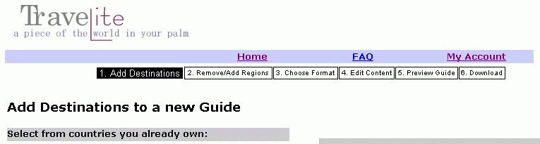
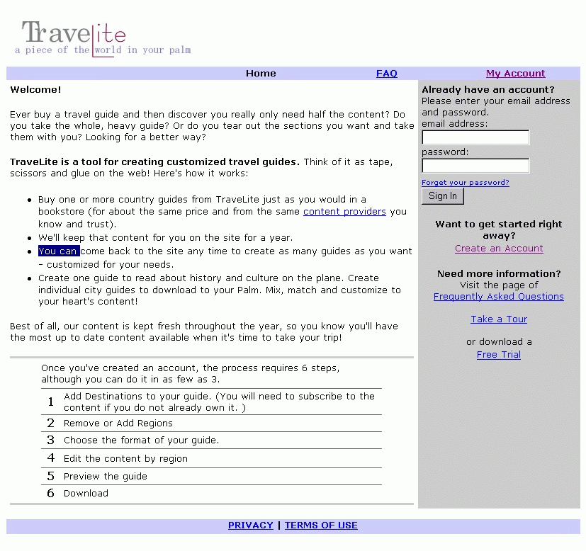
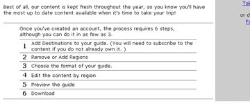
Process Status: Throughout the site, we now provide
more feedback to the user about the process, and their current
location within the process. On the home page, we explain
the steps involved in guide building and give the user an
idea of what to expect (in both time and steps). Then, as
the user moves through the system, we provide a process bar
giving feedback on their current location, how many steps
they have already traversed and how many steps remaining to
go through. We will also implement a tour of the system as
soon as we have it finalized the design.
| Progress
bar: Appears on every page through the Build a Guide process.
|

|
| Section
view of new Home page showing detail explanation of the
steps involved in the process. (click image for view of
entire page) |
 |
Editing
Guide/Region: Within the editing process we also now clearly
indicate to the user the name of the guide that they are working
on, and, within the edit region section, which region they
are working on.
Guide
Size: Currently we provide information to the user on
the memory size of the guide, for example 2000k for a Palm.
Our evaluators noted that it was difficult for them to equate
this with content size. We created an approximation of how
much memory is required for a page of content and now provide
this information this adjacent to the memory indicator to
assist the user in relating their digital guide to the familiar
model of a paper guide. [Note: we have not yet implemented
this, but will have it in place for our user testing beginning
Sunday, April 15 2001.]
Information
Icon/Labeling: The information icon provides context or
overview information for each item next to which it appears.
When the user follows the link, the content is then provided
in a pop-up window. To more clearly label the icon, we included
an alt tag with the message 'See overview information for
(relevant destination)'.
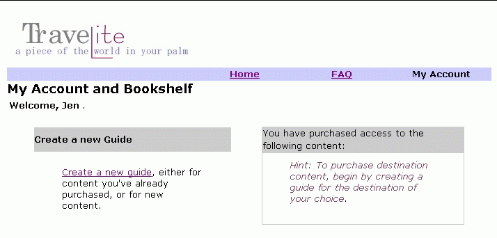
Hints:
Additionally, we decided to incorporate a hints section into
the page design. These hints will give the user suggestions
on how to use the current page. We have already provided a
few of these and will consider others in response to user
testing.
Example
of hints provided throughout system. On the right,
under 'you have purchased access..', TraveLite suggests
to the user that to purchase content, they need to
begin by creating a guide.
|
|
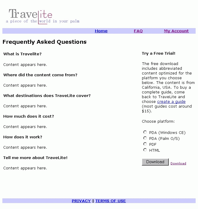
Faq/Trial
Download
In our previous design, we had combined these two sections
onto a single page. The evaluators found this page confusing,
cluttered, and difficult to use. To help guide the user, we've
separated the FAQ and Trial Download into two pages with cross-links
between the two, and provided links to both pages from the
home page.
|
Combined
FAQ free trial download in previous interation.
|
Now
FAQ and Free Trial are two separate pages (FAQ on the
left, and Free Trial on the right).
|
|
|
|
|
The
Purchase Process
The heuristic evaluators found the 'purchase content' and
'guides created' distinction confusing. We struggled with
our business model and determined that allowing users to subscribe
to content on a country level and then create guides based
on any of the content to which they have subscribed, is the
easiest and clearest model for our application. However, we
discovered through this evaluation that this model is still
potentially confusing. To further alleviate confusion and
streamline the flow of the interaction, we decided to simply
redirect the users to the "purchase" section when
they need to purchase a subscription to content. Thus, if
they choose a destination they are not subscribed to, they
will get redirected to the purchase page. By asking users
to subscribe to content only when necessary, we expect that
this new design will require less cognitive load and flow
more smoothly.
We
are aware that this will potentially cause problems and confuse
users, therefore we have paid careful attention to labeling
content on the page, communicating the status of each content
piece and also allowing easy exits for the user to back out
of the purchase process. We believe that our user testing
will show us whether we have made it clear which content the
user has subscribed to and which they need to purchase, and
whether confusion is likely between the two.
Guide
Download
Our evaluators indicated a desire to be able to download their
guide without first previewing it. We structured the flow
originally with a greater degree of control, to ensure that
the user has completed one step of the process before moving
to the next. However, we have decided to allow the user to
download from within the edit process, but are still concerned
that this interrupts the task flow: will users wish to download
in the middle of editing or prefer to review/preview before
downloading? We plan to evaluate this functionality during
our usability testing.
Edit
Guide
Tabs:
the evaluators expressed a concern that in switching tabs,
they were not able to save their work when they moved on to
the next (ie. no 'save' option was provided). This is consistent
with the normal ways in which tabs function: they capture
the information as the user inputs it, allowing him/her to
move rapidly from one tab to another. The user assumes that
their work is saved as they go along. We are concerned that
should we include a 'save' button on each tab page, users
would be even more confused and unsure about what they were
saving (and perhaps mistakenly assume that can save disjoint
sets of content). Therefore, we decided to add a hints section
on some pages that will give the user feedback (explained
above under Sitewide: Providing Feedback) so that on
this page the hint would reassure the user that their work
is saved all along the way.
Some of the other heuristic violations were caused by known
deficiencies in functionality, we address these here to highlight
improved functionality of the system.
- The
tabs will be greyed out (and not accessible) unless they
are clicked to add to guide, then the content within will
be automatically provided by default. We believe that in
not allowing access to the tab unless it is added to the
guide, the user will understand this functionality in an
intuitive manner.
- We
have also clearly labeled the check box with 'Add to Guide'
so that the user understands the action resulting from clicking
the tab. The tab will also 'go live' (not be greyed out)
when the check box is marked.
- We
still wanted to provide the user the option to add or subtract
all the content within a section with little effort, therefore
we maintained the 'Clear all | Select all' on each tab.
- We
have also made the tabs actually look like tabs and clearly
labeled the check box 'add to guide'.
So
much functionality required implementation to produce a prototype
sufficient for testing, that not all the coding is yet completed
for each of the seven tab sections. The Food & Dining
tab is completely implemented and functioning properly, while
the remaining tabs are in varying states of completion. However,
this functionality and overall design changes will be completely
implemented by Sunday April 15 2001, in time for the first
user test.
Editing
Proccess: In the editing process, we have now streamlined
the flow so that the user picks a country, picks their regions
(or accepts the default "all regions") and then
chooses their desired guide size and editing/customizing method
(1. pre-formatted, 2. edit by country, or 3. edit each region).
If the user chooses either the 2. edit by country or 3. edit
each region, they proceed to the edit page. For option 3.
edit by region, the user can edit content for each region,
one content section at a time. Alternatively, with option
2. edit by country, the user performs the customization at
the country-level, and is not required to edit region by region.
Previously
we had the user choose a country, pick their guide size and
then pick regions and edit the content; we realized from the
evaluators' feedback that the region selection also impacts
the potential guide size.
Edit
on Country Level: One of the evaluators noted that they
may wish to edit a country rather than each region (a rather
time-consuming process). We therefore have provided a means
to edit the guide on a country level rather than a region
level. This is available on the Choose Guide Size page.
Created
three distinct paths for editing guide content:
-
preformatted,
'quicky' version,
-
filter on a country level,
-
edit each region.
|
|
'Finished'
button: We decided to change
the 'Finished' button to read 'Bookmark: Edit Later' to indicate
to the user that they are capturing the content but can still
return to the guide to alter it whenever they wish. We had
previously considered using 'Save' but felt that this implied
to the user that they had finished the entire task, not that
they were simply storing the current state for either download
or editing at a later time. This
is not yet implemented, along with the bookmark functionality,
but will be in place for our user testing.
'Save
as' Function: The evaluators also suggested providing
users a means to save an existing guide as a new guide and
edit it in a different way. We plan to add such 'save as'
functionality at a later date. Thereby allowing a user to
duplicate any guide and then edit in a different way, make
additional alterations, without affecting the original.
Error
Recovery
Several of the heuristic violations noted by our evaluators
refered to error recovery or functionality that was not yet
implemented. Although
we specifically stated in our guidelines that this was not
yet implemented, these comments highlight the importance of
providing a means for the user to recovery easily and gracefully
from errors. We will incorporate this as soon as we possibly
can. We have also noted on the attached log where the system
was buggy or needed additional functionality to make the page
work as it should.
|