assignment 2
Find two examples of type in your environment (i.e. not from the web).• Successful type: text that you believe fits its purpose.• Unsuccessful type: text that you believe does not fit its purpose.Take a straight photo of each ‘found’ type example, minimizing distortion. For example, don’t take the photo at a strange angle. Post your photos below by Sunday, February 10th. Post your photos below with a short description of why you chose them.
22 Responses to “assignment 2”
Leave a Reply
You must login to post a comment.
My example of successful type is from a container for beer. I think the type accurately reflects the alternative nature the company is trying to portray. My example of unsuccessful type is from my shower curtain. Although I like the cheery colorful nature of the curtain, the font chosen is very misleading. Additionally, the inconsistent sizing and awkward spacing of the type supports the confusing nature of the print.
Successful Type
I believe the type on Le Petit Prince succeeds completely. It conveys a sense of whimsical fancy to match the artwork. The type and artwork in turn convey the rather whimsical nature of the text.
Unsuccessful Type
The type on the Instructional Support Group’s registration sheet, however, does not fit its purpose. It is supposed to convey all the knowledge necessary to set up and begin using a computer account in the CS labs. Instead, it overwhelms the reader and does not clearly indicate what should be read when, nor what information is important and what is not.
Larger versions of my photos can be found on my flickr page, username “Mikaly001″
Bad Text (Tylenol PM Bottle):
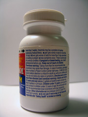
This is my example of poor text. The text is extremely small, making it difficult to read. Furthermore, because of its size, bold, italicized and regular text are all difficult to read. Looking for usage directions is very difficult. The usage section, which I would argue should be a highly visible & readable area, is difficult to locate since it blends in with the rest of the text.
One thing you can’t see well in my photo that I think is good is the large expiration date stamp. It stands out because it is aligned differently (rotated 90 degrees clockwise), uses a larger fontface, and is a different color. Expiration is important since you probably don’t want to be using expired pills.
Good Text (Signs in International House):
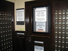
This first photo shows the service door in the International House mailroom. When there is someone in the mailroom available to distribute packages, the sign is not visible (since the door is open). When the service door is closed, the mailroom information is clear and easy to see due to its large fontface. It gives pertinent information about when the service room is open. Additionally, on the lower sign, it shows which day’s mail has been distributed in large red text. A quick glance walking by the mailroom can let you know if that day’s mail had been distributed.
While I was coming back from the mailroom, this door caught my eye. I see it every day going to/from the elevator to my room. It stands about because, first of all, the large white text is accented by the blue border glued on the bright orange posterboard. Large arrows point to baggies labeled “supplies,” and on further inspection, you discover that the baggies are filled with first-aid and birth-control paraphernalia. It is the only door on the whole floor that is decorated so ornately so in the case of an emergency, residents can see it (either going to the elevator, or looking down the hallway).
I like how this font is used. It is plain and rather simple, but still quite bold. It stands out on the face of the building and is clearly legible, but does not try to grab your attention. Its as if it is proudly stating that it is an art musuem, but the outside font is not the show. Inside is what is important and the font doesn’t try to steal any of the attnetion from the art inside.
I don’t care for the NASA text. I think this is because it is so iconic of NASA, that I associate it with an old, dated version of NASA. The new 21st century NASA should have a font that doesn’t feel like a retro 40’s or 50’s font. I think its time for them to do a big corporate makeover.
I chose the following two examples to illustrate successful and unsuccessful type because I thought it was interesting that both used typefaces drawing on common origin, the Arts & Crafts and Art Nouveau movements in the early 20th century. Despite this similarity, however, the two instances use this visual reference to vastly different effects, with very different levels of success.
The first example is taken from the door of Crixa Cakes, a coffeehouse and bakery in Berkeley where I am a frequent customer (hopefully this is relatively clear - taking a good photograph of the glass door was a challenge):
This example uses two typefaces based on the Art Nouveau movement in Europe. I wasn’t able to identify the font used for “Crixa” (I think it’s a modified version of Yolanda Countess), but it’s clearly influenced by Art Nouveau and Arts & Crafts typefaces. The typeface for the URL and the “Cake Cafe” text is Korinna, based on a 1904 Art Nouveau font.
These font choices make perfect sense for Crixa, evoking a romantic image of an Old World cafe, the kind of bohemian establishment popular in Prague or Vienna in the early 20th century. This is definitely the style to which Crixa aspires; their cakes and pastries are largely Eastern European in origin, and the interior decoration and classical music reinforce this association. The way that the fonts on their door quickly and specifically evoke the style that they want for the cafe makes this an especially successful use of type.
Compare this to a sign using a typeface of a similar origin:
This is a municipal health inspection notice in a local taqueria, set in ITC Rennie Mackintosh, based on the letterforms of Rennie Mackintosh, a turn-of-the-century Scottish designer who was highly involved in the Arts & Crafts and Art Nouveau movements in the UK.
Unfortunately, this typeface bears absolutely no relation to the purpose of the health inspection notice. One suspects it’s being used here because the city of Berkeley included the font was a key visual element of its brand, and through the wonders of bureaucracy this was taken to mean that it should be the main typeface in all municipal notices. Ideally, such a notice would appear official and provide clear, legible information. Instead, the use of this typeface, which is clearly not designed for legibility in large blocks of text, makes the notice significantly less official-looking (it looks like the kind of novelty-font-based certificate one might print out at home) and difficult to read. The way in which the typeface actively works against the purpose to which it is employed makes this a particularly unsuccessful use of type.
Successful Type

The Ratatouille movie poster logo exemplifies good type. First, “Ratatouille” is very eye catching (as movie titles should be). The white on blue really makes it pop; moreover, the font is large, well-spaced, and easy to read. The incorporation of the mouse features and chef hat on the dotted ‘i’ gives the logo character as well as a sense of what the movie is about. Second, the font at the bottom matches in color with the Disney and PIXAR logos above. Excellent use of sphere delimiters are used to space out the title letters to help the reader correctly pronounce the movie title.
Unsuccessful Type

The Hollywood Reporter is a deliverer of entertainment news as well as a source of movie reviews. My initial reaction to their logo was that the company name is “The Reporter,” and “Hollywood” was simply vandalized on there. Although red is a color that typically stands out, the type for “Hollywood” is very narrow, cursive, and overlaid on top of a thicker, more serious sans-serifed font – all of which contribute to it looking like spray painted writing. Further, “Hollywood” blends into the thicker red line that underlines the entire logo.
Successful Type
text that you believe fits its purpose
Sign in front of the Downtown Berkeley BART station for the Jewish Music Festival
I think this use of type does a very good job of expressing its purpose. It is part of an advertisement for the Jewish Music Festival. I love how they used the J (in Jewish) to complete the treble clef. This integration is beautifully done and really connects the two ideas (jewish with music). Take note of how they purposely used a serif font for the J, to make it look more traditional and more elegant and ornate with the rest of the treble clef while the rest of the type is sans-serif, a cleaner, more modern look. Another well-thought choice is the use of a slightly lighter shade of blue for the word music and the treble clef but a darker shade of blue for the words Jewish and festival. This is a very subtle difference, but a nice way of drawing your eye to the different parts.
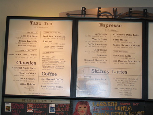
Starbucks Menu @ Starbucks on Shattuck & Cedar
I also wanted to throw in the Starbucks menu as a good use of type, though for different reasons than my first example. It does a very good job of utilizing white space and drawing your eye to the names of the drinks with large bold serif lettering. They use the size of the font to help attract your eye and establish hierarchy within the menu. The sizes of the drinks are the smallest (and in sans-serif which is much easier to read with small type as compared to sans-serif) since they are repeated throughout the menu under every drink and most people already know them so they are less important details. Overall, I think the menu is very readable and easy on the eyes unlike some cafe menus that use obnoxious colors and really pack together all of their information with little whitespace making it hard to know where to look for items or to read them in general.
The menu does have a very standard, homogeneous, “industrial” feel though since it’s printed and not hand-written, I think that’s why Starbucks has little chalkboards all around the shop with suggestions and snippets written by hand like you can see in my photo below the menu (”Leeanne starts her day with a triple grande nonfat, no whip…”), they’re trying to still evoke the small, neighborhood cafe feel.
It was hard for me to decide which examples of good type to use. I found so many that I liked (and I’m very indecisive)! Some of the other examples include the sign for Gregoire’s restaurant, the logo for Village Grounds cafe, and the sign for Mint Leaf bistro.
Unsuccessful Type
text that you believe does not fit its purpose
The Produce Center sign on Shattuck
Okay. Seriously. When you see this text do you think “mmmm fresh fruit and vegetables, yummmm!” I think not. The first thing I think of is bad Americanized Chinese takeout. If you want to elicit ideas of fresh fruit use a crisp, clean font not Shanghai.
I took pictures of the various shampoo bottles littering the shower (they’re not all mine! :P) and compared what I thought were good uses of text to the not so good. Tried to focus only on the text, but it was hard to look at the font exclusively without taking into consideration overall design and packaging. I can’t say my choices of good/bad were not mediated by my emotional response to the associated brand image, haha. Actually, I found that the most successful examples of text usage further enhanced or were congruent with what my perception of the brand was, while the unsuccessful examples were incongruent to my expectations of the company’s image or the product they were selling. Also, simplicity and clarity seemed to be the most important factors, but maybe that’s my own personal taste.
GOOD USES OF TYPE
The Paul Mitchell bottle utilizes various fonts successfully to establish its brand-name image, being conscious of text hierarchy, color, style, and capitalization versus lowercase text usage. Consumers instantly identify the large vertical running text as a salon-quality Paul Mitchell product, not only because of the obvious name printed, but the kind of bold, futuristic, unique font that is used. Additionally, having the basic type of conditioner printed at the very top in an alternate color (the logo also in the corresponding color) helps users to create strong associations between this sort of magenta and “strength conditioner.” The official name is bolded in a strong black, while the details of the product (conveniently translated into four other languages) are in regular typeface, though still maintaining a sense of uniformity throughout due to all the text being of the same font-family.
Similarly, Neutrogena features type that suits the purpose of establishing instant brand-name recognition through the use of font and style; I wonder if they did extensive research to rate the “cleanness” of a number of fonts by a pool of subjects, and then picked the cleanest one to write “CLEAN BALANCE” with. Would a group of users in Japan associate a different font-face with “clean” — and thus, would the font used for Neutrogena bottles abroad differ? Personally, again, by maintaining no more than two font-faces and varying them through capitalization, style/weight, background color, etc., and being concious of the “balance” of text on the label, I think Neutrogena made an easy-to-read, quickly identifiable label for its consumers.
BAD USAGE EXAMPLES
Mm, maybe I’m biased, but I think the designers of this label did a bad job. The good part is that the red distinguishes this product as “super sensitive” right off the bat, but there’s no sense of real logic or hierarchy (though there is definitely an attempt) in the text, which makes it hard to read. Additionally, the background image doesn’t seem to help readability. Although in principle, similar stategies are employed (two fonts, using color, style, etc. to create variation) as the previous two bottles, I think the choice of font confuses me, and I’m not sure which part to read in order to find the information I am looking for. Inevitably, I have to read the entire label and that is frustrating and time-consuming to me as a shampoo-user who is trying to take a quick shower, j/k.
For Clairol’s Herbal Essences, the brand logo is very visible, but the rest of the text is not; the way they treat the details in such small type makes me think the information is not all that important. In addition, I don’t think they were discriminating enough in choosing the right font for their product. It is too generic, does not match the image the logo projects, and again, while I notice the red-highlighted text towards the bottom, I’m not subconsciously drawn to it or aware that this is the information I am looking for.
My example of type which “fits its purpose” is the Ubuntu logo on my laptop. One of the purposes of the Ubuntu distribution is to encourage non-technical users. The typeface they use is friendly and round, with lots of “U”s.

My unsuccessful type was CitiBank’s logo. I think it looks nice, and their use of bold and regular font is good, so it’s not completely unsuccessful. But I don’t understand why they chose to use that red arc. It doesn’t seem like the arc has any reason for being there, or fits a purpose.

GOOD TYPE
A professor in the business school pointed out the genius of Trader Joe’s brand positioning: if the store is out of order, you think, “this store is so quirky and cool!” If they run out of something, you think, “I should have gotten here sooner.” Given the same conditions at Safeway, you’d be ticked off. So, these “handwritten” signs (they’re actually consistent from store to store and are printed on an inkjet printer) do wonders to reinforce the brand image as individualistic and quirky — just like the Trader Joe’s customer. [Note to other Trader Joe’s customers “with toddlers, infants, or one on the way:” despite the apparent “honesty” of the type, this sign really should say don’t eat tuna fish, period.]
BAD TYPE
I had a revelation in the shower at 6 AM: the trademark text-heavy label on the Dr. Bronner’s bottle makes me dizzy. It’s not just the excess of exclamation points and quotation marks! Also sentence fragments: IN THE UPPER CASE! There’s something about the panoply of type styles, sizes, and spacing all on a curved surface that makes my head spin. Of course, the bad type is such a part of the Dr. Bronner’s brand that there’s no chance it will ever be removed from the label.
FUNNY TYPE
Considering license plates are made in prison factories, it’s not that bad of an idea, actually: teaching the inmates to properly kern type could keep graphic design offices staffed with an abundant supply of cheap, if dicey, labor.
I believe the “Silver Surfer” comic book cover has a great font and does a good job of what it was designed to do. The purpose of the type on the cover of a comic book is to attract attention to the book among all the myriad other books on the shelves in the store. It also is designed to give a sense of what the comic is about. In the case of Silver Surfer, I believe that the font appropriately describes the sense of majesty and seems to fly off into the infinity of space!
As I am an avid collector of comic books, I looked at an older Silver Surfer comic to see how the cover used to be. The font looks fairly standard for a comic book and does nothing special to make it stand apart from other comic books. In the early days of comics, most cover fonts on comics were fairly standard.
My example of a type that in my eyes perfectly fits its purpose can be found on an ordinary stop traffic sign. The simple and clear design and the color contrast of white type on red ground makes it easy to read, understand and it catches your attention.


My example of a terrible type is the text on a milk drink, which I saw in a supermarket. It has a sort of monster theme, which I believe is a terrible choice for nutrition or food in general. Its colorful and playful type does not really enhance me to believe this is a delicious but rather slimy drink.
My example of a unsuccessful type is this slide of a lecture at the ischool I think font and color are badly chosen. In my opinion Comic sans MS doesn’t appear professional and is more suitable for childish purposes, which also applies to yellow as font color. Moreover Times isn’t the best font for non print media and seems old fashioned.


The right choice in font and color has been found for this candybox.
GOOD TYPOGRAPHY
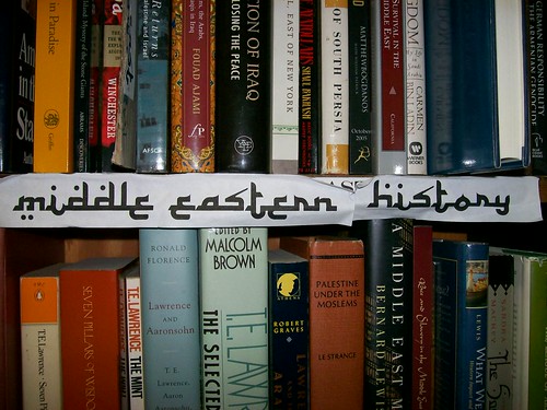
This is a sign for the Middle Eastern History Section of Shakespeare Books on Berkeley. It is an example of effective typography due to the fact that you do not actually even have to read it to know what it is going to say. The font tells you immediately that it is something to do with subjects conceptually related to Arabic. Also, if the sign were actually in Arabic it would not be readable to most. Therefore this font does a wonderful job of giving context by shifting a recognizable cue and allowing extra information to be included.
BAD TYPOGRAPHY
The type face used for the Playstation 3 is not a bad font in and of itself. It suffers from issues of context. First, it is distinctive. This is, again, not a bad thing in and of itself, but when the PS3 logo happened to be announced very near to the announcement of Spiderman 3. Perhaps, if the type face had been less distinctive no-one would have noticed. But as it played out, the fonts are similar if not identical, and it is really obvious if you see them near each other.
Both of my examples are from the front covers of publications.
Bad type

- Cover of a book on Internet Denial of Service (DoS/DDoS) attacks. I don’t think that the type is very successful, as it neither truly reflects the seriousness of the issue (which the book tries to get at), nor do I think it poseses a uniform theme. The impression I get is that it was either designed by an amateur, or by a geek who does not believe in graphic artists.
Good example
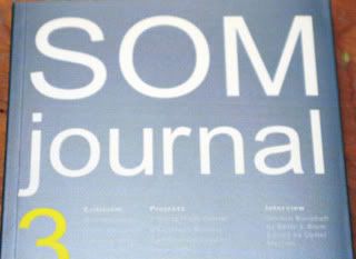
- Cover of “SOM Journal vol. 3,” a periodic publication put by SOM Architecture firm, containing critiques of recently projects. The paper used in the cover is very glossy and the font is very geometric, giving a sense of what’s in store for the reader. The cover itself is very minimalist and tasty, but it’s hard to expect anything less from modern architecture firms!
Text description is everywhere in our environment. In this assignment, I will comment on two sets of successful/unsuccessful types:
1.Text on a bottle:
https://webfiles.berkeley.edu/emeliecheng/shared/CNM290_assignment/type1-1.jpg
https://webfiles.berkeley.edu/emeliecheng/shared/CNM290_assignment/type1-2.jpg
I found those texts on one bottle; interestingly, successful in the front and unsuccessful in the back.
In the front, there are only several words, but with nice organization, and alignment. Also, the important message is emphasized by using bigger font-size and black, which makes it easy to be recognized. For example, this product is hair styling crème for waved hair, so only texts like curl, spiral, crème and texture are highlighted. And the rest texts that are not important are gray and relatively small, so it won’t attract too much attention.
Although the color scheme of black, white and gray is actually identical to the front side, users would have hard time to read the information on the back because the texts are really small; bold style makes it even worse. Also, the most important information for users might be usage direction, but it is overlapped with a gray-texture background.
2.Description of a product:
https://webfiles.berkeley.edu/emeliecheng/shared/CNM290_assignment/type2-1.jpg
https://webfiles.berkeley.edu/emeliecheng/shared/CNM290_assignment/type2-2.JPG
In this set, both texts are descriptions of a product in multiple languages.
On the first (successful) one, the information about this product is well organized to three rows. The designer manipulated three colors perfectly, black for background, orange for highlighted texts and white for details. Sometimes it’s hard to distinguish the letters when the texts are small font size with bold style; but in this case, the font-size and bold are in a good balance. So the users can find the information they want easily and quickly.
On the unsuccessful one, there are 13 different languages with identical color in one piece of paper without any indicator or mark, so it really takes several minutes to find the language I know. The text is small while the bottom of the page is empty space – not a very efficient use of space, in my opinion. The contrast between the color of the paper and the text are too small to read clearly.
Successful Type
Shown in the image is the cover of the book, ‘The Visual Display of Quantitative Information’ by Edward Tufte. I think the cover (or for the matter the book itself) is beautifully designed and typefaced. Though the cover of the book uses a serif font that one sees everywhere, there is some interplay between the graphic, the title and the color of the cover that make it look less of a textbook and more like a collector’s item.
Unsuccessful type
Or generally, the 3D wavy, curvy, tapering etc etc font decorations that Microsoft thought was aesthetically pleasing. Maybe, we’ll talk about reflective logos the same way in ten years?
If the photos don’t display correctly, here they are:
http://picasaweb.google.com/demaws/AEST01/
Successful:
I feel this image does a great job of conveying the message (the name of the resort) with a subtle but effective style. Aesthetically it’s pleasing and gives a clear idea of the theme, and the layout isn’t cluttered.
Unsuccessful
This image (taken from a Barnes&Noble bag) is extremely unsuccessful in my opinion. I feel that it ‘tries too hard’ trying to convey the book them and really detracts from the name/branding of the store. The choice of colors and poorly gradiated shadings also make this look ‘muddy’ and unclear. I’m not impressed with the aesthetic at all.
I have chosen two different cereal boxes as my example of good and bad type. I will starts with the bad one first:

The back of the Honey Nut cheerio box attempts way too hard to convince the consumer that the cereal is good for them. The yellow on orange color type is barely noticable and not attention grabbing at all. The crowding of the text and imagery also disrupts the viewer from remembering any useful information.
Now to the good one:

The honey bunch’s of oats cereal goes the opposite root by NOT turning the back of their box into a FOX NEWS news feed. and instead it uses simple sentences with correct color matching (dark purple on white, white on orange) and a proper and unified font proportion.
(Sorry once again no images - I don’t have a flickr account)
Successful:
My example of successful type is a freeway sign. I love that I can read it quickly, at a distance, and during all times of day.
Unsuccessful:
My example of unsuccessful type is also writing on a bottle, specifically a vitamin bottle. I bought new vitamins last week and it was a frustrating experience trying to decipher the text of the five bottles I was comparing.
Ctrl Space: it’s a great example of good fonts and graphic design. the fonts has the early 8- bit digital characters. there is a direct reference to computer language by using Ctrl instead of Control, [] in red also plays the double meanings, which is a shape of viewfinder.
it’s a very bad fonts. it speaks the old fashion Orientalism. it’s not to hard to see those typos around us.
it means you don’t need to know what it said. because you don’t care to see or nothing is worth to read. the fonts user don’t want to provide the right presetation of the others, etc.
BTW, you can find same racism in one of upper photos on middle east history from bookstore.