Managing Web Bookmarks and Browser History Files in One Interface
- Problem
- Solution Overview
- Tasks & Scenarios (Storyboard Images)
- Design Evolution (Screen Images)
- Final Interface
- Petter: writeup-design evolution
- Hans: writeup-final interface
- Mohammed:final presentation, writeup-problem, solution overview
- Masako: prototype modification, writeup-task & scenarios
Who worked on what?
1. Problem
Bookmark and history functions of web browsers offer a convenient means of retrieving pages that a user has saved or recently visited. Although many browser users find these functions, especially bookmark, useful, their user interfaces are not intuitive and easy to use. It becomes more difficult to locate a certain page in bookmark or history as lists become larger, and the current interfaces don't offer adequate information to find how to organize and navigate the lists. In addition, a user cannot search both bookmarks and history files at once.2. Solution Overview
Though this project, we proposed an integrated interface for bookmark and history functions. The new interface will enable better management of and navigation in a list of URLs and help users to maintain their own useful archive of web sites. Our solution to the problem stated in the previous section is summarized as follows;
- Design bookmark and history management UI that would serve as a bridge across multiple Web browsers.
- Provide affordances that conform with that of the current windowing UI.
- Provide new ways of viewing bookmarks and history files so as to provide a better means of managing them.
3. Tasks & Scenarios
TasksWebmarking is targeted for web browser users regardless of their experience in bookmark/history functions of conventional web browsers. Tasks performed by these target users can be divided into three categories.
- create bookmark
- organize bookmark/history
- finding a particular site
| Create bookmark | |
| a | add a current web page to bookmark |
| organize bookmark/history | |
| b | display contents of bookmark/history folders |
| c | create a new folder |
| d | move bookmark/history files to a bookmark folder |
| finding a particular site | |
| e | browse contents of bookmark/history folders in different views |
| f | search bookmark/history by key words |
Final Task Scenarios
Throughout the design process, we used the following three scenarios;
A. Simple organizing of bookmarks and folders (a, b, c, d)These scenarios are created to cover tasks specified in task analysis. (letters in parentheses represents tasks included in each scenario) At the same time, they incorporate features which are unique in Webmarking. These features include;
B. Browsing with Map view (b, e)
C. Power search history records in Calendar view (e, f)
- integration of bookmark and history files in one interface
- new views - map, calendar
- search function with different result view
AStoryboards
You organize your bookmarks using folders. Recently you have visited several newspaper web sites and saved these sites as bookmarks. Now you are viewing The New York Times homepage.You remember having visited The Financial Times homepage yesterday. But the site is not bookmarked.
- Add this page to your bookmark using the Webmarking interface
- Create a new folder to store several newspaper web sites. Name the folder "News".
- Put the New York Times bookmark to the "News" folder.
B
- Open a history folder for yesterday.
- Find The Financial Times site in the folder.
- Move the site to the "News" folder.
You would like to view your history files using the "Map" view in Webmarking. The "Map" view allows you to view your history files (pages you've visited) in a graphical format showing not only the pages you've visited but which pages you visited them from as well. In this case, you would like to view all the pages that you visited from The New York Times home page.C
- Go to the "Map" view.
- Find and select The New York Times home page as the root document in the "Map" view.
- Find the article of The New York Times you read which is titled "How to Separate Good Data from Bad".
Webmarking allows users to conduct searches over their history and bookmark files while also offering them a navigational interface to facilitate browsing where searching is simply insufficient. In this scenario you would like to perform a search to find the page from The New York Times that you visited last week. The problem, however, is that you are not sure when last week. You are certain that it was not Friday nor was it Wednesday. You decide that the best way to find this page is by having the search results displayed in the "Calendar" view so that you can go to last week's files and see for yourself when it was.
- Open Search dialog box.
- Search on all pages from The New York Times. Select Calendar view as a result view.
- Change the view to "Week" and determine which day (not Friday and not Wednesday) it was when you visited The New York Times.
- Screen shots: index
- click thumbnail to view larger image
| Scenario A: Simple organizing of bookmarks and folders | ||
| 1. | add bookmark >> "Add Bookmark" dialog pops up | 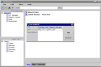 |
| 2. | show the new bookmark in the main (right) window | 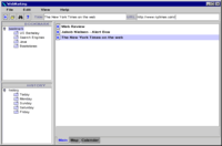 |
| 3. | open "New Folder" dialog | 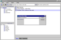 |
| 4. | show the new folder in the bookmark (upper left) window |  |
| 5. | drag & drop a bookmark to the new folder | (unimplemented) |
| 6. | open a history folder > show its contents in the main (right) window | 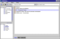 |
| 7. | drag & drop a history file to a bookmark folder | (unimplemented) |
| Scenario B: Browsing with Map view | ||
| 1. | change view to "Map" (click tab at the bottom of the window or select in the View menu) |  |
| 2. | show the map view in the right window |  |
| 3. | select the NY Times page as the root | 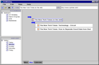 |
| 4. | change the view | |
| Scenario C: Power search history records in Calendar view | ||
| 1. | open search dialog box |  |
| 2. | view search result in "Calendar view" | 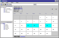 |
| 3. | change the view to "week" | 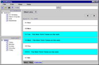 |
4. Design Evolution
Screen images of the design evolutionHow did the interface change?
As is to be expected, numerous changes have been made to our Webmarking system as the result of user tests and other evaluation techniques. Most of these changes are rather minor and superficial, though, when combined, they do often create significant changes in the way the interface looks and feels.
Our first prototype was a crude but effective attempt to implement the ideas from our task analysis effort on a paper computer. The informal testing of this prototype uncovered a wide range of more or less serious problems, most of which were easily solved. For instance, some dialog box fields were unclear or unnecessary, and the distinction between single and double mouse click was not always obvious. More important problems included a conceptual flaw with the Map View what if a site was not visited by link, but rather, indeed, by bookmark? By our next prototype, we modified this feature so that unrelated links would simply show up as root nodes in the map.
Another problem was the lack of integration between our system and the Web browser the users indicated that they would only use the system frequently if it behaved like a natural extension of the browser. As the implementation of an interface between a browser and a Java program is a major hassle, our system has remained strictly stand-alone; if nothing else, we are at least aware of the problem.
Perhaps the most significant change between this paper prototype and the first interactive prototype was the inclusion of redundant interface options many functions could now be accessed in several ways (this redundancy was extended even further after the pilot test). For instance, an "Open page" button was added, giving the users an additional way of expanding (i.e., opening in a browser window) any selected bookmark or history file (the original way of doing this would be to double-click the icon. Also, we expanded the information available on each icon now, when the user placed the mouse pointer at any icon, information such as the URL, full site name and date will pop up (this allowed the interface to show more information than previously without increasing the icon size). Finally, the navigation functionality of the Calendar View was expanded it was now actually possible to easily choose between day, week and month view, which was obviously a required feature.
The second interactive prototype was implemented in Java, and was changed according to the heuristic evaluation taking place between the two prototypes. We found Java to be far more flexible than Visual Basic, so quite a few problems were now easily corrected. Many Wizard of Oz tricks were no longer necessary the file structure could for instance be upgraded from a complete fake one to one that actually works more or less the way it would in a final version.
Quite a few of the usability problems that our evaluators came up with were ignored due to time constraints. We could not, for instance, afford the time to create a Help function for our system, as this would require rather massive amounts of time. Still, of course, quite a few problems were corrected. Again, the navigation functionality of the Calendar View was improved, allowing users to browse more easily through their history folders (previously, it was only possible to look at today's or yesterday's bookmarks without searching).
The main changes in Map View were caused by the pilot user test. Here, it was revealed that this feature was too confusing, and therefore not very well liked. The primary improvements dealt with navigation difficulties the users did not easily understand how to move back on forth in this view. To reduce this problem, we changed the lines linking the various sites to clickable arrows, which will hopefully be more intuitive. Further user tests would be necessary to confirm this.
Another problem in Map View was the fact that the icons did not give away enough information about the underlying Web pages. Our previous idea had been to display information such as the URL, full site name and date when the user placed the mouse pointer at any icon, but our testers did not find this adequate. Consequently, we decided to change this feature, and we do now display more information in the icons themselves. Needless to say, this consumes more screen space, and might as such not be a valid option for a Map of 200 Web sites...
Looking back at our initial design sketches, it is interesting to see that, while changes have certainly been made, the main ideas behind our interface have in fact been with us from the beginning. We can only conclude that either our initial concept was a sound one, or the evaluation techniques applied throughout this design process have been inadequate.
Evaluation techniques
As the various evaluation techniques took place at different stages of the system's development, it is somewhat difficult to compare their usefulness. Obviously, the lo-fi user test discovered mainly problems of high granularity, as it took place at a very early stage (as it's supposed to, of course). The pilot user test, on the other hand, tested a far more refined version of the system, and the problems uncovered were unsurprisingly also of a more refined nature. As such, it is hard to say which was the most useful, since the evaluations fulfilled very different roles in the product development.
Still, some general comments can be made: The lo-fi test was quite useful at providing insights into both the good and the bad sides of our initial design. This was contrasted by the heuristic evaluation, which, while uncovering many problems, did little to tell us what really worked (and which should as such not accidentally be removed in the effort to live up to some heuristic). Also, quite a few of the usability problems found by the evaluators were requests for rather extensive new functionality, which would certainly have been useful for a 'real' application, but is a bit beyond this project. Finally, the pilot test, as the lo-fi test, showed us both the good and the not-so-good sides of our design, though the problems discovered were of a different granularity.
Screen images of the design evolution
Links to the previous assignments
- Initial Suggested Solution (Task Analysis assignment)
- Prototype Overview (Low-Fi assignment)
- Revised Interface Design (Interactive Prototype #1 assignment)
- Interface Redesign (Interactive Prototype #2 assignment)
- Discussion (User Test assignment)
5. Final Interface
* Final prototype is availabe under the project directory. To run the program, you have to use the SIMS UNIX machines or NT machines running Exceed. From these machines, please go to our project directory by typing the following command (in one line) at the command line;
cd /www/docs/courses/is213/s99/Projects/P1/interactive/javaswing/
Then type the following command to start the Java program;
java WebMarking
It may take few seconds before the interface shows up. You may also see the error messages - you can ignore these.
The program is slow - please be patient. To exit the program, select "File" > "Exit" from the menu bar.
Overview
We have implemented the main application window as well as several important interaction methods to provide a way for test users to walk through the scenarios described above. Methods include menus, clickable icons and drag-and-drop operations. Dialogs for adding bookmarks and folders are implemented as well. Finally, we have included three different view modes: Main, map and calendar views. All basic operations and functionality required to try the test scenarios are provided in this prototype.
Functionality
This is the functionality available to users of our third interactive prototype:
Basic features
- Add a new bookmark
- Create a new folder
- Reorganize bookmarks, move and delete functions
Views
- Browse folder contents in main view
- See properties of bookmarks in the tool bar
- Choose between main, map and calendar views using tabs or menus
Search
- Perform a search
- Choose view for presentation of search results
Map
- Pan view by changing root node for the tree structure
Calendar
- Choose between month, week and day view
- Go back and forth in time
User interface design
Basic
features
Adding bookmarks can be done either by choosing 'Add bookmark' from the
'File' menu, or by clicking on the 'Add bookmark' icon on the toolbar.
In both cases, a dialog box appears, giving the user the possibility to
change the bookmark title or URL, and to add a description. In its final
version, the application would probably have the capability of capturing
add bookmark commands from browsers. Folders are created by clicking on
the 'Create folder'-icon or by choosing 'Create folder' from the 'File'
menu. Reorganizing bookmarks is done by using your finger as a mouse-pointer,
and imagining to drag the bookmark to the desired position. The same approach
is used for making bookmarks of history entries.
Views
Browsing folders to see their contents is done in a 'Windows Explorer'-like
fashion, using the main view. A user can click one of the folders in left
side of the window. Then, its contents are displayed in the right window.
To see the properties of a particular bookmark, it must be chosen as the
active bookmark/history. This is done using the mouse. Changing views
is done by clicking on the tabs in the bottom left corner of the window
or choosing a view from "View" menu in the menu bar.
Search
In order to initiate a search, users can either press the 'Search' icon,
or choose 'Search' from the 'File' menu. In either case, the search dialog
box will appear. A user can enter search string and choose how to present
the search results. The user can also specify a particular period of time
if the search should be limited to sites visited in a certain period of
time.
Map
Browsing using the map view is done by clicking on tree nodes. This will
display a new tree with the selected node as root.
Calendar
Calendar time scale is chosen using the menu in the upper left corner
of the calendar view. Moving back and forth in time is done by clicking
on the arrows in the upper right corner.
Unimplemented functionality
In out final prototype, we have still severely limited the functionality of the various view modes. First of all, drag and drop function of bookmark/history file to bookmark folders could not be implemented. This is due to the programming difficulty in Java and limitations of development time. During the user test, rearranging bookmark/history files is done most easily by imagination. (We explained test users that the function is not implemented and asked them to simply tell us if they wanted to drag and drop something.)
Though our Webmarking application is intended to function as an integrated part of the Web browser, the Java prototype we have at this stage is strictly stand-alone. This is mainly due to two reasons: First of all, this integration is not strictly necessary from a testers point of view - the applications functionality can be adequately examined even if it is separated from a browser. Secondly, the integration of a Java program as a plugin in a browser is, if not entirely impossible, well beyond our teams abilities.
Bookmark/history files displayed in Map and Calendar views are static, i.e. they are displayed based on task scenarios we used throughout the design process. To create fully functional Map and Calendar views, we first needed to come up with data structure and detailed rules for the visualization tailored for these views. Considering limitations of time and scope of the project which is to design UI and test "prototype" not the final product, we have decided to limit the behavior of the prototype to those required in three task scenarios.
Search results are faked as well. No matter what the search string contains, the results returned are the same. This function is implemented only to satisfy scenario C, therefore, it can be viewed only in Calendar view. Similarly, map view will only show one particular tree, and there is but two root nodes to choose from as described in scenario B. As long as test users stick to the scenarios, these simplifications should have of no or little impact.
Although the functionality is limited, our prototype includes all components (menu items, tool icons, different views and folder trees) specified in the design based on the results from a series of user tests.
Tools
The final prototype is implemented in Java using the Swing components. Coding was done using JDK1.2 without any WYSIWYG type of programming tools.
Our first interactive prototype was created using Visual Basic. Primary reason for switching to Java from VB was to take advantage of the variety and flexibility of Java's Swing components. For example, "tree" component of VB is strictly for file structure and it represents the actual file structure of the hard disk drive that the application is located. In Java's Swing component, "tree" is a representation of any hierarchical data. It can be a file structure or a set of bookmark folders stored as a text file. It is also possible to change icons in the tree to something other than a file folder.
ImageIcon in Java was also very useful in creating our prototype. GIF images can be displayed in a button, label, tree or list quite easily. Especially the feature to include icons in a list of texts helped us to show bookmark and history icons in Main view.
In addition, tabs that could be displayed at the bottom of the window made it easy to implement three different views in our prototype. In VB, tabs are at the top of the window as default and their position could not be changed. (Or at least we could not find out to change it.)
Given the variety of Swing components, we could create the interface with customized look that includes many small components relatively easily. However, the use of many components introduced the complexity in coding. In addition to the difficulty in visualizing the concept of Map and Calendar views discussed in the previous section, we had to deal with the communication between several components to make them react to events in different components. Although many of our group members had previous experience with Java coding, it took us for a while to catch up with the latest version of Swing components and event model and that resulted in the final prototype with very limited functionality.
prototype #1
prototype #2
test
prototype #3
presentation
05/10/99