Assignment 1
Assignment 2
Assignment 3
Assignment 5
Assignment 6
Assignment 7
Assignment 8
Assignment 9
Write-Up
Introduction
We are developing a web-based collection of user interface (UI) design patterns for UC Berkeley. This collection will serve as a resource for individuals responsible for UI design who have little or no UI design training. We previously identified web applications developers as a target audience for this system. From needs assessment interviews, this type of user has expressed a need for any resource that reduces the guesswork of UI design and implementation. The pattern interface will give this audience a method of browsing and comparing the same class of patterns (such as "navigation") to help solve UI problems.
The purpose of this prototype test was to evaluate the prototype's ability to support our target audience's design process and current understanding of UI components. We evaluated two different design directions of the pattern collection, the ability to support simple browsing tasks, and the visibility and usefulness of specific features in the interface. We also investigated the quality and organization of the patterns to determine areas needing improvement. We further investigated the terminology our audience uses and recognizes in relation to visual components of a page.
Methodology
Participants
To test the paper-prototype we wanted to select participants that fit our primary persona, Hans. This persona represents a web developer on campus who is a jack of all trades: who is involved in application design and development both in back-end and front-end production. Since we had identified two ideal Hans's in the previous rounds of interviews, we decided to approach these two as candidates for user-testing. Fortunately, both individuals were available to test the prototype. For the third participant, we reviewed our logs of interview candidates who for whatever reason could not meet with us at that time. We called a couple of these candidates and asked follow up questions about the level of their UI design and application development experience. We wanted, again, to be sure that we identified a 'Swiss-army' persona. The third candidate matches these criteria. He works as a programmer for the Student Information Systems on campus and was involved in all aspects of application development.
Task Scenario
Your next project on campus is to redesign the navigation on this campus site {show print out}. The navigation is a problem because it is not organized in a way that is easy to understand, specifically there is no hierarchy. It has 7 main top-level navigational categories and 5 sub-level categories. Additionally, other content areas are not represented in the navigation schema. You will look at our pattern library to find a navigation pattern to help solve this problem. Please use our UI design pattern library to assist you in this effort.
Tasks
- Find a navigation pattern that would help clarify the existing navigation. What we were looking for: We wanted to understand how the user went about navigating the site and drilled down.
- [Within each pattern] There are user comments on this page. Where are they located? What we were looking for: Could users find key sections in a pattern easily? Was something like user-submitted comments clear enough to find?
- [Within each pattern] How would you add a comment to this pattern? What we were looking for: Could users locate the link to add comments?
- [Within each pattern] Where would you find some sample code for this pattern? What we were looking for: Could users locate sample code that is embedded in comments and not called out explicitly?
- Go to another navigation pattern that might also provide a solution. What we were looking for: Site exploration. Do we provide sufficient ways to jump to other areas?
- How would you get back to the home page? What we were looking for: How do users go about orienting themselves with the site and are there clear exits?
Pre-Testing
Prior to the actual prototype testing, we conducted two pre-tests, making refinements after each test. We used two SIMS students who fit our primary persona, Hans. From our pre-tests we determined the first part of our script in which we set up the scenario and showed them a "bad site" did not focus the user on a specific design problem. In short, the scenario did not provide enough structure for our users to understand the tasks asked of them. Pre-testers spent too much time reading content of the bad site instead of looking at navigation issues. As a result, we did two things. 1) We repositioned the design problem we wanted them to solve by telling them exactly what the design problem was -- navigation did not reflect a hierarchy and there was no way to tell what page you were on when you navigated away from the home page. 2) We made a hand drawn wireframe of the bad website, but abstracted out any content, leaving navigation as the primary focus.

Test Design & Procedure
Our session lasted approximately 45 minutes to 1 hour depending on the participant and consisted of three phases. In the first phase, participantes were asked to perform tasks using a paper prototype while thinking aloud and pointing to various aspects of the interface. The second phase was a free-form discussion on UI patterns and how they might be used to solve existing problems or be incorporated into the design and development process. The third phase was a written survey. Again participants were asked to think aloud.
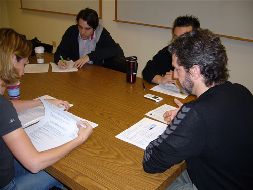
All four team members participated in administering the test. A facilitator lead the session, gave instructions, administered a consent form, answered questions, prompted and encouraged the participant. One team member played the role of computer, producing screens and switching them in response to participant actions. The remaining members took notes and photos. At various points, any member might ask a follow up question or probe for more information about something the participant said. However, we were careful to allow the facilitator to lead the process.
Participants were greeted and given a brief introduction on the project. The facilitator then outlined the agenda of the user testing and the role of lo-fi prototyping. Participants were then given a chance to ask any questions and sign a consent form. Once this was done, the facilitator explained the scenario of the design problem and presented a hand-drawn screen of a fictional UC Berkeley website with poorly designed navigation. The participant was then given the paper prototype and the facilitator began reading out the tasks for the participant to perform. Participants were encouraged to talk out loud and used their finger to point to where they wanted to click on the site.
When the task scenario was completed, participants were then asked about their design issues and to think about how patterns might help. After the discussion, we then provided an exit survey to understand how participants identified common UI elements in web design.
Test Measures
We wanted to learn about and test five elements in our prototype:
1. Navigation: how well did our current navigation scheme work and how could we make it better? Specifically, we tested two different global navigation methods (one horizontal and one vertical.)
2. Naming of Patterns: During the competitive analysis phase, we found little consensus across existing pattern libraries. Since patterns are abstract concepts, naming is important, but difficult to do. At the same time, naming is extremely important for helping the user navigate to a pattern that may be useful to solve a problem at hand.
3. Interaction Flow: We tested how easily and intuitively participants could move around our design to find information, both within pages and between pages.
4. Content of Patterns: We tested each participant’s ability to find information on the page and the utility of that information. We also got feedback on method for labeling an image with solution information specific to each pattern.
5. Images: In what ways are images useful in understanding a pattern? In what ways do images aid or obscure navigation?
Results
Observation, notes, and recordings of each participant are available in the the appendixes. Despite the fact that our testers had some initial problems with the interaction flow in directly finding the target pattern, they all found the right navigational element for the problem. The treatment for the home page featured pattern with thumbnail pattern image confused our testers. Additionally, it was not apparent to our testers at first that there was a navigation category page linked off of the home page content headers. This resulted in the testers guessing about their pattern solution by name alone and going into a pattern like breadcrumbs only to find that it did not solve their problem at hand. However, once testers did find the results category page, they would invariably then choose the pattern solution (tabbed navigation). The following are specific results by the features of our prototype.
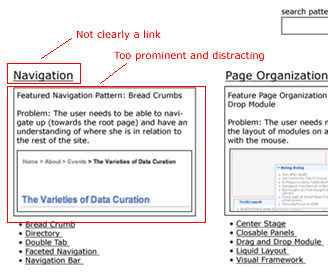
Home page. The featured pattern box was distracting to the testers. They did not catch that the headers for the pattern category were linked nor did they see the bulleted list of the patterns under the box.
Representative Pattern Images. The images focused users on concrete examples instead of a class of patterns. This seems a bit misleading.
Example Images. There was consensus from our testers on using example images that are “well done”, regardless of where they come from. External site examples or well done university examples would be satisfactory. Multiple examples would be useful, particularly for lesser known patterns. Our users did not see the Alpha bullet correspondence with the image.
Navigation. One tester liked the left navigation display with nested pattern categories and patterns. Two felt overloaded by it and prefered the horizontal approach. A horizontal navigation with drop down of the available patterns seems to be a good compromise.
Navigation Category Page. The participants found this page useful once they found it. However, it was a little difficult for them to get there due to interaction problems with the feature box on our home page. Once the testers found this page, they always selected the right solution for the task at hand.
Problem Solving. Function vs Feature approach to problem solving changes the way they think about patterns and what they would call them. For example, they would consider a problem domain like navigating or hierarchy instead of widget type like tabs or bars.
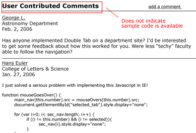
Comments. One participant felt that comments would lend some authority or validation to a pattern. They all found comments at the bottom of the pattern, not in the right sidebar. They all found how to add a comment.
Code Samples in Comments. One participant felt it would be useful if code samples in the comments were highlighted or label, but wouldn’t be the first thing he would go to. One participant felt it would not be useful because its not the format or coding language his systems would require.
Pattern Names. In our exit survey on pattern names, we found that there was no consistency in recall, but more convergence in recognition. When we asked the testers to name highlighted patterns on an image, they all used widely different names for the pattern. However, when we gave the testers a multiple choice list of other library names, the results were more interesting. The metaphor of breadcrumbs and navigation tabs were the strongest in communicating what a pattern did. The worst names were those that were too generic to be meaningful: global navigation, navigation bar, navigation. Interestingly, "utility links" scored high in describing what most would call a "global navigation" widget that included links to "home" and "account". Global navigation scored last on that question. Another interesting finding was that our users preferred the same name, "course schedule", for two widgets that were radically different. One was a true calendar treatment of a course schedule from bSpace and the other was a tabular treatment.
Discussion
I. Future Changes
Home Page. The “featured pattern” section of our home page confused users and made navigation more difficult. We plan to explore different graphic treatments in the next iteration that make it easier to scan the pattern in each category, while still supplying a featured pattern with image for those who will find an example helpful. In addition, one participant initially did not notice that the category itself was clickable, but found the resulting pattern-comparison page very useful. To make this more obvious the design will be modified to follow the pattern category with a link to [view all]. For example: Navigation [view all]
Sample Images. We learned that the usefulness of sample images varied amongst participants—they were especially helpful for some in quickly choosing between alternative patterns. In our next prototype we’d like to find ways to make the images more useful and less distracting. Initially one idea was to use images from UC Berkeley sites, but we found during the test that using images from popular sites (e.g., Google, Apple, Yahoo!) may lend a sense of authority to the patterns, partly just because campus developers want to use patterns that are familiar to students and staff. Sometimes our sample images were either cropped too closely to give context or included too much context to make the pattern clear. One solution we plan to test is using images with context and somehow graphically highlighting the area that represents the pattern. Another problem was that some participants took the images too literally, rather than just as one sample instantiation of the pattern. To correct this problem we want to test using more abstract wireframe images of each pattern. Overall, we found that including more example images in each pattern would be useful.
Image with Solutions Marked. None of our participants noticed our brilliant idea of labeling each item in the solutions section with a letter and then diagramming an image of the pattern with these letters called out. In our next version, we’re hoping to make this more apparent through the use of color. Another solution might be labeling directly with descriptive text rather than letters, though it might be impossible to have enough room for the labels. Our test could also be modified by asking specific questions that require participants to find information in the “solutions” section of the pattern.

Comments. It was not obvious that users could share code in the comments section.
We’ll change the label to something like “User Contributed Comments and Code” to make this more obvious.
Naming. We found that naming the patterns effectively is very difficult. For patterns that have established names (e.g., breadcrumbs) there’s little confusion. When there’s no clear name one strategy that came out of the tests is to use a name that reflects the patterns function rather than how it looks. As one of our participants noted, it’s easy to see what the pattern looks like in the associated image, so having a word such as “horizontal” or “stacked” doesn’t necessarily help as much as a word like “hierarchical.” In the next round we plan to do a card sort on names/terms to find the most useful names possible.
II. What the Evaluation Could Not Tell Us
Because the purpose of the pattern library is to help developers with a complex, nonlinear, and long-term process of developing a web application interface, it was difficult to craft an appropriate task for user testing. In particular we need to learn more about how a pattern is used once a participant has found it in the library. One approach that we’re considering is asking more specific questions about the pattern that require participants to find information and process it. For example, how should links be styled in a breadcrumb?