Design Evolution
Over the course of the iterative process, the design of our interface began with paper-based prototypes. Through usability testing and heuristic evaluations, the UI gradually evolved into a refined interactive prototype.
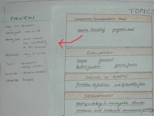
Initial Sketches/Low-Fi Prototype
We used the results of our preliminary interviews, along with comparative analysis, and conducted brainstorming sessions in order to come up with our initial design sketches for the low-fi prototype.
Of the several issues we aimed to address with our first design, it was important for us to try and make a Metadata Tagging Tool that was easy to navigate and use, and not overwhelming in its presentation of metadata. Our group discussed many different ideas with corresponding sketches for how the interface should look and consolidated them into the initial low-fi prototype, containing these key elements:
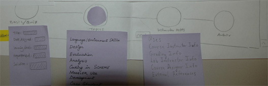
The 4 main sections - Basic Quiz Info, Topics, Instructor Notes, Authoring: We wanted to classify the metadata into logical sections so that the user will not be overwhelmed with tagging all the metadata at once. We also added a link to the authoring section to provide a perspective to the user on how the metadata tool can be used with the authoring tool.
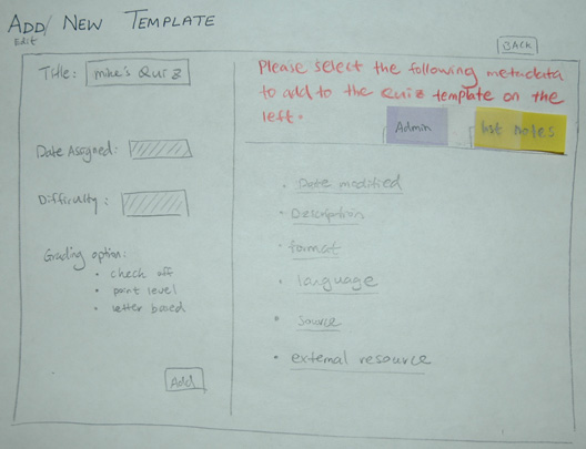
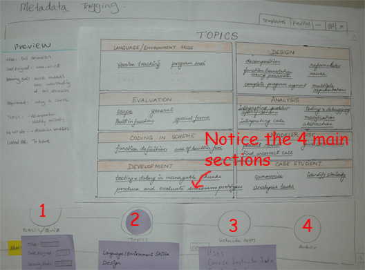 Metadata/Quiz Template section: We had the idea that if we presented the user with the option to select from pre-defined templates, that already had a certain amount of tags associated with the type of activity to be authored, the time to tag an activity would be decreased and allow for an instructor to maintain their habits of quickly authoring activities.
 Navigation Bar: We arranged our navigation bar in a way that we felt would encourage the user to go through the necessary tagging facilities prior to authoring an activity. The Navigation Bar is arranged in an order representative of a progress train, where authoring is the last stage.
 Faceted interface for finding and selecting metadata: Since there is such a large amount of metadata associated with the UCWISE curriculum, our original design took on a faceted approach in browsing and selecting metadata. We used the ideas associated with the Flamenco interface hoping that the user would find that style an easy way to locate the desired metadata.
 Metadata Preview section: In order to give the user positive feedback regarding the metadata they have associated with the activity being authored, we wanted to give the user a way to view everything they have done, so far, in the tagging process.
First Interactive Prototype
After our low-fi usability tests, we found that we needed to make several changes and add a few new features to our design before moving on to implementing the first interactive prototype:
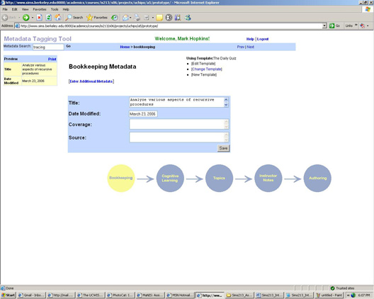
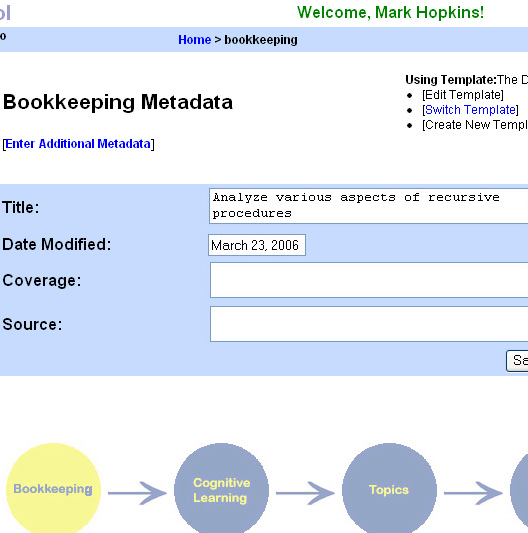
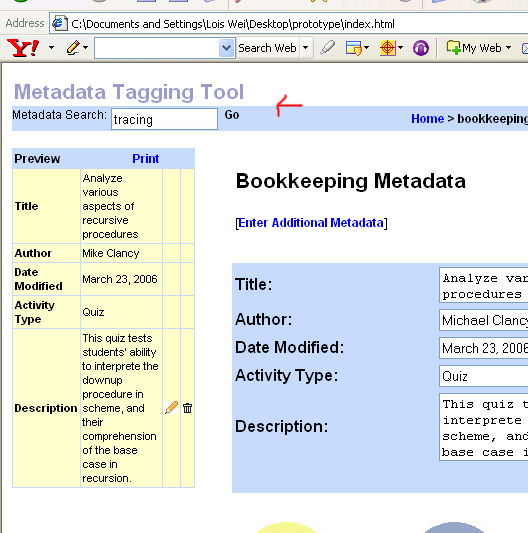
Bookkeeping Metadata section: We changed the name of Basic Quiz Info section to Bookkeeping because our users found the term more intuitive. We also added a description of which template was in use to make the interface easier for the user to understand. We moved the button for adding Additional Metadata above the template to make it more visible.
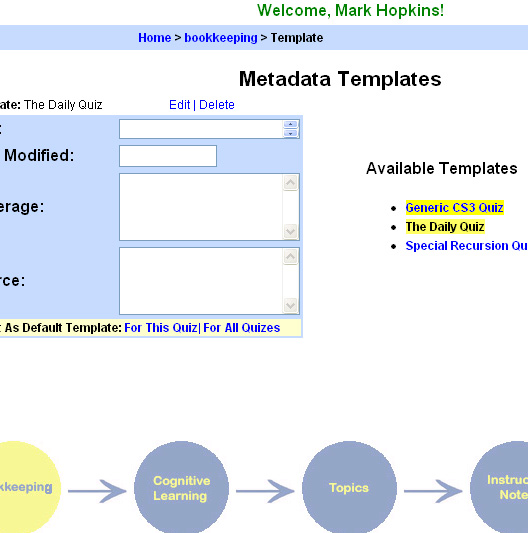
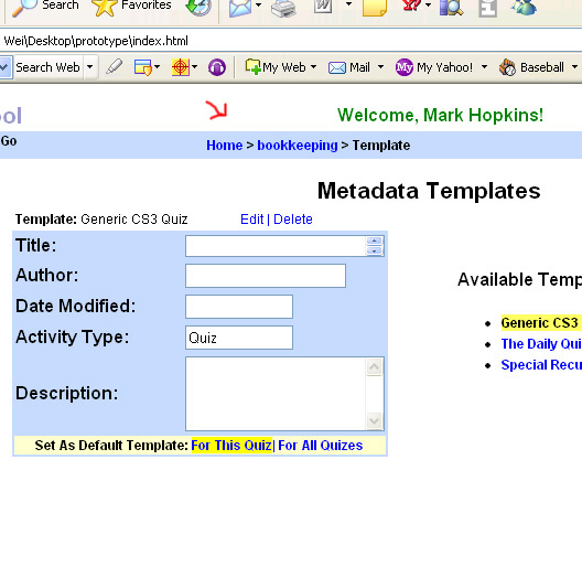
 Metadata Templates: To make the interface more intuitive to the user, we switched the orientation of the page to have the Available Templates on the right side of the screen while the active, or selected, template is on the left.
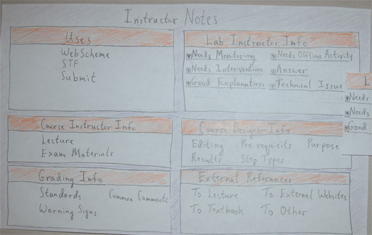
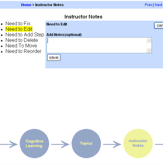
 Instructor Notes: The users significantly downsized the amount of metadata available for this section so we eliminated the faceted arrangement in favor of bulleted lists. We also added a textbox for notes so that the users could add notes on particular pieces of metadata.
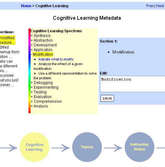
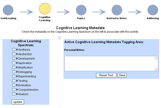
 Cognitive Learning Metadata: This was a new section of metadata added to the interface at the request of our target users.
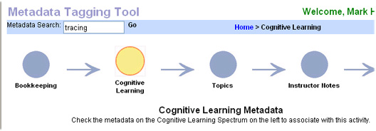
 Metadata Search tool: Since our users were having a tough time finding where certain pieces of metadata were located and envisioning times where that task could be difficult, they expressed a need for a search tool.
 Breadcrumbs: Some of our testers revealed navigation problems within our interface so we felt that adding breadcrumbs might alleviate some of those issues.
Second Interactive Prototype
Our second interactive prototype was developed out of a Heuristic Evaluation conducted on our first interactive prototype by the UI Design Patterns group and Prof. Marti Hearst. From the evaluations on our interface, we addressed the need to simplify and standardize the Metadata Tagging Tool for the second interactive prototype. The changes made in response are:
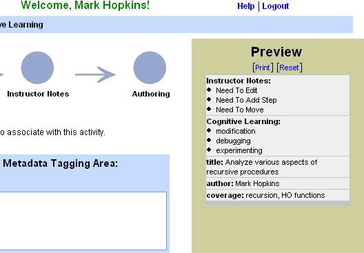
Preview Reorientation: The preview section was moved from the left side of the screen to the right to meet the users traditional expectation for the preview bar location. The color was changed, as well, to further separate its function so as not to confuse it with the active metadata section.
 Navigation Bar Reorientation: The navigation bar was moved from the bottom of the screen to the top in order to provide better visibility and conform with most navigation standards. We also provided better context awareness by highlighting the button of the currently active section.
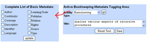
 Removing Templates section: We simplified the Bookkeeping section by getting rid of the separate templates section. The template section and its relationship to the basic bookkeeping metadata tagging were confusing to our heuristic evaluators. As a result, we incorporated metadata form selection for different activities to be on the same page as the basic Bookkeeping metadata tagging section such that there is not any multi-level navigation.
Metadata Checklist: Throughout our interface we needed to standardize the way in which metadata is selected. Therefore, we went with a list-style organization that allowed the user to check off the desired pieces of metadata. This also added to the consistency of our overall interface.
Removing Templates section: We simplified the Bookkeeping section by getting rid of the separate templates section. The template section and its relationship to the basic bookkeeping metadata tagging were confusing to our heuristic evaluators. As a result, we incorporated metadata form selection for different activities to be on the same page as the basic Bookkeeping metadata tagging section such that there is not any multi-level navigation.
Metadata Checklist: Throughout our interface we needed to standardize the way in which metadata is selected. Therefore, we went with a list-style organization that allowed the user to check off the desired pieces of metadata. This also added to the consistency of our overall interface.
 Cognitive Learning Simplification: We needed to have a basic form of tagging for this section before taking on more advanced features, such as tagging individual activity sections. Therefore, we made the functionality of this section to only allow overall tagging of an activity.
Final Design
We conducted a pilot usability study for overall feedback of our interactive design. The final iteration of our UI was aimed to resolve only the most outstanding and frequently mentioned usability issues that arose from the feedback of the users on the existing features. Since this was the last stage of development, we had to focus our changes towards simplification and refinement, rather than trying to add more new features. Our final changes included:
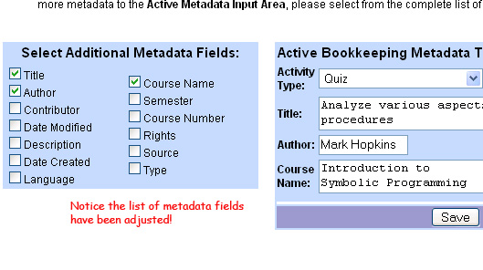
Dynamic Update: Our interactive prototype had an Update button which would transfer selected metadata to the active area. Since all of our users requested that we replace the update button with the dynamic update feature, we implemented the dynamic update feature. This also is the case with the pull down menu on Choose Activity Type in the Bookkeeping section, where we are getting rid of the Go button in favor of dynamic updating.
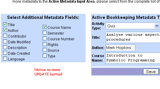 Adjusting Bookkeeping Metadata: The currently available metadata in the Bookkeeping section is based off of the Dublin Core standards. However, the pilot studies revealed that some of the fields were not used by the UCWISE curriculum, therefore we adjusted the listing to include metadata relevant towards computer science activities.
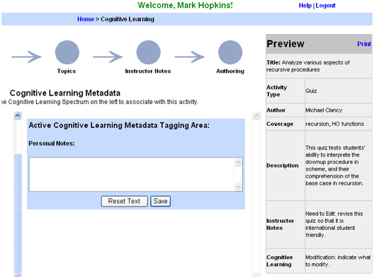
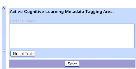
 Moving Reset Text: We have a Reset Text button for resetting text in the personal notes input box for the Cognitive Learning metadata and Instructor Notes. It was located in the center of the page. Through the pilot study, we discovered it was overpowering the more important Save button, so we moved the Reset Text button further from the Save button.
 List-Style Preview: We adjusted our Preview section to show the saved metadata in a list format in order to provide better organization and presentation.
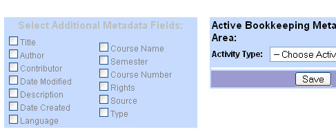
 Bookkeeping Metadata Gray-Out: When user first enters the Bookkeeping section, we wanted to focus the users attention on choosing an activity type before trying to select from the available tags. In order to accomplish this, we decided to gray-out the Additional Metadata section until the user chooses an activity type.
Most Valuable Evaluation Technique
Our prototype continually evolved with each iteration. We began with preliminary sketches and a paper-based prototype, and utilized usability testing, heuristic evaluations, and a pilot usability study to develop three iterations of the interactive prototypes. At each iteration, we evaluated our results in order to make improvements to our design. We feel that each development stage had its own importance and provided useful feedback which aided us in further improving our prototypes.
The usability test based on our Low-Fi prototype provided an easy and flexible way to test different features. The prototype also required relatively little effort to build. However, since it was a paper-based prototype, there were many features that could not be evaluated, such as whether a user would intuitively click on a particular button, or actual time to complete a task.
The pilot usability study also provided us with useful feedback. In the case of the pilot test, however, the major components of our interface were already in place and we were trying to gain information as to how useful our tool was as a whole. This testing was done right before the last stage of our design, therefore, ensuing changes were based around refinement and simplification. Any suggestions for major changes or features, were set aside as future ideas for the tool.
Of all the techniques that we used to develop our prototypes, the heuristic evaluation done by the UI Design Patterns group and Prof. Marti Hearst proved to be the most useful. The UI Design Patterns group pointed out a number of usability issues and provided some great suggestions in areas that needed improvement in terms of consistency in labeling, layout, and user interface components. Also, with suggestions from Prof. Hearst, we made major improvements towards creating a consistent, intuitive, and easy to use interface. The feedback from the heuristic evaluation was from people who have worked on UIs and have a solid understanding of usability and user experience issues.