Summary
Good Features to Utilize:
Metadata tagging on lesson units:Search/Browse learning content based on metadata:
- Making metadata tagging as automatic and implicit as possible
- Making some metadata entry (e.g. learning goals) as optional, so professors are not pigeon-holed into spending a long time filling out the entire form.
- Straight-forward in presentation and appears easy to use
- Provide mouse-over explanation on the given metadata tag
- Template-driven design, provide pre-entered default data fields for common types of applications
- Provide a concise set of default metadata to search the lesson unit on
- Provide mouse-over explanation on a given metadata tag
- Provide clear and concise information to describe each lesson unit on the search result page
Bad Features to Avoid:
- Overwhelming user with too many choices and steps to click through
- Not being flexible with allowing user to enter additional metadata, or search based on additional metadata
1. NCRTEC (North Central Regional Technology in Education Consortium ) Lesson Planner webpage
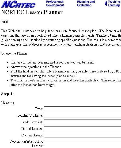
http://www.ncrtec.org/tl/lp/The NCRTEC lesson planner web page is designed to help teachers author systematic lesson plan for their classes. This lesson planner tries to focus on questions which are usually overlooked when a lesson plan is made. This site guides the teacher through a series of steps where the teacher answers specific questions related to the content curriculum predesigned by the teacher.
Basis for selection: This is a good candidate for our comparative analysis as it tries to answer some of the areas that UCWISE project is looking at addressing. It operates with metadata that is similar to the ones that UCWISE is planning to use.
Strengths:
- The opening section titled, "Heading", forces instructors to enter information about the current lesson plan. These are all entries that can be automatically tagged as metadata.
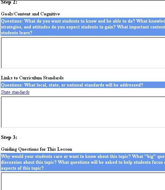
- It has several relevant information entry sections, like, "Goals", "Guiding Questions for This Lesson", "Assessment", and "Learning Connections". These sections provide more information for metadata search tools to find common and repetitive keywords.
- It manages each entry in steps, which maintains an organized approach to entering a lesson plan. There is not a hint of engaging in an annoying metadata entry task, but rather maintaining the focus on the lesson plan process.
- The information entry areas appear to be optional, such that the professor is not pigeon-holed into spending a long time filling out every box.
- Very straight-forward in presentation and appears easy to use. Less time is spent trying to figure out how to use the Lesson Planner.
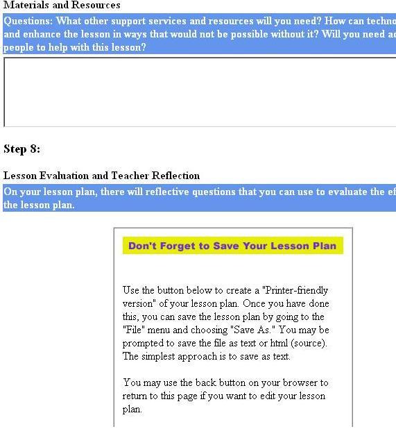
- Lesson Plan can be saved as HTML and Text format
- Lesson Plan can be edited.
- There seems to be way too many steps as far as information entry. It may possibly turn a professor away from wanting to even enter in a lesson plan.
- The Lesson Planner is not automatically integrated within a web-based course application.
- Save option is only available through the web browser, and not built-in with the application.
- Some of the links that are intertwined in the application seem out of place, and possibly distracting.
- The overall look of the interface could be updated, but not to take away from the already easy-to-use style that it possesses.
2. Serf (Server- Side Educational records facilitator)
http://serfsoft.com/serfAuthor.htmlSerf website provides a web based distance education environment for creating and delivering courses in a self paced multimedia learning environment .
Basis for selection: Serf allows automatic metadata tagging and therefore is similar to the HIPO functions.

Strengths:
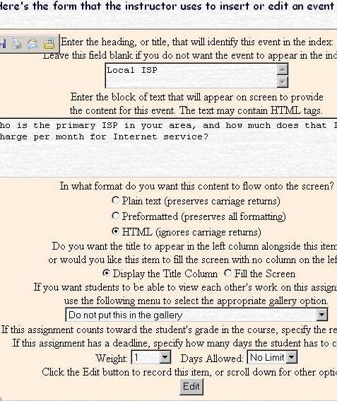
- The text-box entry style is very simple and easy to follow.
- Simple interface that requires very few entries from users. This feature may be liked by professors teaching the course as it is not overwhelming and they don't need to spend too much time entering data.
- User does not have to know html in order to use the application. Using html is an option that is left open to the user if they desire to expand the design of their course pages. This feature may be useful for our HIPO personas as it provides an optional view of the curriculum.
- The menu of events that is provided allows for pre-defined editing forms, and the possibility of implementing predetermined metadata tagging. This feature manybe useful for HIPO as most of the HIPO users are presses for time and could benefit metadata tagging done "behind the scenes".
- Allows for sharing of exercises among students with the option provided to put the exercise in the "gallery" or not.
- The drop down menu for events is very long. This may prove difficult for the user to choose between so many choices and may also end up spending a lot of time trying to select between the different editing forms.
- The text in the editing form is too congested . There needs to be more space between entry boxes, text, etc.
- Options like "In what format do you want this content to flow onto the screen" or "Do you want the title to appear in the left column alongside this item, or would you like this item to fill the screen with no column on the left?" is unnecessary for instructors who are solely looking at creating, editing and managing their class curriculum. Instructors don't need to be dealing with formatting issues, just focusing on the lesson plan.
3. WebEx Meetings
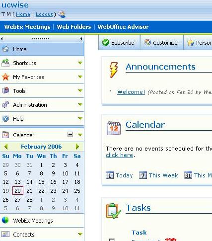
http://ucwise.webexone.com/The WebEx software is not a curriculum authoring tool, but we decided to look at its interface to get some inspiration on how to design the metadata tagging interface.
Strengths:
- The arrangement of the interface has the most important tasks of the meeting manager right at the forefront of the home page. The users can get right to the tasks they need to accomplish with out too much extra navigation.
- The coloring and icon scheme makes for, both, a professional and fun layout to navigate.
- The calendar can be made visible at all times so that the users do not lose track of dates and proper time-frames. Professors in a hurry could benefit from that constant reinforcement.
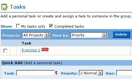
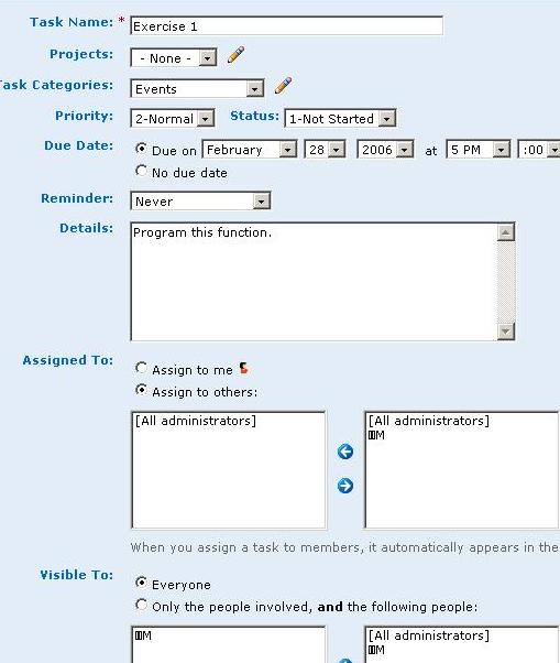
- The Tasks section has an initial quick task layout with just three simple things to insert: task, priority, and date. A somewhat similar layout, with an added text box could be nice for an activity planner because of it's simplicity and automated metadata tagging capabilities.
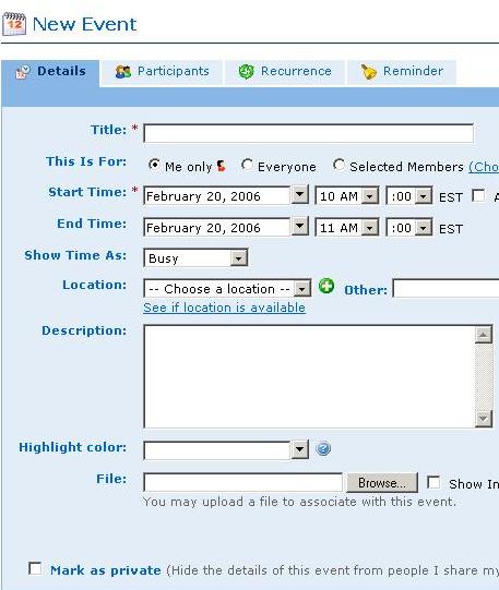
- Inside the Calendar area, the user can click on a time and an event window will pop up to specify the details of the New Event. Perhaps the metadata tagging tool could be integrated with the UCWISE calendar of events.
- The interface might be just a little bit too cluttered. It seems like it could be simplified by getting rid of some of the tasks on the right, like, "Getting Started", and "Links". A metadata tagging tool would have to be simplified a little bit more so that hurried professors are not discouraged by too much information.
- Given that this interface has quite a lot of things going on, it appears that there may be a large learning curve for new users. Our metadata tagging tool would have to make a more simplistic layout so that professors spend less time learning and more time doing.
4. B-space:
http://bspace.berkeley.eduA new collaboration and learning environment at UC Berkeley that is in the process of replacing Blackboard and WebCT. We want to look at how they record curriculum metadata information.
i) Assignment Input Tool
 Strengths:
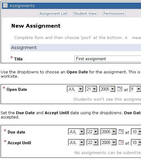
- Contains a clear instruction with screen shots on how to add an assignment to the course
- The metadata tagging for the assignment is implicitly collected during the assignment creation stage, so the metadata can be automatically collected
- Doesnt seem to allow instructors to add any more metadata beyond the very basic ones such as the title, the due date, the "accept until" date.
- Doesnt seem to be very flexible to meet the demand of the instructors who wants to customize what kind of metadata he/she wants to enter (e.g. sharing his/her notes on this assignment with other instructors)
ii) Web Content Setup Tool:
 Strengths:
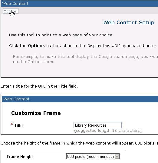
- Very simple interface that allows instructors who are pressed for time to add web content quickly
- provide clear instructions
- the "title" field can be implicated collected as metadata for this content
- no option to tag more metadata for a given content, so it is not flexible for instructors who wants to associate additional information to a given web content
5. SMETE
http://www.smete.orgSMETE is a gateway to a comprehensive collection of science, math, engineering and technology (SMET) education content and services available to learners, educators, and academic policy-makers. We looked at SMETE's learning content search and browsing tool to get some ideas on how to design our own metadata-based search and browsing tool.
i) SMETE Learning content Search tool
 Strengths:
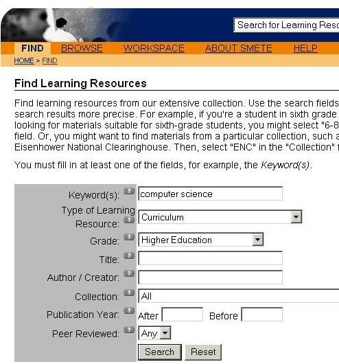
- provide a concise set of metadata to search the lesson unit on
- provide question marks next to each metadata in case the instructors have questions about a given metadata tag
- easy and straightforward to use
- It is not flexible if the instructors want to specify a metadata that is not on the default search page to base his/her search on. For example, if the instructor wants to find all the learning content that last at least 2 weeks.
ii) SMETE learning content browse tool:
 Strengths:
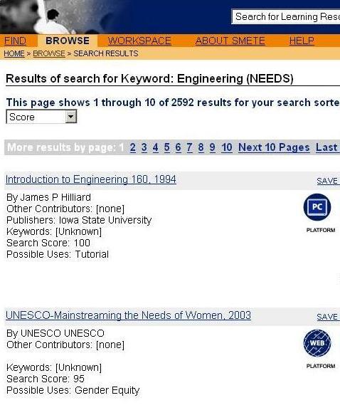
- requires only one click to reach the search result page, so it requires very little effort and learning to use the interface
- provides clear information to describe each learning unit
- specify "possible uses" for a given learning unit, this is very useful information for instructors who are looking for curriculum content to reuse for their course
- Since there are so many learning units on the browse page, it can be too overwhelming to browse through at a time.
- Doesn&apost allow the user to customize what they want to see as the key information related to a given learning content. For example, it may not be so interesting to the instructor as to who authored the lesson unit, but what are the topics of coverage for this lesson unit, how long it takes, and what is the difficulty level for this lesson unit.
- Doesnt allow the user to sort the learning units based on difficulty or relevance.
6. Microsoft Access 2000
We looked at MS Access 2000 to get some idea on how Microsoft designed a database metadata tagging interface.i) Creating a table in design view:
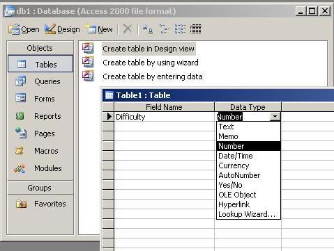 Strengths:( table in design view)
- The tagging interface has a very nice table layout that is easy to view and understand.
- The tagging tool has a Data Type field added to the data. This would provide more specific categories for metadata searching tools to utilize.
- Data Type field has an automatic drop down menu that allows user to select from "text", "number", "memo", and several other types. This feature pre-categorizes data such that the user doesnt have to spend all sorts of time creating type objects for their data.
- It has a Field Properties area that allow user to specify more about the data type, like, field size, decimal places, default value. This feature tags the data with even more specific information, in turn, allowing possible metadata search tools to make their searches even more specific.
- It has default values already filled in the Field Properties area so that the user doesnt feel compelled to specify every piece of data.
- Clicking on each field entry in Field Properties automatically generates an explanation of each field to the right.
- There are too many different data types to choose from in the Data Type drop-down menu.
- There are too many different entries in the Field Properties menu.
- Some of the explanations for the field entries could be more informative and helpful. They could provide an example entry to make things clearer.
- Regardless of how nice the interface may look, it still seems like a tedious task to do batch process tagging.
ii) Creating a table using table wizard
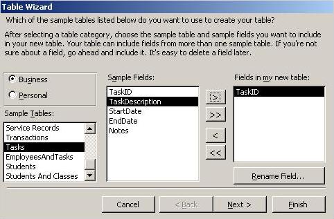 Strengths ( table using table wizard)
- The template driven design, providing pre-entered data fields for common types of applications. The user doesnt have to spend loads of time designing the types of data, but rather just pick and choose which ones they want.
- There are several different types of Sample Tables to choose from, each with their own set of data types. This could possibly make batch processing a whole lot easier, and the professors could also categorize which specific types of data belong to each course object (exercise, reading, etc.).
- The interface has add and subtract options, such that the user can choose which data fields to put in, or take out of, their data table. This would alleviate the necessity of the instructors to have all of the pre-defined data types included with each course object. Maybe some applications do not require every piece of data to be attached.
- The interface appears to be very simple to use and has easy to follow explanations.
- When finished with the data selection process, the user can then go into Design View to tag the data.
- There are a lot of different templates to choose from, possibly making the selection process tedious. If this were designed for a metadata tagging tool, the templates would most likely have to be much more specific, simplified, and refined.
- The Rename Field option. Designing a metadata tagging tool specifically for each course object would make this option go against a well thought out template of pre-defined data types.
7. WebQuest
http://projects.edtech.sandi.net/staffdev/buildingblocks/p-index.htmWebQuest has a very nice idea of providing instructors with templates that includes step by step instructions on how to create a lesson. We decided to borrow this template idea in designing interface for our metadata tool.
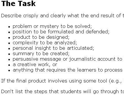 Strengths
- The lesson plan process is very organized in a step-by-step manner, where each step is viewed separately. This allows an instructor to concentrate on each specific task at hand without drifting off to other sections. Those other sections have to be clicked on to view them, versus being viewable with everything else like the NCRTEC Lesson Planner.
- The lesson plan sections appear to be very relevant towards a good lesson plan. The more information provided, the more keywords available for the metadata search tools.
- Each section has very detailed descriptions of what information to enter. Hopefully, this kind of format has a small learning curve for first-time users of the system.
- The user can follow the basic template, which makes it an easy to follow entry process for any level of user.
- The user can also create their own style of template and make it available for other users of WebQuest. This could result in being able to create specific teaching styles for different types of curriculum.
- The user has to know html, by diving into the source code of the lesson plan templates and entering information for each section. All levels of users might get tired of this kind of format, new users especially might be confused.
- There are not any instructions informing the user to view the source code of the templates, which would probably make a new user confused. Lesson plans for our personas should be in a text-box entry method, much like the NCRTEC Lesson Planner.
- The lesson plan is not automatically integrated within a system like UCWISE. Our personas would want an application that doesn&apost require extra time to upload html pages to a server, everything should be taken care of in the background.