assignment 6
From your favorite art, design, movies, etc, identify a palette of 3-5 colors that expresses your sense of color harmony. Post your color palette (with one image or multiple images) with a briefly description below. Due Sunday night.
22 Responses to “assignment 6”
Leave a Reply
You must login to post a comment.
My sense of color harmony can be described using any painting by Paul Gauguin. Here I’ve included a cropped portion of his painting Mata Mua (In Olden Times). When I used to live in Madrid I would go to the Thyssen-Bornemisza Museum over and over just to see this painting. I love the strong earthy colors, especially the yellows, reds, and purples. I also love how the hints of brown really bring these colors nicely together.
My ideas of harmony and colors that invoke the sense of harmony come from my childhood when I spent years in equatorial regions of Africa. In such climates, sunsets are particularly beautiful and there is a blend of blues and reds. Normally, one would not think of blue and red in harmony as they are often clashing. However, if one looks at sunsets, especially in areas that are far away from the industrial pollution of urban areas, then the true harmony of nature and colors can be seen. Here is an example of a sunset from the Caribbean:
In this picture, the blue of the night sky and the red of the sun hanging low on the horizon are blended quite well in a spectrum of pastel colors that are quite smooth and do not have a sudden transition that spoils the harmony.
Here is an example of a sunset from Newport Beach, Virginia:
Again, in the example above, I see and appreciate how the colors seem to blend smoothly into a spectrum of colors. An example of the use of these colors in the design of posters was on the following poster that I saw on BART:
I really like this poster because there is a harmonious mix of colors, and even some use of pastels. It is also appropriate for the poster as it is for a flower show and the poster should emphasize the brilliant colors and beauty of flowers to arouse the visceral quality in the viewer.
I like this poster because it combines fairly deep reds with illuminating blues. (There is another poster which includes deeper reds and golds which I was trying to find but couldn’t—-more like the picture here http://www.imdb.com/media/rm140024064/tt0203009). I love these types of combinations of rich yet bright colors. (I see thousands of other combinations all the time…for example, deep purples or blues with bright yellows/gold etc…) I feel that such combos manage to display a passion or tension that somehow remains actively harmonious, rather than many other types of harmonious colors which convey pleasantness or comfort.
My sense of color harmony can be described using Hokusai’s woodblock print titled “The Great Wave at Kanagawa”. I used to see a large poster-print of this often as an undergrad and it was the first piece that came to mind when I read the assignment.
I really enjoy the colors of this piece. Even though there are only a few colors and shades, they used in a way that makes the work very powerful. At first glance, the huge, dark blue waves with white, finger-like ends is the dominant feature of the work. On further inspection, more objects come into focus such as Mt. Fuji in the background, and then the three tan-colored boats with the fishermen hanging on for dear life.
In this case, I believe the color harmony comes from the simplicity of the palette, where everything is used to emphasize different parts of the work in subtle manner.
I’ve always really enjoyed Edward Robert Hughes’ painting “Midsummer Eve.” Greens, oranges, and golds always meld harmoniously to my eye. In this painting, he manages to meld many different shades of green and orange– for example many of the shadows are very dark green instead of typical black.
The colors I picked out from the painting are below:
This is a frame taken from one of my favorite movies, Spirited Away. The film is incredibly imaginative, and I think that the use of brilliant colors here helps to widen the gap between reality and the mythological spirit world that the protagonist finds herself in. Especially recently, I’ve become more and more fond of vibrant colors; I find them fun and inviting.
This is a photo I took last semester of jellyfish from the Jellies: Living Art exhibit at the Monterey Bay Aquarium. I was in awe at the beauty of the jellyfish. They are truly amazing. I believe these are egg-yolk jellies (Phacellophora camtschatica).
I really love the colors in this photo. The blue (my favorite color) is so vibrant and the pink/red/white’ish glow of the jellies really stands out in the foreground. I think the palette together is engaging and balanced, it’s not too muted or too bright.
There are plenty color combinations that I enjoy, and it really depends on the situation/mood/purpose of the graphic or photograph.
In this case I picked a fairly bright (and wild) color palette, seen in the above image. Red-yellow-blue combination is a pretty basic one. But in its simplicity lies its effectiveness. The above photo nicely improvises on this theme with gradients, giving the car a sense of motion even though it stands still.
Color
I generally prefer art and posters either of very limited color (grayscale, sepia, black and white), or of a very robust color palette (e.g. Monet’s landscapes). Here I have chosen a piece by Rembrant that is closer to a wide palette. There are blacks, tans, browns, and skin tones. The colors balance harmoniously to create a pleasing and comfortable image.
“This is Halloween, red & black, & slightly green.”

The still is from Tim Burton’s Nightmare before Christmas, The three main colors of Halloween town (where the majority of the film takes place) are Black, Green & Red, the secondary colors are mostly greys and blues. The colors are put together throughout the mis en scene to create an area that is creepy, depressing and grimy, overall a place where you do not want to live.
“This is Halloween, red & black, & slightly green.”
The still is from Tim Burton’s Nightmare before Christmas, The three main colors of Halloween town (where the majority of the film takes place) are Black, Green & Red, the secondary colors are mostly greys and blues. The colors are put together throughout the mis en scene to create an area that is creepy, depressing and grimy, overall a place where you do not want to live.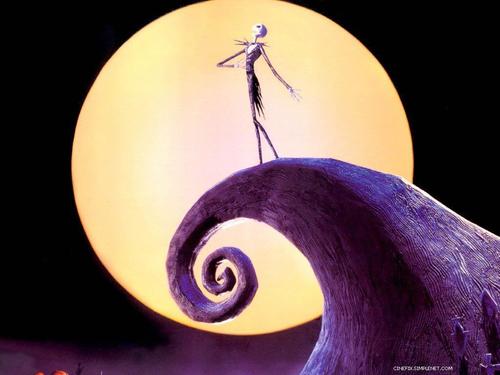
continuing with my fascination with bikes, i thought i’d post this one, which primarily consists of my favorite color: blue. i feel the that silver/grey accents compliment the richness of deep blue and the red background works to contrast it well. it’s hard to tell but the remaining parts of the bike are yellow, which also is good compliment to blue much like the Cal school colors. better contrast in this image: http://tekgen.com/temp/midea/IMG_8295.JPG )
somewhat reminds me of international klein blue: http://en.wikipedia.org/wiki/International_Klein_blue
im not sure what it is about blue, but its been my favorite color ever since i can remember. anytime i see something that has that rich blue luster, i’m immediately drawn to it…
I posted “Impression: soleil levant” (Impression: Sunrise) by Claude Monet. In my eyes the painting creates a great harmony through the softly painted combination of the complementary colors blue and orange. Monet uses a pretty dark green and blue and combines it with a pretty clear and bright yellow and orange. Although the picture shows a pretty depressing motive the color combination creates a feeling of harmony and satisfaction.
I’ve picked a picture of one of my favorite painters - Salvador Dali. It’s a very surrealistic painting with an, in my opinion, great combination of colors. Dali chose a palette of some muted colors and a earthy coloring. However, some elements like the red/green/yellow eyelashes provide a color accent.
I pulled together this palette for a house I designed (my mothers’) from this architectural rendering by Arne Jacobsen and Flemming Lassen. I liked the clarity of the colors — in comparison, the yellow paper seems almost to be a neutral ground.
Lately, I’ve following posters by an artist called James White. In most of his posters, he plays with straight lines and colors to create a breathtaking effect. Here’s a color palette for one poster I really liked. Most of the colors seem retro and light. The harmony between the colors, the contrast created, is nice.
I chose this illustration done by Masha D’yans, an artist famous for her whimsical watercolor card designs. I like how the more earthy, natural tones of green, yellow, brown, very light tan depicting the forest, are contrasted by the red and pink of the girl holding the flower umbrella. Unique and beautiful.
This was much more difficult for me than I think was intended. There are many color schemes I that like at different times and for different reasons. I’ve tried to find one that I seem to gravitate towards frequently though. There is something about the bright rusted orange and the vibrant blue that go together well for me. The contrast of white and black is equally important - expecially gradients of orange and black and blue and black. To me that gives the color depth and life.
Chris
This is a poster I found online. I chose it simply because 1) my favorite color is orange. 2) it is a successful combination of warm and cold colors. 3) the contrast between the main object and the background is incredible.
This is not an easy assignment for me. I do not often give much thought to color and how it plays against itself. But in the end I would say that for design my favorite would have to be minimalist high contrast, high saturation.
I see this used in vector art frequently with white or back dominating, the other providing form, and a third color providing accent. I find it simple, poignant, and vibrant. Here is a rather amusing wallpaper featuring this color mix.
Sorry for the late post. I don’t know if this expresses my personal palette or sense of color harmony, but it’s an image with colors I’ve always liked - I really like taking a deep, rich color like the blue in this image and setting it off against subtler, more matte colors like the taupe and very dark blue I’ve included in this palette.
donald judd
movie sets , godard.