assignment 4
Find both successful and unsuccessful examples of layout design in posters and flyers. Post the photos of your examples and briefly describe what is working and what is not working in terms of layout. Post your images below by Sunday, March 2nd.
18 Responses to “assignment 4”
Leave a Reply
You must login to post a comment.
I was looking at a bunch of stuff this weekend and decided to post two good and two bad examples of design.
The Good

——————————–
The first photo demonstrates a “good” layout design (sorry about the center flash flare in the center). This display is shown next to the main entrance doors into the theatre at Hertz Hall on campus.
Each block is clearly defined and framed.
The portrait of each person is clearly visible and the most prominent part of each block. The white text displaying the artist’s name has good contrast and easily discernable on the colorful background.
Each block has a colorful, but not overwhelming collage of pictures and photographs, most likely having some kind of significance in each artist’s life. The flow and layout the background conveys the feeling of “art” to me.
——-
Another good example of “good” layout design is this handwritten one on one of the community bulletin boards (near the mailroom). This particular poster is larger than the rest of the fliers.
The use of colors attracts the passerby’s eye. The array of colors and use of handwriting is quite different from the rest of the fliers on the board which are predominately displayed on one-colored paper with typed, black text.
Emphasis on different parts of the poster is achieved through coloring and size of text.
Though no borders are drawn, there are definite boundaries of certain areas. On the bottom area, you can easily tell which text belongs to a particular photo.
Neither text nor number of photos seems to be excessive and both contribute to the overall appeal of the poster.
The Bad
——————————–
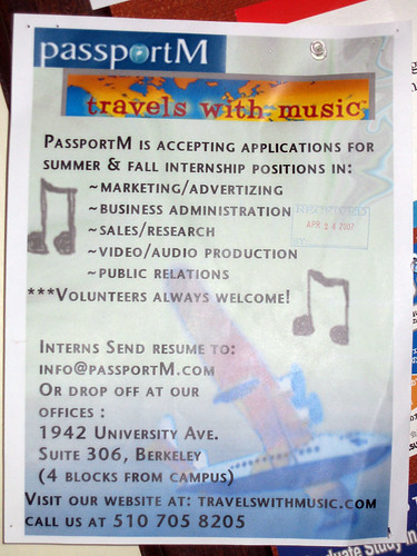
This is a photo of another flier on another bulletin board at my residence hall (this one is near the dining facility). I chose this as a “bad” layout design example.
The first thing that I noticed about this flier was how unreadable it was. Since all the text is the same size, it’s difficult to separate the important information from the supplementary information.
Everything is in capital letters, which is not necessarily a bad thing.
The spacing of text is horrible. Everything seems to be scrunched towards the top or the bottom.
The overall layout of the flier did not make me want to read its content. The only good thing about it is the large 8th notes that are prominently displayed in the background. A viewer could probably guess that the flier is somehow related to music.
——-
This was posted on a bulletin board adjacent to the previous flier.
I think this poster is an example of “bad” layout design (although one can argue that there’s not much “layout” at all.) There’s actually not too much to say since there’s not much content.
First, the good thing about it is the top text, which lets residents know it’s about some kind of opportunity.
For the bad:
The two boxes below the text are difficult to read since such a small is allocated for both. The sizing of the boxes also make the flier feel “lopsided.”
The text on the right box is especially bad because there are no line breaks. All the text is compressed into the small area. The text is all the same size, except for a few exceptions where the text is bold.
Like the previous example, the layout of this flier doesn’t want me to read the content.
I liked Poster A’s layout. It had a clever saying in a bold typeface and got straight to the point. I appreciated that the authors used the color red as a background (which in many current North American cultures often represents danger) instead of trying to portray someone stealing stuff (a portrayal which is usually rife with stereotypes).
In contrast, I disliked this Poster B’s layout. It, like the previous example used simple colors and text to convey its message, but for me the point was not clear. I do not feel the choice of color helped clarify the confusing nature of the text message and my only guess to what the poster was about was a picture of the product in the lower right corner. Although the slogan “you can say more with your credo” is catchy, it doesn’t tie to the practical components of using the phone. Why is it better? What does it really have to do with one’s credo?
The fact that these posters were next to each other emphasized their strengths and weaknesses.
Good Layouts
The flyer uses adequate whitespace to allow the eye to perceive the important aspects.
The two most obvious bits of information are the title and the date (with the fact that it is open to all Cal Graduates).
The most important questions: who, what, and where are immediately apparent. Then, if the reader is interested, the flyer further elaborates details sequentially from top to bottom, one section at a time. These are grouped and titled to allow the user to identify the topics about which they might want to know more.
This is a less obvious example of a good layout.
There is a lot of information, little whitespace, and little aesthetic appeal, but the layout actually is very effective.
The information is clearly grouped, and each item clearly delineated, so that in an emergency, it is easy to identify the important information.
Should a fire occur, the bold text “FIRE” is easy to find, and the instructions associated with that title are all contained within the color-code box.
Bad Layouts
The title is clear, but it fails on all other accounts.
It is impossible to tell where one should start.
There is no obvious flow of information. One cannot tell what text is associated with what image, and the logic behind the color-coding of the boxes is unclear. Most of the text is too small to read unless you are within a foot or so, and the textual information fills almost the entirety of the poster - completely overwhelming the reader.
Good use of layout
I think the layout of this poster does a very good job of directing the reader through the material.
First, the title “Monster in the Dark” is actually written on the umbrella and is in the middle (relatively) of the page. It’s the only real graphic and is the largest on the page, so your eye is drawn to it first. The contrast in size of the umbrella (it’s much larger) to the rest of the information on the page does a good job of focusing the reader’s attention. The umbrella is bold and dark, it has visual weight and intensity which also helps create focus. Additionally, the use of whitespace around the umbrella does a good job of separating it from the rest of the content.
Below the umbrella, the page is divided nicely by the umbrella handle into two columns of information. Since in Western culture we read from top-down and from left-right, it’s good to have all the important information below the Monster in the Dark umbrella (which is the main focus). The edges of the body of text are used effectively to create the illusion of borders between the two columns.
The leftmost column is the most important information - who, what, where, when, why. Again, this is good since we read left-right in Western culture. The date, time, and place are all highlighted using different elements of text (size, color, bold and italic typeface) with a short description of the event below that.
The rightmost column is less important information that you would read if you were still interested. It gives the names of the people who are involved with the production as well as information about where to purchase tickets.
It’s also great how comments of praise for the show and novel are integrated into the umbrella graphic. They are slanted/tilted on the page to look like raindrops. This slanting is somewhat harder to read and definitely used for stylistic purposes, but as far as layout goes they do a nice job of filling the whitespace above the umbrella so as not to make the poster look imbalanced. Overall, the layout has great balance, it’s not too heavy on the top or bottom and does a nice job of guiding the reader, helping him/her to recognize, identify, and comprehend different types of information.
Bad use of layout
This poster does a very bad job of utilizing the layout to help users find information.
A person’s focus is first drawn to the title since it is the largest font size, all caps, bolded, and italicized. This is good but then the reader naturally continues to read down the page. A lot of attention is drawn to the photo since it is centered on the page and there is so much whitespace around it. But then, below the photo there is just this massive block of text. No one will take the time to read it all. The creator should have at least used subheadings to break the body of text into smaller, more understandable sections.
Also, important information like the date, time, and place of the event are on the very top of the page, but since the reader’s attention and focus is first drawn to something below that point, the reader then has to go back and search for all that information. This layout choice creates a broken and fragmented directional flow.
Bleh. I still haven’t even read it all and don’t have much of an idea about what it’s about from just looking at the poster. It’s not inviting.
Good Layout
I like this Arne Jacobsen poster even though the super-spaced, intentionally edgy type is beginning to look a bit dated. The flyer coveys information well. In my case, it’s especially evocative, as it commemorates an exhibit of the work of one of my favorite architects that was held in one of my favorite places in the world, Louisiana. (It’s a state in the US and an art museum in Denmark.)
The layout is simple and makes clear the distinction between the original Jacobsen rendering and the new information; the colors used for the type are drawn from the image, so the blue frame around the perimeter is distinct, but related. (The red is the wall behind the poster.) The yellow of “Arne Jacobsen” relates to the yellow tone that underlies most of the colors in the image.
(Intentionally) Bad Layout
I suppose this placard at the Santana Row mall and housing development is poorly designed on purpose. There is no sense of design here: no kerning, no consideration of alignment, no columns to make the text more readable, no emphasis to indicate which rules might be more important than others. But ironically, in an environment where everything else is so perfect as to be cloying, the complete lack of attention to design makes this sign stand out, which was probably not the intention of the owners of Santana Row. They are (presumably) much more interested in being able to ask people to leave for violating rule #3 (wearing “obscene or offending” clothing), or for violating rule #17 (the bizarre “no hookah pipe smoking.”) Because Santana Row is privately owned, the owners have the right to make rules such as these and ask people to leave. But the odd thing is that it’s a privately owned space designed to look like a public place. Furthermore, Santana Row includes housing, so these rules apply to the actions of people inside their own homes. Making these rules more prominent or eye-catching would burst the illusion, so they are most likely undesigned on purpose.
I´ll start with my example of a poster with an unsuccessful layout. It is a Poster about a Spanish band. I found it on the door of a supermarket in a small town in the Nappa Valley. Although this Poster has a clear center and eye catcher with the photo of the band, I believe this poster has a very confusing composition and layout. Especially the use of all the different typefaces causes this effect. In my eyes there is way too much text on the bottom of the poster. Another arrangement of the different typefaces or less information at all would result in a more successful poster.

Unfortunately i was not able to take a picture of a successful poster. Therefore I chose to take one out of the Internet. One very classic example with a successful layout is the Ipod Poster by Apple. This poster is able to convey its message only by a two colored picture of a dancing person and the Logo. Although apple has a very strong branding and does not have to provide a lot of additional product info for their customer like other posters have to, I think they made a great job.

Good Layout

I liked the layout of this poster for a number of reasons. From my first glance, I could easily tell that music was involved from the striking piano keys that border the bottom of the poster along with the music notes coming from the people playing on the right. I like that my attention is immediately drawn to the image of the performer(or at least who I assume the performer to be) so that I can get an idea of who I’d be seeing. Next, I like how JAZZ (+ other information) is clearly presented in white over black - which provides great contrast. Details about date and time appear at the very bottom.
This layout follows the natural flow of top-to-bottom and left-to-right (at least culturally this makes sense here in the US). The green background that fades as it approaches the bottom also helps the eye in this flow.
Bad Layout

The layout of this flier is disastrous. First, the border looks culturally mismatched. The font used for “Spanish Tutor” is a bit difficult to read and is used again on the lefthand side to present the tutor’s name (a name is something you’d really want highlighted and easy to read when you’re looking for a job. Also, putting the letters of a name top-to-bottom in this case really looks weird. In fact, it wasn’t at all clear to me initially that that was a name.). Furthermore, there is a lot of text grouped to the right along with a trailing image; the large chasm between the tutor’s name and this body of text looks very odd and lonely. I don’t like this at all.
Bad Layout:

This image was an advertisement in the BART station. Although the picture is a bit dark, you can see that the layout is simply too cluttered. The images are layered on top of each other in a somewhat haphazard way.
Good Layout:

I like the way this poster is laid out. It’s simple but effective. The necessary text is on the poster, but doesn’t overwhelm the design.
http://shiwenhua.info/__oneclick_uploads/2008/03/4b.jpg
it’s really hard to read target ads. they are always in bright red.
font and size of words are too small. even this flyer uses an interesting layout.
http://shiwenhua.info/__oneclick_uploads/2008/03/4a.jpg
this is a better flyer. BUY BYE is catching the eye. it’s very easy to read a loud. the red color and spaces on top gave more directions to center column BUY BYE.
Good Example:
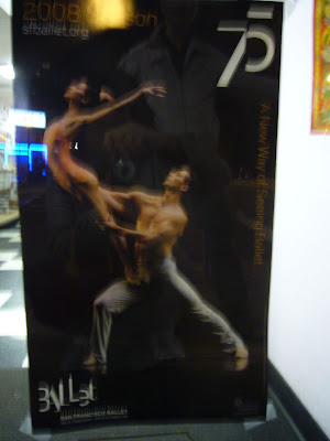
Sorry the picture is not focused very well, but I really like the layout, because it is simple but powerful.
This purpose of this poster is to celebrate San Francisco Ballet’s 75th anniversary. The color choice is plain with black for background, white for important information, and yellow for less important texts. The different font types, capital letters, kerning spacing and bold also distinguishes the importance of these texts.
For the composition, the dancing font, “ballet” in the bottom left and “75” on the top right corner, plus the image in the middle create a dynamic “X” shape on the poster.
Bad Example:
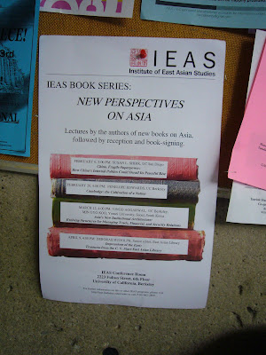
I took this picture in front of engineering library as a bad example of poster/flyer layout. Although the designer tried to be creative by using the book metaphor, there is no big distinction between important or unimportant information. Also the book titles on the spin are simply unreadable.
There are more posters/ flyers I found recently.
http://picasaweb.google.com/millie.cheng/PosterAndFlyer
My example of “unsuccessful” layout comes from the bulletin board at my local library:
The ridiculousness of the subject matter aside, this layout has a number of problems. The worst, I think, is the uneven centering. Centering everything is a pretty straightforward, if boring, way of laying out a page; but the title isn’t properly centered at all, with “Owen Baker Flynn” pushed over to the left. This prominent, seemingly unintentional off-center element throws the whole thing off-kilter, making an already ugly design even worse.
My “successful” example comes from my wall calendar, which features old train posters:
I really like this layout. The clock tower is nicely balanced by the black train, whose angle conveys power and speed. The initial “O” in the text aligns with the clock tower, echoing the shape of the clock, and the left edge of the block of text below it continues the vertical line downward. Although the text block is relatively complex, with several different font sizes and lines protruding to either side, it feels balanced in the composition, partly because of that strong vertical line through the O, and partly because the way the text extends down to the right acts as a counterpoint to the train extending upward above it. The composition as a whole is heavily weighted toward the bottom of the layout, making it feel grounded and drawing the eye toward the text, which is further made to stand out by darkening the background to black and setting the text in white.
My exapmle for a bad layout is this poster of a paper dealine.
It is very confusing, not at all legible and doesn’t invite to get more information.
One of the reasons is the mix of types, the missing hierarchy and the use of italic/upper case/bold etc. Another one is the choice of colors, pink and baby-blue is probably not the best for scientific issues. Maybe the biggest shortcoming is the lack of eye-catching elements in this poster.
http://www.cip.ifi.lmu.de/~baueran/bad.jpg
I like the layout of this poster, which is my example for a successful design. I they’ve done a good job in terms of coloring, choice of fonts an the trendy gradient.
http://www.cip.ifi.lmu.de/~baueran/good.jpg
The first flyer is for a telegraph avenue street fair a few years ago. I appreciate this flyer because it pushes the envelope on some design issues, but manages to pull it off. Firstly, it has an aesthetic and manages to keep it consistent without overwhelming the ability to read the sign. The art used is all line based and suggests a sort of whimsy of ages passed. There seems to be a sort of dreamlike/underwater theme that is played at with the way the text is executed, moving on wavelike paths. It does not, however, render it undreadable. The two most important pieces of information are appropriately emphasized, (the time and the place) and they catch the eye first. While some might have thought to make the name of the event the focus of the flyer, I agree with the choice of the designers. Whether or not you remember what the event is called, as long as you remember where and when it is, you are more likely to attend. The design avoids the use of any large blocks of text, while still conveying the necessary information, and does not over utilize fonts.

The second flyer makes certain rather poor design choices. My biggest problems with it are as follows: The use of 15 different fonts on a single page, and that nothing in the layout ties the piece together. The layout is essentially a set of modular horizontal stripes, which resembles more a set of news stories on a page (which we have learned to read as different items). This is in part because of the riot of fonts does not provide consistency, but also because of layout choices such as the box around the bands playing and the trapped white space between the blocks of information text. To its credit, however, the name of the party and the accompanying picture placed prominently in the top left, get the idea across quickly.

My two examples are from the LAEP Studios in Wurster Hall.
Good Layout

The message is simple and effective, probably moreso that there is a large image of what is to be done, versus the words “Dishes.” Also, the sign is very appropriately located above the sink in the studio.
Bad Layout

I just think this sign is boring, too much white space, and it’s hard to distinguish what is the most important text to read, when “In 315 Studios” is at the center of the page.
Good layout:

This poster which was part of Metallica’s St. Anger tour is very simple, especially since it comes from a band that is known for its heavy and chaotic melodies. There is a semi-diagonal progression within the picture and the lightning bolt coming from the man’s cellphone is a simple way of conveying the emotion within the poster.
Bad layout:

I thought it would be appropriate to show a different poster with the same band as it creates a completely different set of emotional responses from the previous one. The layout for this is just plain ugly and lacks any cohesive direction. The font for it is very neutral and does not create any sense of what the event is all about. The random musical note symbols are also redundant and quite puzzling.
The funding announcement poster is an example of successful layout and the proposed development poster is an example of unsuccessful layout. The main difference between the two examples is their use of space. The former is simple, balanced, and uncluttered. It provides the basic information and utilizes caps and bolding to highlight important components. And lastly the text is centered and its use of simple colors seem friendly and inviting. On the other hand, the latter seems very cluttered and unbalanced. The bottom half of the poster is empty, while the top half is crammed with information. Also the text is moves from occupying the entire width to occupying only half of the width - without an apparent reason. It’s printed in black and white, uses bolding and caps only for its headings, and provides no visuals of the proposed construction.
This poster caught my eye on my commute to school on Bart. This exemplifies good layout design because of the use of attractive colors, the serif font, the use of spacing, and the change in size of the font to draw attention to the important points on the poster.
This poster was on a bulleting board on campus and seems like a really bad layout. The thing that caught my eye is the use of while letters on a black background in certain sections. This makes the letters hard to see, especially because the font is in cursive and very thin. The main point of emphasis on this poster is the graphic, and not the text.