Assignment 1
Assignment 2
Assignment 3
Assignment 5
Assignment 6
Assignment 7
Assignment 8
Assignment 9
Pilot Study Write Up
Introduction
Web Patterns is a library of user interface design patterns for the UC Berkeley web developer community. The purpose of this system is to provide a resource to help developers with little or no formal user interface design training to build sites that are more usable and consistent. The system also encourages feedback and discussion of patterns by allowing all users to comment and include implementation code if needed.
The primary goal of the pilot test was to assess the utility of the site's navigation, information display, and comment input interface. In addition, we wanted to find out more about how participant's might use the system and what type of content they'd like featured on the home page.
Method
Participants
- Participant 1 is a male "Programmer/Analyst" at UC Berkeley. He has been in his current job for 15 years and has no formal training with user interface design.
- Participant 2 is a male "Programmer/Analyst 3" at UC Berkeley. He has been in his current job for 5 years and has no formal training with user interface design.
- Participant 3 is a female "Webmaster" at UC Berkeley. She has been in her current job for 10 years and has no formal training with user interface design.
We chose participants from our previous pool of "Swiss Army Knife" personas who were already familiar with our project and had some general knowledge and/or interest in user interface development. Because the participants had some exposure to the project in the form of interviews or interacting with the lo-fi prototype, we felt that coupled with their experience as developers on campus, they could help point out terminology or interaction that would make sense to the wider campus audience.
Apparatus
We tested our system on a PC laptop running Mozilla Firefox 1.5 at a screen resolution of 1024x760. While we intend to address cross-browser compatibility, it was not critical for this test as we wanted to understand if certain elements as well as their appropriate placement made sense to the user. In addition, Firefox is a browser that many developers are familiar with and much of the Javascript interactivity on this platform worked without flaws.
We had one team member play the role of facilitator and another taking notes and running the timer. We also had one other team member present to take more extensive notes.
The test took place at South Hall in room 110.
Tasks
In previous assignments we discovered that it is difficult to design tasks that are appropriate and useful for testing our interface. During this round we revised the tasks in several ways, partly to correct for problems with previous task and partly to test new elements in the interface. First, in order to find out how easily users could find information within a pattern record, we tried asking questions that required finding specific details within the library. Second, rather than asking participants to redesign the navigation on a page using the library (this proved confusing in the previous round), we provided a site taxonomy and asked participants to produce a quick sketch of a site's navigation design. Third, in order to test the protypes comment functionality, we revised the test to include the task of adding a comment. In specific, participants performed the following tasks:
- Find a part of the site that explains how to use patterns.
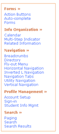
- Find a page that displays all of the patterns in the navigation category at once. What is the maximum number of subcategories that should be visible when using the "Directory" pattern?
- Find another name for the "Navigation Tabs" pattern.
- What problem does "Fly-out Menu" solve?
- Imagine that's you've developed the code in this text file to implement the "Fly-out Menu" and want to share it with other campus developers.
- Please add a comment to the "Fly-out Menu" pattern and add this code.
- You've been assigned the task of building a web site for a department. (Give participant sheet of paper that outlines the site's taxonomy.( Please sketch a few ideas using the pattern library in any way that you find useful.
We included an optional task of editing a pattern as well.
Procedure
- Each test took 40-60 minutes.
- The user sat in front of a laptop with a browser open to the site.
- The facilitator sat to the left of the participant while note-takers and timer sat to the right.
- The facilitator greeted and then asked if there any questions regarding the project.
- First the facilitator had the participant look around the site and talk aloud. We did not provide a demo of the system because we wanted to test whether or not it was self-explanatory.
- The facilitator gave the participant the first task and had the user talk aloud while executing it.
- The timer began taking time once the instruction was read and the user began moving about the site.
- Once the user found an answer out loud, the timer was stopped and recorded and we moved on to subsequent tasks.
- The final task required some explanation by the facilitator and began with the participant sketching out ideas on 2 sheets of paper.
- Once the final task was completed, we moved on to some follow up questions whereby participants could give some feedback and suggestions on improving the site.
Test Measure
Time
We recorded the time it took for each participant to complete a given task. Since most of the tasks were discrete and atomic units of some work, we could draw some correlation between the time it took to complete the task and the ease of use of the systems navigation.
Expediency
We also took note of the general usefulness as well as overall user preference to items on the site and rated them according to what users stated throughout the testing. We graded items that were brought up with most frequency as such: "Easy to find", "Useful", and "Unnoticeable". "Easy to find" indicates that an element on the page was either in a location that was easy to locate or caught the user's attention in a positive manner. "Useful" indicates that an item on the site provided help and ease of use. Finally, "Unnoticeable" means that an element was hard to find and probably requires some consideration in a redesign.
Results
| Task |
Participant 1 |
Participant 2 |
Participant 3 |
| Find "How to use patterns" |
14 sec |
10 sec |
3 mins |
| Find category page |
7.15 sec |
5 sec |
4 sec |
| Max number of subcategories |
30 sec |
60 sec |
1:46 min |
| Synonyms for navigation tabs |
10 sec |
9 sec |
45 sec |
| Problem for Fly-out menu |
6 sec |
10 sec |
10 sec |
| Add comment and/or code |
35 sec |
50 sec |
56 sec |
| Redesign with pattern |
8 mins |
2:46 mins |
7:15 min |
Key Findings:
- The interface for adding comments needs to be extremely simple and should offer users the ability to double check the entry.
- The main types of comments that users are interested in adding to the library are links to sites that implement patterns and feedback about situations in which a pattern didn't work.
- The current home page content in the center top area (aka "Sweet Spot") is ignored by users who already know about patterns. This is partly due to the content and partly to the graphic treatment.
Discussion
Below are specific issues we noticed during the tests followed by implications for the interface.
 Participants found the link to the navigation category page in the main menu quickly when asked to, but there were indications that the question itself gave them the idea to click the link and that they wouldn't have tried to otherwise. This could be in part because of the brown text color or it could be because there's no indication that the resulting page will be to show all the navigation patterns at once.
IMPLICATIONS: Change the color of categories links to the standard blue link color, and indent the pattern options. Add the tooltip found on pattern links in the main nav to the category links, providing text along the lines of “Click here to view all patterns in the Navigation category.”
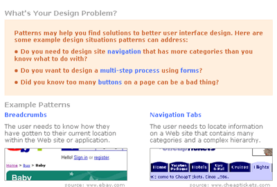
- On the pattern page, participants were unaware that the first statement under the pattern title was a problem summary. Instead, they skipped down to "Use When" section when asked to find the problem that the pattern addresses.
IMPLICATIONS: Label the text with a phrase such as "Problem Summary."
- Sometimes it's not clear that the example image is an example image. It may look like an ad or some other type of intrusive content.
IMPLICATIONS: Add a label or increase the size of the source attribution.
- One participant wanted to be able to see the complete context that example images were pulled from.
IMPLICATIONS: Make the source in the attribution a live link to the site where the image originated.
- The two participants that were more familiar with patterns basically ignored the "Sweet Spot" content on the home page. The colored background set it off, making it easy to scan a bit and figure that nothing of use was contained here. The participant with less knowledge of patterns was interested in first sentence of the content because it gave her an idea of the definition of patterns, but she wasn't interested in the rest of the content.
IMPLICATIONS: Change the purpose of this space to target providing an introduction to patterns to new users. However, it might be more useful to replace this info with our simple one-sentence definition of patterns. We could also use the space to feature links to "How to Use Patterns," and "Developer Resources."
- On the "How to Use Patterns" page, one participant pointed out that the main navigation disappeared from this page.
IMPLICATIONS: Add the navigation to this page.
- Users want the ability to edit or at least preview comments. Immediately after entering a comment the user wants to see that everything got entered and processed by the system correctly.
IMPLICATIONS: After the test we discussed that adding a preview is the best solution, partially for technical reasons, but also because we think it's better for users to not be able to change the conversation after the fact. We will design and implement some type of preview screen before the comment goes live.
- Buttons on the form for formatting code were confusing or didn't work correctly.
IMPLICATIONS: The adding a comment form needs to be very simple. Remove the code button and semantic distinction between comments and code (i.e., we will no longer be able to "bubble up" comments that contain code).
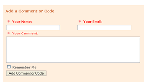
- One participant was interested in adding comments about situations in which a particular pattern didn't work. Both users were interested in adding URLs where a pattern is implemented. At first they seemed to be suggesting a URL field on the form, but then realized that they could just add the URL in a comment. Both expressed mild skepticism that they would ever upload example images or code.
IMPLICATIONS: Add text to the form that suggests that the user can add code or URLs to the the comment without complicating the form by adding additional fields for these specific types of content.
- Comment form validation didn't work perfectly. For example, it allowed an invalid email address to be entered.
IMPLICATIONS: Refine client-side form validation, but also add server-side validation.