Assignment 1
Assignment 2
Assignment 3
Assignment 5
Assignment 6
Assignment 7
Assignment 8
Assignment 9
Comparative Analysis
The goal of this comparative analysis is to understand current approaches to organizing and displaying a pattern collection and to understand if there are any standards in the way patterns are displayed or written. Additionally, we wanted to determine if there are similar or different patterns across the collections.
General Observations
-
All collections place too much burden on the user knowing the pattern name when finding the pattern. Providing multiple ways to browse a pattern collection (by problem, by solution) or even in a faceted manner might help the user discover the appropriate pattern more easily.
-
With the exception of Yahoo! Design Library, visual elements often appear at the end of the pattern and not in the context of the solution. A close association between an example and the text describing it would be helpful.
-
With the exception of Design of Sites, none set the context of where to use these in a design process. It would be helpful to see where this can inform design in a project cycle.
- There is little overlap in the patterns offered.
-
Collections often lack a global navigation of patterns. This means the user must use the browser buttons or go to the home page to access other patterns.
Methodology
We selected four UI design pattern collections--two books and two online collections.
- The Design of Sites by Douglas van Duyne, James Landay, and Jason Hong was one of the first commercially available books on web patterns. A web version of this collection is available, but is far less useful than the book.
- Designing Interfaces by Jenifer Tidwell's is a book on interaction patterns published in December of 2005 based on her academic workat MIT. A web version of this collection is available, but is far less useful than the book.
- Yahoo! Design Pattern Library (http://developer.yahoo.net/ypatterns/) launched in February 2006.
- Martijn van Welie's Web Design Patterns (http://www.welie.com/patterns/index.html).
We developed a template of evaluation criteria for consistency across evaluations.
- Home page. (web only) How informative is the home page? How is it organized? Does it set the proper context for visitors?
-
Target Audience What kind of audience are they geared towards?
-
Site/Book Organization Is the site organization intuitive and easy to understand?
-
Navigation (web only) How is the navigation organized?
-
Content Section for explaining what a pattern is? Number of patterns in the collection? Quality of content. How are related patterns conveyed?
-
Links & Labels Are labels on section headers and content groupings easy to understand?
-
Findability of a Pattern Search, Browse, Discover a pattern?
-
Level of User Contribution (web only) Can users submit a pattern /comment on a pattern?
-
Pattern Analysis What is the format and content of the pattern? What are the strengths and weaknesses of the pattern display?
Designing Interfaces by Jenifer Tidwell O’Reilly Media, Inc 2006
Target Audience T his is intended for UI designers with any kind of experience with desktop apps, web apps, interactive web sites, software for handhelds, kiosks, or operating systems. UI design experience of the intended audience may range from little to frequent, but the book is not geared toward non-designers or those unfamiliar with basics. The book is rich with terms of art and assumes a level of knowledge about control sets and usability testing.
Site/Book Organization Each chapter tackles a theme. The first 5 chapters cover themes thatapply to almost any interface. Chapters 6-8 are slightly more focused on specific situations. The last chapter deals with aesthetics.
Content
- The preface is very well done. It describes patterns, their use, history and the intended audience of the book. There are 94 patterns in this book.
- Patterns have the following sections: what, use when, why, how, examples. Related patterns appear in bold in the text for scanability.
- Some of the visual elements in the book are wire frames with abstract diagrams to demonstrate principles (Gestalt p95, window structures p28). She also uses sequence diagrams to convey interactivity. (p62) However, they are used very infrequently.
- The text could benefit from more visuals embedded within paragraphs. The How section is disconnected from the Examples. A small example component with description could accomplish this in a more appealing way.
Links & Labels
- While the book organization is good and on the surface seems to make good sense for how designers might tackle a problem, I found the pattern names vary in ability to convey the pattern without reading further.
- Unclear: Hub and spoke, satisficing, habituation, escape hatch. It is not clear what these are or whether they are commonly used terms in the interface design world.
- Suggestive, but not totally clear: dropdown chooser, list builder. These suggest something I’ve heard before but I’m not sure if it's what I think it is.
- Clear: breadcrumbs, auto-completion, progress indicator. These terms should be familiar to most designers.
Findability of a Pattern (web only)
- Easy to browse in a book format. However, cross referencing related patterns is a bit cumbersome. You have to refer to a pattern index that is embedded in the middle of the chapter instead of the first page of the chapter.
- Color is used for each chapter so it is easy to distinguish them visually. Patterns are numbered, but the numbers are not used to cross reference them. I suspect because it is more meaningful to use the name, so this is not a bad thing.
- Pattern Name
- Visual example
- What
- Use When
- Why
- How
- Examples
Strengths:
- Web version includes inline links to related patterns
- Very text heavy and difficult to scan
- “How” section provides extensive explanation of how to implement the pattern. This is good but is more aimed at designers and is too detailed and text heavy for our users.
Yahoo! Design Patterns http://developer.yahoo.net/ypatterns/
Home page. (web only) Homepage is GREAT. There are thumbnails of 9 recent patterns added to the library. This allows you to visually confirm or explore patterns. Each thumbnail is also clickable. A title and brief description sit below it. Homepage contains a link to "What is a pattern." They explain it briefly in one sentence then link you to detailed information.
Target Audience Developer community – it lives on developer.yahoo.com. Possibly designers as well. Not beginners.
Site/Book Organization Overall, it is very easy to understand, but there is not a lot of content. it will be interesting to see how this scales in the future with blog posts and new patterns.
Navigation (web only)- Navigation is grouped by “User Needs to” and “Application Needs to,” which provides two different routes or points of entry to a specific pattern.
- Navigation is expandable/collapsible by a click. There seems no way to expand or collapse all which is cumbersome.
- Not all items are linked in the nav. There are placeholder links for patterns not posted yet.
- Within the Patterns, the main nav disappears so the only navigable component is browser button or breadcrumb.
Content A section explains what patterns are and references IAwiki. Also they discuss the Yahoo! process for developing a pattern.
A UI code library exists separately but is referenced from the pattern library.
15 patterns. They clearly plan to scale in the near future with placeholder links.
Links & Labels Seem to be directed at developers, designers. Definitely not beginners. Example terms: module tabs, item pagination, auto complete. These seem to conform with typical terms of art in app or web development.
Findability of a Pattern (web only) Related patterns are well done. It is easy to go directly to them, although they do not appear to be referenced within the pattern text, they are in the contextual nav.
Level of User Contribution (web only)
- There is a blog about each pattern.
- Pattern suggestions are vetted out and developed internally although external suggestions are taken. Patterns are user tested in lo-fi prototypes.
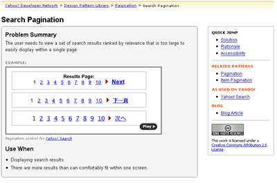
- Pattern Name
- Problem Summary
- visual example, with link to source
- Use When
- Solution
- Rationale
- Accessibility
Strengths:
- Sets off the essential elements of the pattern (“Problem Statement”, a visual example, and “Use When”) in a shaded box at the top of the page of each pattern for quick overview
- Visual examples are all from Yahoo! properties and are high quality, colorful examples
- Visual example has a link to view an inline video of user interaction with an instance of the pattern
- “Quick Jump” links to other sections of the pattern: Solution, Rationale, and Accessibility
- Links to “Related Patterns”
- “As Used on Yahoo!” provides links to live sites that use the pattern in question

- All text, except the problem statement, is written in bullet points for easy scanning
- “Accessibility” section describes user interaction made possible by using this pattern
- “Solution” section often uses subheadings that group the information, allowing for quicker scanning
Weaknesses:
- “Rationale” section often describes problems associated with this pattern, which would be better in a separate section
 Target Audience The book is written for "anyone involved in the design and implementation of a Web site." (Design of Sites, p. xxxvi) However, it is more focused towards web design professions, such as information architects and interaction designers.
Book Organization The book organization is logical. The first part of the book (p. 1-100) covers the customer-centered design process. The second part of the book (p. 106-623) is the pattern collection. The appendix (p. 627-end ) includes sections on "running usability evaluations", "online research", a glossary of terms, and resources.

Content The introduction is well written and gives a good explanation of the history and use of patterns. The chapter also covers an example pattern and how to use the features in the book. Interestingly, this chapter on patterns is between chapters explaining the authors customer-centered design process, which is similar to the the user-centered design life cycle covered in IS213. Patterns are treated as a part of this process and should be continually evaluated in the context of a customer-centered design approach.
There are 90 individual patterns organized into 12 conceptual groups which are color coded. Each pattern is assigned to a group. Images of screen shots and widgets showing the pattern in use are used liberally throughout the book. Additionally, when text in the pattern cross-references another pattern the pattern name and classification label are listed in-line with the color coded alpha numeric label listed in the margin besides the reference.
The patterns are quite good -- easy to read and understand. There are full descriptions of the reasoning for a patterns and adequate examples. Studies justifying the use of the pattern are referenced in the pattern text giving the pattern greater credibility. However, the problem statement often contains what might be considered solution information. Additionally, even though having good, lengthy description is good for learning about patterns, it does not work as well for ready-reference and quick look-ups.
Strengths
- patterns are well written and clear
- pattern groups are mostly clear
- the inclusion of patterns into an iterative and customer-centered design methodology makes the book especially valuable
Weaknesses
- problem statements often include solution information
- patterns descriptions are long making use as quick reference more difficult
The naming of the patterns themselves is less clear. For instance, without reading a discription I would never have guessed that process funnel is a pattern to help designers limit the number of steps in a user task while keeping the process free of extraneous links. The only clue of what type of problem it might solve is it's grouping under "helping customers complete tasks" category. Other patterns are a little more clearly suggestive or widely know, such as, location bread crumb, embedded links, sign-in/new account, but many in the book do not help readers get a sense of the problem they are trying to solve. Patterns such as search action module, straightforward search forms, and familar language just do not tell us much by name alone.
Strengths
- alphanumeric classification system of patterns which aids in cross-referencing and identification of patterns
- color coding of patterns by pattern group
- naming of patterns often did not convey the problem the pattern sought to solve -- this phenomena was acute when the pattern was not well known to the evaluator (process funnel)
Strengths
- traditional reference book format
- findable by table of contents, pattern group, or keyword index
- cross-referencing within patterns clear
- not findable by problem designer seeks to solve
- not searchable
- visual example, including source and explanatory note
- Background
- Problem
- Solution
- Consider These Other Patterns
Strengths:
- Visual example paired with a explanation provide a good entry point to each pattern
- "Background" section puts the pattern in the context of other patterns and the design process in general
- Use of bold text in the problem desription helps for scanability of the essential problem before the detailed explanation
- "Consider These Other Patterns" is great for cross-referencing
- Solutions could be more detail oriented. For example, in breadcrumb the authors didn't describe that the last entry should not be a link
- More bullet point style writing would make the pattern easier to scan for a quick solution
www.welie.com - patterns in Interaction Design http://www.welie.com/patterns

Target Audience
There are no 'who this site is intended for' or 'how to use' sections, but the sites appear to be geared toward professional interaction designers and developers.
Site Organization
Patterns are organized into ten categories, such as, site types, searching, user experience, etc. Each pattern is named and then hyperlinked to the fuller pattern description. There are no search features or alternate ways to browse the content. One interesting accessibility feature is that the patterns are available in Russian.
Content There are no real sections explaining what patterns are or how to use the pattern collection. There are 121 Web site design patterns, 26 GUI design patterns, and 7 mobile UI design patterns. Only the Web site patterns were evaluated.
Strengths
- the 121 patterns are bucketed into 10 categories giving the page a clean appearance
- the pattern layout is clean with graphical image listed first, giving users an easy way to see context of use
- the pattern description is relatively short often providing the user a one sentence problem and use when statement.
- no definition of what a pattern is
- no information on how to use the pattern collection
Links & Labels As with Design of Sites, pattern names do not correspond well with the problem they are trying to solve. For instance, it would be difficult for a novice or experienced designer to describe a collector or topic page without looking at the description of the pattern. This is frustrating for the user, especially considering there is no way to browse from one pattern to another pattern or to get a better sense of what each pattern does at a thumbnail level.
Additionally, many of the patterns do not seem to fit in the pattern groups they are bucketed in. For instance, login and register are listed under ecommerce, but these features are found readily on many non-commerce sites on the web. These problems could be solved by providing multiple ways to browse the content and better categorization. One good feature used by the welie site is the embedded links within pattern to cross-reference other related patterns. This provides the user with an easy way to explore related patterns.
Strengths
- embedded links cross-referencing related patterns
- naming that does not correspond to problem
- pattern groups are not well defined and children patterns do not always fit
Strengths
- pattern categories aid in finding pattern
- no search
- browsing is limited to pattern name only
Pattern Analysis Elements Used to Describe Each Pattern:
- Pattern Name
- Problem
- visual example, with link to source
- Use When
- Solution
- Why
- More Examples

Strengths:
- Visual example has a link to the site that implements the pattern
- Solution section begins with a brief statement in boldface that helps drive the main point home given that there’s so much text
- Appears to be adding the ability to add comments to patterns, but this is isn’t fully implemented yet
Weaknesses:
- No way to easily see related patterns
- Total lack of graphic design makes page boring
- Extremely text-heavy and difficult to scan
- No connection with examples of code