
Second Interactive Prototype | Appendix | Work Breakdown
Introduction
A heuristic evaluation was conducted for our first interactive prototype by the Geneboree team. The Geneboree team were also kind enough to take some additional time to elaborate on each of the interface issues they discovered during the course of their evaluation. After discussing each problem raised, we then broke the heuristics violations down by severity and by page. By listing the the problems found by page, it became clear that the Schedule and Lighting Problems pages needed the most attention. This report briefly recounts the the heuristic violations by page and then provides a discussion of how these issues were addressed and what design changes were made.
Heuristic Evaluation Addressed
To view the full Heuristic Evaluation performed by the Geneboree team, please click here. The following are summaries, group by relevant page.
DashboardThe heuristic violation identified for the Dashboard entailed a minor discussion as to whether the link should be changed to View Other Energy Usage Graphs or View Full Energy Usage Graph. We ultimately agreed that the latter, View Full Energy Usage Graph was indicative of the type of functionality served on the View Energy Graph page to which this link directs a user.
View ProblemsThe heuristic evaluation revealed the most problems associated with the Lighting Problems page. The evaluators found problems with inconsistent icon toggling. They pointed out that one could toggle icons on the list of lighting problems, but not on the dashboard nor the floor plan display. They also explained how leaving these icons' semantic meaning to the users to define, forced the user to recall rather than recognize what they may have meant in a previous session. Another severe issue is that we included information about recently fixed lights in the same list as lighting problems. Some of the minor issues included the "previous" and "next" links, the abbreviation of "Floor" as "Fl", and the mistagging of the floor plan as "Unresolved Problems".
The Lighting Problems page was a major focus for this second interactive prototype. The issue of toggling soon became secondary to discussing the role which icons play. Our team was not sure whether users want the ability to tag lighting problems based on severity, on "if seen" (Viewed or New) or on reported status (whether the problem had been reported to an electrician). In the end we decided to spell out the purpose of the icon. We created a flag to indicate if a problem had be reported or not. However, limitations of our system require this flag to be manually manipulated by the user. We hope future testing will uncover the utility, or lack thereof, of this feature.
By default, all new lighting problems appear without a flag icon. With this new icon representation, there is also an interactive fly-out with each lighting problem that contains additional information about the problem, including a textbox to leave notes for later use. Within this fly-out, users use a checkbox to indicate if a problem has been reported. The note section should help make it clear that this area is for their own use only and not filled with data provided by the system. The dynamic interaction between this checkbox and the flag should make their connection clear and reinforce the flags' use. To further make the icon's semantic meaning less ambiguous in this prototype, we included a key that defines the flag to mean the issue has been reported.
In developing the new conceptual model, Charlie Hiuzenga, our contact at the CBE, explained to us that there are three problems that the wireless devices can report: Lamp, Ballast and Power. This information is important when the user wants to find out more about a lighting problem in order to accurately report an issue to the electrician. Users can click on the problem's date field to bring up the fly-out which contains the more specific problem data.
There are two additional features on the Lighting Problems page. First, as mentioned in the heuristic evaluation, it was hard to map a problem defined on the floor plan to its informational component in the left-hand table. To address this disconnect, we used a brushing and linking system. Rooms that have existing lighting problems are colored. As a user mouses-over those rooms, the room highlights and the corresponding problem in the left-hand table is also highlighted. In addition, as a user mouses-over the problem table component, the corresponding room on the floor plan is highlighted. If the information refers to a room that is not currently displayed pictorially (because it is on a different floor), then the link to that floor highlights, indicating the problem is on another floor. This should provide direct mapping, in both directions, between the visual display of a problem and its list complement.
Other changes to the Lighting Problems page include orange icon labels on the floor plan indicating the total lighting problems per floor and summary data at the top of the lighting problems list to indicate total lighting problems, total reported, and total problems unreported. We removed the title "Unresolved Problems" from the floor plan display, and, provided three ways to order the problems: by date, floor and reported status. The evaluators mentioned that they wished they could alter the order in which the list was displayed. In future versions we might consider allowing for users to change these orders from ascending to descending. Finally we removed the "fixed" problem component of this list. The evaluators pointed out that this was unlikely to be necessary and in its current form was potentially confusing to the user. In the future we may bring this back as a "problem history" feature.
Turn Lights ON/OFF
The first violation, which calls for a "select all" function, is certainly a valid recommendation. We believe that adding a select all mechanism would indeed be beneficial to the user. Unfortunately, we did not have time to make this addition in this version of the prototype and have deferred it until the next version. In addition, we worry about potential users errors that could occur if it was too easy to turn off every light in the building.
To address the second violation, we decided to make the ON/OFF buttons larger and add additional vertical space around them to help differentiate them from the header section; this design change should make the "2. Turn Lights ON/OFF" section more prominent to the user.
We felt that the second heuristic violation for this page was extremely valid and easy to solve. We discussed simply appending the number of lights currently on to the floor name in the floor level widget that is located to the left of the building plan. However, we felt that because this floor changing widget is used on so many pages, we wanted to maintain consistency. Instead, we decided to add a separate icon to the left of the floor level widget which would contain the number of lights currently on for that floor. That way, pages that needed this functionality could add the column of icons; pages that did not would simply not have this column. At first, we thought a light bulb icon would be appropriate. However, the small size and text overlay made the bulb unrecognizable. As an alternative, we chose to copy the legend box and simply insert the number. This turned out to be a superior solution because it added a new dimension of consistency to the page.
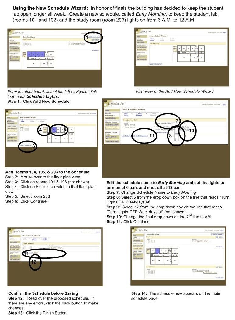
Schedule Lights
First, it should be noted that the Schedule Lights page was not wholly developed for the first interactive prototype. For the second interactive prototype, the team followed through with its original intentions by implementing the Add New Schedule wizard. The new schedule wizard has 3 steps: Select Rooms, Create Schedule, and Confirm Schedule. These three steps guide the user through the scheduling process. We deemed this important after the low-fidelity user testing because most participants had trouble figuring out how to successfully, and correctly, add a new schedule.
A change that we were able to make, and which affected the entire application, was the addition of mouse over effects on the building plans. We already had a mouse over effect on the schedule page but the colors were inconsistent with the other building plan interaction styles. Plus, we wanted to port the mouse over effect to all of the other building plans that had interactivity to highlight their interactive nature. To this end we have standardized the mouse over and highlight interaction across all pages. Floors now gain a blue border when the mouse enters. Once selected, the blue outline remains (except for the Turn Lights On/Off page where the yellow color provides an important indication of a light being on).
There were quite a number of heuristic violations that surfaced concerning the Schedule Lights page; these violations concerned mostly the functionality of adding a new schedule or editing an existing schedule, but also touched on functionality that was not offered that seemed necessary. A specific function not offered is the ability to check for active and inactive schedules, as well as a way to check for overlapping schedules pertaining to the same room. To address all of these violations we first looked for ways in which our schedule wizard would change the functionality and handle some of the problems discovered. Our initial idea for the schedule wizard included a final step for error-checking. This final step would validate the new schedule against existing schedules, highlighting any rooms with conflicting ON/OFF patterns. Additionally, because overlapping schedules are potentially harmful for special events within a building, we also planned to allow users to select a room out of a list to view all active schedules applied to that specific room. Unfortunately, due to time constraints, these functions are not implemented in this second interactive prototype, and are planned for the third interactive prototype.
The major change to the Schedule Lights page was the schedule wizard, while other changes addressed the heuristic violations more specifically. The Save button is more obvious - bold and bigger, while the Delete button switches to a Cancel button while in edit mode. Since the floor plan is the only way for a user to add rooms to a schedule, both in the new wizard and in edit mode, we now have a floor plan, if hidden, pop open when a user clicks the Edit button. Also, in edit mode, we made the schedule name editable.
We encountered some trouble in adding a Remove Room link to each room in the list of rooms; this is something we would like to have implemented for the next prototype.
What Lights are ON
We implemented two solutions for with this problem. First, we decided that the purpose and nature of this page made it a better fit under the Energy Usage section. Second, we discussed the potential benefits of adding a level of interactivity to the page. Interactivity would provide more uniformity to the application as a whole since all other pages containing a building plan graphic were interactive. However, we did not want to provide interactivity just for the sake of it.
Our ultimate decision was to forgo the interactivity of this page for now because we felt that did not support any important goals or tasks that a user might have while on this page. Additionally, we thought that our decision to add obvious mouse over effects to the other building plans (which were interactive in nature) would help differentiate interactive from non-interactive building plans and lessen the confusion. One change that we have discussed adding in our next prototype is overlaying the wattage used onto the building plan so that the user can use either the textual list or the plan to see usage.
Energy Usage and Graph
The violations regarding confusing data labels and a missing legend needed to interpret the graph were mostly addressed when we switched graphing software packages. Issues such as non-integer labels on the date axis and the addition of a legend were addressed with this back-end change. The number of labels used on the date axis was lowered to reduce the amount of visual clutter and to improve label readability. Grid lines were also removed to reduce "chart junk."
While the first prototype was only able to plot one line per graph, the new graphs now plot two lines, differentiating graph plots by the color of the lines and the shape of data points. More contextual information is now conveyed through the title of each graph as well as the inclusion of a graph legend.
The violation regarding printing of graphs was not addressed in the second prototype as we felt that it was a feature request that we did not include in our usage scenarios. Future versions of the interface may include this functionality.
Unaddressed Heuristic Violations
Some heuristic violations went unaddressed because we feel that more user feedback during the Pilot Usability Study is necessary. Features that went undeveloped for the second interactive prototype include: making the floor plan borders larger and more obvious as a user mouses over, creating a login page in order to represent intended functionality, importing user name (over our persona's name) into the interface, and making lights turned on, energy usage and schedules persistent across all pages.
General Heuristic ViolationsWhile we see this as a legitimate concern, we wish to test it with users on computers they might typically work on to establish if font size is a problem.
Second Interactive Prototype
Owing to the the heavy reliance on CSS and javascript, it remains difficult to effectively support multiple browsers and platforms. Since we are using the same tools as used for the first interactive prototype, the second interactive prototype only works in Microsoft Internet Explorer running on Windows XP. Additionally, resizing the browser window may cause the floor layouts to no longer display correctly.
Please agree to any Javascript usage warnings that might occur, these will not appear in the final version.
To begin, click on the provided link provided:
Second Interactive Prototype
Appendix
Scheduling StoryboardWork Breakdown
| Ivan Tam | Lindsay Tabas | Katrina Rhoads | John-Mark Josling | |
| Revised Interface Design | 20% | 20% | 35% | 25% |
| Revised Interface Development | 30% | 0% | 40% | 30% |
| Interactive Prototype Write-up | 15% | 60% | 5% | 20% |
| Web Site Update | 0% | 40% | 0% | 60% |