It has been estimated (by the New York Times and other blog counting services) that there are 3 million blogs and 5 million daily blog readers. Twenty percent of these blogs go dead after about two months of operation, while many more are started. Of those live and regularly updated, the content, for various reasons, can be very useful. This kind of information, provided free on the internet by bloggers, can be useful if the nuggets of value can be extracted and understood. Creating an interface to make explicit these conversations is key to making what people say available. Our project proposes to create a usable, useful, and enjoyable interface for searching and browsing blog and blog-related content.
To better illustrate the problem, we will use a scenario involving our primary target persona, David Dursley. David is a political campaign manager in California's latest gubernatorial campaign. When he first heard of blogging, David recognized blogs as a new way to talk to and listen to the constituents and masses he would need to win over. He manages the blog for his campaign, and he is a frequent blog reader, with many descriptions he reads daily.
High level goals:
Mid level goals:
Turning these goals into tasks, David needs to accomplish three main tasks:
Learn more about David and other target personas
This system design relies on technology that already exists, so our concern is with designing the front-end effectively. Therefore we will not focus on the algorithms in the back-end system, but rather the interface that communicates the results of an existing back-end and the topic and conversation searches users perform. We looked at a number of existing interfaces, noting aspects we liked and did not like. None provided the right model to meet David's needs.
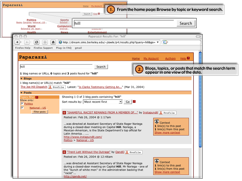
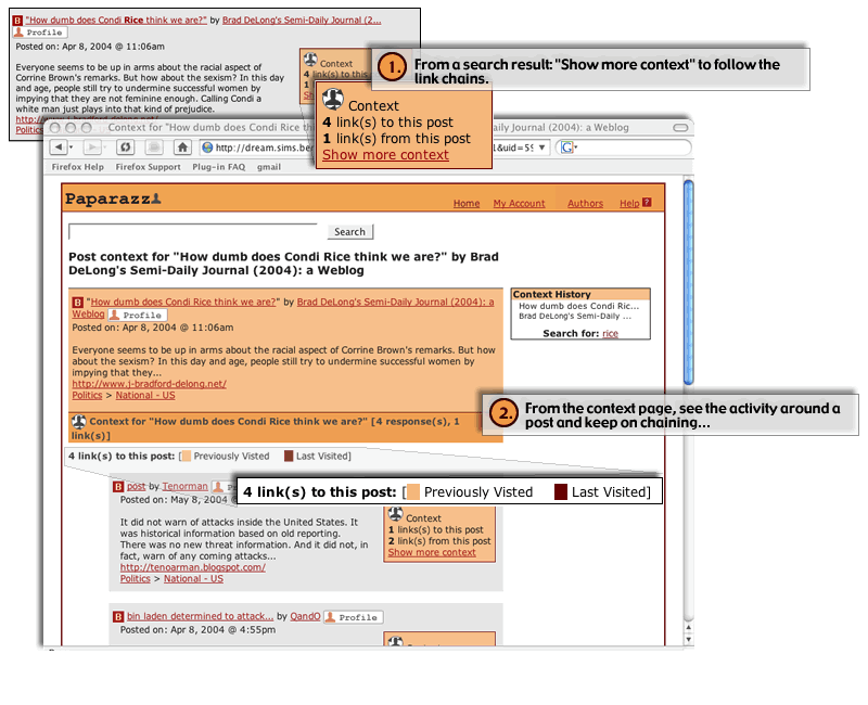
Our solution solves these needs, by integrating keyword search of blog post content, topical browsing, and finding blog profiles in one interface. Furthermore, we provide a way to chain through blog posts in two directions: "up" the chain by following links from a given blog post to another, and "down" the chain by following links that link to a given blog post.
The Paparazzi interface has come as the result of four design iterations and peer feedback in-between. We have focused our efforts on designing:
All of the content in the prototype is "faked," though some of the blogs and posts are real. However, we anticipate being able to plug our demo into a live data feed in the future.
The following figures provide an overview of how the major functionality works.
As described below, a number of evaluation techniques informed the design of our prototype. While we found the user tests to be valuable, we found the most helpful to be the heuristic evaluation. We feel that we were able to make the biggest improvement with the least amount of discussion. The early user tests exposed big problems, but the heuristic evaluation did a better job of pointing out a wide variety of smaller issues, which, taken together, added up to significant usability problems.
Our design efforts have primarily been about meeting two goals:
Goal 1 involved answering these two questions:
Goal 2 focused on one question:
We used our first prototype, made from foam-core, heavy duty paper, and glue, to test some very basic ideas that we had regarding how users could accomplish the revised high-level tasks. We tried accomplishing Goal 1 by separating the site into three distinct areas, corresponding to the three main tasks of performing a regular keyword search, browsing topics, and finding blog information. There would be various linking between the three sections.
We also tried expanded search results and the notion of a blog conversation to help to accomplish Goal 2. We then ran this prototype by three users.
Results
The paper prototype was a successful failure. We tested the prototype with three users. Those tests demonstrated that our first approaches to meeting both goals would most likely not work. However, the prototyping process was inexpensive and it enabled us to move confidently forward with another attempt at a solution.
Read more about the paper prototype and lessons learned.
In the next iteration, we combined the the site model to reflect a unified search. Through one search, a user would potentially have results that matched bloggers, topics, and individual posts. Then, using the activity links in a search result, we guided users to a context page.
Change 1: Site structure redesign
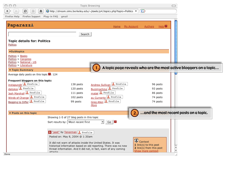
Users could search for anything (specific blogs, topics or keywords) and the results would provide cues as to what types of things match the search and let them choose their own course of action from there. For example, a search for "basketball" might lead to a blogger named "BasketballBlogger," a blog topic under "Entertainment > Sports > Basketball," or individual posts that have the keyword "basketball" in them. We chose to order the sections on specificity (blogger matches, topic matches, all post matches).
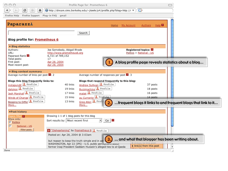
We carried this visually to the other pages as well. On a topic, the first section contains subtopics, the second contains information about the bloggers who post on that topic, and the third section contains posts on that topic. In a blogger profile page, the first section is a set of statistics on that blogger, the second is about who that blogger links to and who links to that blogger, and the third section contains that bloggers posts.
Change 2: Use of icons
One of the things our user tests revealed is that people correctly identified that blog entry titles would link to the actual blog entry (outside of Paparazzi) and that the blog name would link that blog. Paparazzi was introducing a new concept: that of the blogger profile that should be associated with the blog name. In order to support this type of interaction, we created a blogger profile icon that would be shown inline with the blog name. We also used an icon to help reinforce the idea of linking to the context of a blog post.
Change 3: The new "context" page vs. the old "conversation" page and the elimination of the expandable search result
Our paper prototype did not implement the functionality behind a link we had associated with each blog search result: "Show conversation." None of our users really understood what that would do. Our initial revision to this concept was to have an expandable "context" link right below each search result that would show what each blog post is linking to and what is linking to each blog post. Then, users could click on another link that would take them to a page similar to "Google groups" which would have a threaded discussion-like interface. Another mockup quickly revealed some difficult interaction issues that would result from the "expandable" search result.
Therefore, we decided to scrap the expandable search result altogether. We would show data grouped under the notion of "activity" and have a link to a blog context page that would allow users to chain through blog posts.
Change 4: The context-sensitive topics filter
Flamenco and other related work on dynamic filtering and topic clustering inspired us to have a notion of a topics filter that was always attached to the "posts" section of any page. This would show what topics are covered by the result set (and ideally how many, though this is not in the prototype), and allow users to just focus on posts that have to do with the topics they are interested.
Change 5: Added a simple front page
We designed a Yahoo! (circa 1997)-like front page that would support searching or topic browsing. This moved the topics to a more prominent place (they had their own tab in the prior design).
Results
We then ran this interface by a heuristic evaluation team (the Manis group), who provided excellent feedback for further iteration. The good news was that we were closer to reaching Goal 1, the design of usable site model. The unified search model seemed to work for them. We still had some work to do with the layout of the various pages and the layout of an individual search result.
However, with regards to meeting Goal 2, the design of an interface for following blog post conversations, we still had a sizable task ahead. The terminology we used in this pro type did not work well for the evaluators and the layout of the context page did not make it clear what we were trying to accomplish.
Launch the first interactive prototype (will open in new window)
In the second interactive prototype, we worked hard on improving the layout each page in the site and, specifically, an individual search result. We also tried to improve the consistency of our blog chaining terminology. Finally, we experimented with an icon to help maintain the users' context as they chained through blog context.
In the development of our second interactive prototype we focused on four general areas of change:
Additionally, we decided as a group to ignore some of the general terminology issues unless they were misleading or inconsistent in our usage of them in our site. There is a language that is developing around the concept of blogging. Some of this language (such as the word "blog" itself) is becoming more and more mainstream. It would have been counterproductive to create an interface that makes these terms "intuitive."
New format for individual search results
Based on some of the heuristic
violations raised by Manis we redesigned the format for the search results
so that the "context" information would be offset from the search
results "content." We actually had attempted to do this in our paper
prototype, but found that users would only look down a list of results and would
not look to a side area that had data about the post. However, by placing the
search results title (the blog post title, the author, and so forth) above the
content and context information we could address this issue.
Addition of results summaries
Manis found the section headings confusing, and after conversation with them,
we believe that this was primarily the case when there were no results found
for a particular section. We discussed various ways of dealing with this issue.
In the end, we decided to summarize the results at the top of the page and then
not include that section if there were no results for a particular section.
Removed the post topics filter from the topics page
The original idea was that
if someone were one a topic page for a topic that had lots of subtopics, there
would be a lot of posts on that topic and it would be beneficial to allow them
to filter by those subtopics. However, the Manis evaluators were confused by
how the subtopics filter related to the topics browsing hierarchy in general
and it was especially confusing on this page (as we allow users to navigate
down the hierarchy by presenting the subtopics first in the page). Therefore,
we traded power for simplicity and removed the topics filter in the posts section
on this page.
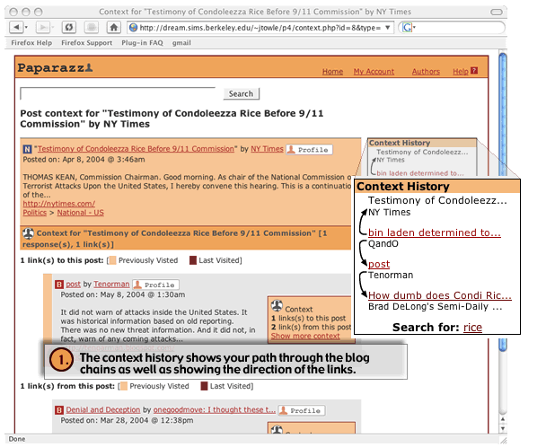
Modifications to the context page
In response to some feedback from Manis, Professor Hearst, and our own intuition,
we made some changes to the context pages. We had a lengthy debate of somehow
showing chaining history and could not reach a solution we liked as a group.
The only thing we were sure on is somehow visually indicating which post a user
had just come from in the chain. That post would appear first in either the
"responses to this post" list or the "links from this post"
list. The solution in this prototype was another icon.
We presented some thoughts to the class on 4/12/04. They had some interesting ideas and we worked towards incorporating them for future iterations.
While developing this prototype we decided to include news articles in the context page. We realize that this potentially opens up many questions such as "should there be a profile page for each news source?" At the time we ignored news articles in all other areas outside of this page. As so many blogs link to news or non-blogs, it seemed impossible to even discuss "context" without including them here.
Finally, we switched the placement of the context sections so that chaining down took precedence over chaining up.
Icon design
One of Manis's evaluators found the icons unreadable and another found the profile
icon confusing because of its proximity to the blog link and other inconsistencies.
In general, they liked the context icon, though. We still felt we needed the
profile icon rather than only a text link to the profile page. So, we made the
profile icon more of a graphic that included the text "profile."
Links to "home" and "help"
While the evaluators liked having the search box on every page, they wanted
a way to start over from the front page of topic browsing. We considered having
an "All" topics page (like any other topics page) but decided to start
with having an explicit link "home."
We also added a link to a general help page, though did not implement the help section.
General design changes
The first interactive prototype did not emphasize visual look and feel, though
it did work on layout. We were happy to see that the layout passed the heuristic
evaluation. We made some changes to incorporate a softer look.
Launch the second interactive prototype (will open in new window)
In between the second interactive prototype and the user test, we incorporated some additional changes based off of feedback and other items on our to-do list. The biggest change was the addition of color. We had put off using color until we were confidant in our general layout.
Results
We ran the third interactive pro type through a pilot usability study. While not absolutely conclusive, the study demonstrated that we accomplished Goal 1, but still had to make some changes to meet Goal 2. For example, terminology for blog chaining still did not make sense for our users.
Launch the third interactive prototype (will open in new window)
Most of our efforts on this final iteration, were spent improving the interface so that users would be able to keep track of their activity while chaining through blog posts on our context page.
Launch Paparazzi (will open in new browser window)
Below is a list of aspects of the interface not yet implemented:
A note on visualization
Our original plans for Paparazzi included visualization to solve the problem of making blog conversations accessible. However, as the project progressed, we realized that this could be the entire project. We revisited the topic frequently. For example, following the first interactive prototype, we spent some time thinking about the use of some type of information visualization in the context of addressing some the heuristic violations and addressing some concerns of Professor Hearst.
After some thinking and debate, we decided that while visualization would probably be helpful in many areas (perhaps even more effective than text) even a simple visualization such as a line graph to represent post activity over time would be difficult to implement in a way that would be useful for our usability tests. For example, we could see creating some non-dynamic visualizations to put in front of users, but a dynamically driven visualization would not be easy given our group resources. And, if the visualization was not dynamically driven like the rest of our content, users just wouldn't get it.
We made extensive use of the whiteboard and dry-erase markers throughout the design process. We created our mockups using Fireworks and Dreamweaver. Using PHP/HTML, CSS, and a little XML, we developed implemented the prototype so that we could play with the content and the visual display of that content. There was some debate internally as to whether this was too much work and if it would limit our ability to just "prototype" (i.e.. throw something together and test it rapidly). However, because our interface is so content-centric, we realized that we needed something that would be reusable for later prototypes.
A major drawback of this approach is that it requires special skills. Not everyone can manipulate PHP. Not everyone gets how CSS should be used with HTML. However, the advantage is that we have a lot of functionality and can now rapidly iterate.