UI Redesign
In the Second Interactive Prototype we incorporated feedback received from a second round of user testing on three users using the First Interactive Prototype, as well as from the Heuristic Evaluation. We also built out the Calendar.
Screen shots of screens that we added or changed can be found below.
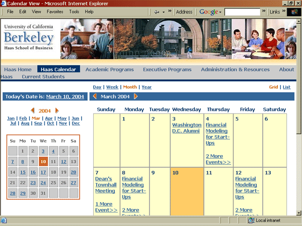
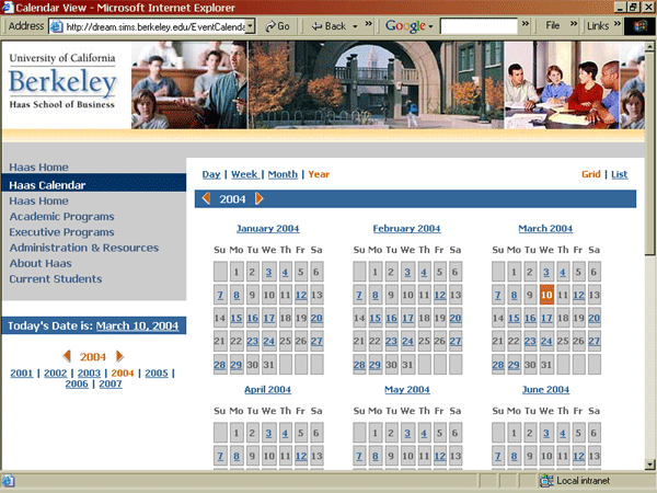
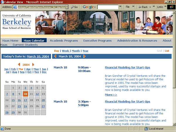
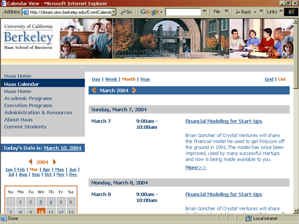
Calendar
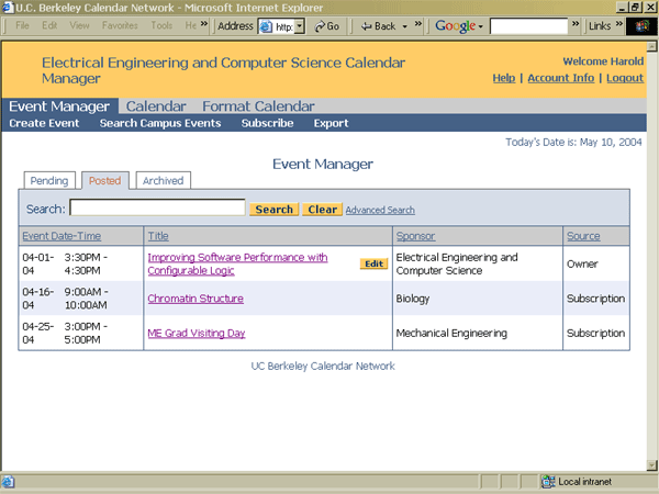
Event Manager
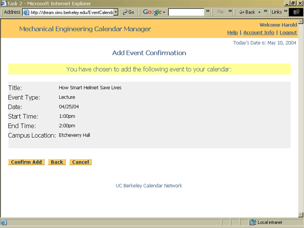
Add Event Confirmation
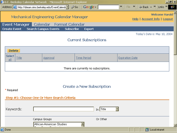
Subscribe
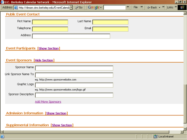
Add Event Form
Response to Heuristic Evaluation
| SCENARIO 1 |
|
1. [H1 Simple & natural
dialog] (Severity 2) The date search options are overwhelming. Start with a simple text search. Allow users to click on column titles and have them sort. Include an arrow icon next to the title indicating if the sort is ascending or descending. If user’s want advanced search functionality, such as the date options being initially presented, include a link to an Advanced Search area. RESPONSE: This was a limitation of our prototype. The date search options would not be exposed until the user selected "Date" from the Filter By drop-down box. However, we did agree with the point that a calendar owner might want to do more advanced searching on their own events than we allow in our Filter By function. Also, we do like the idea of using an arrow icon next to each column header (Title, Date-Time, Sponsor, and Source) and using that to do column sorts instead of the column header. This will allow the user to determine whether the sort is ascending or descending. Our user testing has indicated that most users will use this sorting function to find events they want, so we have decided to remove the Filter By function and replace it with a keyword search on Event Title, with a link to more advanced search options, which will be identical to the search functionality in the Advanced Search in the Search Events (which will become Search Campus Events in this version) section. |
| 2. [H1: Simple and natural dialogue/navigation]
(Severity 2) The ‘Event Manager’ option in the menu could be clearer. The orange does not stand out well on the slate gray. Size of font may assist in reinforcing menu hierarchy. RESPONSE:We will make the font larger on the first level of the menu, and will find a brighter orange to use to highlight the user's location. |
| 3. [H2 Speak the users’ language]
(Severity 2) Source is too close in meaning to Sponsor. User’s may find it confusing. A different word should be used to identify the Origin or Status of the event. Note: Severity level reflects assumption that some testing was performed and UI reflects feedback RESPONSE: We do not believe this is a serious problem, and cannot think of another word to describe source. We agree that it can be misleading, but our users have never had a problem with this, and the meaning of the word Source is very clear from the content of the column. |
| 4. [H2 Speak the users’ language]
(Severity 2) View and clicking on the event’s name are similar actions. View should be eliminated. Note: Severity level reflects assumption that some testing was performed and UI reflects feedback RESPONSE: We decided that clicking on the link to the event would take the user to a nicely-formatted event summary screen which would display all event information that has been entered, and would include buttons that represented all the actions the user could take on the event. The choices a user would have for each type of event is listed below: Dont own, Pending: Post, Remove, Recommend, Cancel We will then only have Edit buttons for events that the user can edit, and not have any View or View/Edit buttons. This button will take the user to a populated Add Event form. Thus the link and Edit buttons will have different functionalities, as the Edit button will be a shortcut to the Add form allowing the user to avoid seeing the event preview described above. |
| 5. [H3 Minimize users’ memory
load] (Severity 2) As UCB is in PST, I’m guessing the events are PST. But it would be useful to include such information as visitors to the calendars / web sites may be from out of town RESPONSE: We do not believe that this will be a problem for our users since UC-Berkeley is located in the PST time zone and almost all events are located on campus or in the Bay Area. If the events are not located in California, we agree that a different time zone should be displayed, but that is a feature to be addressed in future releases if that need arises. |
| 6. [H3 Minimize users’ memory
load] (Severity 2) It would be nice to have current date and time or a month view of a calendar on every screen. RESPONSE: We will have current date on every screen. We believe having a calendar on every screen is a feature request, not a usability issue. |
| 7. [H3 Minimize users’ memory
load] (Severity 2) The Date – Time column of the pending event screen could be confusing. Initially I thought it meant the date/time the event was submitted and then realized the ‘Received’ column did this. Could be clarified with ‘Event Date – Time’ label. RESPONSE: We will call this column Event Date-Time |
| 8. [H4 Consistency] (Severity 2) The Post and Delete buttons were at the top of the screen on the Pending window and in yellow. After clicking through the Guidant Information Meeting title, they are on the bottom of the window and in blue. The location and color should be consistent. RESPONSE: We are going to make all the buttons yellow, but the location of the buttons is determined by the type of screen. We must put the buttons on the top of the screen where there is a list of events so that they will be visible if the event list is long. It is an accepted convention to put buttons on the bottom in confirmation screens. |
| 9. [H4 Consistency] (Severity 2) Most websites where users have to locate information contained in potentially long lists contain a text oriented search box. User’s will expect this functionality. It should be included on the Posted tab. RESPONSE: See entry #1. We do not believe the search functionality is necessary in the Pending events section, as it will never be very large, and users will usually not know what is there. The users will still be able to organize the Pending section using the filtering arrows. |
| 10. [H4 Consistency] (Severity 3) The word “Owner” is used in the Search drop down whereas the word Sponsor is used as a column heading. RESPONSE: We will replace Owner with Sponsor in the first drop-down and have the second drop-down contain all of the possible Sponsors for the list of events. In addition, we will add Source to the first drop-down and put the names of all the subscriptions in the second drop-down. Another idea would be to make the show all choice a link so that its really easy to go back to the full list, instead of having to choose it in the drop down and press go. We will also use some way of visually distinguishing owner events (e.g. color the word owner, color the whole row etc.). |
| 11. [H5 Feedback] (Severity 3) There isn’t any indication what “today” is. As this is a “calendar” application, today’s date should be prominently reflected. Also if I had just returned from holiday, having today’s date visible would put the age of the pending events into context. RESPONSE: We will include the current date in the white part of the screen on the top right. |
| 12. [H5 Feedback] (Severity 3) The ‘The events have been successfully posted.’ response that a user received after confirming event post does not stand out. Could be addressed by adding color or an icon to attract locus of attention. RESPONSE: We will move this text to the center and highlight it in pale yellow. |
| 13. [H6 Clearly marked exits] (Severity
3) There doesn’t appear to be a place where “deleted” events go. This implies once they are deleted they are eliminated from the event calendar. What happens if a mistake is made? How can you get the event back? RESPONSE: We will change the wording so that events not owned by the calendar that are in the Pending queue are Removed, not Deleted. The calendar owner will, however, be able to delete the events they own from Pending. We will provide a confirmation screen that makes it clear that the event will be permanently deleted from the repository. Additionally, we will not allow deletion of events that have been posted on calendars, only cancellation, unless they are private events that could not have been posted to other calendars. |
| 14. [H9 Prevent Errors] (Severity
2) Labels would be helpful for event fields. More so for very detailed event listings. RESPONSE: We had already planned to do this and will make this change in our next version of the prototype. |
| 15. [H9 Prevent Errors] (Severity
2) Include a dialog stating “Forgot your password? Click here” RESPONSE: We have not yet designed the log-in page, but will definitely include this functionality. |
| SCENARIO 2 |
| 1. [H1 Simple & natural dialog] (Severity 3) Seeing the word “Calendar” twice in the navigation might cause confusion (Calendar, Format Calendar). The Calendar link should remain. Then, once in the Calendar window, there should be a link to Format Calendar. Placing the Format Calendar link as a sub-task of Calendar would help to put the functionality into context. RESPONSE: We will not make this change. We had designed the navigation that way in the last prototype and two rounds of testing have confirmed that users prefer the current navigation. The calendar link will open up a new window to preview the calendar exactly as it appears on the website and so it will no longer have any navigation back to the calendar management tool. |
| 2. [H1 Simple & natural dialog] (Severity 4) Having all the Add Event sections presented initially is overwhelming. Consider minimizing them, so they take up less space until the user needs a section and expands it. Or place the sections in a wizard. Allow the user to navigation through the steps using a drop down menu. Then they could click directly to the steps they need and skip ones that are not needed. RESPONSE: This was a limitation of our prototype and is already fixed. We are only leaving the 5 main sections open, the rest are initially hidden. We may also provide a way for calendar administrators to customize their add form in terms of what sections they would like shown initially. |
| 3. [H2 Speak the users’ language] (Severity
3) Field groupings are intuitive, but it is hard to skim headings. Making them bolder or larger might address this issue. RESPONSE: We will try making the headings bold and potentially move them in slightly from the edge. |
| 4. [H2 Speak the users’ language] (Severity
3) I was not sure how to select a color option from the background color spectrum. Since I did not have the Hex value, I tried to click on colors but the hex value did not change to suggest that it had been selected. Not sure if this was limit of prototype or limit of design. RESPONSE: This was a limitation of the prototype. We had already planned to change the choose color mechanism to the standard icon that pops up a color wheel window. |
| 5. [H2 Speak the users’ language] (Severity
3) Meaning of “Link Sponsor's Name To” is unclear RESPONSE: We will change the form to read Sponsor name with a text box and then the next box will say Link Sponsor name to. We do not believe that this will be confusing. |
| 6. [H3 Minimize users’ memory load] (Severity
2) There isn’t any indication of which color is currently selected. The current color should be highlighted in some manner. RESPONSE: See entry #4. |
| 7. [H4 Consistency] (Severity 3) The inclusion of two Location sections with different fields for data entry is very confusing. The sections should be labeled different or combined in a simpler manner. RESPONSE: This is a limitation of the prototype. Only one Location section or the other will be visible, depending on whether the user has selected Campus or Off-Campus events. It will default to Campus. |
| 8. [H4 Consistency] (Severity 2) The “post event” confirmation screen should be consistent with the one used in Scenario 1. RESPONSE: The confirmations will look different based on whether events were multiple-selected and acted upon, or whether a single event was acted-upon. Otherwise the confirmations will be the same. |
| 9. [H5 Feedback] (Severity 4) Which, if any, fields are required? Most likely some fields are required. If not, bogus data will be entered into the system. [Note Scenario 3 – Select Options includes an “Optional” indicator. So are all fields without this Optional indicator required?] RESPONSE: This is fixed in the Add form, as we have added an asterisk to the required fields along with an explanation. In the subscription form we will change the text in step one to read Choose one or more search criteria and in step 2 & 3, we will use asterisks next to the required fields and remove the word optional to be consistent with the Add Form. We will put the "*required" up at the top of the screen. |
| 10. [H5 Feedback] (Severity 4) Having real text included in the Format Calendar – Calendar Event preview might confuse users. The preview should be clearly identified as an example. RESPONSE: We will make the text more generic to solve this problem. |
| 11. [H6 Clearly marked exits] (Severity 3) It is unclear where the user would be taken from the ‘Add Confirm’ page if they select cancel. Will it cancel posting an event all together or take you back to the ‘Add Event’ screen with your event information still completed. It would be nice to have the ability to edit the listing on the confirmation page in the event you realize you made a mistake. RESPONSE: We will add a Back button to the choices, which will take the user back to the Add Form, pre-populated with the data they entered. The cancel button will take the user back to the Event Manager. |
| 12. [H7 Shortcuts] (Severity 2) Having two Location sections is confusing. Only one should be presented initially. If users want to enter in more Location details, the appropriate fields should be presented after a user indicates more location details are available. RESPONSE: See entry #7. |
| 13. [H7 Shortcuts] (Severity 4) It would be helpful to have a “Clone” option. If there are two events which share most of the same details, the user should not have to reenter the information twice. S/he should be able to copy the details from the first event s/he entered. RESPONSE: We agree that this is a useful feature but not that it is a Must fix usability problem." |
| 14. [H7 Shortcuts] (Severity 4) There doesn’t appear to be a way to indicate or set-up a repeating event. Having this functionality would eliminate the user from having to enter the same details multiple times. RESPONSE: There is a way to set-up a repeating event by using the advanced date and time feature which was not yet implemented. We will add explanatory text next to this link to explain how to enter repeating events. |
| 15. [H10 Help & Documentation] (Severity 1) Context sensitive help would be useful next to the Event Type drop down. Users may not know how to classify an event. Even thought a Help link exists, it seems very far away when one is working in a specific screen RESPONSE: We are planning to add context help where appropriate later on in the process. |
| SCENARIO 3 |
| 1. [H1 Simple & natural dialog] (Severity 2) If the only option in the Search drop down is Keyword, than a drop down is not necessary. RESPONSE: This was a limitation of the prototype. We will make this change. |
| 2. [H1 Simple & natural dialog] (Severity 2) The steps should be reordered to reflect the way users will probably think about events. Most likely they will identify the sponsor first. Then they will identify specific keywords. Essentially keywords are a subset of the sponsor’s events and consequently should come secondary. RESPONSE: Based on our user interviews, we believe keyword will be the most often-used search criterion. |
| 3. [H1 Simple & natural dialog] (Severity 2) I wanted the search button to be the first button on the left rather than the far right button. Might cause user error. RESPONSE: We agree that this could cause errors and will move all buttons to the left side, making the most often used button the first button on the left. |
| 4. [H2 Speak the users’ language] (Severity
3) The labels in Step 2: Select Options are confusing. Specifically - “I want to receive events that occur X weeks ahead or less.” Ahead of what? “2 Weeks Expiration Date (optional):” expire from where? RESPONSE: We have specifically asked users to evaluate this wording and have not had a problem in two rounds of usability testing so we do not agree that it is a problem for our user base. |
| 5. [H2 Speak the users’ language] (Severity
2) Subscribe implies the page would be focused on subscribing to events. Instead the screen appears to contain information about current subscriptions as well as functionality to subscribe to new events. Having these features near each other is useful, but there should be a clearer distinction on the screen. RESPONSE: We agree that this might be visually confusing, so we will add more whitespace between the two sections. We believe that they should be on the same page, however, as users may want to see what their current subscriptions are when they are adding new ones. |
| 6. [H2 Speak the users’ language] (Severity
3) The labels in Step 2: Select Options are confusing. Specifically - “I want to receive events that occur X weeks ahead or less.” Ahead of what? “2 Weeks Expiration Date (optional):” expire from where? RESPONSE: This is a repeat of #4 above. |
| 7. [H5 Feedback] (Severity 4) Currently there is no way to know if there are limits to what you can name your subscription. Additional feedback for the user next to the subscription name box would be helpful to know if it must be one word or if there are any special characters to avoid. RESPONSE: The field will be large enough that users will not often run into the limit, and we will put an example title below the field to illustrate a typical name. We do not want to include a character limit as we would have to put it on every field in our entire site. |
| 8. [H7 Shortcuts] (Severity 2) It would be helpful to remind users of how to select multiple items from the menus (by pressing Ctrl-click) or have a select all option that allows a user to keep his subscription broad. RESPONSE: We had already planned to do this. |
Second Interactive Prototype
The Second Interactive Prototype is located at: http://dream.sims.berkeley.edu/EventCalendar/Documents/SecondInteractivePrototype/login.php.
All scenarios will begin at this link. We will be using scenarios that are very similar to those used in Assignment 5, except that now each user will have a specific user ID and password. Not all the functionality suggested by the interface is available yet, but all functions necessary for the Usability Testing assignment will be working before we begin testing.
Task Scenarios
Scenario #1: Post, Edit, & Delete Events
You are the calendar administrator for the Mechanical Engineering department. You have been using the calendar system for a few months, and subscribe to events from many different calendars. You have chosen to manually approve all events that you subscribe to before posting them to your calendar. Today you are logging in to review new events that came in over the weekend.
- Log in with user ID and password "me"
- Review your Pending events
- Post all EECS events to your calendar (3 events). You are familiar with EECS events and don't feel it necessary to review each one in detail.
- You are not sure whether you want to include the Bio Engineering "Guidant Information Meeting" and so decide to review it more closely.
- You decide that you don't want to post it on your calendar and want to remove it from your Pending events list.
- You received an email asking you to change the time for the "ME Grad Visiting Day" on 4/14/04 to 2-4pm. This event has already been posted to your calendar. Find it and make the time change.
Scenario #2: Add Event & Administer Calendar
You are the calendar administrator for the Mechanical Engineering department and need to add a new event to your calendar and change the background color of your calendar.
- Log in with user ID and password "me"
- Add the following event:
Date: 4/25/04
Time: 1-2pm
Title: How Smart Helmets Save Lives
Event Type: Lecture
Location: Etcheverry Hall - Post it to your calendar immediately
- Find and review the event you just posted
- Change the background color of your calendar to blue
- Change the site navigation that is displayed on your calendar to vertical
Scenario #3: Find Campus Event & Set Up Subscription
You are the calendar administrator for the Biology department and have been using the system for a few weeks, but so far only for your department's own events. Today you want to start adding some other campus events to your calendar.
- Log in with user ID and password "biology"
- Find the following campus event: Environmental Science, 4/8/04, 4:00pm: "The Conquest of Bread: 150 years of CA Agribusiness"
- Post it to your calendar
- Set up a subscription to receive all seminars sponsored by the Civil & Environmental Engineering and Environmental Science departments that contain the word "environment" in the description. You want to manually approve all events before they post. You want to receive events that occur 2 weeks ahead or less. Name this subscription "Environmental Seminars."
- Look at your department calendar