Throughout the Event modeling process, this team used the Document Engineering methodologies Dr. Glushko had taught in his course. He defines “Document Engineering” as “a new discipline for specifying, designing, and implementing the electronic documents that request or provide interfaces to business processes via web-based services.”[2] A Document Engineer begins this process by analyzing existing documents from businesses or entities that want to communicate with each other, augmented by information obtained from other sources of requirements like the people who create or use the documents. A data model for the problem space is then created, which results in a set of reusable components that can be expressed as XML schemas. These components are then be used to create the documents that these entities exchange. Thus Document Engineering is a way to analyze information from diverse sources and create a common data model that all these sources can use to build the documents they can use to communicate. The use of a common data model allows entities to exchange information in a loosely-coupled manner that still ensures that all entities know exactly what the information means.
Our group also followed what Dr. Glushko calls “a "document-centric" version of”…“the classical "analyze - design - refine - implement" methodology.”[3] We began this process by selecting 23 campus calendars and “harvesting” the data elements from each one. We then went through a process of harmonizing and consolidating the data elements into a list of candidate components. The “design” portion of the process involved using normalization procedures to separate the elements into functionally dependent aggregates. This resulted in a conceptual model of an event. Our final step was to begin the “implementation” process by encoding this conceptual model into an XML schema. The final version of the Event Model can be found in Appendix A.
After the creation of the Event model, our development process was focused on the creation of the Calendar Management Tool and web-based calendar. The Calendar Management Tool is a web-based application designed for the U.C. Berkeley community. It allows any campus group or department to add their calendar events to a centralized repository in order to facilitate sharing of event information. Events can be designated as "private" in which case they are only available to the event owner's calendar or "public" in which case they are available to any calendar in the network. Each group can use the tool to manage events and customize its own dynamic, web-based calendar showcasing these events. The tool also allows users to choose specific events from other calendars or set up a subscription to automatically receive events according to some criteria (e.g."lectures and seminars sponsored by Haas") and display them on their own calendars.
We conducted interviews with current calendar owners on campus during January 2004 as part of the needs assessment process for designing our tool.
The goal of the interviews was to gather information about how calendar owners currently create and maintain their departmental calendars. We asked questions relating to:
Current calendar/event management processes
Technical expertise and development capabilities
Likes and dislikes about current system/methods
Communicating events within the UCB community
Event data used
Design recommendations
See Appendix B for the full list of interview questions.
We identified as many separate calendars on campus as possible and classified them by technical sophistication (high, medium and low). Calendars in the “high” category included the general UCB events calendar, the Haas School of Business calendar and the Berkeley Art Museum/Pacific Film Archive calendar. Calendars in the “medium” category included Boalt Law school calendar and the Letters & Sciences calendar. Lastly, calendars in the “low” category included the calendar for the Center for Latin American Studies and the Center for East Asian Studies. There were 12 participants in the interview process. All of the participants were current calendar administrators on the U.C. Berkeley campus and were chosen to evenly represent the different levels of technical sophistication that we had identified.
The interviews were conducted over several weeks in January 2004. Each interview lasted approximately 1.5 hours. There were always two members of our group at each interview. One group member led the interview while the other took notes and occasionally asked a question to ensure that the interview stayed on track and that all topics of interest were pursued.
We gained a great deal of information about how calendar administrators currently manage their calendars and how they envision working with the U.C. Berkeley Calendar Network from the interviews. The key points were:
Most calendar administrators receive events for posting (either through a form or email) and must approve them.
The Center for South East Asian Studies & Journalism mentioned that they sometimes receive fliers containing event information for them to post.
People wanted to ensure that they remain able to quickly change event information on their calendar if there is a last minute change to an event.
Allowing people other than the calendar administrator to modify events was mentioned more than once.
No one was very concerned about the security issues involved in sharing their events in a centralized database.
Calendar owners stressed the importance of being able to designate events as private and keep them on their own calendars without making them available to the greater calendar network.
Most people liked to keep old events published on their website because it brought traffic to their site.
There was a variety of interest in pulling events from other departments, but unanimous interest in pushing events out to the greater campus community.
Our data model of an event seemed sufficient for the majority of users; a few calendars had additional fields that they would include.
Many interviewees remarked that it would be great to extend the functionality of our tool to manage personal calendars as well as departmental calendars.
It was important to the calendar owners that in using our tool they would still be able to maintain the current ‘look and feel’ of their calendars.
The summarized interview notes can be found in Appendix C.
Our team performed an extensive competitive analysis on eight calendaring applications. These eight were selected because they represent the most popular and feature-rich calendaring applications used on the Berkeley campus and beyond. The eight calendars we analyzed include:
Apple iCal
CalAgenda
Calendars.net
Microsoft Outlook
The Queer Berkeley Calendar
The UCB Live Calender
Web Event
Yahoo! Calendar
For each calendar we evaluated the functionality associated with adding, editing, and deleting an event. We also evaluated the actual calendar displays, paying particular attention to the navigation and the various formats for viewing events, such as grid and list. We looked for and noted any especially useful and clearly designed features. We logged the positive and negative aspects of each calendar.
Apple iCal http://www.apple.com/ical
Description
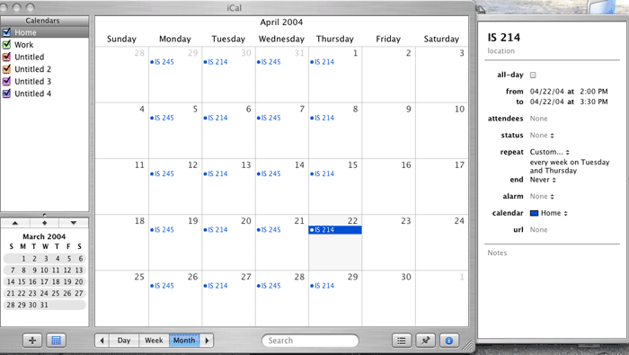
Apple’s iCal is a personal calendaring application that allows you to easily add and interact with events. iCal has several interesting features such as allowing you to create and apply a label to your events, distinguishing them from each other by color and type. iCal allows you to view all events by month, week, or day or just view events of a particular type (eg. Academic, Personal, Work). Another impressive feature is the ability to sync your calendar with your mobile phone, PDA, or iPod. A final time saving feature is the ability to search for events by keyword.
Positive Aspects
Lets you subscribe to public calendars available on the Internet.
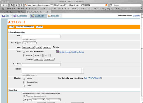
Adding and deleting events is fairly intuitive. You can add more information to your event by entering data into a right side panel (shown above). This panel, however, doesn't resemble a form you can actually type information in.
Negative Aspects
When you’re in week view, it’s difficult to tell what month you’re in.
iCal only displays your events in grid view which means you can only view a small amount of information per event. To view all of the information associated with an event you have to select it and view the details in the right side panel mentioned earlier.
CalAgenda http://calagenda.berkeley.edu
Description
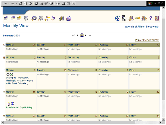
CalAgenda is the main calendar management and scheduling tool used by UC Berkeley faculty and staff to access each other's personal calendars, schedule meetings, and coordinate the sharing of resources such as conference rooms and projectors. Oracle is the vendor and the Calendar application is part of the Oracle Collaboration Suite.
CalAgenda displays events in day, week, or month view. Creating an event (CalAgenda refers to it as a meeting) is fairly easy and you also have the option of adding notes and tasks to a particular day.
Positive Aspects
You can view your calendar in an accessibility mode.
You can set and edit access rights so that you can restrict access to your calendar.
Important page level buttons, such as Create and Cancel for adding an event, repeat at the bottom of the page.
CalAgenda supports email notifications and reminders.
Negative Aspects
The daily and weekly views resemble pages from a planner, however the month view, which defaults to a grid display (shown above), doesn’t distinguish between events and the borders between days are barely noticeable.
It’s difficult to discern what the icons in the application mean. The icons are associated with different calendar views and actions, however, it’s unclear what they mean until your mouse-over one and view it’s alt tag.
You can’t publish a public version of your calendar. Your calendar is only accessible through CalAgenda, which is a restricted password protected application.
There are five tabbed sections associated with adding an event. This means you can’t see all of your event fields at once. Also the layout of some sections lacks adequate padding.
The printer friendly version cuts off the edge of the calendar.
The application allows you to view the schedules of those you would like to invite to meetings. Ideally, however, the application would be able to analyze everyone’s schedule and suggest several meeting times everyone can make, without forcing you to check everyone’s availability first.
Calendars.net http://www.calendars.net
Description
Calendars.net is a free interactive web calendar hosting service. You and anyone you choose can post events. You can allow public access to your calendar or restrict who views it. Calendars.net provides lots of calendar styling options as well as the ability to import and export event information. Calendars.net will display events in day, week, and month view, and displays your calendar in grid and list formats.
Positive Aspects
Calenders.net allows you to navigate to a specific date immediately. The calendar displays all twelve months for the entire year, rather than forcing you navigate from month to month.
Calendars.net provides the ability to search event text or search for events within a date range. Your search results can then be displayed in grid, list, or condensed calendar format.
Administering your calendar is fairly simple and Calendars.net provides many options for styling your calendar.
Negative Aspects
The condensed view of your calendar, where one line is given for each week, is quite confusing and not a very useful view.
Although Calendars.net provides many ways to style your calendar, there is no way to format events with lengthy descriptions or pictures. A long event description will likely warp certain calendar views, such as viewing your entire month in the grid format.
Microsoft Outlook http://www.microsoft.com/office/outlook/prodinfo/overview.mspx
Description
Microsoft’s Outlook is a powerful integrated solution for managing email, tasks, scheduling, contacts, and other information. Outlook is one of the most sophisticated calendaring and scheduling applications available. It includes many time saving features and captures fairly detailed event information.
Positive Aspects
Has sophisticated ways to sort and view event information. You can sort by day, week, and month. You can also sort by your active appointments, reoccurring appointments, by category, and more. Outlook allows you to change the views of your sorting results.
You have the ability to change column widths and sort by column headings when in list view.
Like calendar applications mentioned earlier, Outlook allows you to search for events.
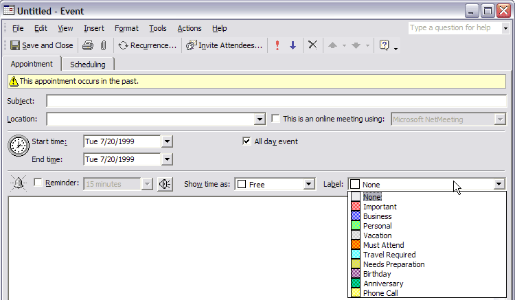
You can apply a color code to your events identifying them as personal, academic, work related etc. This visually distinguishes your events from each other.
Outlook lets you view your event at a glance in a convenient preview pane.
When the application launches, it displays your calendar in the view you used last.
Similar to Apple’s iCal, simply clicking on a date/time cell or on an event allows you to add, edit, or delete an event. This type of direct manipulation is more common in desktop application than in web applications.
You can type in a start date and end date for your event or you can click on an icon that allows you to select a date from a pop up calendar thumbnail.
You can see the duration of an event when specifying an end time.
Outlook automatically notifies you when you're about to entering a conflicting event, but doesn't prevent you from entering that event.
Outlook allows you to add events with detailed time and date options, such as events spanning multiple days with different start and end times for each day.
When modifying an event that is reoccurring Outlook asks you whether you want to modify only that single event or the entire occurrence.
Negative Aspects
Outlook doesn’t provide a way to view your entire year.
Jumping to a specific date is not very intuitive and is a multi-step process. It’s equally as awkward to return to your current date in Outlook.
The month view shows the start time and title for every event, however, the title gets truncated after a certain number of characters even when there’s room in the day cell to view more of it.
The UC Berkeley Queer Calendar of Events http://queer.berkeley.edu/calendar
Description
This is a campus calendar targeted towards the queer community at U.C. Berkeley which allows the general public to post events. You can only display your calendar in month view and in the grid format. To view the details of an event you click on its title and the page refreshes with the event details.
Positive Aspects
Aesthetically pleasing appearance
The start time for each event is displayed in the month view of your calendar.
Although you can include HTML tags when entering your event description in the web form used to add an event to the calendar.
Negative Aspects
If a day displays several events, that day's cell will stretch the grid view of the calendar, warping the display and forcing the user to scroll down to see the rest of the calendar.
The calendar navigation is quite limited. If you want to navigate to a particular month you have to click on a "next" link that navigates you through every month until you reach the one you want.
The month view in grid format is the only way to view your calendar.
This calendar has no search, sort, or filter options for quick access to events.
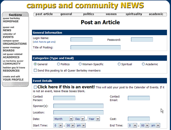
There is a rather large, and somewhat distracting, picture of a desktop calendar that serves as the background image of the Queer calendar.
The same web form (shown above) used for posting an event is used for posting an article. If this isn't already confusing, the title of the page says "Post an Article". There is a checkbox next to a bolded sentence which asks you to select the checkbox if you are indeed posting an event. This sentence breaks the flow of the web form.
The web form doesn't indicate which fields are required and which are optional when entering event or article information.
Once you've added an event, it posts live in the calendar. The only way to remove your event or modify it is to contact the calendar administrator.
The UC Berkeley Live Calendar http:live.berkeley.edu
Description
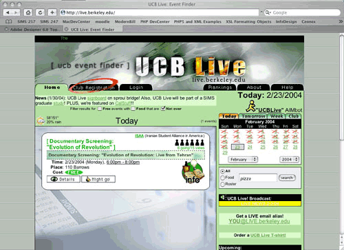
UCB Live is a student run calendar intended for UCB students. The calendar allows approved student groups to create accounts and post, edit, or delete events. UCB Live displays events two weeks in advance. The home page displays the current day's events. A thumbnail month view of the calendar allows you to navigate to a particular day and view its events.
Positive Aspects
This calendar includes several extra features of particular interest to students, such as the ability to search for free events and events offering food. The interface uses lots of icons to distinguish event types (eg. Sports, Entertainment etc.) and for quick scanning.
When you view the details of an event you can email the contact person with a comment or notify him/her if you plan on attending the event.
Every registered club automatically gets its own calendar, so that if you're interested in viewing events from a particular club, you can navigate to their calendar.
UCB Live allows you to preview your event before posting.
Negative Aspects
Because UCB Live doesn't really monitor the event postings, its common to see the same event repeated multiple times in the calendar.
It's common to see events that pertain to only several people. These events are more appropriate for a personal calendar not a campus-wide calendar.
WebEvent http://webevent.com
Description
WebEvent is a web based calendaring application that offers several options for displaying calendar events. WebEvent claims to integrate personal and group calendaring into one enterprise-wide system where public events can be published in a manner available to anyone while private events can be published to an intranet accessible to a particular audience only.
Positive Aspects
Offers a day, week, two-week, month, and year view of your events. These choices are presented in a tabbed interface.
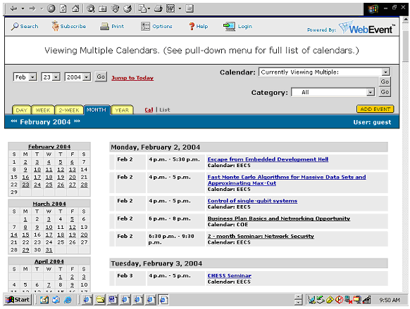
Several calendar thumbnails (shown above) can be used to navigate to a particular day's events. You can also navigate month by month by clicking on links on either side of the month heading.
WebEvent offers a convenient link for jumping to the current day.
You can search for events by keyword, calendar, category, and date.
WebEvent allows you to subscribe to events in order to be updated when event information changes and be notified via email before an event occurs.
WebEvent has a convenient export feature for exporting event information in a comma separated values file.
Provides a list and grid viewing format.
WebEvent Includes handy features for calendar administrator features, such as giving them the choice to approve events before they post live or to allow events to post live as soon as they are entered.
Negative Aspects
When viewing the month view in grid format, if several events are listed in a single day cell, that cell will stretch the calendar, warping its appearance and forcing the user to scroll downward to view the rest of the calendar.
The web form used for adding an event doesn't supporting repeating events very well.
The application doesn't devote enough room to the calendar because the calendar header, which is mainly for decorative purpose, is a fixed frame that occupies a quarter of the screen on a 1024x768 resolution.
Although it's nice that WebEvent provides a printer-friendly version of the calendar, the view cuts off a part of the calendar.
Yahoo! Calendar http://calendar.yahoo.com
Description
Yahoo! Calendar is a comprehensive web application for personal calendaring. The application allows for the customization of colors and layout, displays several calendar views, and has convenient sharing and publishing features.
Positive Aspects
Yahoo! Calendar allows you to search for events.
You can view your events in list and grid formats. In the list format you have several filter options that allow you to limit the number of events displayed.
Yahoo! Calendar allows you to add tasks to a particular day.
You can use the thumbnail calendar view to navigate your calendar. This thumbnail changes in appearance depending on your calendar view. For example, if you're in the day view of your calendar, the thumbnail displays all of the days in the month as links, however, if you're in the year view of your calendar, the thumbnail displays all of the months in the year as links.
Yahoo! Calendars allows you to subscribe to sports events, financial information, and other event content that can be included along with your personal events.
If you want to quickly add an event without having to navigate to the add event web form, Yahoo! Calendar provides a minimal web form at the bottom of each calendar page to quickly add an event.
Because the web form for adding events is fairly long, allowing you to enter detailed event information, certain sections of the add form can be hidden and then exposed by clicking on a link.
When including an date for your event, Yahoo! Calendar automatically displays the day of the week your event is taking place on.
When adding an event to your calendar you can activate a pop up window that displays your current calendar and available dates and times so that you can avoid entering a conflicting event.
You can add a note to your event.
In the add event form, Yahoo! Calendar allows you to include the emails of those you would like to invite to your event.
If you have multiple events to add to your calendar, the add form includes a button called "Save and Add Another Event".
You can click on events directly to edit or delete them from your calendar.
Yahoo! Calendar includes a section in the add event form for creating detailed rules for repeating events.
Page level buttons, such as the "Save", "Save and Add Another", and "Cancel" buttons found in the add event form, are included at the top and bottom of the page.
Negative Aspects
When adding an event to your calendar you're forced to enter a duration rather than simply including an end time for your event.
We followed the principles taught in Marti Heart's IS213: User Interface Design and Development class when evaluating and iterating through multiple interface designs for the Calendar Management Tool. We began with a usability evaluation of a paper prototype, then two versions of a lo-fi prototype, and finally a second interactive prototype. Our third interactive prototype is the final version of our system.
Our goals for our four usability testing sessions were essentially the same:
Ensure that participants can find and use the various functions in the interface
Determine whether the functionality provided is valuable to the participants
Determine whether the interaction flow is natural and intuitive and matches current user workflow
Determine whether the application will meet the needs of current calendar administrators
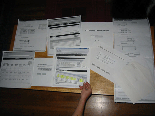
Our lo-fi paper prototype consisted of wireframe screenshots of our task scenarios. The wireframes were intended to show the basic layout and interaction of our designs without additional detailed graphics. The GUI elements (i.e. buttons, text boxes, text fields, etc.) were created from a template and looked similar on all of our screens. Each screenshot included a browser frame to set the context of our web-based application. In addition to the screenshots, we printed stick-ons (i.e. drop-down menus, tables, etc.) to modify parts of the screen as users interacted with the interface. The paper prototype was printed in grayscale on 8.5 x 11 paper. We taped several pieces of paper together when we needed to create a longer, "scrollable" screen. In our design, certain parts of the screen would change color based on user interaction. In those cases, we marked our grayscale prototype with a colored highlighter.
The screen shots of the major sections of our lo-fi prototype can be found in Appendix E.
Three campus calendar administrators participated in our study. Each of the participants' calendars has different goals and thus dictates different needs for the system. Participant #1 only wants to display events from her own department but wants multiple users within her department to be able to add and edit events on the calendar. Participant #2 wants to display her departments own events but also aggregate events from other departments. Participant #3 does not create any events and instead has a calendar intended to aggregate and display all of the events of interest to the Berkeley campus community.
All four of our team members were in the room for each testing session. One team member conducted the testing session. She introduced the application, explained the purpose and logistics of the lo-fi testing and described each task scenario. She was the only one who spoke during the testing. One team member acted as the computer by choosing the correct "screen" to display in response to the participants actions; she did not speak during the testing except to explain the computer's actions. A second team member assisted with the computer by organizing the pieces of the paper prototype for each task but did not interact directly with the participant. She also timed how long it took each participant to do each task. The last team member sat beside the participant as an observer and took notes on a laptop.
Each participant was given three task scenarios. The test conductor handed out three task sheets describing each scenario. The participant was given a chance to read through the tasks and ask any questions before she began. For each task, the participant was encouraged to think out loud and explain her actions as well as to physically interact with the prototype by using her finger as the mouse pointer. After all three tasks were completed, there was a brief interview in which all four team members participated. The participant was asked to share her overall impressions of the interface, tasks and workflow as well as to answer some specific questions about the system. Each testing session lasted approximately one hour.
The task scenarios included:
Scenario #1: Post, Edit, & Delete Events
Scenario #2: Add Event & Administer Calendar
Scenario #3: Find Campus Event & Set Up Subscription
The full task scenarios can be found in Appendix D.
Overall, we were pleased to find that our general concept made sense to our test participants, and that they found the flow of the application was fairly logical. However, as we knew we would probably discover, several of our participants had difficulty with some of the terminology we used to describe the structure and functions of the application. We were also happy to hear that we seemed to be providing about the right level of functionality to calendar owners, although our Add Event form and Event Search function need to be simplified.
Based on the results of this session of usability testing, we decided to make the following changes to the interface:
Restructure the global navigation
Rethink our terminology
Simplify the Add Form
Simplify the Event Search
Reduce number of confirmation pages
Reposition, highlight, and possibly rename "Filter" button
Reposition "Export" button
Separate "Date" and "Time" in all displays of Event data
Make sure that Calendar Administrators can distinguish between Events that come in from an on-line "Add" form versus "Drafts" created by their staff
In addition, we decided to investigate whether the following features would be feasible:
A "Notes" feature allowing users to send a note to other calendar administrators to whom they are recommending Events
Email notification functionality to inform calendar administrators about added, changed, and deleted Events
Provide different levels of access for users
We incorporated many of the suggestions gleaned from our first round of usability testing into our first interactive prototype. Screenshots of this prototype can be found in Appendix F. The major changes we made included:
Completely changing the navigation to include three major sections (Event Manger, Calendar, & Format Calendar) and a sub-navigational menu for the Event Manager section (which included Add Event, Search, Subscribe, & Export)
The use of tabs to visually separate and section off long pages like Pending & Posted Events and Format Calendar
Added a "Quick Search" to the Search section
Reduced the number of confirmation messages and screens
No longer allowed events which had been shared with other calendars to be deleted
As part of our IS 213 classwork, another project team did a heuristic evaluation of our first interactive prototype using the same task scenarios as were used during our usability testing of the paper prototype. Jakob Nielsen defines a heuristic evaluation as "the analysis of a user interface to determine what is good and bad about the usability of the interface. Generally this was accomplished through systematic inspection of the interface using a set of usability principles as criterion for determining what is good. The goal of heuristic evaluation is to identify usability problems so they can be eliminated." [4]
We fixed the main problems identified by our classmates in our second interactive prototype. The problems were:
Navigation could still use improvement
The “Filter By” options in the Event Manager are overwhelming
It is sometimes confusing to allow actions to be executed in multiple ways (e.g. editing an event by clicking on a link from the event title as well as using an edit button)
Confirmation messages should stand out more
“Deleting” events is too strong a word
“Cancel” & “Back” needed on Add form confirmation
Need to standardize button locations
The second interactive prototype reflected changes suggested by our classmates in the heuristic evaluation, as well as in reaction to problems found in an informal usability study we conducted. We had three calendar owner participants who used the same tasks and scenarios that were used in the heuristic evaluation. Screen shots of the second interactive prototype can be found in Appendix G.
The major changes made to the second interactive prototype included:
Navigation
The global navigation was made larger in order to emphasize the hierarchy between it and the sub-navigation
Search was changed to Search Campus Events to make it clearer on what dataset the search was being conducted
Event Manager
The Filter on the Posted tab was changed to Search and a link was added to expose the Advanced Search options on another page
Removed the View and View/Edit buttons. The links from the event title will now always take the user to an Event Details screen, and only events that are editable (meaning owned by the person using this Event Manager) will have Edit buttons. This will be a shortcut to a populated version of the Create Event form where they user can edit the event. Users can also access the populated Add Event form from the Event Details page.
Create Event
Add Event was changed to Create Event to underscore the fact that it involved the creation of a new event, not the addition of an already existing event to a calendar
Implemented the "Show/Hide Section" features so that only the first five sections are initially exposed to the user.
General
Confirmation messages were given a yellow background
Made all buttons on all screens yellow, and located them on the left-hand side of the screen, with the most frequently-used button on the far left.
Following the completion of the second interactive prototype, another usability study was conducted.
We had three participants; one was male and two were female. Two of the participants are currently calendar administrators on campus and the third is a calendar content manager. One of these participants has a calendar which is an aggregator of campus events, and the other two have fairly high-level calendars which primarily post their own events but sometimes or often have a need to share their events with other departments or organizations on campus. All of the participants are very familiar with web-based applications and other calendaring tools.
All four of our team members were in the room for each testing session. One team member conducted the testing session. She introduced the application, explained the purpose and logistics of the study and described each task scenario. She was the only one who spoke during the testing. The other team members observed and took notes during the testing. One timed how long it took for the participants to complete each task. All of the team members were involved in asking questions at the end of each testing session.
Each participant was given three task scenarios. The participant was given all three task scenarios (each on a separate sheet of paper) at the beginning of the testing session and was given a chance to read through the tasks and ask any questions before she began. For each task, the participant was encouraged to think out loud and explain her actions as she interacted with the computer. After all three tasks were completed, there was a brief interview in which all four team members participated. The participant was asked to share her overall impressions of the interface, tasks and workflow as well as to answer some specific questions about the system. Each testing session lasted approximately one hour. See Appendix H for our usability testing notes.
As a follow-up to the testing session, each participant filled out a survey. This allowed them an opportunity to give us more feedback about our interface, and gave us more quantitative measures of the interface's usability. See Appendix I for the full list of survey questions.
Overall, our participants were pleased with our application. They found the system relatively easy to use, found that the interaction flow was natural and intuitive and matched their current workflow, and thought that the functionality provided was valuable. However, some thought functionality that they wouldn't use in their department, such as the Export function, was not as valuable. All participants thought this application would be helpful to many campus departments including their own. We were even surprised to find that one high-level calendar owner who had functionality on her site that we do not plan to reproduce in this release still had a use for our system. Even if she didn't use our application to create her website, she thought using the Create Event form in our application would be a great way to send event information to multiple departments. This is a task she regularly performs now by visiting multiple sites and entering data individually for each calendar. Our testing verified that some interface design decisions we had made were helpful to our users. All participants liked being able to view their live calendar through the application, and most were really excited that we had provided a preview of what their formatting changes would look like in the Format Calendar section. We verified that users preferred to be able to click on the event's link to see a nicely formatted summary of event information, and appreciated the shortcut Edit button in the Event Manager which allowed them to bypass this screen and go directly to a populated version of the Create Event form. We also verified that the search options we offered in Search Campus Events seemed to be the right ones, and that the Create Event form was not too overwhelming, thought it was clear that it could still use some explanatory text for some of the more complicated fields. Two of the three participants thought it would be helpful to be able to be able to customize the way the Create Event form appeared to the user in the application.
The main problems experienced by participants that we have addressed in our final prototype included:
Event Manager
Users had trouble finding some functions in the sub-navigation
Users would like to be able to search all tabs
Users did not think it was clear that the search boxes in each tab acted on that tab only
Users did not notice confirmation messages
Format Calendar
Users were confused about the difference between Preview Calendar in the Format Calendar section and Calendar on the primary navigation
Restore Default Settings was unclear
Event Details
The flow from this page doesn’t make sense if the user doesn’t want to take any action; the Cancel button doesn't seem appropriate
Subscribe
It is confusing to include Event Date in the list of choices offered
Create Event form
The concepts of Public vs. Private events (Event Status) and the meaning of Public Event Contact were not clear to users
In order to address these and other issues, we made the following changes to the final prototype:
Event Manager
Changed the global navigation so Event Manager includes a “Department Name” Calendar Events section which will encompass the Pending/Posted/ Archived tabbed section
Put search functionality on all tabs (Pending, Posted, & Archived Events) and changed the label on the search button to indicate what tab the user is on (e.g. Search Posted Events)
Added green background to confirmation messages
Format Calendar
Add explanatory text to Preview Calendar
Remove Restore Default Settings
Event Details
Change Cancel button to Back
Subscribe
Remove Event Date from the options offered
Create Event form
Change Event Status to Event Sharing Status
Change Public Event Contact to Event Contact and add explanatory text
Navigation
Change Calendar to View Live Calendar, move it to the right side, and give it a different style to indicate that it is different conceptually from the other areas of the application
[2] Center for Document Engineering website, http://cde.berkeley.edu/ (5-01-04).
[3] Document Engineering: Designing Documents for Transactions and Web Services, http://www.sims.berkeley.edu/~glushko/xml2003/slide37.htm (5-01-04).
[4] Jakob Nielsen, Usability Engineering, (San Francisco: Morgan: Morgan Kaufmann, 1994).