Project Goals
Most timeline displays are either limited to a single domain or inclusive of many domains. The former type do not provide context or connections with other historical domains, while the latter are often difficult to use because they overload the viewer with too much data at once. Our goal was to solve these problems by designing a visualization tool that would allow the user to dynamically select two different timelines and display them in a manner that would facilitate the discovery of surprising synchronicities or the mapping of a known domain to unfamiliar material. For example, a movie fan might be able to more easily absorb a timeline of 20th century U.S. history while simultaneously viewing a movie history timeline. The tool could potentially be used to compare two timelines of similar domains or vastly different domains, such as:
• media history with copyright history
• history of hip-hop with 20th century U.S. history
• your life with your mother's life
• histories by two different futurists
• two histories of an era with different political biases (e.g., liberal version vs. conservative version)
Our design was developed for the use of a general audience (similar to Wikipedia), rather than for experts or academics. Similarly, we wanted the tool to provide informative entertainment by making it fun to explore the data.
Related Work
Below we discuss four projects that tackled similar problems to those we explored.
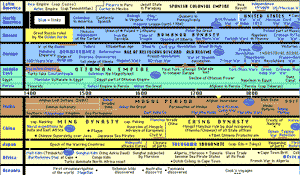
Fig. 2: HyperHistory
1. HyperHistory online and print version
This design combines historical timelines from different subjects and geographical regions, and providing some of the original impetus for our project. One problem with this visualization is that it gives too much information to be absorbed at once. There are too many data points on the timelines that are presented in a similar manner visually, and its difficult to found a point of entry to begin an exploration of the data. The design does not offer users much help in detecting correlations between the different historical events other than special arrangement. It also does not allow the user to filter the data to view areas of interest directly next to each other.
2. OurTimeLines
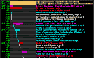
Fig. 3: OurTimeLines
This site allows the user to enter their birth date and a few life events, then maps these to their own database of historical events. The combining of timeline information is interesting, but returns too much data and displays much of it as text, rather than as timelines.
This site attempts to present different historical timelines of world events. It does address the problem of displaying different events that overlap in time by listing them under the time scale at different levels. However, the arrangement of data points at the different levels makes it difficult to scan for the exact year on which an event took place.
Fig. 4: TimeLines.Info
4. BBC's Timeline: Persecution and Genocide Under the Nazis 1933 - 1945
This animated timeline gave us inspiration for our slideshow feature. However, it only shows one timeline in a single domain. Since the domain is hardwired into the timeline design, it is not possible to use this timeline application to view any other timeline domains. Also the design of the timeline makes it difficult to get an overall idea of the events on the timeline. The user interface controls are creative, but not intuitive.
Based on our survey of the different timelines, we have not found a timeline tool that allows the user to dynamically pick two different domains of timelines to compare on a single timescale. Most of the timelines we encountered also do not allow the user to dynamically adjust timeline scale to view events in different levels of detail.
Design Description and Process
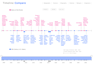
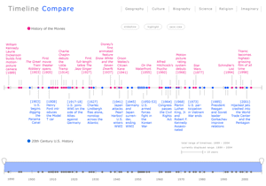
Our primary design concern was to make each timeline visible as a distinct entity, but arranged to facilitate easy comparison. Consequently we chose to have the timelines share one line for event markers, with one timeline's labels above the line, and the other's below the line. In order to minimize any visual separation between the two timelines, the year of each event is placed in the event's label on the side closest to the line, without any years on the actual line. To distinguish between each timeline's markers, we chose colors (magenta and blue) that are bright and fun, but also easily discernable from each other. Each timeline's labels are the same color as its markers, and colored circles are located next to the title of each timeline, in order to make the categorical meaning of the colors obvious without having to use a key. Elements such as the line itself, the hatch marks, the legend, and UI buttons are rendered in gray based on Stephen Few's principle that non-data ink should be de-emphasized and neutral in order to draw the viewer's eye to the data rather than the infrastructure used to display it. We chose filled circles as markers for events that happened in a single year, though other shapes may have worked just as well. For entries that lasted for multiple years, hereafter referred to as "spans", we used a rectangular shape with rounded ends designed to look like a circle marker that has been stretched.
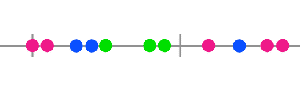
Fig. 5: The green-circle solution.
The initial idea for situations in which an event from each timeline fell on the same year was to encode them in a color that represented a combination of the colors for each timeline. For example, magenta and blue combined would make a purple colored marker. However, the result was that circles for these years were hard to distinguish from the others, in direct contrast to the goal of making these markers "pop" for easy comparison. One proposed solution was to use green and yellow for the two timelines so that the combined color would be blue, which would be very intuitive. Yellow labels, however, were very difficult to read. The next solution considered was to render the combined marker in a third color from the same palette. However, a mockup that used a green for the combined markers drew universally negative comments for being unintuitive. In some ways the unintutiveness of the green markers actually served the design purpose of making these markers stand out, and we could have simply added a legend to explain the meaning of green. We realized, however, that it would be unnecessarily confusing for users, and that the initial goal of making these markers stand out dramatically overstated the importance of events occurring in the same year since events appearing close to each other are often of equal interest. Two alternate solutions were considered:
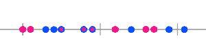
Fig. 6: The circle-inside-circle solution.
• putting a circle of one color inside a circle of the other color (e.g., magenta inside of blue)
• making the bottom half of the circle blue and the top half magenta
Once these were mocked up, the second was obviously superior, partly because it was simply easier to make out visually, but also because it maintained the color-to-position relationship between the timelines.
Based on our target audience and intended purpose, another essential design goal was to make the visualization as clean and simple as possible. Comparing traditional timelines, however, is complicated because they vary in many ways, such as level of granularity used (e.g., decades, years, months, or days), length of the string used to label each event, overall span of time covered, and density of events per time period.
The granularity of time problem was solved by making the decision to use the year as the primary unit for placing events on the timeline, partly because this is the unit most frequently used in timelines, but also because it would allow for a simple and uniform display for users. In the situation that two events from one timeline fall in the same year, or that the specific date of an event is especially important, additional information can be made available to the user in a details-on-demand window that pops up when the user mouses over an event's marker or label. Similarly, events with very long labels can use an abbreviated version in the main visualization, with the full version in the pop-up window.
This, however, does not solve all the problems with labeling. Since even short labels take up more screen space than markers, a timeline with many events would require the user to do a lot of scrolling when all events are displayed. If one timeline has twenty events in a twenty-year-period while the timeline being compared has only one event in the same period, there might be points in which most of the screen is used to display the first timeline's labels, effectively making comparison impossible.
In working on design solutions to these problems, we carefully considered whether to make our timeline run vertically or horizontally. The vertical solution offered the benefit that it was easy to line up an event's label with its marker, as long as the label was kept short enough to avoid line wrapping. On the other hand, having time run from top to bottom has cultural implications that data is in descending order or decreasing priority, while the horizontal orientation is more intuitive to the way we think about time, perhaps because English is read from left to right.
Eventually we decided to solve the problems of varying content density by choosing to fit the entire contents of both timelines on one screen. In other words, when the user chooses the two timelines to display, the tool would algorithmically determine a pixel-to-year ratio to allow for the complete range of years to be displayed on one screen. Obviously this requires developing some method of limiting which events are fully displayed at any one time. With this in mind we chose the horizontal orientation for the timeline since screen space is wider than it is long, allowing for the maximum amount of events to be displayed at any one time. For situations in which there is not enough room to display the labels for every event in the timelines, we tried several encodings, including empty circles, colored circles with small lines coming off them as though leading toward a hidden label, and smaller circles. The first option was found to be unintuitive, while the latter two were well-liked and wound up being included in different versions of the visualization for our user tests.
The decision to not display the labels for all events lead to the inevitable question of how to decide which events to leave out, especially considering that every combination of timelines would allow room to display a different number of events in any given timeline. Our initial mockups were done with the idea that timeline events would be tagged with a priority level that could be used algorithmically at runtime to choose the most important events to be displayed with labels in the given space. This would introduce a level of editorial judgment that could be problematic given that representations of history are often controversial and political. On the other hand, timelines are always subjective, even when consisting of undisputed data, since any decade is filled with an infinite number of events that might be selected for inclusion by the timeline author. Even without the notion of prioritizing events, it would be important to somehow include each timeline's source so that viewers could interpret them accordingly. One solution would be to use Wikipedia as the source for all timeline's in the system to ensure that at minimum the authorship had some democratic validity. The prioritization problem could be solved using a random function to choose which events to display, though this probably wouldn't make for the best user experience. Perhaps the ideal solution would be to somehow allow users to contribute to the prioritization.
To enable users to view the labels of events that are not initially displayed, we developed a range selector. Initially this involved two sliders on a line at the bottom of the screen, marked with years corresponding to the timeline above, and a small overview window that showed a miniature version of the whole timeline with a box representing the currently selected area. After some consideration we decided to combine the line and overview box, by making the two sliders apply directly to a gray copy of the initial view of the timeline with years placed below the line. A light color is used to denote the currently selected area between the two sliders—the "selection window." This window would be "drag-able" so that if, for example, the user selects a range of ten years, the window can then be dragged from its center to view different ten-year periods throughout the currently selected timelines.
To provide context given that the range of years currently displayed is variable, we added a legend below the timeline that shows the full time span covered by both timelines, the time span currently displayed, and a visual notation of how space on the timeline currently maps to years. Some people who looked at initial drafts of the design pointed out that there should be a more noticeable way of showing the years currently displayed, but we wanted to avoid placing years anywhere near the timeline since this would either increase the visual clutter or leave less space for actual events. The solution was to also place the currently selected year in magenta above the two sliders on the range selector, making them difficult to miss while making a selection, but out of the way while viewing the timeline (see Fig. 8).
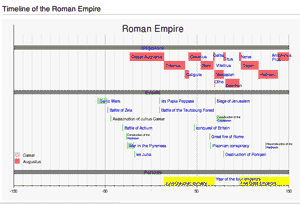
Another problem we discussed is the inclusion of categories in some timelines. The simplest type of categories are various ways of indicating that several events are part of a particular period, such as a timeline of African-American history with a region labeled "The Harlem Renaissance." These types of categorical groupings can be handled in our design by using the span encoding. Others timelines break up the data into broad categories such as the timeline of Roman Empire shown in Fig. 9, which has three horizontal bands for "Emperors," "Events," and "Periods". This timeline is reminiscent of the HyperHistory project and to some degree represents the type of the design that our tool is trying to avoid. In a broader sense, the difference between any two timelines that cover the same time period is exactly that events have been categorized differently. For example, the events in the history of movies timeline and the 20th-century U.S. history timeline, cover the same years, but their constituent events have been put into different categories. Therefore, one solution for encoding the timeline in Fig. 9 in our system, would be to break it into three different timelines: Roman Empire Emperors, Roman Empire Events, and Roman Empire Periods. We also experimented with creating categorical groupings by adding light colors behind event labels, which worked perfectly, but may be unnecessary if the previous solutions work for most timelines. In the effort to make the design as universal as possible, in that it could encode many timelines, it would be ideal to keep it as simple as possible, with the fewest number of added features that are only necessary for a limited number of source materials.
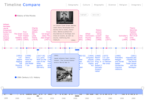
Our user interface includes three "feature" buttons located above the timelines called "slideshow," "highlight," and "save view." The slideshow design provides an easily accessable way to view the details-on-demand pop-ups by generating an automated slideshow. To add a more movie-like atmosphere to the experience the background of the interface changes from white to black during the slideshow and all other controls, such as the range selector, disappear. We also used animation so that each event's slide fades on and off the screen without creating a jarring effect. As the show progresses, a cursor-like oval proceeds from left to right across the timeline, marking the currently displayed events. The user can control the slideshow either by dragging the oval or via stop, pause, and play buttons modeled after the familiar stereo interface. It would be interesting to explore making the timing of the slideshow be in proportion to the actual amount of time being represented in the timeline (e.g., one year might equal 1 second), thereby giving the user a more visceral experience of the correlation between events. The movie-like effect could also be enhanced by giving the user the option to select musical accompaniment for the show.
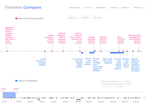
The other feature buttons are less developed ideas that we'd like to explore further. The initial idea for the "highlight" button was to make a way for users to automatically highlight names or significant terms that occur in both currently selected timelines. For example, in a view of the histories of Christianity and the Roman Empire, the highlight button could be used to add a unique color behind the common term "Nero" in each timeline, helping users draw comparisons. "Save View" is simply a way to allow users to capture the current state of the screen. Ideally we'd like to add a social component to the tool by allowing users to easily share the results of their explorations through saving and annotating views.
User Study

Participant 1
Age: Between 30 and 40
Gender: Female
Occupation: SIMS student
Computer Experience: Skilled computer user
Participant 2
Age: Between 30 and 40
Gender: Male
Occupation: SIMS student
Computer Experience: Skilled computer user, skilled programmer
Participant 3
Age: Between 20 and 30
Gender: Female
Occupation: Education dept. student, also works on campus
Computer Experience: uses computer daily, but not an expert
Note: This participant has a visual arts background and was very observant of both intended visual design details and unintended problems.
Because we do not have a working prototype and even the task of making a lo-fi prototype would be very difficult for our project, we generally avoided "tasks" in our user study, and aimed instead to test the intuitiveness of static images of the interface. The user test was broken into four main components: readability and visual encoding, interactivity and features, design variations, and reflective questions.
For the readability and visual encoding portion we began by showing participants one of four different variations of the design and simply asked them to describe what they saw on the screen. The four designs varied in the style of circles used to encode that an event from each timeline happened in the same year, the encoding for events that did not have a label displayed, and whether spans were on or off the main line. One design was used for the first two parts of the user test, and then we showed the other designs to see which the user preferred. We varied which design was shown first to make sure that responses weren't affected by users simply becoming attached to the first design shown.

In all cases participants were able to figure out the basic premise of the display. (For example, one participant said, "Oh, civil rights movement was around the same time that "Psycho" came out. Interesting parallel!") We had a list of encodings, such as the symbol used for spans, that we asked about if users didn't mention them in their answers to very open-ended questions at the beginning of the test, and all the encodings proved to be clear to the participants. Some participants, however, did find the event labels difficult to read. Participant 3 suggested more space around labels and more attention to line breaks. Two participants noted that the magenta color draws the eye more than the blue color, which could be a problem, and one of those participants didn't like the magenta color on a purely aesthetic level.
In the interactivity portion of the study we asked participants to imagine that the display was interactive and describe what they envision it being able to do. All users described the notion of the details-on-demand pop-ups that were already included in our design, but surprisingly all users expected that the pop-up would be triggered by scrolling over the label text as well as the actual marker on the line. This may be a side effect of having small markers that would require a fair amount of precision to scroll over, or it may be related to users being accustomed to scrolling over hyperlinks on the web. The users were also accurate in their guesses as to what the "slideshow" and "save screen" buttons would do. In general, all participants were impressed with our demo of the slideshow and thought it would be fun and informative. The "highlight" button, however, was confusing and prompted ideas we'd never considered, such as giving the user a marker tool for adding highlights to the display. Other participants comments on "highlight" included:
• "My mouse could designate what should appear and disappear, and it would only show what I have chosen"
• "A mode for me to highlight things; maybe see major events; I don't know;"
The range selector was clear to both our more technically savvy participants but somewhat confusing to our third participant. When prompted to explain what that portion of the display might do, she described the sliders as looking like "teeth." After explaining what the range selector was for, she thought the design might be as intuitive as it could be, but that their should be some kind of instructions that popup when the user scrolls over the range selector to explain what it does. Perhaps a simpler solution would be to quickly show the sliders moving when the user first starts up the tool and selects two timelines, since the basic problem seemed to be just that it wasn't obvious that the sliders were movable. Other solutions could be modifying the look of sliders to be more intuitive, or by adding arrows to indicate that they move.
Participants comments about the four different versions were unanimous, regardless of the order they were shown in. Overall, participants said that they preferred version 4, which uses the split circles for events on the same year, small circles without label lines for encoding events without a label, and has spans set off the line. Participants found the small circles intuitive ("The smaller circles means there are more data behind it") and claimed to prefer having no label lines because they design looked "less cluttered" and "more sophisticated." However, there was some indication that the label lines helped participants notice when small circles marked a point that had an event from each timeline. One user who liked the small circles also noted that, "The small dot makes it harder to click on since they are so small."
At the end of the study we asked participants to offer general thoughts on how the tool might be improved and how they imagine using it in their lives. The following are some of the ideas that would be useful in further development of the tool:
• "If the two events are on the same year, there should be some explanation about how they are related"
• "If I taught a class lesson in history, it would be awesome. I am thinking of it more in a classroom, in front of the class, or in private lessons. Showing the history of different cultures developing, or the kids comparing their timeline in parallel with their parents."
• "It would be nice if it was a wiki type thing, so the user can add in events."
• "I'd like to add personal reference to make the timeline events more useful to me."
• "It would be really cool if Timeline Compare were posted to Wikipedia, so the timelines can be created for free by anyone who is willing to contribute. You should talk to the people at Wikipedia about this."
Future Work
![[click to enlarge]](images/version-4.gif)
![[click to enlarge]](images/version-5-popups.gif)
![[click to enlarge]](images/rome-christianity.gif)
![[click to enlarge]](images/categories.gif)
![[click to enlarge]](images/slideshow_1.gif)
![[click to enlarge]](images/version-1.gif)
![[click to enlarge]](images/processing.gif)
The primary next step would, of course, be creating a working implementation of our design. We've done some work on developing a schema for encoding timeline data, and it would be interesting to test the implementation with a database of dozens of timelines.
There are, however, also some design directions that we'd like to explore further. More work is needed to make the event labels readable. We'd also like to develop a better system for users to hide and unhide labels. Our original project goal also included the notion of a very different view that we called "context view." Context view is intended to solve the problem of displaying two timelines with vastly different scales (e.g., a history of Earth with U.S. history). In these instances it's not useful to have the two timelines share one line, but would instead make sense to display both timelines next to each other with visual indicators of how the shorter timeline fits into the larger timeline.
Tools Used
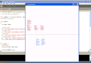
Our mockups were created in Illustrator, except the slideshow prototype, which was created in PowerPoint. For our future work, we plan to store the timeline data in a MySQL database and use the Processing library available at http://www.bezier.de/mysql/ to extract the timeline data from the database, which can be manipulated for display using Processing. Links to examples of code we've created so far:
• example 1
• example 2
References
[1] Stephen Few. Show Me the Number.link
[2] Bay-Wei Chang, David Ungar. Animation: From Cartoons to the User Interface. UIST 1993. link
Links
• slides from the presentation we gave on 11.23.05
• a prototype of the slideshow feature of our visualization
• the wiki we're using as a tool to develop the visualization
• our user study script