Assignment: Thoughtless Acts
Collaborators:
Skateboarders

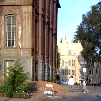
Outside of South Hall, there's a sloped area of dirt that skateboarders are using as a ramp to do stunts. I really like this scene, because I feel like the goal of skateboarding is to try and integrate one's immediate environment into the art itself. Skateboarders are naturally good at leveraging their surroundings to do stunts and tricks.
As far as design solutions go, I don't necessarily think there's anything to solve here. The skateboarders are simply taking advantage of a natural ramp, but if it becomes a problem, I bet that either (1) adding some beautiful landscaping on the side of South Hall or (2) making a skate park nearby would be potential options.
Gum on the Trash

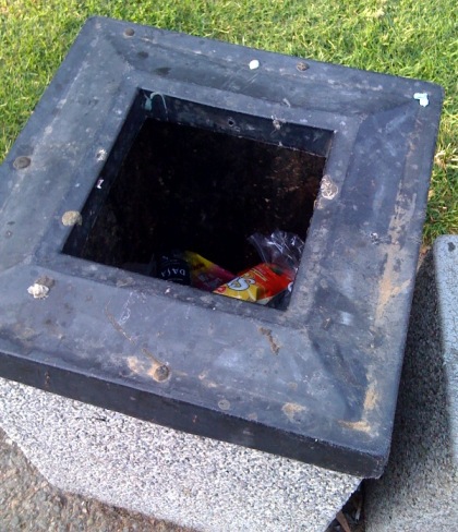
In Sproul Plaza, there are many trash cans, each with its own character. The perimeter of this particular trash can is covered in gum. This isn't really unusual or anything, but is worth noting.
It's possible that this gum-on-the-perimeter phenomenon is simply a function of laziness, but perhaps there could be some sort of place, other than on the top of the trash can receptacle, where people could stick their gum?
Recycling Confusion

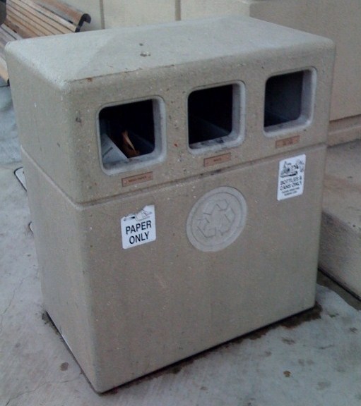
I found this trash / recycling receptacle to be the candidate in most need of a re-design. First, I observed a man (1) crush a can (which I believe he intended to recycle, and (2) put it in the trash slot (center) rather than in the can slot (left). This is a real recycling tragedy, because even though there was actually an intent to recycle, the can went in the trash.
I can think of a number of design features that could make this trash / recycling receptacle more intuitive. Some ideas:
- Encode the openings of each bucket (paper, trash, and cans/bottles) with a different shape (to give the user a cue as to which type of object is expected). So, a paper / cardboard bucket opening could be more like a rectangular slot, and a can / bottle bucket opening could look more circular.
- Include icons below each opening which indicate the type of object expected.
- Remove the "recycle arrows" icon from underneath the "trash" opening...I think the icon might inadvertently indicate to the user that the center opening corresponds to a recycle bucket.
Phone

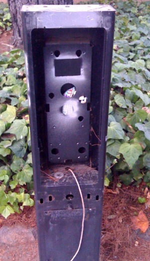
I found this abandoned pay phone outside of the Hearst Gym. People had stuffed their trash into the metal skeleton of the frame. I believe that the design solution would simply be to remove it, or replace it with a trash can.
