Infovis Final Project Writeup, Spring 2004
Lauren Wilkinson
Team
I worked with the Road Sage team: Mikhail Avrekh, John Han and Sean Savage. I took the team lead on the map visualization work, with my designs being subject to the input and approval of my teammates.
Background: The Road Sage Project
Road Sage was conceptualized as a final Masters project. The system allows users to obtain road traffic forecasts for a specified time of travel. Caltrans road sensors placed along highways throughout the Bay Area provide a rich source of up-to-the-minute traffic information. Using an extensive database of historical highway speeds, Road Sage provides traffic congestion-aware routing and estimated travel time forecasts. Optimal route information is then visually displayed to users utilizing web-based geographic information system (GIS) tools.
Project Goals
The Road Sage map visualization is primarily targeted toward presentation.
Specifically, my goal was to develop an interactive traffic map of the Bay Area,
to graphically present the following information:
·
optimal routes based on traffic; and
·
freeway speeds along alternative routes.
Furthermore, the Road Sage system offers both live and predictive traffic data based on historical patterns. One critical goal in the visualization was to clearly differentiate between the real-time and predictive views.
Additionally, the predicted traffic map was designed to be interactive based on time of travel. Bay Area drivers have an intuitive knowledge that traffic predictively differs based on time and day; for example, Monday morning traffic predictably differs from late night traffic. We wanted to build a map that would allow users to interactively view comparative traffic patterns for different times. This allows the user to answer questions like What kind of traffic can I typically expect along 880 on Monday mornings at 9 AM? and Is the traffic better if I leave at 10 AM instead?.
The map visualization was designed to support the following tasks:
· exploring average traffic for a specified trip and
travel time;
· checking current traffic for a
specified trip;
· choosing the best route for a
specified trip and travel time.
Related Work
Routing websites such as Yahoo! Maps and MapQuest provide street maps and driving directions for US cities. Most of the Bay Area drivers we interviewed currently use Yahoo! Maps and MapQuest in their travel planning tasks. Both tools provide well-designed, focus+context visualizations of driving directions. Textual address-to-address directions augment a visual map that highlights the user's entire route. Yahoo! Maps adds the additional focus feature of zooming in on the last few blocks of the trip. In MapQuest, the map appears below the complete printout of directions. In both applications, users can generate driving directions by entering their start and ending addresses in several forms: street address, intersection, zip code or city. The flexibility of the tool allows users to quickly generate accurate and customized directions.
Live traffic websites provide online maps of current traffic information.
SF Bay Traffic.com provides live textual traffic updates on
the front page. To view more information, the user rolls his/her mouse over the
icons. This website also provides a map of real-time traffic data. Mouse
rollovers provide detailed information about each event.
Events are indicated
as follows:
- Green dots along a freeway indicate low traffic;
- Red dots indicate slow-moving traffic;
- "!"
icons indicate skid hazards;
- "X" icons indicate emergency road
obstructions;
- Highway icons indicate disabled vehicle
obstructions;
- Automobile icons indicate accidents.
KTVU.com Bay Area Traffic Watch provides an online map for
live traffic incident reports and freeway speeds. Mouse rollovers provide
details. Information is visualized on the map as follows:
-
Circles along each major highway indicate speeds. The color of each circle
differentiates speeds. Green is fastest and red is slowest.
-
Diamonds indicate accidents. The color of each diamond represents the severity
of the accident, where red is severe; orange is moderate and yellow is
minor.
Differentiating Features
My project differentiates itself
from the competition with two key advantages:
(1)
Estimated Travel Times with Traffic Intelligence. None of the
current
working applications for travel planning factor traffic into travel
time estimates. Many of our interviewees, for example, expressed frustration
with MapQuest and Yahoo! Maps for always having inaccurate travel times.
(2) Predictive Traffic Intelligence. Though applications like KTVU.com, SF Bay Traffic.com and SF Gate provided real-time traffic data, none of the current applications go the next step of analyzing historical traffic patterns to predict future traffic. Our application has the advantage of drawing upon a large set of archived traffic data to extract typical traffic patterns, so the person who wants to drive to an interview Tuesday 10AM in San Jose can plan ahead of time for what the traffic will typically be like along that route.
Road Sage Data
Road Sage draws upon a long history of speed data through Bay Area freeways. The traffic data feed comes from Caltrans and their network of sensors installed throughout Bay Area highways. Caltrans data streams are stored in a database operated by the Freeway Performance Measurement System, PeMS. The PeMS project is conducted by the Department of Electrical Engineering and Computer Sciences at Berkeley. Our routing middleware directly accesses the PeMS database to produce traffic-intelligent routing for a specified trip and a particular time of day.
We processed this large source of data to extract typical traffic patterns based on time of day and day of week. We averaged the data at a fine granularity to obtain typical traffic speeds for every 5 minute period of every day. Thus we were able to provide Bay Area drivers with an accurate picture of typical traffic along their route for any given time of travel. This capability to extract typical traffic patterns significantly differentiates Road Sage from currently available online traffic systems, all of which solely rely on live traffic conditions.
The backend and middleware and back ends were designed along the lines of a standard three-tier structure: We used Oracle 9i as the database to store the speed and travel time data. The routing middle layer was implemented in Java, by developing an internal network representation of the Bay Area freeways and then running Dijkstras algorithm, weighting the edges (stretches of highways) by travel time. Dijkstras is a standard algorithm for computing shortest paths based on specified criteria.
Current Implementation
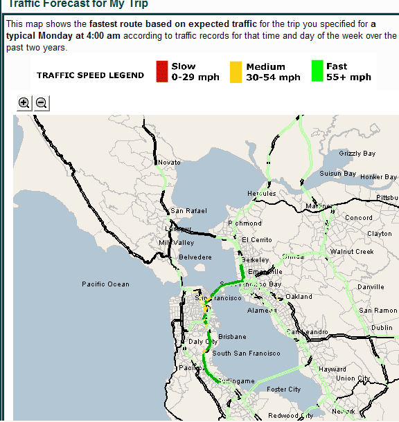
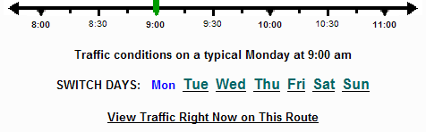
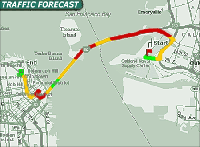
Road Sage allows Bay Area drivers to specify a trip and a time of intended departure or arrival; the system will then calculate the optimal route and estimated travel time based on traffic for that time and day. The optimal route is calculated using typical traffic patterns extracted from historical data. This route is then visualized in bold on the interactive map (Figure 1). All freeways are color-coded by traffic speed. Those freeways that are not along the optimal route are also colored in a lighter font, so that users can visually compare alternate paths. A zoom feature allows users to compare routes more closely. A time slider appearing beneath the predicted traffic map allows the user to quickly explore typical traffic for alternate travel times (Figure 2). Furthermore, a day selector allows the user to change their day of travel.
Figure 1. Visualization of an optimal route based on traffic.
Figure 2. The Road Sage time slider.
The map visualization is targeted toward the presentation of quantitative attributes, specifically typical speed data for various times of day and days of the week. Color is applied to immediately visualize the difference between speeds: green is used for fast speeds (55 mph and higher); yellow for medium speeds (30-54 mph); and red for slow speeds (0-29 mph). Portions of the freeway that do not have speed detectors are colored in black. This color scheme successfully applies the visualization principle that colors can be effectively used to recognize distinctions. The limited palette of three colors successfully applies Ware's principle that only a small number of colors can be rapidly perceived. Furthermore, the color choices of green, yellow and red are designed to model the stop light metaphor familiar to all drivers. Unfortunately, the palette is currently inaccessible to color-blind users who cannot differentiate between red and green. For future work, we would want to offer a different palette option for color-blind users.
Freeways are visualized as parallel lines in the map, such that the user can view speed data for both directions of a given freeway.
The time slider offers an accessible, interactive view of ordinal data, in the sense that the typical traffic map for the Bay Area is inherent "ordered" by time of day and day of the week. The slider allows users to seamlessly visualize traffic as it changes over time.
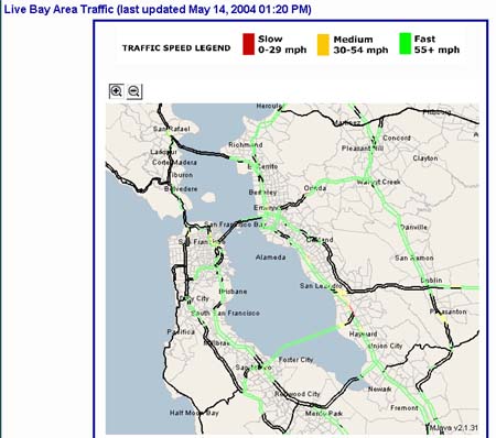
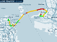
A live traffic thumbnail allows users to toggle from the predicted traffic map to a view of live traffic conditions (Figure 3). This map refreshes at 15-minute intervals. Again, freeways are color-coded by speeds. This feature allows drivers to immediately see if live traffic anomalies differ from typical trends.
Figure 3. Live traffic map visualization.
A series of usability tests on our mapping prototypes indicated that the
distinction between typical traffic and live traffic map views was unclear. Sean
Savage and I developed several prototypes for more clearly differentiating the
typical and live traffic map views. We prototyped an animated map for live
traffic (Figure 4), compared to a static map for typical traffic. Animation,
being defined as "the quality or condition of being alive, active, spirited, or
vigorous" (dictionary.com), is a perfect visual tool for bringing attention to
live traffic. Additionally, we prototyped differentiating features such as
distinct title banners and background colors for typical vs. live traffic views
(Figure 5). Unfortunately the TimeMap open source mapping applet has limitations
in its functionality, such that neither animation nor variant background colors
were possible for the real system. For a production system, we would want to use
a different tool.
Figure 4. Prototype for an animated live traffic map
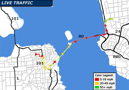
Figure 5. Prototype for differentiated background and title bars for live vs. static traffic
Insights Provided by the Visualization
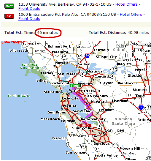
Strikingly, the visualization of optimal routes based on traffic immediately illustrates the shortest route distance-wise is not always optimal. During our needs assessment phase, we interviewed 20 Bay Area drivers, who told us that the "optimal" route is always the fastest route. Systems like MapQuest suggest routes based on distance; however, a comparative analysis of a MapQuest recommended route and a Road Sage traffic-intelligent route proves that routing based on distance does not always produce the fastest route. To show this, we entered a trip from Berkeley to Palo Alto into the MapQuest system, which routed us down 880 and over the Dumbarton Bridge, as shown in Figure 6. MapQuest suggested that this route would take 46 minutes.
Figure 6. MapQuest's recommended route from Berkeley to Palo Alto
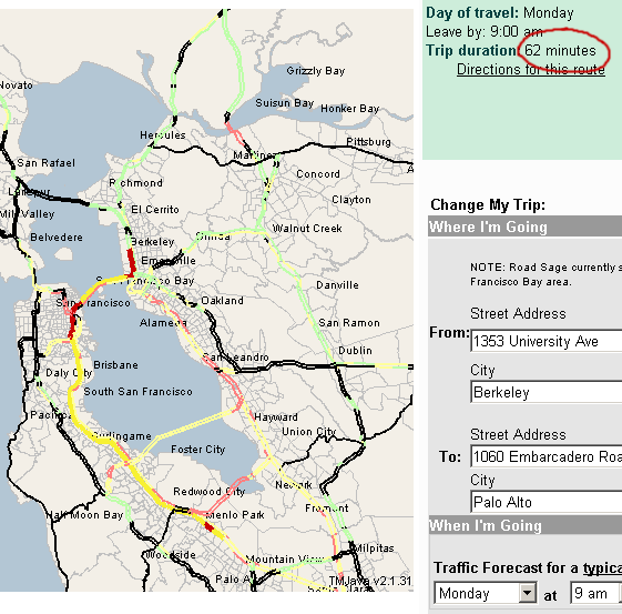
However, any seasoned Bay Area driver intuitively knows that driving from Berkeley to Palo Alto will take longer than 46 minutes, especially during rush hour. We entered the same trip in the Road Sage system, with a departure time of Monday at 9 AM, morning rush hour. The traffic-based visualization suggests a different route than MapQuest. Rather than going down 880, it's actually faster to drive across the Bay Bridge and down 101 when traffic is taken into consideration. Even though the route through 101 is slightly longer distance-wise, it's the optimal route time-wise due to bad traffic on 880. The Road Sage visualization in Figure 7 immediately demonstrates that bad traffic conditions (indicated by red) on 880 and the Dumbarton bridge render 101 the faster route to take. Furthermore, the Road Sage travel time of 62 minutes is much more believable than the 46 minutes estimated by MapQuest, particularly at rush hour.
Figure 7. Road Sage Route from Berkeley to Palo Alto during Monday rush hour
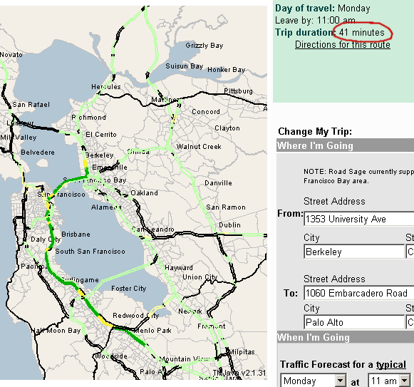
When we moved the time slider to 11 AM, we retrieved a non-rush-hour traffic picture along the route. The traffic-based routing algorithm still suggests taking 101 rather than 880. A visual comparison of the two routes is slightly ambiguous, since both routes are mostly colored green with some stretches of yellow. Road Sage provides an estimated trip duration of 41 minutes, beating MapQuest's estimate of 46 minutes and encouraging the user to try this alternate route.
Figure 8. Road Sage Route from Berkeley to Palo Alto on Monday after rush hour
Thus, we conclude that visualizing optimal routes by traffic, particularly in a side-by-side comparison with optimal routes by distance, effectively proves the shortest path by distance is not always the fastest! We truly believe that there is a large, unfulfilled need to integrate traffic with routing.
Tools Used
The map was generated by developing a vector-based map representation of the Bay Area freeways using a geographic information system (GIS) development tool known as ArcView. I obtained a digitized map of the Bay Area freeways and background contours. I manually annotated this digital map file (in GIS terms: a shapefile) so that the digitized freeway segments would match the routing middlewares internal network structure defined for the routing algorithm. Once this was complete, the middleware code could dynamically generate a new shapefile every time a new optimal route was computed. The shapefile is embedded into a web page via a Java applet, using the open-source TimeMap Java software. TimeMap was developed as part of the Electronic Cultural Atlas Initiative (ECAI) project, located here at UC Berkeley. Finally, to integrate the time dimension with the interactive map, we built a slider using GIF files and PHP code that would dynamically instantiate a call to the Java middleware to generate a new map for the selected time.
Though TimeMap enabled a quick method for embedding a vector-based map into a
web page, it offered severe limitations that we would want to avoid for a
production release of Road Sage. Such limitations include the inability to
include animation or custom labeling (like freeway symbols to label the
freeways). We have experimented with other GIS tools, such as various software
packages that generate graphics (e.g. GIF files) from GIS shapefiles, but all of
these either did not meet our needs or were too expensive to be appropriate for
a zero-budget Masters project.