Philip Buonadonna, Jason Hill
{philipb,jhill}@cs.berkeley.edu
Recent advances in micro-electronics and machine (MEMS) technology has enabled a new class of sensor technology. These sensing devices combine the power of larger sensors but in a physical form-factor of only a few square centimeters to microscopic size. Dubbed "networked sensors"[1], they typically have an embedded processor capable of a few million instructions per second (MIPS), a limited amount of data storage (i.e. 4KB or less), a small power source, a short range wireless communication terminal (i.e. radio or optical) and an array of environmental sensors. While the functionality of an individual networked sensor is limited, a collection of them working in concert could achieve a wide variety of high-level tasks not possible with conventional sensing methods. Examples include fine-grained temperature gradient detection, wireless radio transmission and fading pattern analysis and cell-level medical diagnosis.
As yet, there are still many hurdles to overcome to realize the full capability of networked sensors. An obvious category of problems concerns the technology and operational constraints of these devices. The processors, communication transceivers and power sources needed to realize a microscopic sensor are a few of these. Another classes of problems are those which are beyond just the sensors themselves. One major area here concerns interpretation of data and management. A large sensor network has the ability to create voluminous amounts of data in near real time. Human interpretation of this data will require sophisticated tools. Using scientific visualization techniques can help in many aspects of this. However, in addition to the scientific aspects are the necessary information tasks related to managing a networked sensor system.
A key aspect of efficiently managing a system is the rapid and accurate interpretation of data from the system. Data used for management consists of many types, ordinal, interval, etc., and may have complex interrelationships. In a networked sensor array, this dataset includes such elements the sensor's name or ID, location, connectivity information and battery status. While some management tasks can be automated, an effective user interface for control of the system is also important.
Information visualization techniques are an interesting space on which to base a possible interface. The tools used for information visualization are capable of examine large datasets with many dimensions over a wide variety of data types. The problem wee seek to study is what facets of information visualization could be applicable to networked sensor management. The specific management issues we tackle are topology and communication path discovery, individual sensor status and historical data review. Through a Java based prototype, we apply the visualization techniques of a 2-D geographic layout, parallel coordinates and data drill-down techniques to investigate these issues. We also examine the use of slider bars as a selection mechanism for analyzing a window of time in a data set. Our ultimate goal was to build a tool that could be used by networked sensor developers in both the research and industrial communities.
The rest of this report is organized as follows.Section 2 discusses the particular management issues we are examining. Section 3 outlines our application of visualization techniques to these issues using a prototype tool. Section 4 presents initial user group feedback on the tool. In the last section, we conclude with summary remarks..
In this section, we elaborate on the management issues related to networked sensors that we investigate in this project. The objective here is to develop a basis for what problems could be aided by information visualization.
The first management issue concerns topology discovery. One of the most basic questions that must be answered when managing a sensor network is "Where are they?" Closely coupled with physical location are the communication pathways through the network. Understanding these pathways helps in diagnosing information flow efficiency and possible problems. In a sensor network, topology and communication pathway discovery is complicated by certain factors. The first is the dynamic nature of the environment. Sensor networks may have highly mobile nodes whose inter-connectivity varies widely over time. While the network may automatically maintain its connectivity statistics, a method of illustrating the nature of the changes would be valuable. Another factor surrounds the technology constraints of the sensors. Determining sensor location could be done through external means such as GPS or other geo-location system at the expense additional processing and power resources on the sensor. Thus we explore the use of passive RF signal strength measurement as a metric for topology determination. Signal strength determines connectivity and approximates line-of-sight distance between sensors and can be measured without significant impact on the sensor resources. This data could be processed automatically to achieve a basic, 2 dimensional relative position visualization or it could be analyzed manually through additional tools. We explore both alternatives and ways to combine key aspects of both into a single tool.
The ability to monitor an individual sensor node or subset of nodes in a network forms another management issue. The applications here are numerous. Examples include system diagnostics and point-of-interest data monitoring. Two aspects that are important to monitoring are the ability to easily locate a node/group of nodes and then effectively displaying the desired data. We address both points in this project.
The last management issue we explore is that of historical data selection and analysis. In a sensor network, being able to determine what happened in the past is just as important as present-tense monitoring. Being able to select a time window and replay the data stream from the sensor array would benefit both the system manager and the end user of the sensor data. Thus, we examine possible methods to do historical browsing and extraction of data using visualization tools.
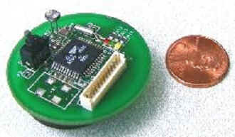
For this project, we examine the use of 2-D geographic layout, parallel coordinates, data drill-down and slider-bar interfaces as techniques to address networked sensor management issues. The evaluation platform was a Java based prototype that combined all of these components into a single program. The tool consists of approximately 1500 lines of code and can be applied to either a data-trace (i.e. networked sensor data stored in a file) or to real-time data from an active network. For this project, the test an evaluation data was in the form of a trace-file collected from a sensor network of WeC sensors (Figure 1) over a 48 hour period. In this section, we discuss how the visualization techniques were applied to management of the sensor network. Where applicable, screenshots of the tool are included to highlight ideas.
Figure 1: The weC prototype sensor.
2-D Geographic Layout
The 2-D geographic layout, is a natural starting point for management of a sensor network. Here, the obvious application to management is an instantaneous visual approximation of a sensor network topology. Additionally, the 2-D layout allows for sensor-status, communication paths and sensor data to be combined into a single visualization. Figure 2 illustrates an example visualization from our prototype tool using this technique.
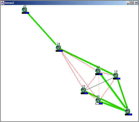
Figure 2: 2-D geographic layout of a sensor network. Red lines indicate positive connectivity, while the green overlay is the principle communication route. The rectangles below a sensor icon displays light/temperature in the left/right box.
The tool automatically generates the layout as follows. As data packets from individual sensors arrive from the network, an icon representing that sensor node is plotted on the graph. The icon for an individual sensor is persistent unless no data from that sensor is received for a certain timeout period (discussed later). Subsequent packets from the same node within the timeout serve only to update information and reset the timer. In our system, packets arrive from the network through a single sensor node designated the base-station node. This is generally the first node plotted and becomes the root of the graph. The relative position between multiple nodes is determined using a dynamic push-pull algorithm. All nodes exert a 'push' force on each other that is inversely proportional to their distance from each other. This has the tendency to spread the nodes apart from each other towards the edge of the frame. Counteracting the 'push' dynamic is a 'pull' dynamic that is proportional to the measured signal strength between the two nodes as relayed in the data packet. Two nodes with mutual RF connectivity, as represented by a red edge between them, will attract until the 'push' force equals the 'pull' force and they reach a stable distance state from each other. When a connectivity update is received, the 'pull' force will either increase or decrease, thus changing the distance between the nodes. This algorithm is repeatedly computed for all discovered nodes to achieve a graph topology that maintains this pair wise stability. It essentially is a solution mechanism for a system of equations. However, this particular solution method behaves better in the presence of error in the connectivity data.
To enhance the 2-D interface, additional information is plotted that is useful from a management perspective. The green highlighted edge between two nodes represents the primary communication path (i.e. the route that packets flow to reach the base-station sensor). Coupled with each sensor icon is a graphic displaying coarse information from the sensors. In Figure 2, the sensor data include measured light intensity and temperature. Including basic sensor information serves two useful purposes. First, it helps answer the immediate question, "Is the sensor working?" Second, it can be used as a verification mechanism for location. Sensors within close proximity to each other may have similar sensor readings as opposed to sensors that are relatively distant.
Parallel Coordinates
While the 2-D layout automatically generates a geographic topology, it is also useful to have a mechanism to manually adjust the layout if necessary. We explore the use of the parallel coordinates technique[2] as a method to provide connectivity detail in a manner that allows a users to interactively tune a particular topology. Our use of parallel coordinates, in this case, is modified slightly for the task. In a standard parallel coordinates tool, each axis represents a dimension of the data set. Rows of data are then plotted across each dimension to produce a series of traces. Sets of traces can then be selected, or 'brushed', to highlight trends and correlations. Sensor network connectivity data does not perfectly fit the model for straightforward parallel coordinates application. This data, if laid out in a table, would appear much like a distance table (Figure 3) for a map. The rows and columns of the table represent the possible sensor and the intersection of a column/row represents the signal strength between those nodes. Thus each row of data is correlated to a particular column.
| Node A | Node B | Node C | |
| Node A | 10 | 7 | 1 |
| Node B | 7 | 10 | 5 |
| Node C | 1 | 5 | 10 |
Figure 3: Example connectivity data table. The intersection of a row & column represents the connectivity between those nodes. (10 = highest, 0 = lowest)
This data is mapped to a parallel coordinates as follows. The horizontal columns become the coordinate dimensions of the data (i.e. each node is assigned an axis). The rows of connectivity information are then plotted across the dimensions as would be done normally. As an enhancement, we color coordinate the dimensions and the data rows. Each dimension (node) is assigned a color and it's corresponding row trace is given the same color. The resultant graph (Figure 4) provides a two pieces of information. For a given axis (node), one can determine the connectivity to all other nodes. The same determination can be made by following a particular trace across all dimensions. Between any two dimensions, a particular trace represent the relative connectivity of each of two nodes to a third node (i.e. how well node A connects to node C vs. how node B connects to node C).
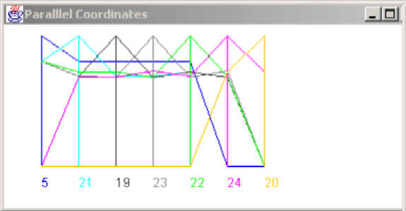
Figure 4: Parallel coordinates view of connectivity for the topology in Figure 2.Note that traces for sensors 21,19 and 23 are cluster towards the top and or bottom, indicating that these devices are close together. Sensors 24 and 20 have criss-crossed traces, indicating these motes are set apart from the rest.
As a further enhancement, we couple the modified parallel axis tool with the 2-D layout in an interactive fashion. As nodes are plotted on the 2-D layout, the parallel coordinates representation is simultaneously update. The organization of the axes in the parallel coordinates is determined by the distance to a root node as pictured on the 2-D layout. The user can select and move nodes in the 2-D layout and then evaluate their placement in the parallel visualization. If a group of nodes are properly placed together, their traces will appear clustered at the top and bottom of a collection of axes. An out of place node in the cluster will have traces that criss-cross between the high a low points of the axes. The effect produces an immediate intuition about nodes that are physically close together without having to manually parse a connectivity table.
Data Drill Down
Another feature that was incorporated into the 2-D layout was data drill down for an individual sensor node. While the icon graphics provide a rough visualization of sensor data, it is also valuable to be able to 'zoom' in for more detailed information. This is a natural application for data drill down which allows for navigating through a hierarchy of detail. In our prototype, double-clicking on any node opens up a new window that provides detailed information (Figure 5). It includes the node name, the name of it's parent in the routing tree and packet statistics. It also includes present sensor information historical graph of sensor data. The graph is useful for identifying trends such as a malfunctioning sensor or corrupted data.

Figure 5: A drill-down view for sensor 20.
Slider Bar Interface
Slider bar interfaces were added to the tool for two purposes. The first was a simple slider collection to control the dynamic behavior of the 2-D layout (Figure 6). One modifiable parameter is the timeout values associated with nodes and edges. For example, when packets are not received from an individual node for a certain duration, it is removed from the visualization. A similar behavior occurs for edge timeouts. Another modifiable parameters is the push-pull stability of the auto-layout function. Providing an interface to adjust timeouts allows the system manager to tune the visualization to the applicable environment of the network. A highly dynamic network would be better visualized using shorter timeouts and vice versa for a static network.
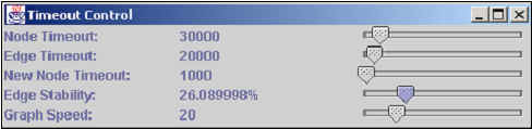
Figure 6: 2-D layout parameter manipulation panel.
The second slider interface was an emulation of a double-slider bar (adopted from the Spotfire tool [4]) for historical data review (Figure 7). A checkbox on the tool permits the manager to halt in-situ monitoring and review collected data. Moving the top slider allows selection of the starting point while the bottom slider selects the width of the excerpt window to replay. A graphic beneath the sliders helps visualize the location and width of the window with respect to the total amount of data collected. Text supplements the graphic with precise time code information about the data portion selected.
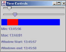
Figure 7: Historical data review panel. The top and bottom sliders emulate a 'double-slider' interface that permits browsing of a fixed window across the entire data set. The upper slide controls the start point while the lower controls the window width.
In this section, we present highlights of user feedback regarding the visualization prototype. The personnel selected for feedback were two individuals involved in related networked sensor projects (the target users for this tool) and one outside person.. The feedback was in the context of how well the visualizations depicted information they needed to know in order to manage the sensors.
In general, the majority of the feedback was positive. Topping the list was the 2-D layout and the ability to drill down. The users found the 2-D layout to be a useful top level management interface providing topology information and coarse sensor information. Drilling down to individual sensors aided diagnostics and tracing the performance/data trends of individual sensors in a manner that was easy to use.
The interviewees also provided critical feedback on what was missing and/or what could be improved with the visualization and prototype tool. Key points included:
- Highlight the nodes on the 2-D layout with the same color on the parallel coordinates: Presently, the only coupling piece of information between the 2-D layout and the parallel coordinates is the name or ID number of the sensor. The users found it somewhat difficult to keep track of information between the parallel coordinates view and the layout. Thus, the recommended that nodes on the 2-D layout be highlighted in some fashion with the same colors as on the parallel coordinates frame.
- Permit real-time data playback: The historical review visualization presently uses an arbitrary time scale to 'replay' the selected data. Users felt that a real-time scale would be useful from a management perspective.
- Integrate command/query functions: Presently, commands send into the sensor network must be done through a separate mechanism. The users suggested that the ability to send commands through the same tool used to visualize data would be a more intuitive method. The effect of the commands could be then immediately seen in the visualization.
- Include the ability to zoom in and out: The 2-D layout only presents a view at a single, preset scale. The ability to zoom in and out would be useful for large sensor networkes. Along these lines, it was suggested that the tool 'greek' clusters of sensors together (e.g. blur the distinct icons into a single symbol as the frame is zoomed out). The effect parallels the drill-down technique: the farther out the view, more of the network can be seen, but with less detail.
As modern computing systems become more complex, the need to integrate advanced information visualization techniques with management functions becomes apparent. Networked sensors are no exception to this trend. In this project, we have explored the application of visualization techniques to sensor management issues of topology discovery, sensor status and historical information review. Using a prototype tool, we implemented a 2-D geographic layout for visualization of a networked sensor topology. We then coupled this interface with a parallel coordinates visualization of connectivity data to assist interpreting sensor topology. We also incorporated data drill down to permit viewing of detailed information about individual sensors. Finally, we implemented a series of slider bar interfaces to permit tuning of the 2-D layout, and to replay historical data over a defined window of time. User feedback as well as our own experience with the tool were positive. While this and other tools may undergo future revisions, we foresee continued use of these visualization methods as an important aspect of the networked sensor project.
[1] Hill, J., Szewczyk, R., Woo, A., Hollar, S., Culler, D., Pister, K., "System architecture directions for networked sensors." Proceedings of the 8th International Conference on Architectural Support for Programming Languages and Operating Systems, Cambridge, MA, 2000
[2] Inselberg, A., "Parallel coordinates for multidimensional displays." Spatial Information Technologies for Remote Sensing Today and Tomorrow. The Ninth William T. Pecora Memorial Remote Sensing Symposium, Silver Spring, MD, 1984, p. 312-324
[3] Spence, R, "Information Visualization." Addison Wesley, 2001.
[4] Spotfire, http://www.spotfire.com