
Figure 1: The main interface. Time slider across the top specifies the current query range, map displays traffic incidents, road sensors, and cameras, and righthand panels display auxiliary information.
Francis Li
Sam Madden
Megan Thomas
UCBerkeley
IS247
Fall 2000
We created an extensible software framework for freeway traffic visualization. While we wanted the system to be usable by the casual commuter, the users we were primarily interested in benefiting were the users with less casual interest in traffic behaviour, traffic engineers and the like.
Our main problem was to design a framework that could integrate data in many formats, from many sources, in a comprehensible fashion, so that the user need not be bothered with the need to explicitly manage and combine multiple data sources and types, but could focus on extracting meaning from the data. We knew we planned to integrate both on-line and offline data, data that was numerical, pictoral, graphical and textual. Our framework would need flexibility at the user level, so that the user could easily view details about whatever they were interested in, and flexibility at the system level, to handle multiple data sources and types.
Our first focus was to visualize the data from the loop detector sensors located underneath the stretch of I-80/I-580 between Gilman and Powell in Berkeley, and to add in other data types and visualizations as they promised to help clarify the traffic behaviour detected by the sensors.
We had two main sources of inspiration when we began our work, books and on-line WWW searches.
From the books we primarily learned that little effort has been put into computer-based traffic vizualization, at least little that could be detected with library catalog searches. [1,2]1 We also learned that traffic engineers are interested in an astonishing breadth of information2 about the communities roads run through and the characteristics of the roads themselves. A system for visualizing a variety of data in an integrated fashion should be very useful to them.
On-line traffic visualizations we found focused strongly on information commuters would find useful, and little else. Basically, they either took the form of a map with the road lines colored to represent some average of the current traffic speed on that road segment, or a map with accidents plotted and the local equivalent of the CHP traffic incident reports listed nearby. None of them provide a notion of time or history, nor do they provide finely detailed information. They served as a baseline to measure our work against.
Sample of Traffic Reporting Sites
We spoke to PATH researcher Dr. Ben Coifman (now a professor at Ohio State) about building a traffic data visualization system and learned that he basically wanted more of what he already had and had little awareness of more complex visualization possibilities. But he wanted his familiar graphs strongly. So if we wanted our tool accepted, we had to facilitate the graphing methods they were already using. We had to give them the familiar ... then seduce them into using new capabilities.
This project was inspired by our access to the sensor data from UCBerkeley's ITS, and the knowledge that no one has done more than basic data visualization work with that data. We also felt that the data would be most useful in context with data about other things that affect traffic.
All of our data, however, could be tied to a combination of a particular location and time. This made the decision to center our user interface around a map easy. That decision made, the rest fell into place.
We decided to build a prototype rather than design a potential system because we were hoping to get users at ITS interested in using our system after the end of the semester. We felt that for convincing real users of the utility of what we designed, a prototype would be far more effective than a series of pictures. In addition, we felt that a prototype would be a more effective tool for demonstrating the viability of our ideas than pictures.
The current visualization, shown in Figure 1, is a map-driven interface, implemented in Java, which allows users to brush over incidents, sensors, and cameras on the map to bring up detailed views of information. The right-hand pane shows a number of readouts for currently selected cameras, sensors, and incidents. We chose to try to integrate several simultaneous views of road conditions into one window because we believe it will enable the user to explore and correlate various events and incidents with detailed road speed and traffic flow graphs. All of the panels in the simulation can be resized to show a more detailed view and can be hidden to make more screen real-estate available for other visualization components.
Figure 1: The main interface. Time slider across the top specifies the current query range, map displays traffic incidents, road sensors, and cameras, and righthand panels display auxiliary information.
The time slider across the top is used to specify the current range of time being displayed: changing the currently selected date fetches a new set of traffic incidents and generates new plots for the sensors being displayed in the righthand panels. The top most panel on the right is an information readout, which contains a key for the traffic sensors and displays summary information for incidents and sensors which the user mouses over. The second righthand panel shows live traffic views from a number of WebCams. The bottom two panels display detailed plots of road information and allow the user to overlap graphs from different dates, lanes, and road sensors.
The dates above the slider updates as the slider is dragged. This feedback makes the interface much more usable. The inclusion of the day of week greatly facilitates comparing one week to another, or the same day across several weeks. The slider moves in 8 hour increments, which allow users to rapidly view interesting times of day. When dragged as far to the right as possible, the slider snaps to the current time of day, which allows casual users to see the current state of the road via cameras and CHP incidents.

Figure 2: The time slider. The date updates as the sliders are dragged.
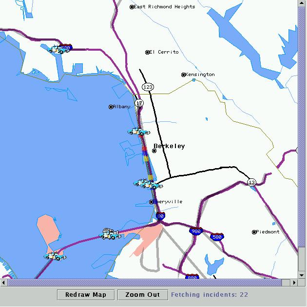
Figure 3: The Map. Incidents, cameras, and road sensors are plotted according to the current time.
Mousing over an incident, web cam, road sensor, or road will display details in the information panel in the upper right. Figure 4 shows an example of what the information readout looks like for a road sensor (a map snapshot and the information panel have been combined in a single graphic in the interest of saving space.)
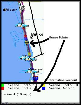
Figure 4: Example: Mousing over an station brings up a string showing the average speed at that station.
Clicking on one of these objects triggers an event which is visible to all panels in the system. Panels may choose events to respond to; for instance, the graph panel responds to a click on a road sensor, but not to a click on an incident. In the current implementation, clicking on an incident or a road causes nothing to happen. Clicking on a camera loads a view of the road at the most recent time selected by the time slider, if such an image is available. Clicking on a road sensor causes a graph of the road speed and traffic volume to be displayed for the currently selected time range.
Incidents are stored in the Telegraph database system, which polls the CHP Website every few minutes for incidents and stores them. This allows both near-real-time and historical events queries to be run. Incidents are mapped to longitude and latitude via simple text-matching for interstate and exit names. Latitudes and longitudes were determined by using TerraServer to look at images of the Bay Area and then manually estimate the coordinates of freeway exits.
The colors for the road sensors are determined by taking the average speed across all lanes of traffic at each sensor during the time period selected by the user. Obviously, this is a very-coarse grain summary of traffic conditions which does not convey much information about overall road conditions -- see our Visualization Ideas section for ideas about how to improve this aspect of the visualization. Road sensor data is stored in a Microsoft SQL server database (the Telegraph Server is not yet high performance enough to be able to perform the necessary aggregate queries over several hundred megabytes of data.)
The map implementation is oriented towards flexibility. Additional geographic data points, such as information about hospitals, public transportation, public events, or additional road sensors can be easily added. Furthermore, additional display panels can easily interface to user-inputs on the map -- all they have to do is register to listen to map events and inputs will be made available to them.
The two panels at the bottom of the right hand side of the display give detailed graphs of the activity over road sensors. Figure 5 shows an example of speed and volume plots for the week beginning 6/12/00. The top of each graph is labelled with the data set, station, and most recent date plotted. The lane popup allows the lane within the current station to be selected. Lanes are labeled with their direction and some identifying information (e.g. Fast Lane, HOV lane). The key to the right identifies the data-set in the event that multiple data sets are plotted on a single graph (see below). The x axis is labeled with hours from the beginning of the time range. We chose to use relative hours rather than absolute dates so that two data sets could be compared without placing multiple sets of labels below the X-axis. See the Visualization Ideas section for ideas about how to improve our labeling of graphs. The graphs can be zoomed into by selecting a region of interest. When in their default (unzoomed) view, lines from the top and bottom graphs line up: looking at Figure 5, one can see that slow points in the road correspond fairly well with extended periods of high volume.
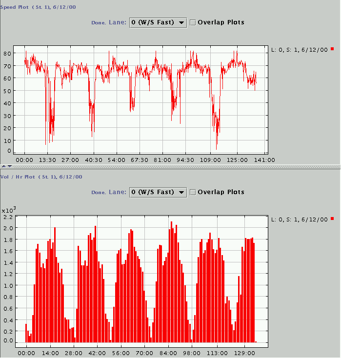
Figure 5: Example: Speed and volume plots for the week beginning 6/12/00, lane 0 at Station 1.
The "Overlap Plots" button allows additional data sets to be plotted over the current data set. Figure 6 shows the three weeks beginning 6/12, 6/19/, and 6/26 plotted on one axis, with a few annotations. Some trends are immediately obvious, even at this high level view -- for instance, Friday afternoon is regularly worse than any other afternoon, although 5PM is always a bad time to be on the road. A few spikes occur which seem out of the ordinary: for instance, the divot in the speed plot for the 6/12 (red) week on Monday evening indicates that something out of the ordinary probably happened on the road at that time. By looking at the volume plot, we see that it appears that volume was slightly higher than usual during this time, but not so much higher that traffic should have fallen off this much. Similarly, we se a dent in the 6/19 (blue) line on Friday night, which also can't be explained by volume. Although not shown here, these aberrations are evident across all lanes, indicating that they are probably caused by some external event (e.g. an accident or construction). The static nature of this document does not do these visualizations justice -- it is very nice to be able to dynamically replot and zoom into the data.
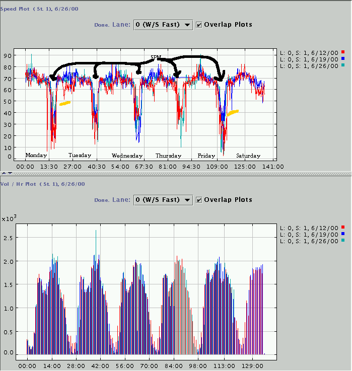
Figure 6: Example: Speed and volume plots for three weeks, lane 0 at Station 1.
Figure 7 shows a speed plot for Sensor 5 (University Ave) on westbound I-80 on Wednesday, 11/29. Mouse is over the vehicle fire near Emeryville which occurred at 5:44 AM. Notice that the graphs shows a substantial flow dip just before 6am corresponding to the fire, followed by a rapid recovery and then a rapid fall off just after 6am corresponding to the beginning of morning rush hour.
It is this sort of incident to traffic flow correlation, coupled with live traffic views, that we believe will make our system most useful to traffic engineers. Unfortunately, we were only able to obtain a limited sample of recent sensor data, so we were not able to do other correlations than the one presented here.
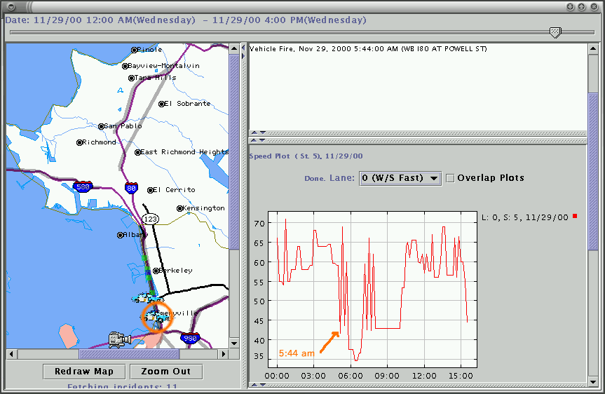
Figure 7: Example: Speed plot for Sensor 5 (University Ave) on WB I-80 on Wednesday, 11/29. Mouse is over the vehicle fire near Emeryville which occurred at 5:44 AM.
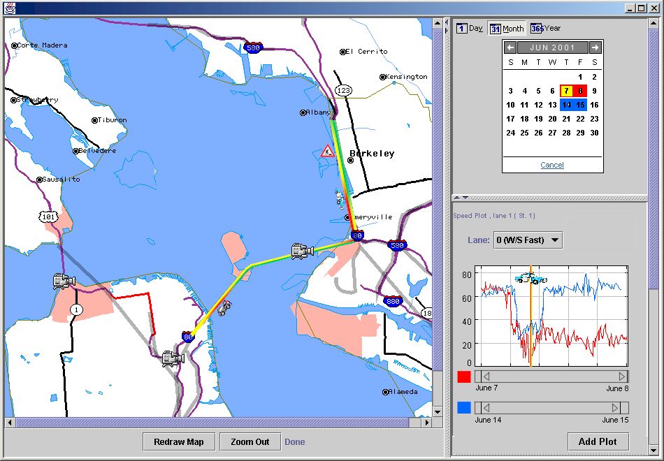
Figure 8: Hypothetical screen shot demonstrating visualization ideas developed but not implemented.
Figure 8 shows some of the ideas we would have liked to implement. The map incorporates the semantic zoom on roadways with lane by lane depiction of traffic speed, color-coded. (Green = go fast.) The icons for traffic incidents are tilted to point in the direction of the traffic on the side of the freeway the incidents occurred on. In addition, different icons are used for different types of traffic incidents - ambulance for injury accident, police car for unspecified incident, stick figure for pedestrian on the roadway, etc.
In the upper left is an alternative to the time slider, which would allow the selection of a week (horizontal selection), or simply of all Fridays (vertical selection). The buttons at the top allow one to choose whether to look at a single day on an hour by hour basis, a month, or a year.
In the lower right is an example of a more sophisticated graphing interface. The bars below the graph are tied to the lines on the graph, they control the width of the lines so that sensor data over different time ranges can be clearly labeled and compared; the bars can also be used to expand and contract the lengths of the lines. They can not be used to define the ranges of time over which the data is graphed; that must be done with the time slider. The vertical bar marks the time on the red line that a traffic incident selected by the user from the map occurred.
We gave a demo of our system to Randall Cayford at the UCBerkeley Institute of Transportation Studies on Monday, December 11, 2000.
He particularly liked the lane by lane graphing of results from loop detector sensors for any span of time in the data set; his system can currently only graph averages over a one day period. CalTrans people have asked him for both the ability to graph more than one day of data, and the ability to graph lane by lane data, both of which we provide.
He also liked our coloring of the loop detector sensors with different colors based on the average speed of traffic over the selected time span at that sensor. Other CalTrans people have expressed interest in data vizualizations at precisely that level of detail.
In addition to what we currently do, he asked about the possibility of making it easy to graph HOV (High-Occupancy Vehicle) lane behaviour vs. an average of all-non-HOV lanes behaviour. He was also interested in us including density/speed contour maps like those available here.3 Both of these additions are fairly trivial additions to our current capabilities.4
Mr. Cayford said he is definitely interested in getting our code on-line, so it would be easily accessible to CalTrans and him. He also told us that we can probably get access to data from all of the functioning CalTrans road sensors in the Bay Area sometime soon, which would definitely make our visualization much more comprehensive and useful.
We focused on the implementation of a viable, demonstratable system, and we succeeded. We were able to demonstrate our prototype to a user well enough that he would like to integrate it into a WWW site he is building.
We do regret that we were not able to get sensor data that overlapped the traffic incident data we collected, so we were not able to perform any traffic analysis ourselves in order to have snappy traffic trivia for our presentation or this paper.
We did observe that, with data visualization projects, there is no difficulty thinking up visualization ideas. (Rather the reverse.) Separating good ideas from dubious, however, is more difficult. User testing is probably the best way to accomplish this.
Books
WWW sites
We are all agreed that it is fine if this project report is made public.
EDA assigments:
What each of us did:
And static data examples:
12/13/2000