
Figure 1: Furi Gnutella Net Screen (click for larger image)
gnuTellaVision:
Real Time Visualization
of a Peer to Peer Network
Rachna Dhamija, Danyel Fisher, Ka-Ping Yee
1.1 Motivation
The goal of our project is to create an interface to visualize peer to peer networks in real time. We chose to visualize Gnutella, a popular file sharing network [1]. Our challenge is to convey a comprehensive picture of the distributed gnutella nodes, messages and the constantly changing network state.
The specific goals of our visualization are threefold:
1) to help users explore the network and obtain information about: individual nodes (IP address, connection speed, files offered, reliability, percent of requests answered, node behavior over time), messages (paths that searches and replies take), the network as a whole (topology, connectedness, growth, performance) and the content that is available on the network.
2) to demonstrate how Gnutella works. Our visualization may be useful to end users in demonstrating how the network works and what effects their actions have. For example, users may ask: How many nodes am I connected to? What is the path that my search queries take? What happens when I adjust certain parameters, such as the breadth of my search or the number of nodes that can connect to me?
3) to help users enhance their search performance by identifying files they might be interested in, finding parts of the network that perform well and avoiding those parts of the network that do not.
1.2 Overview of Gnutella
The Gnutella protocol itself consists of five types of messages: ping, pong, query, query reply, and push. A ping message is used to discover new nodes on the network. A pong message is sent as a reply to a ping and provides information on a network node, including IP address, port number, and number of files shared. A query message is used to search for files shared by other nodes on the network; it contains a query string and a minimum requested link speed. A query reply message contains a list of one or more files which match a given query, the size of each file, and the link speed of the responding node. A push message is used to upload file to clients behind a firewall who can not download files themselves. More details on the gnutella protocol can be found in [2].
We implemented a Gnutella client in Python to collect network data. Using this client, we are able to send Gnutella pings and queries to other nodes and to monitor and log all messages that are sent through us by other nodes (search queries, search responses, pings and pongs).
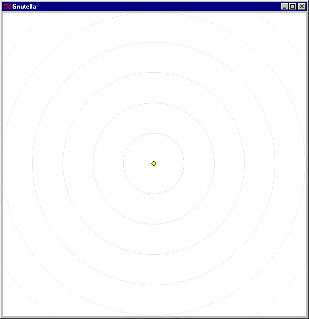
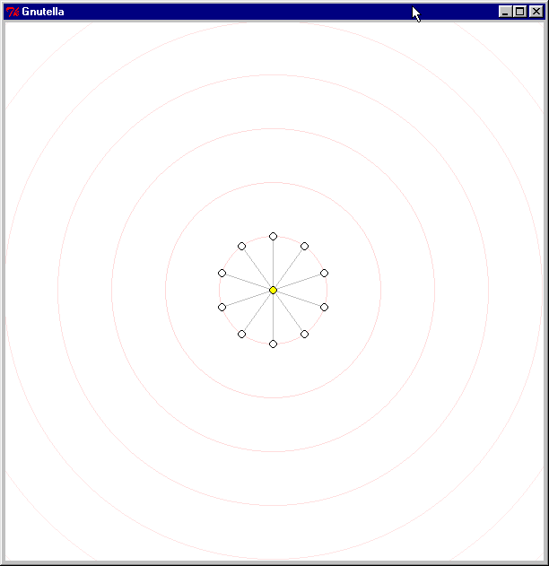
2.1 Gnutella interfaces: There are a large number of clients and interfaces available to Gnutella users. The Furi Gnutella client provides a network status screen that gives users information about the nodes they are connected to (see Figure 1).
Figure 1: Furi Gnutella Net Screen (click for larger image)

Figure 2: Clip2 Gnutella network map (click for larger image)
2.2 Gnutella network maps: We are aware of two efforts to map the structure of the Gnutella network. Figure 2 shows a partial map of the Gnutella network created by Clip2 DSS. This map is a snapshot taken in July 2000 and is intended to illustrate the network's multiply connected nature. Each dot corresponds to a Gnutella node, and each line represents a connection between nodes. Clip2 DSS does not offer details on how this graph was created.

Figure 3: Seinberg Gnutella network map (click for larger
image)
Figure 3 shows a map of a Gnutella network created by Steve G. Steinberg [3]. Data on the structure of the network was gathered using a modified Gnutella client to perform the equivalent of traceroute and then the maps were created using Graphviz. In contrast to these efforts, we desired to create a dynamic rather than static visualization, that would allow users to explore the network as it changes over time.
2.3. Dynamic
network graphing: A number of researchers have explored visualizations of
dynamic networks; we found no projects that were satisfactory for our needs.
For our application, we needed a visualization that could respond as quickly
as the network changed. Note that we distinguish between dynamic visualizations
of static networks [4], and visualizations of dynamic networks, which are prone
to gain or lose nodes and members. There seem to be very few projects that have
actually created dynamic systems. One exception is [5], where a dynamic graph
network is used to draw additional pages discovered on the World Wide Web. There
are a variety of standard graph layout algorithms, emphasising different aspects
of visualization. A description of many of them can be found at [6, 7].
2.4. Gnutella and Peer To Peer Research: Clip2 published a resarch report describing the current state of the Gnutella network [8]. Using a large number of research machines to probe the network, they accomplished a large-scale "crawl", finding out (among other things) that the diameter of the network was as high as fifteen nodes. A second paper, from Xerox PARC discussed the ratio of those who download files to those who provide files to others, finding that far more users copy files than sharetheir own [9].
3.1. Overview of the interface
Our visualization of the Gnutella network is aimed at displaying the connection topology and behaviour of the participating nodes. The interface presents one screen to the user that maps all of the nodes their client knows about. The system uses a network layout to illustrate the members of the network. Servents (nodes) on the network are drawn as circles of varying colors and sizes on the graph. Connections are indicated by lines between the nodes. Nodes gradually appear on the network, brighten as a connections occur, and then darken as the connection is ignored or dropped. Currently, the system uses gnutellahosts.com (a service run by Clip2 DSS) as a starting point to find other nodes to connect to.
At a glance, users can see how many nodes in their immediate network are up and responding. Watching the visualization for a few moments gives the user a good sense of which nodes are likely to relay queries and which remain silent, which provide many files and which have few.
3.2 Visual affordances
Each node in the network is displayed as a filled circle whose size is proportional to the number of files that the node claims to be offering (as indicated in the "Pong" reply we received from the node). The radius of the circle is proportional to the square root of the number of files so that there is a linear relationship between the area of the circle and the number of files. Where the available screen space constrains the size of the circle, we use the largest size we can fit and draw a bold border around the circle. This representation draws attention to those nodes that have the most to share.
If the circle is large enough, we display just the number of files inside the circle. If the circle is large enough to contain the IP address of the host, we display this also.
The concentric rings displayed on the graph background help the user to determine the distance of the node from the center node (initially gnutellahosts.com), by the shortest-known path. Note that the nodes may have formed a new connection, and thus have a shorter path available after the network has been redrawn. The rings also provide a central point of focus for the selected node. More details on graph layout are found in the next section.
The color of nodes and their borders indicate their connection state: when we first learn about a node, it appears in white. Blue indicates that we are trying to connect and yellow indicates that a connection has been successfully established. When we either can not connect to a node, because it has rejected us or because we have been suddenly dropped, it will appear grey. Nodes with a black border are pending further action, while nodes with a grey border have been examined and set aside. Thus, nodes that are no longer important to us fade into the background.
Lines between nodes
indicate connections between them. The color of the line indicates direct/indirect
connections between nodes.
Whenever we see a query message arrive from a particular node, the search string is displayed in a small font at the top of the node (we do not know if this node actually originated the query or is simply passing it along to us). The search string is also added to the history of search strings, shown in a larger font but a faint grey color, that scrolls up the left side of the display. This gives the users a sense of the amount of query activity on the network graph itself, while also providing a longer history to provide an idea of the currently popular search terms.
Users can also interact with the interface by clicking on nodes and receiving feedback:
Right-clicking on a particular node shows more detailed information about it on a status line at the bottom of the display: we see the IP address and port number, the number of files offered, the total number of kilobytes of data offered, and a count of the types of messages we have seen from the node. The node momentarily turns pink to indicate that it has been clicked.
To test for the connectivity of nodes, the user can interactively initiate a query by clicking on a currently connected node. This sends a query to the node, and the node flashes red on the display. As the query propagates through the network, we will see the message forwarded back to us; whenever this happens, the forwarding host also flashes in red and a message is displayed on the status line. This interactive test lets the user determine empirically whether a particular host is well connected.
Finally, users can recenter the graph around a particular node by shift-clicking on it. The node turns purple to indicate that it has been selected, and moves to the central focus, while the other nodes quickly shift position. The new central node then returns to its original color.
3.3. Visualization details
Topology information is collected by sending "Ping" messages to nodes on the network and listening for "Pong" replies from their immediate neighbours. These "Ping" messages have a time-to-live of 1 to ensure that they only propagate one step. Newly discovered neighbours are then queued so that we can in turn connect to them and attempt to determine their neighbours.
While a connection is open to a given node we also receive any messages that the node chooses to forward to us. Since Gnutella relies on the participating hosts to propagate search queries throughout the network, we are able to see these query messages.
Our method for the discovery of nodes naturally arranges them in a hierarchy, since each node is discovered due to a "pong" relayed by an immediate neighbor that we already know about. If node A told us about node B, we consider node B a child of node A in the hierarchy.
The hierarchy
is displayed in concentric rings around a central node, which is initially the
first host we connect to. (This is gnutellahosts.com, the host
we use to seed our discovery algorithm with the IP addresses of ten live hosts.)
Each node lies on the ring corresponding to its shortest network distance from the central node. The rings are drawn in faint pink to make this network distance apparent. A node is allocated a sector of its ring, within the sector assigned to its parent, where the angular size of the sector is proportional to the total size of the node and all its descendants. The central node gets all 360 degrees to allocate among its children based on their sizes; each child then allocates its angular sector among its children, and so on.
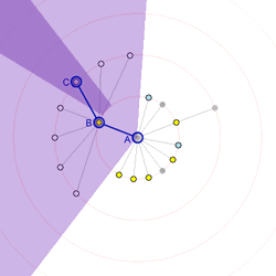
Figures 4 and 5
Figure 4 demonstrates this for a small network. Node A is at the center, and so its children are arranged in a ring about it. Node B, one of those children, has many children of its own, and therefore needs more space to lay them out. Its own children are arrayed around the second ring. Node B controls a larger portion of the inner ring compared to most other nodes because of its many children. Its region is highlighted in light purple. Node C, one of B's children, in turn controls a small sector of the second ring. C's region, as indicated by the darker purple, is a slice of the second ring. Any of C's descendants will be arranged inside that purple region. Figure 5 extends this notion to a more complex network, with four layers of hierarchy and nodes of different sizes.
Nodes are joined
to their parents by grey lines. Over the course of the session we may discover
connections between two nodes that we already know about in different parts
of the graph. These connections, which are independent of the parent-child relationships
shown by the layout, are shown in light green.
3.3.2. Interactive Refocusing
Shift-clicking on a particular node recenters the display on that node. The node moves to the center of the display and all the other nodes move to the appropriate rings based on the new hierarchy determined from the center node.
This is implemented by performing a breadth-first traversal of the graph starting from the selected node. Dijkstra's shortest-path algorithm gives us the new shortest network path from the selected node to all the other nodes, hence determining the new ring on which to place each node. When performing this algorithm, all graph connections are considered equivalent whether or not they are part of the current hierarchy. All of the neighbours of the selected node are now its children, so all the green lines from the new top node become grey.
In our initial implementation, the resulting transition was highly disorienting because nodes could end up anywhere on their target ring. Often, a large number of nodes would cross to nearly the opposite side of the display, making it difficult or impossible to see the correspondence between the nodes in their old positions and their new positions.
We addressed this by animating a smooth transition between the old layout and the new layout. Our first attempt at this was to move each node along the straight line between its old and new positions. This made it much easier to follow an individual node, but still tended to be confusing as many nodes would cross through the center of the graph and obscure each other as they move to the other side of the display.
In many common transitions, nodes would stay on the same ring or move to an adjacent ring, yet the linear movement would cause a node to leave the ring and travel far away from it, into the middle of the display, before returning to the ring. To alleviate this problem, we decided to perform the linear interpolation in a polar coordinate space rather than a rectangular space. Thus, nodes that stayed on the same ring would follow the circumference of the ring, and nodes that changed rings would smoothly spiral from one ring to another. Our choice of layout algorithm generated an implicit expectation that radial distance should convey network distance from the center at all times; interpolating in polar coordinate space is consistent with this expectation. This produced a much smoother animation in which groups of nodes would rotate around the center of graph together. The clustering of the nodes in this way dramatically reduces the cognitive overhead of understanding the animation, since it permits the human visual system to "chunk" the constituent objects into a unit.
The resulting transitions still often involved more crossing-over and wheeling around the display than necessary, since no effort had yet been made to minimize the total amount of movement. Therefore, we devised two constraints to maintain the best possible consistency between the old and new layout.
First, to minimize rotational travel, we are free to rotate the entire new layout to any orientation. To choose the best final orientation, we consider the parent of the selected new central node. This parent must end up on the first ring since it is an immediate neighbor of the new center. We chose to orient the new layout so that this neighbor's position on the first ring matches its current position with respect to the selected node. That is, the direction of the line joining the selected node and its parent remains constant.
Second, to minimize crossover, we want to arrange the children of each node in the optimal order. For each node X, we choose the order of its new children by considering the directions of each of the lines joining it to its neighbors in the current layout. We arrange these lines in clockwise order, starting from the direction of the line joining the node to its parent. This ensures that any lines representing hierarchical connections in the new layout will not coincide with each other during the transition.
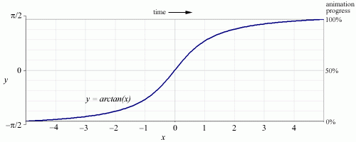
Figure 6
Finally, we want
to provide the best possible visual constancy at the beginning and the end of
the animation. Taking note of Bay-Wei Chang's suggestion to apply the techniques
of traditional animation to interaction design, we decided to use slow-in, slow-out
timing rather than straight linear timing. This was implemented by using a segment
of the arctangent function to govern the animation's progress over time. The
result is a smooth and convincing transition between two different hierarchical
views of the same graph.
3.4. Screen Shots and Movie
This section provides annotated screen shots and an animated capture of gnuTellaVision in action. (We have also provided the source code and installation instructions on this site, if you'd like to try using gnuTellaVision to connect to the Gnutella network yourself). Click on any of the images to view them in more detail.
3.4.1. Node discovery- Figures 7, 8 and 9 show the interface as it starts up and new nodes are discovered.
We first estabish a connection to gnutellahosts.com which provides us with other nodes to connect to (the yellow node in the center of the screen indicates a successful connection to gnutellahosts.com). Within a few seconds, we are informed about other Gnutella servents (indicated by the white nodes).
Figures 7 and 8
The node colors change to indicate their current state. As we attempt to make connections to nodes they turn blue. Once we have successfully established a connection, the nodes light up in yellow. Dropped or rejected connections become greyed out. Note that a new node has been discovered (shown in white). Its position on the second ring of the circle indicates its distance from the center node (initially gnutellahosts.com), by the shortest-known path. Text of search queries appear temporarily above the node from which they originate. Search queries also persist in a non intrusive light gray scrolling list on the bottom left of the screen.
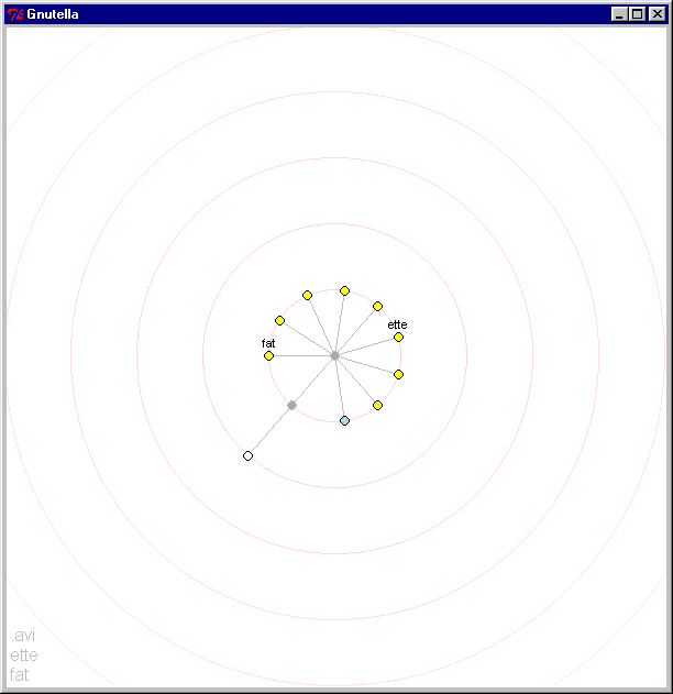
Figure 9
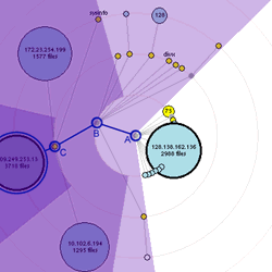
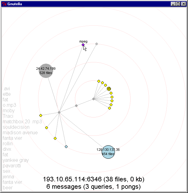
3.4.2. Network growth: Figures 10 and 11 show the network as it grows and expands. Note that we have discovered a node which contains many more files than others, as indicated by its proportional size.
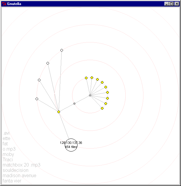
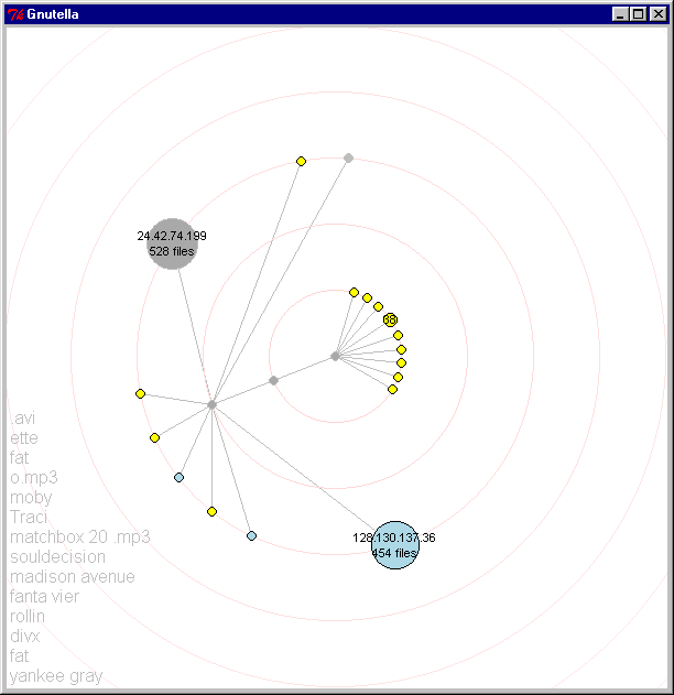
Figures 10 and 11
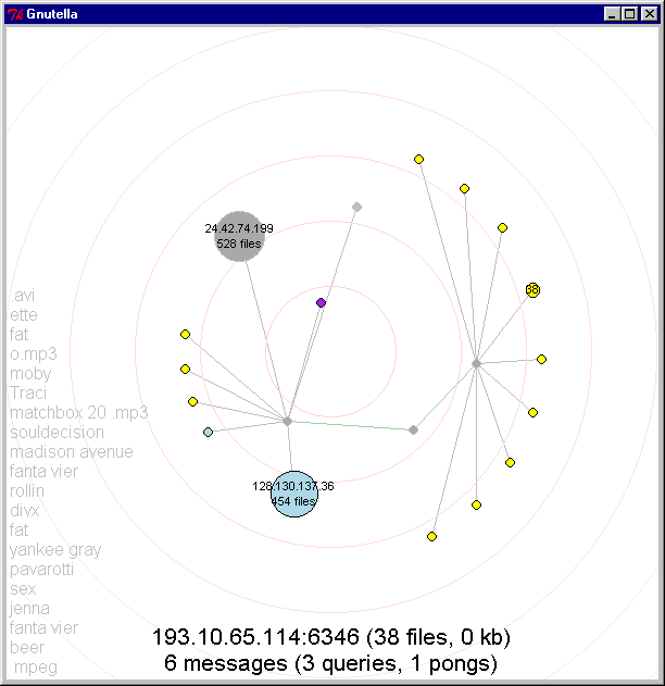
3.4.3. User Interaction - Users can interact with the network by clicking on nodes.
Investigate nodes: Figure 12 shows the user right-clicking on a node to find out more information about it. When clicked, the node turns pink momentarily to give the user feedback that it has been clicked. Data about the node (IP address, number of files it is offering, and file size) and about messages we have received form this node (and types of messages) is displayed in black text on the bottom of the screen.
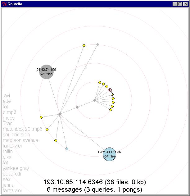
Figure 12
Recentering the graph: Users can click on a node to recenter the graph around a chosen node. When the user shift-clicks on a node, the chosen node turns purple and the network shifts as that node moves to the center. Figures 13-15 illustrate this transition in progress.
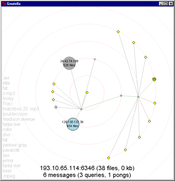
Figures 13, 14, 15
3.4.4. MOVIE: gtv.avi (1:14, 14.1 MB)
This short film
shows a capture of our visualization running on the gnutella network in realtime.
The text at the bottom provides information about the currently selected gnutella
servent. Along the left side, you can see search queries that our system has
seen on the nework. Periodically, the user shift-clicks on a node to recenter
the network. The node turns purple and moves toward the center, shifting the
whole network to compensate. When the user left-clicks on a node, he is issuing
a query into the rest of the network. The selected node turns red and other
nodes that see that query also flash red. (captured on December 13, 2000)
3.5. Rejected Ideas- We experimented with a number of ideas as our interface evolved. Some were rejected as a natural process of evolution, while others were rejected in response to informal user feedback we received during development.
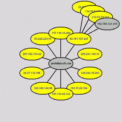
Figure 16: an early layout attempt
Figure 16 shows one of our early graph layout attempts. In this version, equal space is given to each sibling (rather than based on the total of the sizes of all the descendants of each sibling). As you can see, with this layout algorithm and large ovals instead of circles, nodes quickly begin to occlude each other.
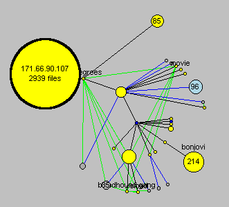
Figure 17: old color scheme
Figure 17 illustrates a color scheme that many users found confusing. We had hoped that it would be interpreted as "connections are yellow, non-connected nodes are light blue"; "possible connections are black, rejected connections are gray." Users appreciated that bright yellow was used for actively connected nodes, because they stood out. But the other bright colors distracted users with details that were not so important to them. For example, many were confused about the brightly colored lines and how they differed from each other. Our most recent color palette is more subdued and strong contrasting colors are used only when highlighting an important distinction between nodes or actions.
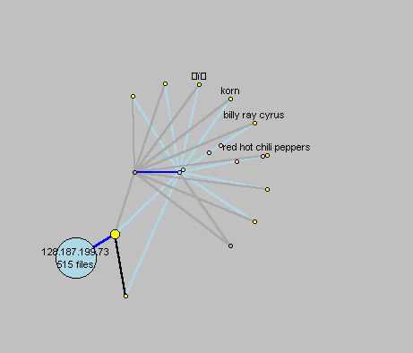
Figure 18: experiments with animating messages
Another idea we explored was to animate the messages as they travelled along connections between nodes. Colored circles were used to indicate various types of messages. Here we see several nodes sending ping messages (shown as pink circles travelling from the outer node toward the center). We rejected this idea because it was hard to distinguish the animated messages from the nodes and because the animation was very cluttered and busy. Perhaps if we use some other shape to distinguish the messages, or if we can animate them in a less distracting way, this may be a useful feature. Users suggested that this should be a feature that can be turned on or off as desired.
In this section we provide both our own observations from using the visualization as well as feedback we received from users.
4.1. Observations: Our visualization made many things quickly apparent about the network. We quickly learned that the network was filled with impatient nodes, constantly connecting and disconnecting. There are many more small nodes downloading files compared to larger nodes that have files to share. We also learned that searches are propagated unevenly, at best: some nodes would quickly relay our searches to the rest of the network; others would simply drop the search. Often we would not see a message in a search propagated for quite a while, followed by a long series of echos every few seconds. User search queries tend to be very simple and general, consisting of one or two terms.
4.2. User feedback: To get informal feedback on the interface, we showed it to a group of three undergraduates who have experience with Gnutella. In the course of development, we also showed the interface to a few friends and collegues (and to the class during presentation). Despite the informality of our "user testing", many of the same issues were raised repeatedly, influencing the course of our design.
The first reaction most users had was amazement that we were really connected to the Gnutella network and graphing it in real time.
The next reaction was usually an interest in the types of search queries that were being relayed on the network. A few users asked if they could replay the text of the search queries or slow it down, because the text appeared too fast for them to process it. This lead to the addition of the scrolling display of the text queries to the background of our canvas.
Many users commented on the layout of the nodes. Some disliked that nodes were concentrated in the center of the screen (early versions represented the network in a more compact space) and had the desire to spread them out and to "move around" in the network. This lead us to implement node refocusing.
Users found the use of node size to represent number of files shared to be intuitive. Users also found the use of color to represent node state to be intuitive, but they did not like our choice of colors! (as discussed in the "Rejected Ideas" section). One exception was the use of bright yellow to indicate connected nodes. We retained this representation throughout most of our designs.
Most interestingly, users were very curious about others on the network. Many referred to the nodes as "people" and wanted to find out who they were, where they were and what types of files they were offering. The visualization does seem to offer a greater sense of "connectedness" to others who participate in the network and provides a qualitatively different experience compared to exisitng interfaces for interacting with the network.
Finally, almost all users asked if we planned to incorporate this into a full fledged Gnutella client.
The visualization does not yet address some issues that seem to be critical to the peer-to-peer experience. Most crucially, nodes are prone to disappearing unexpectedly. It would be vaulable to add information about how long we have known about a node, and how often it has been available.
Similarly, we draw all implicit connections that we have learned about, but we do not remove those connections when nodes lose track of each other. Therefore, as time passes, the image converges on a complete graph, as each node draws close to every other node. We would like to remove unnecessary links.
Other information about nodes would be useful, too. For example, we have no way to show whether a server is likely to respond to requests, what the selection of files it offers, or whether it is currently accepting HTTP connections. We would like to enhance the descriptor view at the bottom of the screen, or add a more detailed view, that can tell us about what this node has to offer and how reliable it is.
Our layout has some built-in biases. It suggests that there is a certain importance to the connections we heard about first, and it often separates nodes that we connect to later farther across the screen. It might be useful to experiment with different layouts--spring embedders, for example, or other patterns-- to see whether we can obtain a more consistent layout pattern.
A useful enhancement would be to allow the user to drop or remove nodes, to connect to named hosts, and to move those hosts that respond quickly to our pings closer to the center. This visualization will be most useful when it is connected to a Gnutella servent and is a full participant in the network. At that point, we would be able to answer the common user question "where are we on the network?" by rendering ourselves as a node on the graph.
The GnuTellaVision visualization was createed with Python and Tkinter ("Tk interface"-- the de-facto Python interface to the Tk GUI toolkit). Tkinter is not the only GUI for Python, but we chose to use it because it is the most commonly used one, and is easily portable between Unix and Windows.
After experimenting with the open Java FURI client, we decided that the code was simply too complex to be useful to us. We also evaluated existing graph visualization tools, but found that they were hard to integrate with our Python Gnutella client or they were too limited (e.g. some only allowed to generate directed graphs and others only produced static visualizations). Instead, we built our own implementation of the Gnutella protocol in Python and then started connecting to the network and visualizing it on our own. Perhaps the greatest advantage of using Python was the ability to rapidly iterate through many designs. It is always more work to get a system working from scratch then it is to use a pre-existing software, however, this allowed us to create our own features and functionality. We do not feel we could have created this visualization, and the affordances we allow, with off the shelf software.
[1]
Gnutella, http://gnutella.wego.com/
[2] Gnutella Protocol documented by Clip 2 DSS, http://www.gnutellahosts.com/GnutellaProtocol04.pdf
[3] Image from An Atlas of CyberSpace, Topology maps (page 2), http://www.geog.ucl.ac.uk/casa/martin/atlas/more_topology.html
[4] as demonstrated at http://www.networkinsight.net/
[5] Ulrik Brandes, Vanessa Kääb, Andres Löh, Dorothea Wagner and Thomas Willhalm:
Dynamic WWW Structures in 3D. Journal of Graph Algorithms and Applications 4(3):183-191,
2000. http://www.inf.uni-konstanz.de/~brandes/publications/
[6] Advances in the Theory and Practice of Graph Drawing Roberto Tamassia http://www.cs.brown.edu/people/rt/papers/ordal96/ordal96.html
[7] Ulrik Brandes: Layout of Graph Visualizations. Ph.D. Thesis, University
of Konstanz. June 1999. http://www.ub.unikonstanz.de/kops/volltexte/1999/255/
[8] Gnutella: To the Bandwidth Barrier and Beyond http://dss.clip2.com/gnutella.html
[9] Free Riding on Gnutella Eytan Adar and Bernardo A. Huberman http://www.parc.xerox.com/istl/groups/iea/papers/gnutella/index.html