Task 1B -- Find books/articles written by Nonaka.
Task 2 - A graduate student in the Business school working on a class project. A book briefly describing a branch of knowledge management called intellectual capital seems likely to have a lot of information for his project. Find information about intellectual capital.
Task 3 -- An information manager in a company. His boss asks him to do a study and evaluation on the options and issues of developing KM systems. Find information on the existing systems, the companies behind the systems, etc..
For the final usability test, we kept the first two task scenarios from the low-fi testing with only a slight modification. We eliminated Task1B which asked participants to find books by an author since our UI no longer supports bibliographic searches. Because of UI changes, the third scenario also changed since it would be too easy to accomplish. With a products tab, users could just look for products there so we created a more challenging third scenario.
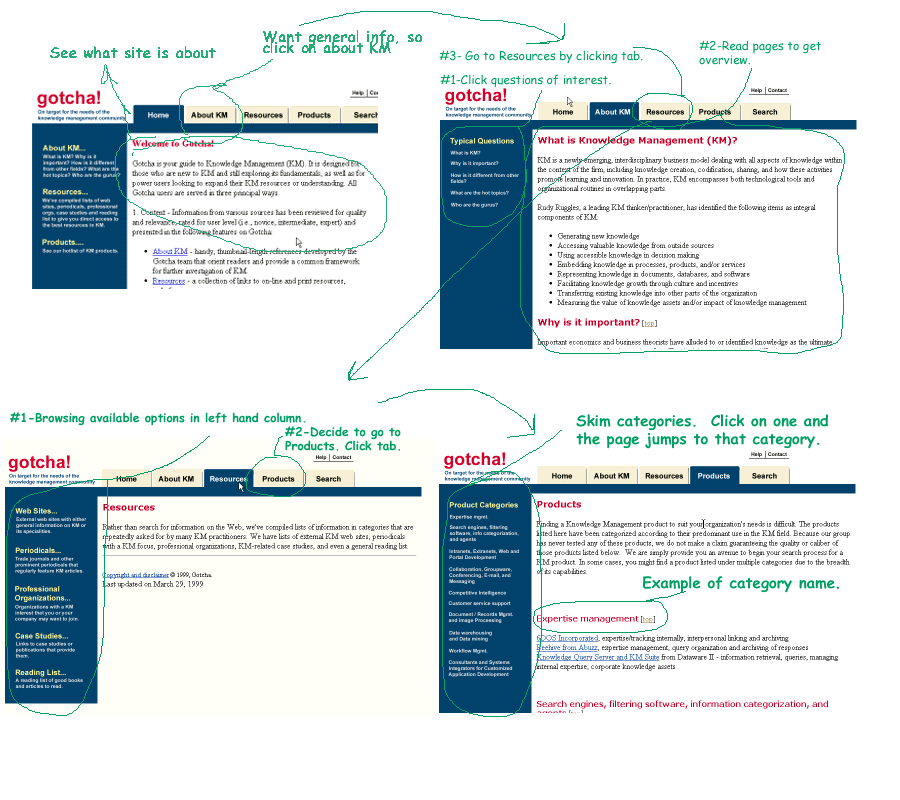
Scenario 1 -- You work as a project manager in a company. You are new
to the knowledge management domain and want to find some general information
about the subject. (annotated storyboard for scenario1)
We chose this scenario to test if the content information provided
in our site can satisfy the novice users' general information need.
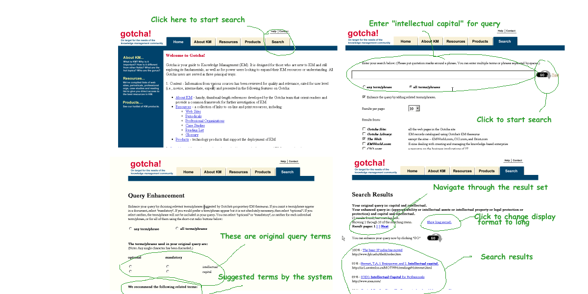
Scenario 2 - You are a graduate student in the Business school working
on a class project. A book briefly describing a branch of knowledge management
called intellectual capital seems likely to have a lot of information for
your project. Find information about intellectual capital. (annotated
storyboard for scenario2)
This scenario was designed to test our search engines.
Scenario 3 - Your sales staff has not been meeting its quotas and customers
are complaining about poor customer service. You heard through the grapevine
that a lot of knowledge management projects fix just these kinds of problems,
but you are not sure how. You want to find information about these kinds
of projects that other companies have set into motion and their results.
(annotated storyboard for scenario3)
Scenario 3 was intended to test if the user can accomplish some relatively
complex task in our system. He may utilize the content information provided
in our site, do searches using our metasearch engine, or combine any information
available from the site.
The interface of Gotcha system has gone through several iterations
based on feedback from low-fi testing, heuristic evaluation, and
final usability test. Changes were made during each iteration. The final
user interface is quite different from the initial
sketches.
In low-fi prototyping, we tested our UI sketches on 3 users. All of
them are novices on KM. Their feedback led to some major changes in our
initial UI design:
| Topmost Pages | Home | About KM | Resources | Products | Search | Help |
| Children | Gurus | Web
sites
Periodicals Professional Orgs Case Studies Reading List Glossary |
Tips |
Home
page
The home page provides users a short guide to our site, including what
content information can be found in our site and what functions or features
we provide can help users find information. The users can click on
the links of their interests which lead them directly to the corresponding
pages. There is also a link to "about Gotcha and its creators" on
the bottom of the page for the users who might be interested in our project.
About
KM page
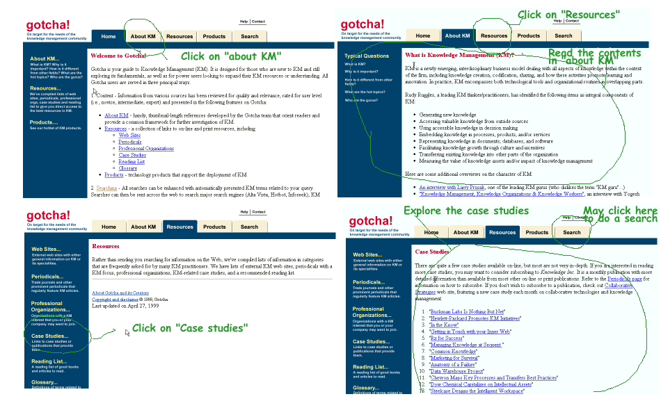
In "about KM" page, we compiled several basic questions about KM and
the corresponding answers, such as "what is KM", "what is the difference
between KM and other disciplines". This page can serve as a starting point
for novice users, especially someone who knows nothing about KM.
Resources
page
In "Resources" page, We have lists of external KM web sites, periodicals
with a KM focus, professional organizations, KM-related case studies,
a recommended reading list and a glossary.
Web
sites
Web sites page provides links to external web sites with either general
information on KM or its specialities. The sites are organized into several
categories, such as collections/reference guides, publications, organizations/communities.
Periodicals
In "Periodicals", we recommended 5 good periodicals on KM based on
our review. There is also a list of non-reviewed periodicals on this page.
Professional
Orgs
In "Professional organizations" page is a list of organizations with
a KM interest.
Case
Studies
This page provides links to case studies or publications that provide
them.
Reading
List
In the "Reading list", the users can find the top picks we recommended,
and other readings well-organized by categories. For online resources,
we provided links which can direct the users to the corresponding sites.
For some books which has no information available online, their bibliographic
information was provided instead.
Glossary
"Glossary" provides brief definitions to some key terminology in KM
domain area. These terms are ranked by alphabetical order. This page is
linked to our meta search engine by "view records related to this term".
The user can click on "view records related to this term" to search for
resources on this term. It is the same as typying the term in the search
page to conduct a search.
Products
page
In "Products" page, we provide lists of KM systems, products, and the
companies behind them. They have been categorized according to their
predominant use in the KM field so that the users can locate the products
that suit their needs easily and quickly.
Search
The users can type in any keyword they want to conduct a search. The
system provides several search options:
SearchTips
"Search Tips" gives some brief information on how to use the meta search
engine.
Help
"Help" page provides some assistance for new users to navigate the
Gotcha site.
Dreamweaver was used as the predominant WYSIWYG web design tool. It
worked fairly well for most of the tasks needed to construct web pages.
Its ability to create image maps within the application was the most useful
feature of all. It was simple to use and quick. Without such a WYSIWYG
tool the total amount of time to complete the task would have easily tripled.
None of the fancy features
helped us decide which layout would be the most user-friendly.
This creative process occurred completely in the minds of our group member's
minds and from user testing. Dreamweaver only helped us instantiate
our ideas faster than if we had to code it by hand. Dreamweaver demonstrated
difficulty in performing some operations like creating / modifying complex
tables (tables within tables) and creating /setting anchors. Consideration
was given to using Frontpage for more complex tables but the application's
interoperability problem defeated that idea. Instead, Amazon.com's
site was edited and used as the basis for Gotcha's pages. This eliminated
the need to create our pages from scratch. Netscape Page Composer
was used to compensate for Dreamweaver's weakness in creating / setting
anchors because it has a more intuitive procedure for creating and setting
anchors.
Adobe Photoshop was used as the exclusive graphic design program. Photoshop was used to create the GIFs that serve as the image maps at the top of each page (tab folder image) and any image maps appearing in the left hand column of most pages (navigation feature to the children of topmost pages). Six separate tab folder images were created because the visible page has its tab highlighted in blue whereas the non-visible pages have their tabs in yellow. Even though Photoshop provided a great deal of flexibility in moving portions of the images around and changing font and image colors, it didn't provide a guide on how to choose colors. That decision was left completely to the group's discretion. This could be disastrous to people with no sense of coordination. The one feature that was invaluable was the text edit feature introduced in version 4.0 enabling users to edit text layers separately. This is a valuable time saver given the previous version required users to delete the text layer and create a brand new one even if the change was something as simple as changing the spelling. Photoshop is a complicated application to grasp and use, but no better alternative exists. It doesn't show how big (e.g. KB) an image is within the context of the application. A user must open the directory in a separate window and check. This is very distracting if a user wants to compare image sizes based on formats. Modifying images is also a time-intensive and tedious task. After changing the total number of tabs from five to six, all five images were changed after hours of work. Despite the availability of macros, the detail-oriented nature of the work couldn't take advantage of macros to speed the process. The other main difficulty was Photoshop's inability to support the drawing of circular or elliptical figures. This required us to modify pre-existing images instead of creating our own.
Perl was used to create the cgi scripts to implement search. Perl
is a language for easily manipulating text, files, and processes. It provides
a simple and fairly readable way to do jobs. Perl was used to parse the
user search query, identify the phrases. If the user chooses to enhance
the query, then the program matches the terms/phrases against the Gotcha
thesaurus, and a query enhancement form is created and returned to the
user. The form allows the user to choose any term/phrase they want to include
in the enhanced query. Then the submitted enhanced query will be processed
and the program will use the enhanced query to conduct the search. Otherwise,
the original query will be used. The program then does an inhouse search
and/or passes the query along to other search engines. All the results
will be processed, merged and presented to the user. The problem with this
programming language is that it is quite easy to introduce bugs, and quite
time-consuming to fix all the bugs. Also, it takes more processing time
than languages such as C and C++.