Interactive PrototypeRosalie Lack Joanne Miller Sally Thomas April 1, 1999
1. Problem and solution overviewThe existing "Suffragists Speak" multimedia web-based resource(http://www.sims.berkeley.edu/courses/final-projects/suffragists/SuffragistsSpeak/Homeframecontracted.html) is a workable and useful Web site that contains a large amount of information about the womens suffrage movement of 1910 to 1920. However, there are several design-based problems that need to be addressed to make the site as useful as possible to potential users. The Suffragists Speak group will add functionality by altering the design and adding features to make the site more navigable and to make information easier to find and more comprehensible. 2. TasksScenario 1: High school student: Is writing an assignment for her American history class, for which she has been asked to create a fictional family living in 1915. She decides to make the mother a suffragist, and her teacher suggests the "Suffragists Speak" site. She looks it up on the Internet, clicks on "Meet the Suffragists" to see if she can find someone who was a mother. She reads through the brief biographies provided, and becomes interested in Sara Bard Field, who was a mother and a poet. She clicks on "Read oral history" of Sara Bard Field. When the Table of Contents page comes up, she clicks on the section that seems to relate to Fields activities during 1915. After she reads through that chapter of the manuscript, she decides to click on the "Suffragist Chronology" on the top frame, to get a better idea of what was going on in the Suffragist movement in 1915. After she reads through the chronology, she decides to go back to the "Meet the Suffragists" page because she remembers that there were links to some of Fields writings and speeches. This gives her plenty of material for her fictional character. (View Scenario 1)Scenario 2: History Graduate Student: Is writing a dissertation on women reformers in the American progressive era, with a special focus on Jane Addams, the founder of Hull House, a settlement house in Chicago. Accesses the "Suffragists Speak" web site, looks through our sources, and then calls up the search page to conduct a search of "Jane Addams" over the entire collection of resources. The search results point to many different types of resourcesseveral of the oral histories, some newspaper clippings, and some books. (View Scenario 2) Scenario 3: High School Teacher: Is interested in international
connections to the American womans suffrage movement. Recollects that
there is a mother-daughter British "team" but she cannot remember their
name (if only she could see a list it would come back to her). At the "Suffragists
Speak" site sees that she can browse subject categorieschooses that option.
Sees the name "Pankhurst" and remembers that that is the name. Clicks
on "Pankhurst" and she is returned to the search page and "Pankhurst" has
been automatically placed in the "Search for:" box. Submits the search
and is pointed to some interesting documents. (View Scenario
3)
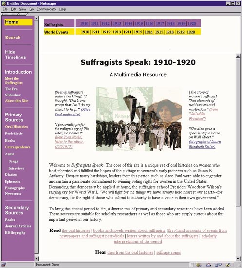
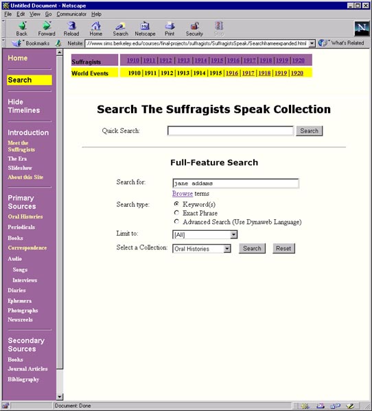
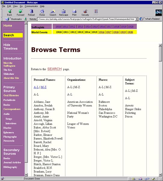
3. Revised Interface designThe revision of our Web site design came directly from our low-fidelity testing. The changes included navigation (via the use of frames), the search page, labels, and the Dynaweb interface.NavigationIn the low-fidelity testing the participants tested two versions of an interface. In one version, the navigation information appeared in a top frame in pull-down menus. In the other version, navigation information was visible in the left-hand frame. When building our interactive prototype for this assignment, we looked at our notes from the testing sessions and were convinced that keeping the left-hand frame was the best solution. First, all three of the participants said that they liked the left-hand frame because it allowed them to see all the options that were available (vs. having to click on pull-down menus). In addition, the left-hand frame helped to structure the way that a user unfamiliar with the subject matter might progress through the site.In designing the left-hand frame we realized that it would contain a lot of information, and we were concerned that the user not get lost. In the low-fidelity prototype we put a box around the label of the current page in each frame. We replicated that feature in the interactive prototype by putting a yellow box around the current page label (see Figure 1). In an earlier iteration of the interactive prototype the left-hand frame background was a dark mauve color and the box of the current page was in blue, but the contrast was too subtle. We changed the background to a lighter shade of purple, changed the highlighting color to a bright yellow, and changed the text of the current page to black. The contrast between the yellow and purple quickly conveys status information about the page viewed in the right window. Search Page (see Figure 2)In the low-fidelity prototypes search page, the choices in the pull-down menu for Select a Collection were unclear to one of the participants. She expected that the collection names would be the same as the choices in the left-hand frame. Instead, they were the names of the actual documents. For example instead of Primary Books, the menu listed the books individually. For our interactive prototype, we changed the list to reflect the labels from the left-hand frame. While we lose some searching capability because the user now searches over all primary books, we think that it is a lot clearer to the user and maintains the logic of the system's architecture.The browse pull-down menu on the search page offered the user the possibility to browse lists by organization name, person name, place, or subject terms. The menu was confusing because it was right in the middle of the search page. We substituted a link for the pull-down menu. We also combined the browse lists and put them on one page (rather than separate pages for each category), where each category is a column in a table. (See Figure 3) TimelineFor the interactive prototype, we created the pop up boxes for the timelines that we had sketched and described in our low-fi prototype. During the user testing we discovered that, while the timelines are important tools (especially for researchers new to the subject matter), they might not need to be constantly apparent at the top of the screen (in fact, they could be an annoyance to more advanced scholars). In response, we added a feature where users can open and close the timeline as they wish. The timeline appears in a top frame when users click on show timelines on the left-hand navigation bar and disappears when users click on hide timelines. (See the Home page with timeline Figure 1, the Home page without the timeline Figure 4)DynawebWe started out this project wanting to make changes to Dynaweb interface but learned that the Bancroft Library (where Dynaweb materials are located) would not allow us to do that. So we decided to mock up HTML pages that would show what the Dynaweb pages would look like if we could make the changes we wanted. The main change was to get rid of the bottom frame. The frame contains icon buttons that are not intuitive and that lead to other documents on the Bancroft site that are not related to our materials. In addition, it contains a search feature that does not offer the choices that our search page does. (See HTML mock-up.)For the purposes of the heuristic evaluation, we will direct users to the Dynaweb interface because we would like more formal user feedback on Dynaweb's particular features. LabelsSome of the labels we used in our low-fi prototype confused the users. The meaning of thesorted by labels on the Correspondence, Books, and Periodicals pages were unclear to the low-fi testing participants. We moved the labels from the left-hand frame to the pages themselves and added more text to help clarify. (For example, the by suffragists label on the books page was interpreted to mean books written by suffragists, so we changed to Sorted by suffragist as subject.)4. Prototype overviewOverview of the UI implementedThe user interface that we implemented reflects lessons from our low-fidelity usability testing and an iterative design process. The home page consists of a brief introduction to the contents of the site, and features a left-hand frame to act as a navigation guide. The purple and yellow color scheme reflects the colors of the suffragist movement.The site includes an optional top frame where the user can select to view two timelines, or the user can choose to not have the timelines shown. Both timelines utilize pop-up windows that appear on top of the browser window. The top (purple) timeline contains a chronology of the suffragist movement. The lower (yellow) timeline contains information about world events in the years shown. We redesigned the search page to be more intuitive to the user. (See search page.) What was left out and whyWe left out the pull-down menus that we had mocked-up for the low-fi testing. The main reason was aesthetics, but there were also technical considerations. None of the team members knew how to employ Javascript to make the mouseover/pull down windows happen, and we did not have time to explore and learn in the time allotted. The site was created using Dreamweaver, a Web page design program that the members of the group knew how to use.Not all of the timeline dates have content. We are concentrating on design, so we felt that putting up a few of the dates would be enough to give the user a feel for how the timelines work. Tools usedWe used Dreamweaver, which worked fine in general, but we would have benefited fromknowing more about Javascript to implement some of the interactive things we wanted to do. Problems with the toolsAs mentioned, we think that Dreamweaver limited what we could implement on the site. There was not enough time to learn other tools or languages that might have been helpful.5. See Screen dumps of the site.6. How to run the interfaceIntroductionLast Fall, Rosalie and Sally worked on a team to develop a prototype of the "Suffragists Speak" site for Dale Dougherty's electronic publishing class. If you are interested to the "before" site, the URL is: http://sims.berkeley.edu/courses/is290-2/f98/GroupC/SuffragistsSpeak/frame.htm. For this class we are investigating ways to make the site more easily navigable and adding features such as the timeline and slideshow, and maybe a database. The contents of the site The site contains text documents (books, transcriptions of oral histories, correspondence, periodicals, and a bibliography) and multimedia items (photographs, ephemera, and audio clips of songs and interviews). The text documents are encoded with SGML. In order to view them in HTML they are interpreted into HTML on-the-fly with a browser called Dynaweb. The multimedia items are not SGML-encoded so they are displayed directly in HTML documents. When you click on a link to view the text documents or when you view
the search results you will be in Dynaweb. We recognize that the Dynaweb
interface may be disorienting. We cannot make any changes to the Dynaweb
interface because it is on the Sunsite server, but we would like to get
your feedback on what changes you would like to see made. For this project,
we will take your feedback and mock up the proposed alterations in HTML.
PasswordYou will need to enter a password to access some of the documents. When prompted, the user ID is: teitest, the password is: sgml.Search The search page is fully functional, but there is currently no help page. Any suggestions of what should be included would be great. The "Browse terms" sends you to a list of terms that you can search on. Currently if you find a term you would like to search on you can copy it and go back to the search page and paste it into the "Search for" box. Ideally we would like to allow the user to click on the term and automatically send it back to the "Search for" box on the search page. Since the text is SGML-encoded, the "Limit to" category helps to further refine your search, when you choose one of the limits the search engine is then searching over the SGML tag. Under "Select a Collection:" a choice is "Timelines," but currently we only have the Suffragists timeline in there. Under development The slideshow, diaries, newsreels and journal articles are still under
development.
|