|
Method
Participants
We tested three different participants. The first is a 30-year-old female,
an employee of the City of Berkeley, an experienced user of the World
Wide Web, and an acquaintance of one of our team members. The second user
is a 29-year-old fifth-year graduate student in history at UC Berkeley
who is a writing her dissertation on a topic related to the American suffragist
movement. She is an experienced user of the WWW, but does not have much
experience using online research reference tools like "Suffragists Speak"
(primarily because there are not many in existence). She was referred
to us by another graduate student in history, and we met for the first
time on the day of the test. The third participant is a 28-year-old archivist
from the Documents Collection at the College of Environmental Design at
UC Berkeley, an acquaintance of all of the team members. She received
a master's degree in library science at Simmons College in Massachusetts,
and has been working professionally as an archivist for almost two years.
She is familiar with the Dynaweb interface and with historical research.
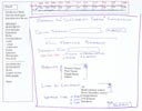
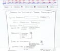
Scenarios and Procedure
We gave the participants the following scenario: Learn all you can about
suffragist Alice Paul (for example, you have to give a presentation about
her). You also want to find out what else is going on in 1914, one of
the years that Alice Paul was active in the suffragist movement.
We also encouraged the participants to browse and explore the site on
their own. We requested that they think out loud. The facilitator prompted
the user when the tester seemed puzzled, stuck, or quiet.
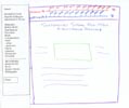
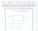
We tested both interfaces and with each participant we used Interface
#2 before Interface #1. We wanted to be consistent in conducting the tests,
and to avoid bias in favor of Interface #1.
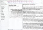
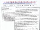
Test
Measures
- Navigation
- Ease of Use
- Integration of SGML/HTML pages
- Integration of Timeline
We measured the comparable usability of the interfaces. We looked for confusion
on the part of the users, and whether they were able to find what they were
looking for. We listened to their comments concerning navigation, interface
design, and comparison of the two interfaces.
Results
Recurring themes in the interface
tests
- Participants wanted more information about what the content
was and where it came from. Particularly within the oral histories,
users understood that the left screen was a table of contents, but were
still often confused about what the contents meant.
- Participants did not go directly to the search screen. (In fact,
they went to the search screen last, and once there needed some direction
as to what to do.)
- With Interface #2, two out of the three participants did not immediately
recognize that they could click on Introduction to get biographies of
the suffragists (as discussed below, this is part of the limitations
of paper-based testing vs. the Web).
- When shown Interface #1, participants immediately liked that they
were able to see all of the choices at all times.
Some specifics
Interface #2 (we tested the second interface first to avoid bias towards
the existing prototype, Interface #1): Two of the three participants seemed
to have a difficult time knowing where to start looking for information
about a suffragist. Their solution was to look first at the timeline to
gather background information (in addition to Alice Paul, they were also
supposed to find information about the year 1914). All participants chose
Introduction as the first pull-down menu, and all went to Meet the Suffragists
(instead of Introduction to the Era) first. All participants also went directly
to the oral history from the link on the Meet the Suffragists page biography.
(For our prototype, we only printed information about Alice Paul. On the
Web, users could scroll down to find information about all of the suffragists.)
One participant became extremely focused on the oral history to the extent
that she neglected (forgot about?) the pull-down windows in the top frame.
All of the participants went to the Primary Sources pull-down window before
going to the Secondary Sources. And all went to the Search page last. One
participant was confused that a link to Books appeared under Primary Sources
and also under Secondary Sources, and one participant questioned books as
a primary source (they are written by women suffragists of the time, although
not any of the suffragists whose oral histories appear on the site).
Interface #1: Participants did not go through all of the same steps in
Interface #1 because they knew what the links would lead to by this time.
One participant who had not used the search function in Interface #2 decided
(after gentle prompting from the facilitator) to do a search. Like the
other two, this participant did not seem to realize that "browse" would
bring up an alphabetical list of subjects from the chosen category. The
results were somewhat surprising to the participant, since the Dynaweb
search engine is very confusing (the results include documents in which
the search term does not appear).
Discussion
What we learned
We learned that participants liked the left frame because it provided more
information about the contents of the site. Because it was constantly there,
it reminded people of resources they may have overlooked on the top-frame
interface. However, we are not ready to give up the top frame idea yet because
on the Web, unlike the paper prototype, users can easily and quickly see
their options by moving the mouse.
We learned that we need better descriptive information and labels. For
example, it was not obvious to one participant that "Meet the Suffragists"
was going to be biographies of the women. In some cases, we also need
better labels to identify the content of the page. For example, the various
sorting options (by Suffragist, by Subject, by Date, etc.) can be confusing.
Within the Dynaweb oral histories it is not always clear what the user
is seeing or what the links lead to.
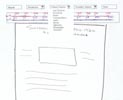
We found that a potential drawback to Interface #2 is that users may
never see the list of all suffragist oral histories (with thumbnail photographs)
because they are more likely to link directly to the oral history from
the Meet the Suffragists page. (Though each of the suffragist's oral histories
is linked from the Meet the Suffragists page, so this is not a disaster.)
What the evaluation could not
tell us
Since we were not able to show all of the pages from the site, the gaps
in content led to some confusion for the participant. We were surprised
that all of the participants really took the time to read the content
that we did provide from the site. More actual content would have provided
more context for the site as a whole. We did not include any actual text
on the Home page of the low-fi prototype, which may have given participants
an alternate starting point, particularly from Interface #2 where they
seemed to have some confusion about where to begin.
Low-fi interfaces could not accurately convey the potential difficulty
of the multiple frames (what we see as the main problem with interface
#1). The menu options of interface #2 were not as evident as they would
be on the Web with a tester using a mouse.
We were not able to simulate the interactiveness of the timeline pop-up
window. On the screen, users can move, minimize or close the window, but
on this is not possible paper.
Finally, it was difficult to judge what type of impact the testing order
of the two interfaces had on the experience and opinions of the participant.
We might have had different responses if we had given the participant
Interface #1 before Interface #2.
What we will change
When we started this design procedure, we thought that adding a contextual
world news timeline and making it and the existing suffragist chronology
a more integral part of the site was a crucial change. After completing
the tests, we realize that, while the timelines are relevant parts of
the site, they might not need to be constantly apparent at the top of
the screen. Further (Web-based) testing may disprove this, but our testers
did not jump to the timeline in the midst of browsing the other material
on the site. Rather than changing the placement of the timeline, another
option for us is to include reminders and pointers to the timeline within
the pages of the site. Our users did appreciate the world timeline, and
adding that is certainly a change that we will make to the site.
We will modify and add labels and explanatory text to some of the pages
to help clarify and identify the contents.
While the tests seemed to indicate that users preferred the left frame,
we want to implement the pull-down window interface on the Web to test
in a more realistic setting. As mentioned above, we think that the paper
prototype did not sufficiently convey the clunkiness (especially on a
small screen) of two left frames next to each other. If users still do
not respond to the pull-down windows, then we will continue to work with
the left frame.
Appendices
|