Suffragists Speak Group:
Rosalie Lack
Joanne Miller
Sally Thomas
SIMS 213, May 10, 1999
In response to a heuristic evaluation of the site and the results of
several usability tests, we improved labeling throughout the site to more
clearly identify the source of each historical document, and to more accurately
reflect the scope of the material provided. Several users expressed a concern
about the authenticity and accuracy of the transcriptions of the historical
documents we selected for the site. We therefore showed how it would look
to include graphic images of periodical articles that could be examined
by users to verify the validity of the online transcriptions.
Each scenario was designed to test different parts of the system. The
first assignment was to conduct research for a dissertation on Jane Addams
(designed to test the participants use of the search engine). The second
assignment was to try to recall the names of the British mother-daughter
suffragists (designed to test use of the "Browse terms" function available
from the Search page). The last scenario was designed to test how the participants
browsed or searched the system, and whether or how they used the timeline
tool to get information about Alice Pauls activities in 1917.
The user starts with the search page and enters the name Jane Addams.
The user views the search results

The user then clicks through a variety of the found items and learns more about Jane Addams.
Scenario 2: You are a teacher interested in international connections to the American womans suffrage movement. You recollect that there is a mother-daughter British team but cannot remember their names. You go to the site to try to find out.
The user goes to the search page and clicks on Browse terms to see if she can jog her memory by looking at names.
She gets the Browse Terms page and looks through the list of Personal Names. She finds two women with the name Pankhurst, and remembers that they are who she is looking for.
She goes back to the search page and types Pankhurst and England into the search page, using the Advanced Search search type.
She then gets the search results screen. (We only have one HTML mock-up of the Search Results pagefor the Jane Addams searchbut the format would be the same.)
Then she clicks on a resource that she would like to explore, for example the oral histories (here also we only have one mocked-up HTML page, so the screen shot is not completely accurate). She can easily use the new Return to Search Results button to return the results.
Scenario 3: You are interested in finding out general information about Alice Paul. In addition, you want to learn specifically about her activities in 1917.
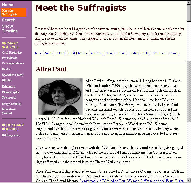
The user starts from the home page and chooses Meet the Suffragists to see a biography of Alice Paul.
She reads Alice Pauls biography and chooses to go to the oral history to learn more.
When the Table of Contents page comes up (in the left Dynaweb frame), the user scrolls through the list and clicks on the section where Alice Paul recounts her activities during 1917. After she reads through that chapter of the manuscript, she decides to click on the Show Timeline link to get more information about what was going on in 1917 and to see if Alice Paul is mentioned.
The timeline pop ups and she reads about 1917 and learns more about Alice Pauls activities in 1917.
The following section presents the design stages, highlighting when
and how the low-fi testing, heuristic evaluation and usability tests drove
our decisions. The discussion is organized by the following categories:
Navigation, SGML/HTML integration, Search, Browse, and Timeline. These
categories loosely map to the areas that we initially identified as needing
improvement.
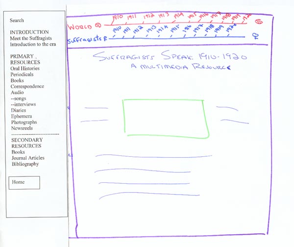
During low-fidelity testing we mocked up two interfaces because we wanted
to explore different navigation options (see Figure 2: Low Fidelity Testing,
below). For both interfaces we included two timelines in the top frame
(see the Timeline section below for a detailed discussion of the timelines).
For Interface #1, we removed the top navigation bar and placed all the
links in the left-hand frame. One reason for doing this was that we felt
that separate navigation tools (left and top, see Figure 1: Original Navigation
System) could be confusing. It might not be immediately evident to the
user why certain items were in the left frame and others in the top navigation
bar.
| Interface #1 Left-hand Frame | Interface #2 Pull-down Menus |
 |
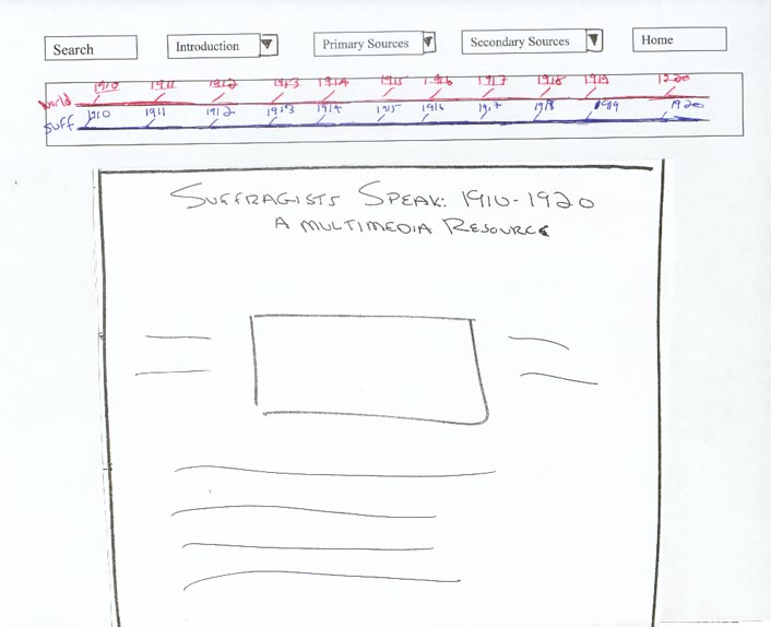 |
For Interface #2, we tested removing the left frame and replacing
it with a top frame that contained pull-down menus with the navigation
options. The rationale for experimenting with this design was related to
the Dynaweb interface (see SGML/HTML Integration section). When users enter
a Dynaweb document they are presented with a left and right frame. We felt
that by eliminating our left frame the screen would be less cluttered.
One of the primary goals of the low-fi experiment was to see how users responded to the two different interfaces, and to see if they had a preference for one of them. We had three participants, and gave each one the same scenario to work through for each of the two interfaces. We observed whether their navigation changed depending on which interface they used. We asked the participants to think aloud so we would understand to our best ability what they thought of each interface.
Regarding the navigation, we learned that all of the participants preferred the left frame because it allowed them to see all of the available options (vs. having to click on pull-down menus). In addition, we observed that the left frame helped to structure the way a user unfamiliar with the subject matter might progress through the site.
Based on these tests we chose to keep the left frame. However, in designing the frame we realized that it would contain a lot of information, and we were concerned that users would get overwhelmed. The left frame proved to be more difficult to design than we anticipated. We decided to add a highlight box around the label of the current page. In an earlier iteration the background color of the left frame was dark mauve and the highlight box was blue, but the contrast was too subtle. We changed the background color to a lighter shade of purple, changed the highlight color to a bright yellow and made the visited links blue. The heuristic team noted that the blue visited link color was difficult to see on the purple background. We changed the visited link color to be the same as the unvisited link color (white). We chose to make the visited and unvisited links the same color because we found that otherwise there would simply be too many colors in the left navigation frame. But then we realized that white would not show up with the yellow highlighting that we used to show which page is currently being viewed. So we choose to use orange as the highlight color.
The contrast between the orange and purple quickly conveys status information about the page viewed in the right window (see Figure 3: Left Navigation Highlights).
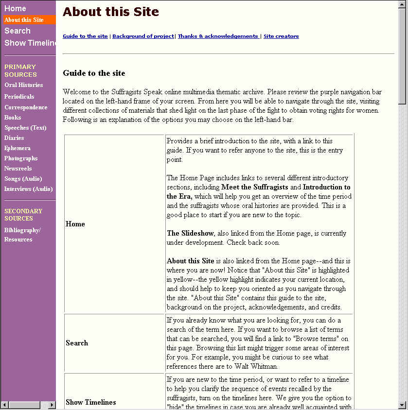
An additional navigational suggestion that we received through user testing was to make the left frame shorter. The length of the frame required users to scroll up or down to see where they were in the list of contents. Another element that many of the testers suggested was to include a page that served as an introduction to the site; where they could quickly get an idea of the scope of the site. We incorporated these suggestions by expanding the About this site page to function more like a site map and detailed overview. It now lists each resource with a brief description of what it is (see Figure 4: About this Site).
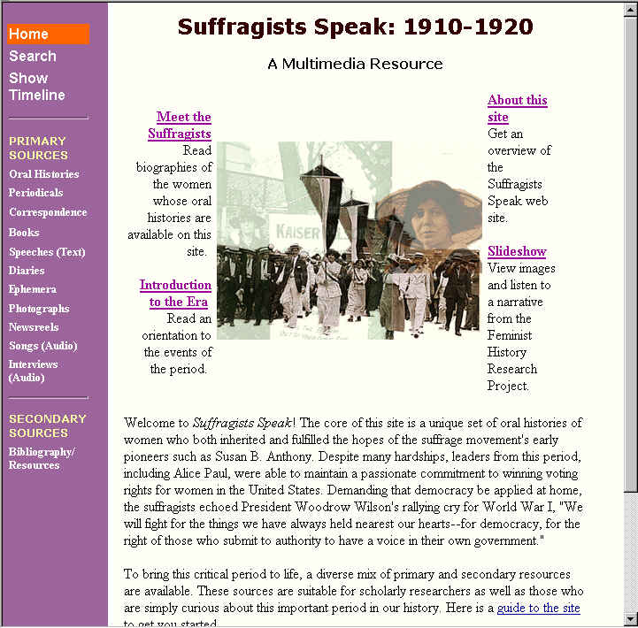
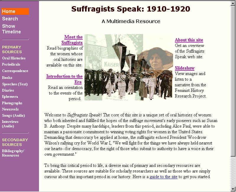
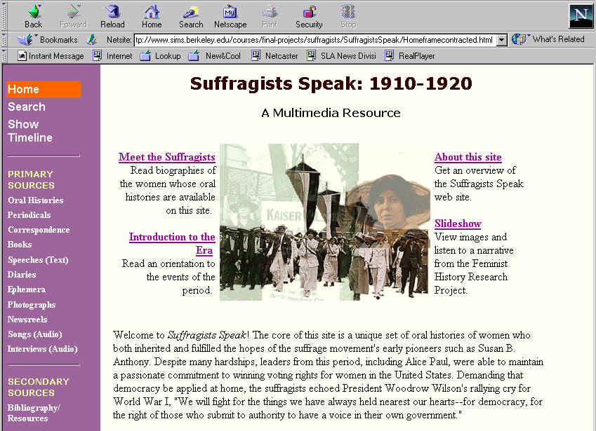
In addition, in order to shorten the left frame we moved the introductory materials (Meet the Suffragists, Introduction to the Era, About this Site and the Slide Show) to links that surround the image on the front page (Figure 5: Home Page with Introductory Materials). The rationale was to make the home page the place where users are presented immediately with all introductory materials and where they could return for more introductory materials as desired. This option leaves the left frame as a true navigation tool for the other major categories of primary and secondary resources on the site
A labeling issue that the testers identified was that the Bibliography,
label was not clear. They thought that it would only contain references
to books and articles, but it in fact also contains links to web resources.
We changed to label to Bibliography/Resources to make it more inclusive
(due to time constraints, we have not implemented this change on all of
the left navigation frames)
During the user tests, only one of the testers noticed the sort by
option. So we moved it again, this time to the right-hand corner in order
to make it more noticeable. Another issue that the testers raised was that
they cautioned against misleading users into believing that the site was
comprehensive with regard to the entire suffragist movement. This was particularly
relevant for undergraduate students unfamiliar with primary source research.
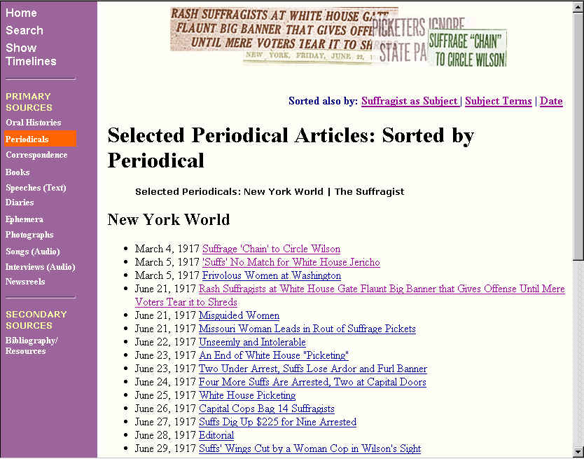
We added the label selected periodicals in order to convey that
we only have a few of many periodicals (see Figure 8:
Current Sort by Feature).
The Dynaweb interface is made up of two frames: a left frame that generally contains a table of contents, and a right frame. As noted in the Navigation section above, in the low-fidelity testing period we tested a design in which all the navigation options were in pull-down menus in the top frame. This option would have eliminated the problem of a frame-within-a-frame that occurs when the user views a Dynaweb document (see Figure 9: Original Dynaweb Screen). However, users preferred the left frame, even if it meant having three frames.
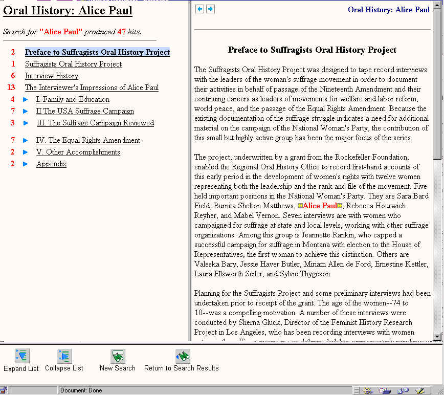
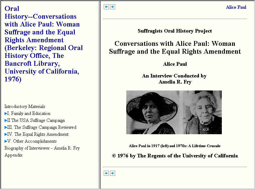
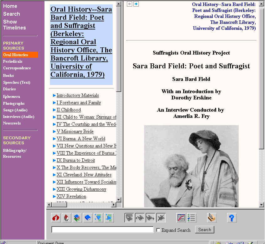
Users identified many usability problems with the Dynaweb interface. They were particularly confused about the function of the many buttons in the bottom frame. In addition, the evaluators recommended that we create a more seamless transition between our site and Dynaweb. Since we could not make any changes to Dynaweb, we mocked up HTML pages to reflect the changes we would like to see made (see Figure 10: HTML Mock-up of Dynaweb Page). Essentially, we removed the bottom frame that contains the confusing icon buttons that lead to other documents on the Bancroft Librarys site that are not related to our materials. In addition, several testers did not realize when they were in the actual oral history. So we added the title Oral History: Alice Paul to the left-hand frame and the full citation for the oral history to the right frame.
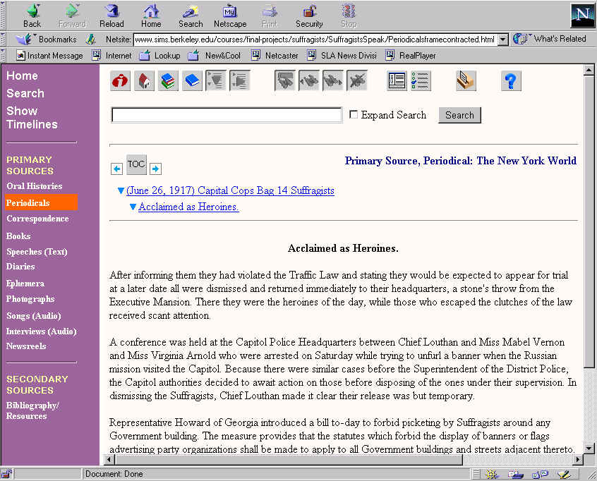
We chose to display the SGML-encoded documents that are only one or
two pages (such as periodicals and correspondence) without frames. The
frames are necessary for long documents, such as the oral histories because
the left frame contains the table of contents. When the frames are removed
in Dynaweb, the bottom frame buttons move to the top of the document. The
heuristic evaluation team noted that that it was confusing to have buttons
sometimes in the bottom frame and other times at the top of the documents.
They also noted that the buttons were confusing because their functionality
was unintuitive (they are icons without text explanations). Interestingly,
during usability testing we found that none of the testers seem to notice
those buttons. We attribute this to the artificial testing atmosphere,
and usability testers who were more interested in content than design.
However, we think that left on their own, the usability testers would notice
the buttons and wonder about their purpose. We mocked up HTML pages to
demonstrate the changes that we would like to make to the correspondence
and periodicals pages to address this usability problem. Like the oral
history mock up, we removed the buttons and added the document type to
the label (e.g., Periodical: New York World). See Figure
11: Periodical Page Before and Figure 12: Periodical
Page After.
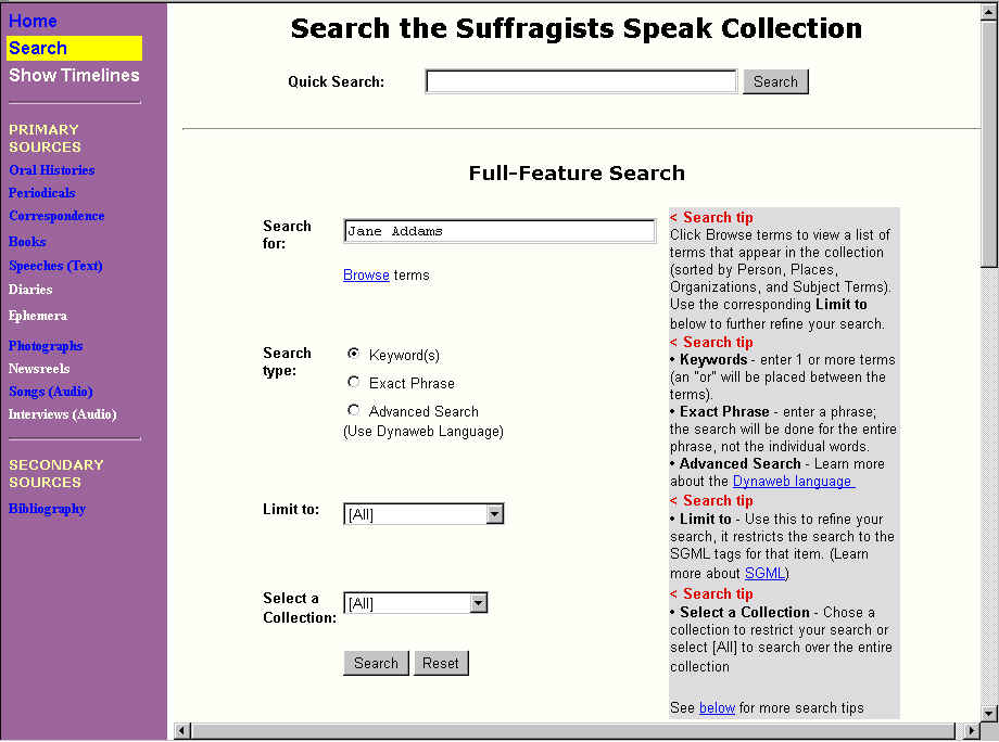
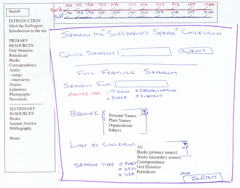
For the low-fidelity testing we mocked up a design of the new search page that included both the quick and full-feature search (see Figure 13: Low-Fidelity Search Page). During the testing, we had difficulty fully evaluating the effectiveness of the search page because the search engines effectiveness is tied to its functionality. However, we did get some feedback that helped us in our redesign.
Overall the users were overwhelmed by the search page options. In order to make it more usable we moved some of the options around and moved others into pulldown menus. We collapsed the choose 1 only option into to a pull down menu and called it limit to. In addition, in order to clarify the options, we moved the keyword option to the top of the list and made it the default choice because people tended to be more familiar with that option. Also we added the label advanced search next to the Dynaweb search choice to alert the user (previously the label was use the Dynaweb language).
Another change that we implemented based on low-fidelity testing was
changing the Select a Collection choices. Initially the names in the
pull down menu for Select a Collection consisted of the names of documents.
For example, instead of Primary Books, the menu listed the books individually.
Our testers found those choices confusing because they expected that the
collection names would be the same as the choices in the left-hand frame
of the Web page. We changed the list to reflect the labels from the left
frame. While we lost some searching capability because users now search
over all primary books rather than individual books, we think that it is
clearer and maintains the logic of the systems architecture.
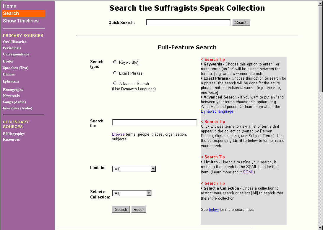
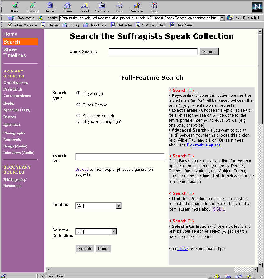
However, during the pilot user study we found that users were still
confused by the search page and, more importantly, we found that even though
they were confused they did not read the search tips until we prompted
them. In addition, after reading the search tips they identified areas
that were still unclear. So we expanded the search tips and included how
to do a Boolean and search (something two of the testers wanted to do).
Also only one of the testers noticed the Browse terms and did not take
the time to read the search tips that explained what it was, so we changed
the label to (Browse terms: persons, places, organizations, subjects).
In addition, we reversed the order of the search type and the search
for: options. We thought that if users were confronted with a choice of
search type first then they would be more inclined to read the search tips
to figure out which was the best option (see Figure
15: Current Search Page).
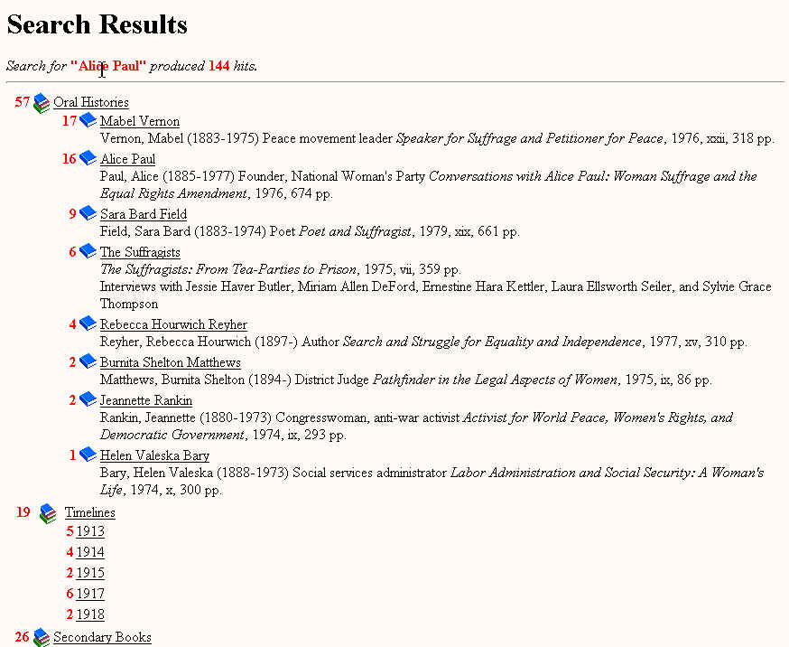
We mocked up HTML pages with our solution. We choose to make the first screen with no frames and to display the list expanded, with the goal of making it look more like search results that people have come to expect on the Web (see Figure 17: Revised Search Results - First Page).
The heuristic team identified that once the users clicks on one of the
choices from the search results page, there was no way to return to the
original search results without repeatedly clicking on the Internet browsers
back button. Also the usability testers indicated that they would like
to be able to return to the most recent search results and to return easily
to our search page. During the usability testing the users did not understand
what the blue arrow icon meant (it means that the list can be expanded).
Again, since the results are in Dynaweb and we were not able to make changes
to the document, we created an HTML version to demonstrate the changes
that we would like to implement (see Figure
18: Revised Search Results Second Page). We added icon buttons with
text: Expand and Collapse the list, New Search and return to Search Results.
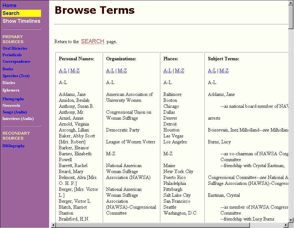
After initial usability testing we found that it would be more convenient
to combine the four lists into one page (Figure
20: Browse Terms Page).
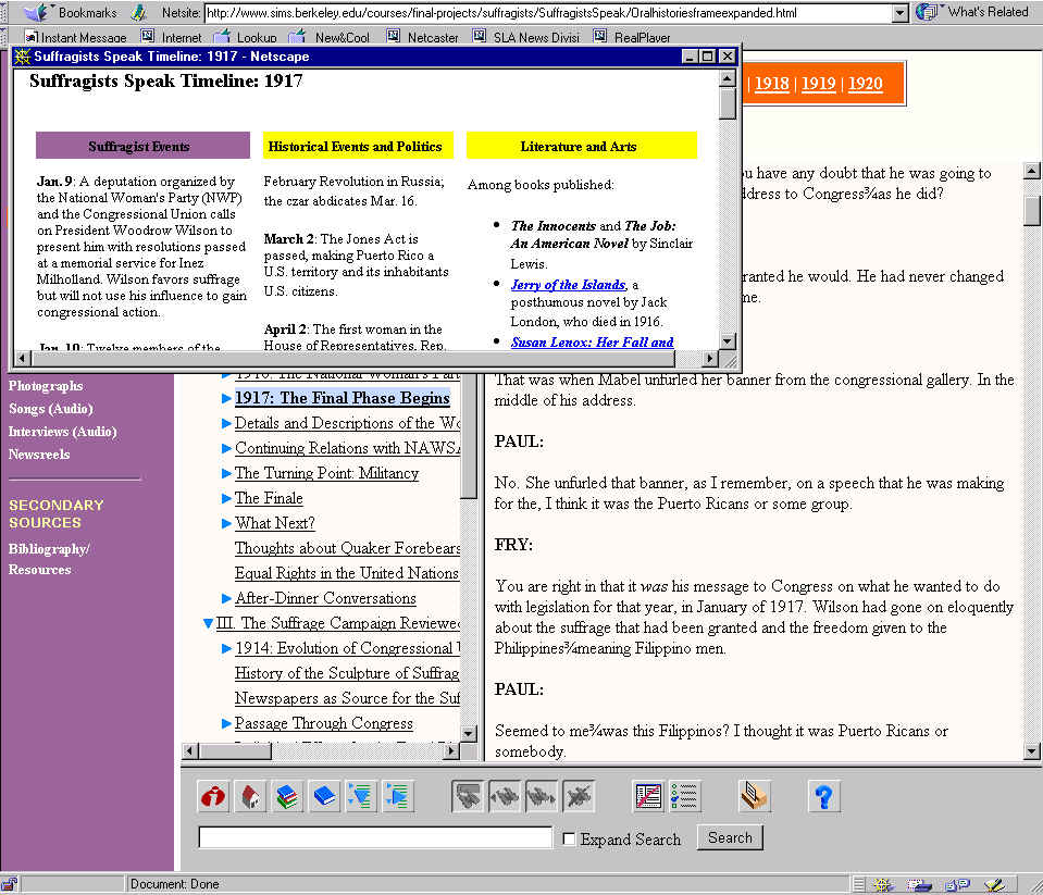
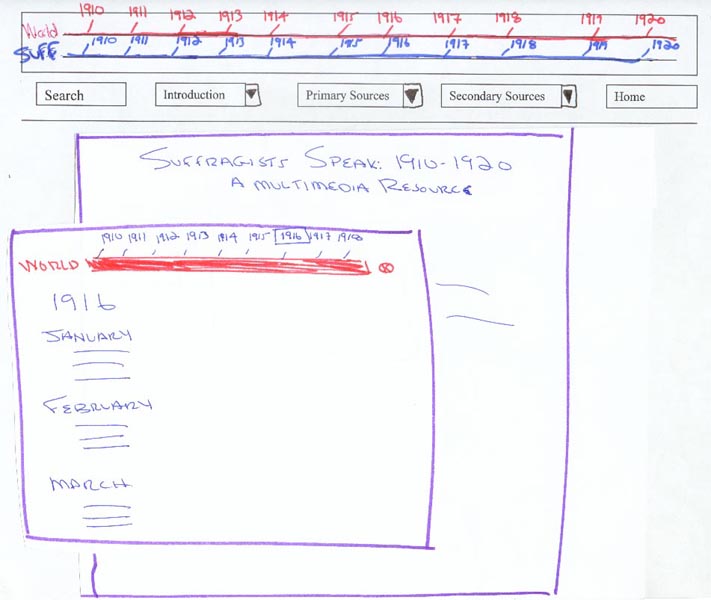
We felt that by making the timeline simply another choice of documents did not make it interactive in the way that we had envisioned. In addition, we wanted to add a second timeline of general historical events. The initial design for the world and suffragist timelines was to include them both in the top frame with links that opened up the information into a new, small browser window (see Figure 22: Low-Fidelity Timeline). We chose to implement the timeline using an adjustable and scrollable pop-up window because it allows users to refer to the timeline without losing their place in the main document. They can switch back and forth between screens as they read.
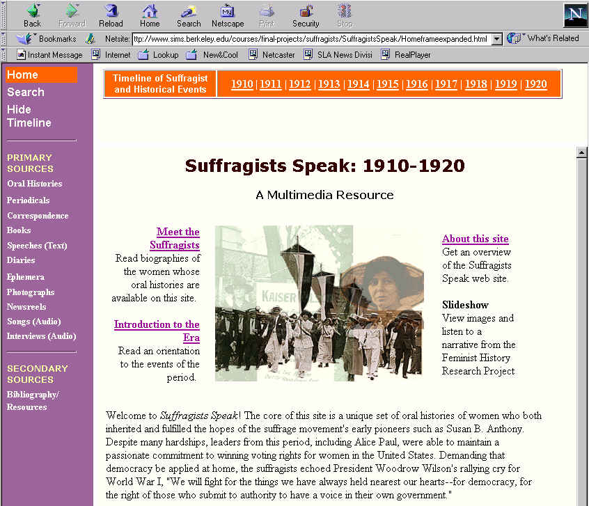
During the user testing we discovered that users liked the idea of the timeline pop-up window. However we also found that while the timelines are important tools (especially for researchers new to the subject matter), they might not need to be constantly apparent at the top of the screen (in fact, they could be an annoyance to more advanced scholars). In response, we added a feature where users can open and close the timelines as they wish. When user clicks on Show Timelines in the left navigation the timeline appears in a top frame (see Figure 23: Show Timelines). It disappears when the user clicks on Hide Timelines (see Figure 24: Hide Timelines).
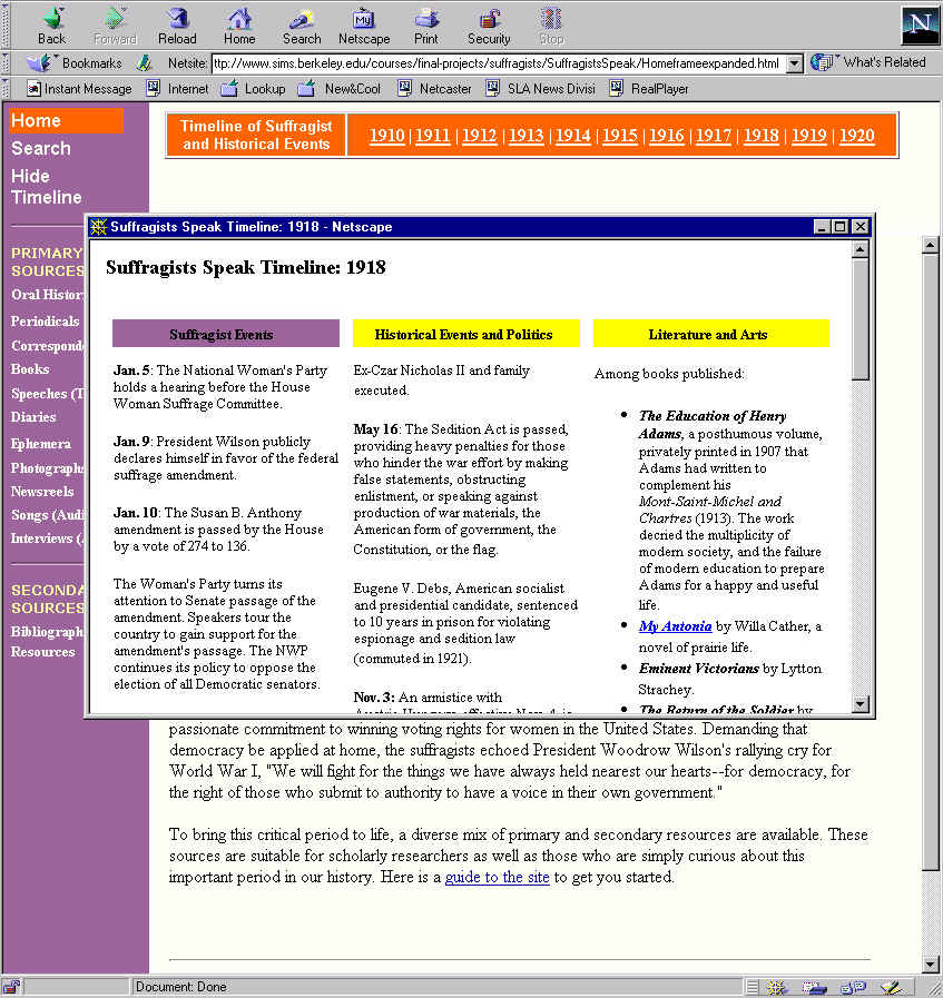
Testers preferred to have the world and suffragist timeline information in one screen so that they could easily cross-reference events. We therefore combined the timelines and added forward and back navigation within the windows so users can jump directly to subsequent and previous years.
Another issue pointed out by the testers was that they did not realize
that the timeline contained a fairly detailed account of suffragist events
between 1910 and 1920, historical and political events, and art and literature.
Many testers, especially those who considered themselves familiar with
the major historical events of the period, did not access the timeline
because they expected a very brief account of major historical events (for
example, Beginning of World War I, etc.). So we plan to change the navigation
label from simply Show Timeline to Show Chronologies and the timeline
itself we labeled "Chronologies of Suffragist and Other Historical Events"
to better convey the extent of the materials. (See Figure
25: Final Version of the Timeline.)
Users suggested that we add more links between material on the site. For example on the Meet the Suffragists page where we have a link to the oral histories we should also include a link to the audio excerpts that we have for that person. We added some links on the Meet the Suffragists page to the Alice Paul and Sara Bard Field biographies, and as time permits we will add links throughout the site.
Testers also commented that we need to have an editorial statement that
clearly states what the site covers and what it does not. We have not written
such a statement but recognize that it is needed.
The pilot usability test was also extremely helpful because we were
able to get input from real usershistory graduate students. Their feedback
was important for interface design and for content.
Another issue on the Browse Terms page is that currently the personal names are searchable within the SGML-encoded documents, but the subject terms are not. It will require a lot of work to embed the document with the appropriate tags, making it possible to search on the subject terms and find their occurrence in the appropriate location in the document, but to make the subject term tags themselves invisible to the user (we found this to be a problem we couldn't solve in the time available).
Other changes were minimally implemented, but we would like to make
changes throughout the site. We have not changed all the link colors on
all of the left navigation frames. Each frame is its own document, and
changing all of them is not feasible in the time remaining. (In fact, there
are two left navigation frames for each page of the site due to the show
timeline and hid timeline feature.) We also need to make links to materials
through out the site, which was a great suggestion from several users.
We stared to do it on the Meet the Suffragists page within several other
biographies of the women.
We created HTML pages that serve as a gateway to the SGML documents. We used the Dreamweaver WYSIWYG editor because it offered functionality such as creation of frames and easily-implemented Javascripts.
We used ColdFusion in our final prototype iteration to generate the Periodicals pages with various sort by options. Previously, each of these pages was hard coded with HTML. That meant that any time a periodical article was added, the new URL needed to be added to four different HTML documents. Using ColdFusion, we now have one database that supplies the information on the fly for all four pages. The reordering is done dynamically by the ColdFusion application calling on the database. The ability to easily update the material on the web site using one database is extremely important from a scalability point of view.
To some extent, using Dreamweaver limited what we could implement on
the site. We probably could have benefited from other web-site creation
tools and languages, but there was not enough time to learn other tools
or languages well enough to help. We would have benefited from knowing
more about Javascript to create additional features.
[Note: All team members contributed to this assignment.]