
This first interactive prototype is our first iteration following our low-fidelity paper prototype. However, we would still consider the interactive prototype to be "low fidelity" in the sense that we still concentrated on basic functionality and site structure. While this included page layout that supports the tasks, we did not spend time on aesthetics.
Our paper prototype was a success...in that it failed for our users but allowed us to gain some good insight as to how our users conceptualize the subject of blogging. The paper prototype presented a site structure that separated the three main tasks - find a blogger/blog, browse a topical area, find posts that match a keyword - into three sections of the site.
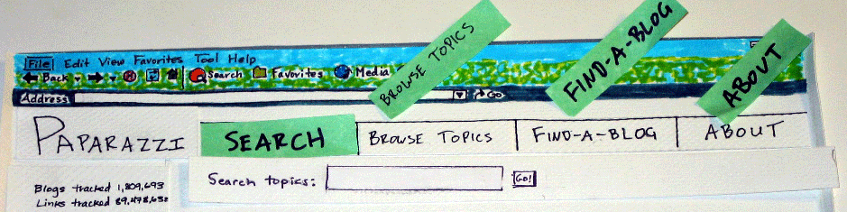
(more pics of the paper prototype)
In this iteration, we chose to modify our task scenarios only slightly. Our new scenarios cover the same types of tasks, using the three types of blog search and evaluation techniques (browsing, keyword search and blog statistics)
Change 1: Site structure redesign
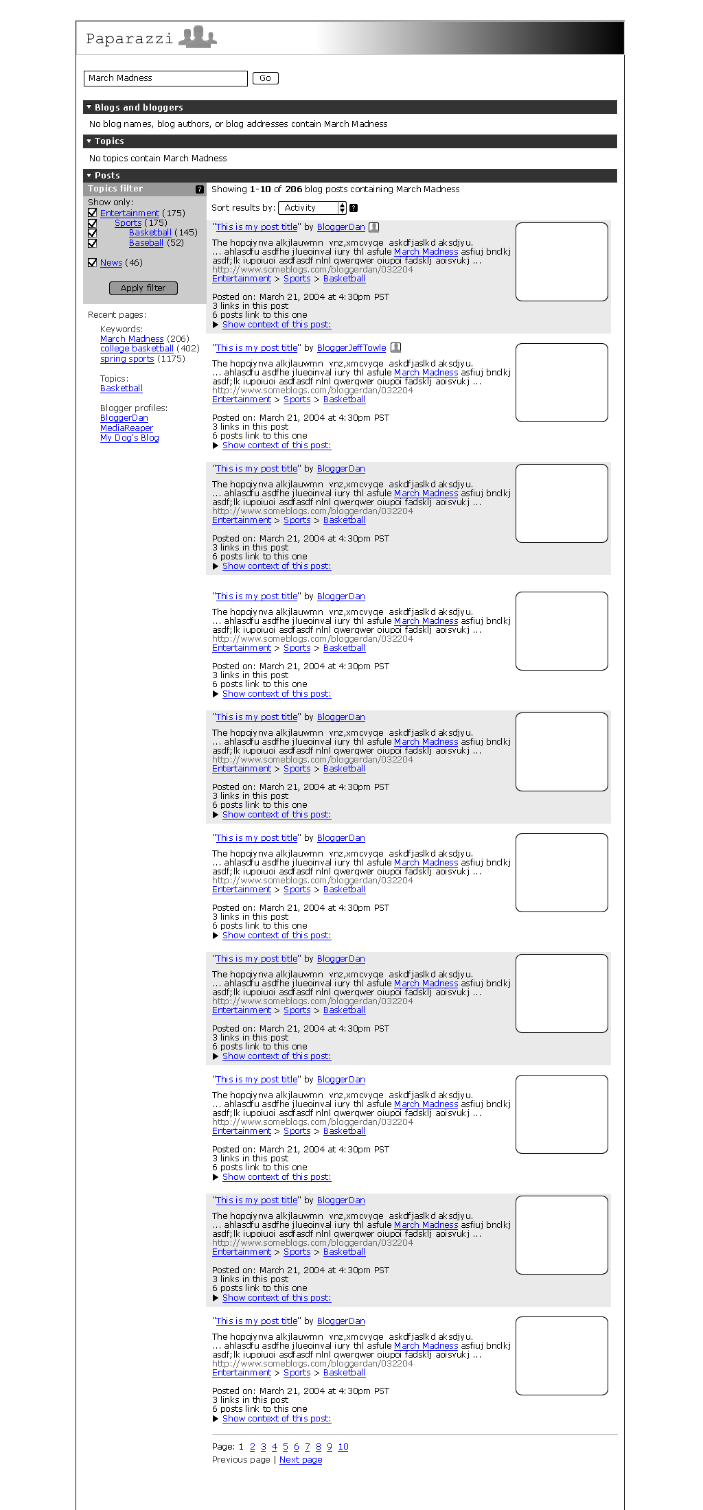
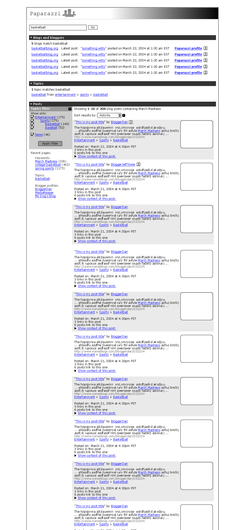
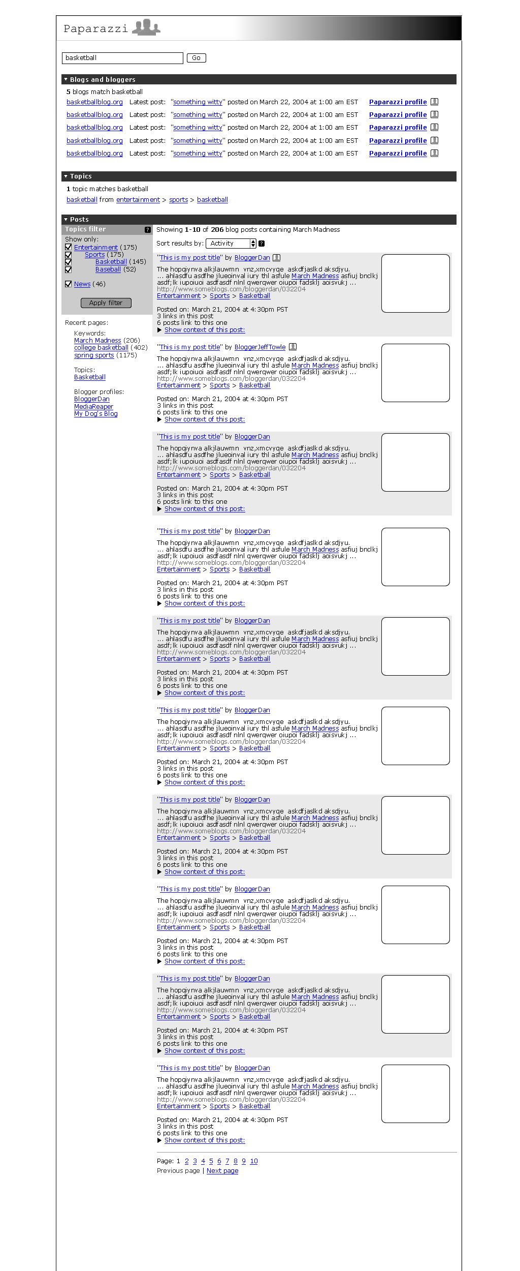
In this iteration of the prototype we wanted to try a different approach in terms of site architecture: users would have one search box. They could search for anything (specific blogs, topics or keywords) and the results would provide them cues as to what types of things match the search and let them choose their own course of action from there. For example, a search for "basketball" might lead to a blogger named BasketballBlogger, a blog topic under Entertainment > Sports > Basketball, or individual posts that have the keyword "basketball" in them. We chose to order the sections on specificity (blogger matches, topic matches, all post matches).
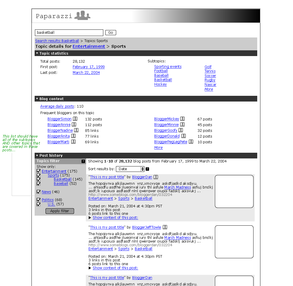
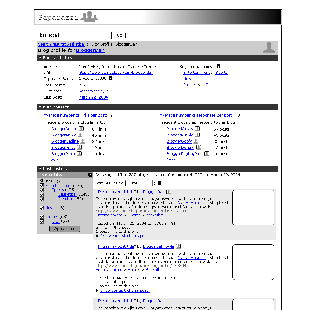
We carried this visually to the other pages as well. In the page on a particular topic, the first section contains subtopics, the second contains information about the bloggers who post on that topic, and the third section contains posts on that topic. In a blogger profile page, the first section is a set of statistics on that blogger, the second is about who that blogger links to and who links to that blogger, and the third section contains that bloggers posts.
Change 2: Use of icons
One of the things our user tests revealed is that people correctly identified that blog entry titles would link to the actual blog entry (outside of Paparazzi) and that the blog name would link that blog. Paparazzi was introducing a new concept: that of the blogger profile that should be associated with the blog name. In order to support this type of interaction, we created a blogger profile icon that would be shown inline with the blog name. We also used an icon to help reinforce the idea of linking to the context of a blog post.
The Profile Icon: ![]()
The
Context Icon: ![]()
Change 3: The new "context" page vs. the old "conversation" page and the elimination of the expandable search result
Our paper prototype did not implement the functionality behind a link we had associated with each blog search result: "Show conversation." None of our users really understood what that would do. Our initial revision to this concept was to have an expandable "context" link right below each search result that would show what each blog post is linking to and what is linking to each blog post. Then, users could click on another link that would take them to a page similar to "Google groups" which would have a threaded discussion-like interface. Another mockup quickly revealed some difficult interaction issues that would result from the "expandable" search result.
Therefore, we decided to scrap the expandable search result altogether. We would show data grouped under the notion of "activity" and have a link to a blog context page that would allow users to chain through blog posts. We are still working on ways to track the history of this chaining so that users don't get lost.
Change 4: The context-sensitive topics filter
Flamenco and other related work on dynamic filtering and topic clustering inspired us to have a notion of a topics filter that was always attached to the "posts" section of any page. This would show what topics are covered by the result set (and ideally how many, though this is not in the prototype), and allow users to just focus on posts that have to do with the topics they are interested.
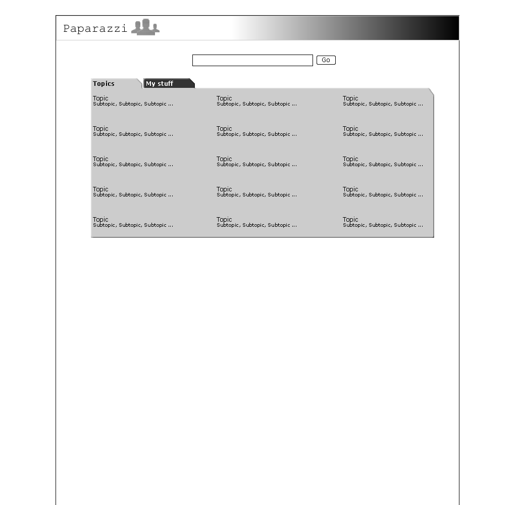
Change 5: Added a simple front page
We designed a Yahoo! (circa 1997)-like front page that would support searching or topic browsing. This moved the topics to a more prominent place (they had their own tab in the prior design).
Using PHP/HTML, CSS, and a little XML, we developed a prototype that would allow us to play with the content and the visual display of that content. There was some debate internally as to whether this was too much work and if it would limit our ability to just "prototype" (i.e.. throw something together and test it rapidly). Because our interface is so content-centric, we realized that we needed something that would be reusable for later prototypes.
A major drawback of this approach is that it requires special skills. Not everyone can manipulate PHP. Not everyone gets how CSS should be used with HTML. However, the advantage is that we have a lot of functionality and can now rapidly iterate.
We do not have any mockups of the pages we did not implement at this point. All of the interactive pages are there, even though some of the features on those pages are not yet functioning (ie, filtering by topic). We imagine that the help will be context sensitive and will result in little pop-up windows.
The link below will point your browser to the interactive prototype. The data set contains posts on current controversy regarding Richard Clarke and the 9/11 Commission hearings. These posts fall under the "news" topic. We have a few different bloggers in the data set. There is still some "dummy data" lingering which may be confusing.
We added this content to facilitate the tasks that we designed for the David Dursley persona, who would be tracking topics and monitoring specific blogs. [New Tasks]
Mary - Content & Presentation
Dan - Prototype Design & Presentation
Jeff - Prototype Implementation
All - Comments on each other's portion & general design