Florance Gee
IS 231
Individual Assignment 1
1. The Rider Mel’s Mountain Bike Guide to Moab is a site where the book (The Rider Mel’s Mountain Bike Guide to Moab) is sold. The book has mainly maps, directions and yellow pages on the recommended biking places in Moab, Utah. The site has some basic information on the book, sample pages, book reviews, and ordering capability. It additionally has photos and videos of the author Rider Mel’s biking experiences.
The following user interface face HE rules have been violated on this web site:
H1-1: Simple and Natural Dialogue
Good graphic design and color are important in achieving a simple and natural dialogue for modern computer systems with graphical user interfaces. The site design has too many colors contrasting each other. There are about 10 colors (excluding colors of the logo) that are being used just on the homepage. For example, the home page has bright red and yellow and other major colors, and they compete for attention. They make the page look like a salad mix and users would feel the page is screaming to them.
Severity Rating: Minor usability problem
Solution: Limit the colors to a small number of consistently applied colors.
H1-2: Speak the User�s Language
The site is clearly not speaking in user’s language. Some of the terms being used are very confusing and misleading. The site is about selling a book, and so when you see the link “Photos and Vidoes”, you would think that it leads you to photos and videos of the book, but surprisingly, it actually leads you to photos and videos of the author’s traveling experiences. Another very bad term is “Sample Trails” on the left navigational bar. What do “Sample Trails” mean? Would that be information on some biking trails? But which trails? The term is clearly badly used, especially when you find out that it links to a picture of an inside page of the book that talks about biking trails in Moab. The term “About Rider Mel” implies information about the author Rider Mel, but the page links to a description of the book
Severity Rating: Major usability problem
Solution: Clarify some of the confusing terms. For example, the link “Photos and Videos” can be omitted, and instead there can be a link that has information on the author. It can have the name “Author” or the existing “About Rider Mel” , and the inside page of “Author” can have more personal information on the author, and links to photos and videos of his travel experiences. “Sample Trails” can be replaced by “Sample Pages” of the book.
H1-4: Consistency
The layout of many features is inconsistent throughout the site is inconsistent. For example, the size of the left navigational bar changes from page to page, sometimes it is larger and sometime it is smaller. The font of the site also changes haphazardly. The content of some pages are in the font of times roman, while the content of other pages are in another font.
Severity Rating: Major usability problem
Solution: Change the content font, navigational bar size to be the same on every page. Maybe use a template or a cascade style sheet for the web site so that the layout, font, and size can be more easily controlled.
H1-6: Clearly Marked Exit
Once the user goes to the site’s shopping cart (from the new online ordering link on the homepage), which is a different web site, the user cannot go back to the original Rider Mel’s site. There is no link to go back and the “Back” button of the browser is also not functional. The user is trapped to be in the shopping cart unless he/she retypes the url and re-enter the Rel Mel’s homepage from the beginning. There is no easy way out once a user lands on the shopping cart’s page, both intentionally and unintentionally, and the user might be tempted to leave the site entirely.
Severity Rating: Major usability problem
Solution: Add a link from the shopping cart page to go back to the Rider Mel’s web site. Release the lock on the back button so users can go backward and forward freely from the browser.
H1-3: Minimize Users’ Memory Load and H1-9: Prevent Errors
The homepage tells you that there is a new online ordering form available, but when you click on the “Ordering” link and go to the ordering inside page, that option is not available. There is an icon of an online ordering company, but it is not clickable, and there is no way to go to the online ordering form from the “Ordering” page unless you remember that the link is actually only on the homepage. This adds to user memory load and violates the memory load design principle. Since the online ordering option is not available on the “Ordering” page, users would have to choose other options. There is only one other option available: to printout an order form and fill it out and mail it back to the author. This involves too many steps, and will lead to errors easily. Receipt and proof of purchase are not available when mailing in the order form, and customers are not protected as a result. Users are prone to errors when ordering from this site.
Severity Rating: Major usability problem
Solution: Add an online ordering link to go to the shopping cart from the “Ordering” page. When users mail in an order form, provide a method for customers to print out a receipt or proof of purchase. An example would be emailing the ordering form to the author and receiving a confirmation once the email has been received.
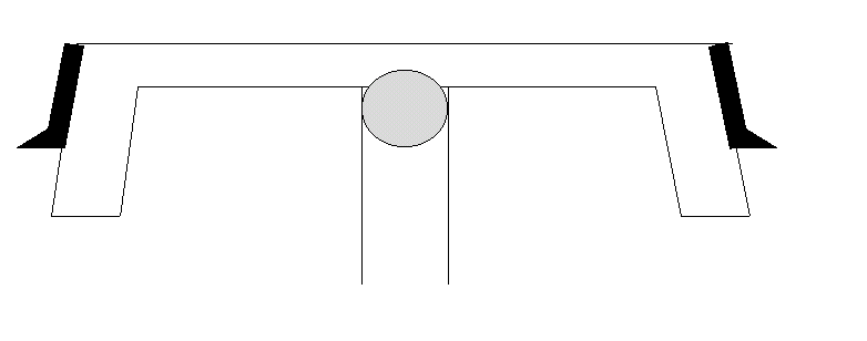
Figure 2: Bike handle that contains a lever control on each side and a dial in the middle
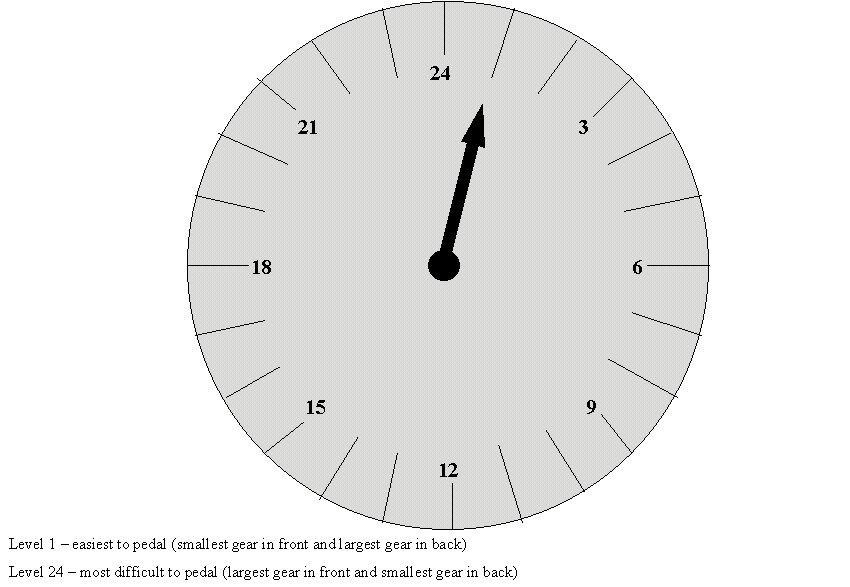
The current design is clearly hard to understand and control, so safety might be at stake when the gear shifts are changed. In my proposed design, this safety concern can be minimized. There is one dial control in the middle of the bike handle that indicates the current gear level. There are totally 24 gear difficulty levels available, and the dial shows all levels in a clock-like environment, as shown in figure 1. Level 1 is the easiest level to pedal with the smallest gear in the front and the largest gear in the back, and the figure shows the bike is currently at level 1. Level 2 is the next easiest level with the smallest gear in the front and the second largest gear in the back. Level 3 is where the smallest gear is in the front and the third largest gear is in the back. The gradual increase in difficulty level continues until level 24 where the largest gear is in the front and the smallest gear is in the back. Figure 2 shows where the dial is located in relation to the bike handle and the lever controls. The gray circle in the middle is the dial and the black lever on each side is a gear shift. Pressing the lever on the right once will turn the arrow indicator clockwise one step on the dial, and will increase the gear difficulty level by 1, except when the level is at 24, and turning it clockwise will change the gear back to level 1. Pressing the level on the left will turn the arrow indicator anti-clockwise on the dial, decreasing the difficulty level accordingly, except at level 1, where pressing the lever on the left will change the gear to level 24. The design is easy for users to understand since there is only one linear scale on the difficulty level, and the clock-like environment should be familiar for everyone. Pressing the right lever turns the dial clockwise, and it is a mental mapping of turning right, and pressing the left lever is a mental mapping of turning left (anti-clockwise on the dial).