Ran Li
IS213
Individual Assignment
3/11/04
Heuristic Evaluation
The web site, Rider Mel's Mountain Bike Guide
to Moab, is trying to introduce and advertise the user a reference book
about riding mountain bike in Moab. It allows the user to read the book samples
and reviews. It also provides the book ordering information and related links.
In order to draw the user’s interests, the site publishes Moab photos as well
as video clips, and prize more involvement trough a contest.
Violations
[H1-1: Simple & natural dialog]
|
Reason |
Severity |
Recommendation |
|
On
the left panel, the site use large amounts of screen space to display the
retailer’s logo. Since less is more, the CCNOW logo is not necessary at all
to display on every page of the web site. |
4 |
Remove
the logo from the left navigation bar and put it inside the order page at
most |
|
The
homepage looks noisy by using wildly contrasting, highly saturated colors. |
3 |
Simplify
the colors. Use at most three or four colors. |
[H1-2:
Speak the users’ language]
|
Reason |
Severity |
Recommendation |
|
“Back To the Moab
Information Site” link make no sense to user who enter the site directly. Why
and where should I back? |
3 |
Put
the Moab Information Site into its cool link page or add a link on left panel
named More Moab Information |
|
Put
“Home” at bottom, but “About” at the top in the left navigation bar is not a
way the user get used to |
3 |
Pop
“Home” to the top, and put “About” to the bottom |
[H1-4: Consistency]
|
Reason |
Severity |
Recommendation |
|
The
link “Photos” on left navigation bar become “Photos & Videos” in Home and
Photos’ pages, but return back to “Photos” in all other pages. |
3 |
Change
“Photos” to “Photos & Videos” to keep consistence on left navigation bar |
|
Use
“Ordering” on left navigation bar, but use “Order” on the bottom of page
navigation |
3 |
Change
“Ordering” to “Order” for all navigation links |
|
In
the photo page, the Photo labeled with new! Sometimes appease on the top of
the photo, sometimes on the left of the photo. |
2 |
Align
“new!” label on top of all new photos. |
[H1-5:
Feedback]
|
Reason |
Severity |
Recommendation |
|
In
the video clips page, there is no clear clue that whether the links open an
online watching clips or a download version and how big or long it is. |
2 |
Clarify
user should download the video, how big it is and how long it will take. |
[H1-7: Shortcuts]
|
Reason |
Severity |
Recommendation |
|
In
the ordering page, there is no way to go to the authorized online retailer. |
4 |
Provide
a hyperlink to the CCNOW online ordering page for the book |
[H1-9:
Prevent errors]
|
Reason |
Severity |
Recommendation |
|
In
the homepage, once users click the online ordering link, they can never go
back except reopen the site. |
4 |
The
link should open a new window to CCNOW site |
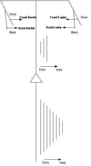
Bicycle Gear-shift Redesign
Since the design of the gears (both front and end) have been decided, move them inward (in this case is towards left side) make the ride easy and move them towards right side make the ride hard. I decide to map the levels on the right handle to shift the gear to the easy riding way since the direction of pressing the levels is as same as the direction the gears will really move. Also, since silver level is in front of black level, I decide to map the silver level to control the front gear and black level to control the back gear. Also, the same reasoning way is applied to the design of the left handle.