Individual Assignment
IS 213
User Interface Design
Nettie Ng
March 11, 2004
Question 1: Heuristic
Evaluation
- Simple and natural dialogue
This site certainly has a problem with over-doing color. Texts are presented in yellow, green, black, white, red, and blue six different colors. Color should only be used to categorize, and differentiate, not to give information.
Rating: 4
Suggested solution: Change the font color to black. May use bigger font or bold to emphasize certain text contents.
- Prevent errors
The placement (in the middle) and presentation (in big colorful fonts) of the texts are very misleading. The green and yellow texts in the middle of the page appear to me that they are some kinds of links that could lead to the main content of the homepage, whereas in fact they are just static text/descriptions of the content of the book – “Mountain Bike Guide” and have nothing to do with the homepage.
Rating: 5
Suggested solution: If really the homepage is to showcase the content of the Guide, it might be better to write out clearing in a short paragraph with headings saying “This guide features simple map, easy to follow directions…….”, so users know that these texts are describing what the guide is about and not what the homepage is about.
- Consistency
Links on the page are presented in different colors. White is used for left-panel links, blue is used for the link in the middle, and green is used for the link at the bottom of the page (“Back To The Moab Information Site”).
Rating: 3
Suggested solution: Use one color for all links on the page.
- Clearly marked exit
If “The Moab Information Site” is the parent site of this site then user may want to go back to that site after finished browsing this site. There is a lack of clearly marked exit to do that now. The “Back To The Moab Information Site” link located at the bottom of the page is not very obvious to me.
Rating: 3
Suggested solution: Have a link on the left panel to make exit more clearer.
- Simple and natural dialogue
The link to “home” on the left panel is listed at the bottom of all links, which is not the natural way of how link orders are usually presented. It is used placed on the top of all links.
Rating: 2
Suggested solution: Move the “home” link to the top of all links.
- Prevent errors
On the ordering page, the three choices of ordering are presented in a way that looks like user can click the first choice (image icon) to place an order online, whereas in reality the image is a static image with no function attached to it. Also the second and third options both represent mail-in ordering, one is to provide a form and one is to provide with the address, which the way it lays out appears as if there are two different options of submitting order.
Rating: 5
Suggested solution: 1. Either implement the online ordering function or remove the image icon totally to avoid error. 2. Remove option three since the address is already on the form. 3. Change the wording of option two to something like “To order by mail, click here to obtain an ordering form”.
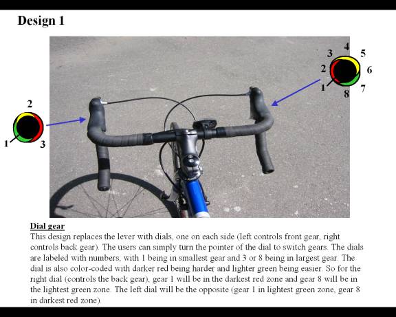
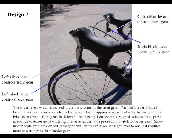
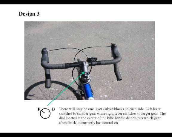
Question 2: Bicycle Gear-shift Redesign
The original design is not intuitive and confusing to me. The design is that pressing the black lever switches to higher gear and pressing the silver lever switches to lower gear for both front and back gears. However, since switching gears to higher or lower gears on front and back produce opposite effect, the users have to first remember high front gear means more difficult, which is opposite for back gear then they have to remember left levers control front and right levers control back. And most significantly there is no display as to what gear he/she is currently in. This is problematic since then you have to keep adjusting gears hoping to feel what gear you are in, or you would have to physically look at the chains, which could be challenging especially for back gear which is located at the back and there are eight different gears.