Question 1: Heuristic Evaluation
General Comments on Solutions
Overall, people did very well on this and I could have included many people's solutions here. One problem that does come up is some people did not structure their critique around the "official" heuristics, but rather used general design principles like "Poor graphic design". If you're doing an HE you need to structure your critique around a well-defined set of guidelines. It's fine to decide which set you want to use, but in the assignment I asked you to either use Nielsen's original ones or else declare which set you are using instead.
Solution by Hong Qu
Preface from Marti: I selected this one because it is concise while really nailing the main problems with the site, in the context of the heuristics. It also does a nice job of integrated suggested solutions. One point of disagreement is that I would not assign such high severity ratings to the problems found; none of these merit a severity rating of 4.
The website Rider Mel's Mountain Bike Guide to Moab (RMMBGM) promotes a book about mountain biking in Moah Utah. The writer, a Canadian biker named Mel, created this website to showcase his enthusiasm and expertise as well as to sell the book. The website provides two means of ordering: a paper order form and an online order form operated by a third-party e-commerce website. To persuade visitors to purchase the book, the website contains a sample page from the book, a list of featured content, and book reviews copied from biking magazines. There are also photos, videos, links, and contact information to entertain and convince visitors that Mel is an authority in this recreational activity.
The website has many usability problems:
|
Guideline |
Speak the User’s Language |
|
Description |
There is no indication that the website is devoted to a book. Even the links to order “your copy” does not use the word “book.” The picture in the homepage is supposed to be the front cover of the book, but it is indistinguishable from other types of web images. The only way to figure out that the website talks about a book is by clicking into the Book Reviews page. |
|
Severity |
4 |
|
Solution |
Write an introductory paragraph introducing the content of the website. Use the word “book” in text and links. Make the image of the book with a drop shadow and smaller to communicate to visitors the metaphor of an actual physical book. |
|
Guideline |
Consistency |
|
Description |
The online ordering form has an entirely different design than the rest of the website. Once the visitor click on the link, a new order form takes over the browser. The ordering form is designed and operated by a company called CCNOW. |
|
Severity |
2 |
|
Solution |
Mel, the website owner, probably lacks the technical expertise and financial resources to build his own order form. Ideally, Mel can utilize SSL encryption to create an order form right so that it is more integrated with the rest of the website. |
|
Guideline |
Simple and natural Dialogue |
|
Description |
The navigation system in the website is poorly organized. While the main menu is located in the left sidebar, there are important links hidden in the body pages. On the homepage, the eye-catching image of a list of featured content jumps out at visitors prompting them to click on them even though they are not links. Another gaping problem arises when users try to go to the order form. Only the text link on the homepage is a live link. The image of CCNOW is not clickable and won’t take the user to the order form. |
|
Severity |
4 |
|
Solution |
Revise the left menu to include links to the ordering form. Change the attention grabbing bulleted list into more subdued style of text. The ordering page should have two clearly labeled choices: order online and order by mail. |
|
Guideline |
Clearly Marked Exits |
|
Description |
After going to the order form page, users want to be able to return to the main website. The back button’s functionality becomes disabled in a way that visitors cannot get back once they have entered the order form website. |
|
Severity |
3 |
|
Solution |
Make sure that the back button is not disabled by CCNOW. |
|
Guideline |
Minimize User Memory Load |
|
Description |
The home button is located in an awkward position. Users have to read through the entire left menu to find the link to home. Another link at the bottom of the page is labeled “Back To The Moab Information Site.” This link takes the user to moab-utah main website. Both of these links are labeled ambiguously and placed in hidden spots. Users have to memorize the location and destination of these two navigation elements. |
|
Severity |
1 |
|
Solution |
Make the logo a link to home. Move the “Back To The Moab Information Site” link to the bottom of the left menu. In general, layout the menu links in a more structured and orderly manner. |
Solution by Judy Ma
The intended functionality of the interface is to provide an overview of the guidebook, Rider Mel's Mountain Bike Guide to Moab, and to allow the user to purchase the book through the website. To provide an overview of the book, the site has a short summary about the book's features, movie clips and photos of Mel and his friends, a sample trail, and reviews of the book. If the user wants to order the guidebook online, he must go to the homepage and click on the ordering link there. Otherwise the user must print and fill out an order form and send it via postal mail.
Heuristic Violations
H4 Consistency
Problem: A link in the left navigation and footer appears as "Photos & Videos"
when you are on the homepage or on the Photos page. For all other pages on the
site, the link same link appears as "Photos."
Severity: 2
Fix: Change all occurrences of "Photos" into "Photos & Videos" in the left
navigation and footer.
Problem: The CCNow graphic for ordering the guidebook is not click-able whereas
other graphics, namely on the Links page, are.
Severity: 3
Fix: Make the CCNow graphic linked to the ordering site and open the resulting
page in a new window.
H1 Simple and Natural Dialog
Problem: There is a variety of color for the links in the left navigation, the
main content window, and the bottom frame.
Severity: 1
Fix: Choose one color for the links.
Problem: The choice of colors for the interface is too bright and contrasting
(red, yellow, and green).
Severity: 1
Fix: Limit the color-coding and choose more muted tones.
Problem: The grouping of the links in the left navigation is random.
Severity: 2
Fix: Group by guidebook overview and ordering information.
Problem: The Ordering page is confusing. The CCNow graphic is not click-able
but the wording on the page makes it seem like the user can click it and order
the book. Also, there are too many "OR's" on the page, making the ordering
instructions difficult to understand. (see screen shot below)
Severity: 4
Fix: Make the CCNow graphic linked to the ordering site and open the resulting
page in a new window. Fix the wording so that it is clear the user has only two
choices: He can click on the CCNow graphic to order online, or fill out the
order form and mail it in.
H2 Speak the user's language
Problem: The "About Rider Mel" misleads the user to think that the page is
about the person Rider Mel. Instead, it is about the book and not the person
who wrote it.
Severity: 3
Fix: Either change the link's wording to say "About the Book" or change the
content of the page to be about the person Rider Mel.
H6 Clearly marked exits
Problem: After clicking on the order link, the user is unable to return to
Mel's site. The Back button just keeps refreshing the CCNow page. If the user
wants to return to Mel's site, he must click on the link at the CCNow ordering
page, which then displays Mel's site in a frame. Thus, the user is trapped
within the ordering frame without any way to get rid of it. (see screen shot
below)
Severity: 4
Fix: Have the CCNow ordering page open in a separate window.
Question 2: Bicycle Gear-shift Redesign Question
General comments on solutions
I was really looking for a discussion of the cognitive issues when critiquing this design and proposing a solution. See the text of the question:
-
I claim that the mapping between the actions the gear shifts are supposed to
produce and the actions they do indeed produce are unintuitive and require
memorization that can interfer with safe operation on the road.
For this question, either defend the current design or describe how the design
could be done better. Focus especially on the ideas of mental models and mappings.
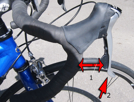
An important point to discuss is the inconsistency between the movement of the gearshifts and what it is they do. Pressing harder doesn't consistently make riding harder or easier. Pressing the black lever doesn't consistently make it harder or easier, nor does pressing the silver lever. Nor is one hand dedicated to harder or easier. In short, the mappings in this design are as confusing as they could possibly be.
On top of all this, it is very difficult to know what state the bicycle is in while riding it. In other words, the bike is highly modal, but the modes are not visible. The only cue for the rear gear position is to look backwards and down, something which I find impossible to do safely if riding fast.
There are a number of plausible solutions. One way to go is to model the status of the bike as being in one of three main modes (large, medium, and small, as dictated by the front gear) and indicate this with a big switch of some kind, on the lefthand side, or in the center of the handlebars. Then within the main mode, the rider can switch from harder to easier and back. This is a good model as it reflects the physics of the bike in a meaningful way, since the rider is supposed to gradually shift from larger to smaller gears and back.
Another way to go is to at least ensure that moving the gears in the direction of a given difficulty is consistent with the gearshift. So some people suggested a slider-like control that moves up for harder, down for easier, one for each set of gears. A drawback her is it is a bit less clear how the two sets of gears interoperate.
Many other important factors came up, like being concerned about the wear and tear on the shifts to be sure they last, and taking into account the type of user of the bicycle (professional racer vs. recreational user, etc)
Solution by Allison Bloodworth
Preface from Marti: the description does not need to be this long; I selected this example because it does a good job of incorporating the cognitive principles (negative transfer, cultural standards, visibility of mappings, design of affordances) learned in class while at the same time really describing the problems with the design. This solution is also well done, keeping in mind the physical constraints, while not allowing them to force a bad design. Note that I do not include the sketch; the text describes it well enough.It seems very obvious from looking at the pictures of the gear-shifts that they do not match a typical bicycle user's mental model of how a gear-shift would work. The discussion on the class email list to clarify their operation, even after Marti's careful explanation, also illustrates this fact. Most people would assume that the large silver levers are the brakes, and only the brakes, because that conforms to their mental model of a bicycle; they have learned that there are separate levers that control the gears and brakes. This is somewhat of a cultural standard, which most bicycle users discover when they are young. If a user assumes that this mental model of how bicycle gears should function can be transferred to this bicycle, they will experience negative transfer, and be wrong.
Another reason that people would have difficulty determining how gear-shifts work is that the results of their operations are not immediately visible to the user, making it difficult for them to determine what has happened. This is a problem in all bicycles with gear-shifts, and is not specific to the design of these gear-shifts. Although feedback is provided after a gear is shifted by the change in ease of pedaling, the user cannot actually see which gear they have affected (e.g. front or back), or which direction they have moved the chain on the gear. Norman states, "visibility indicates the mapping between intended actions and actual operations." In the case of a bicycle, users would more easily be able to predict what would happen when they move one of the gear-shifts next time if they could see what had actually happened. This might help them realize what pattern the gears follow in terms of making pedaling either easier or more difficult.
I have never been able to create a mental model of how my gear shifts work. I know if I am adjusting the chain on the side that has three possible gears, it is always harder to pedal when I am on the large gear, and becomes progressively easier when I move to the smaller gears. However, before reading the explanation of how this bike worked, I really had no idea that it worked the opposite way in the back because I had never been able to observe the gears. Because I know at least this much, I often look down at the front gears as I am beginning to press a gear shift on my bicycle to see if I can tell what direction it is going to go before actually activating it. This helps me determine whether I am pressing the correct lever. However, this is a dangerous action which necessitates that I look away from the road and down at my feet for a moment and really only allows me to look at the side with three possible gears near my feet. It would be much better if I could somehow receive feedback about what the gear-shift was going to do without looking down.
Since we cannot change the design of the gears to give the user feedback before they shift them, we need to focus on making sure that the gear-shifts give the proper affordances to the user so that they can determine how to operate them. The action of the gear-shifts should also create a conceptual model that will allow the user to map the actions they take on the gear-shifts to the effect it will have on how hard or easy it is to pedal.
The first problem is that the constraints on the gear-shifts of Marti's bicycle are misleading, in that it wouldn't seem obvious to a user at first that these things that appear to be brakes could move right and left and become gear-shifts. Even if the user knew that the gear-shifts were indeed gear-shifts in addition to brakes, they offer no affordances to indicate that they can be moved inwards. I am not sure I understand the reason for combining the gear-shift and brakes into one lever, but assuming that there is indeed some reason this is preferable for a user of this type of bicycle, I would add a depression about the size of a finger on the outside of the two levers which would indicate to the user that they could place their finger there and push the lever in.
The second problem is that users have difficulty remembering which lever makes it easier to pedal and which lever makes it harder to pedal because they do opposite things on opposite sides. This prevents the user from creating a mental model where moving one gear-shift lever always makes it easier to pedal and moving the other one always makes it harder to pedal. Assuming there is no mechanical reason that I cannot do this, I would re-wire the controls so that the silver shift lever always made it harder to pedal, and the black shift lever always made it easier to pedal. If this was not possible because the big shift lever always moved the chain up the gears and the smaller shift lever always moved it down, I would design two equal size, but differently designed shift levers so that the user would not perceive that they have opposite actions (e.g. "make it easier to pedal" vs. "make it harder to pedal") on each side.
I think it would also help the users map the gear-shifts to the gear they will effect if I put numbers or a color code on each shift lever, visible to the user. That way the user can easily remember that "3" or "red" is the big gear in front that has three levels and makes more dramatic changes and "5" or "green" is the smaller gear in the back that makes less dramatic changes. That is easier to remember than right or left.
Solution by Jeff Towle
This was turned in in pdf format
Solution by Krista Gettle
Preface from Marti: This is a very creative solution that really addresses the mapping issues
Excerpt from the question: "I claim that the mapping between the actions the gear shifts are supposed to produce and the actions they do indeed produce are unintuitive and require memorization that can interfere with safe operation on the road."
I concur with the assertion made in the assignment. As an individual who gave up riding an 18-speed bike because I could not master it. I relish the opportunity to make the controls more usable.
Issues with Current Design
The primary issues with the current design are:
 Current Design
1) The distance between the handlebar of the gear shift levers requires the rider have a very wide grip in order to operate comfortably.
2) The levers are positioned so that the black lever is nested in the silver lever making it difficult to distinguish them by touch and manipulate them independently.
3) The mapping
between the levers and their function is not uniform. For instance, on the left
side pressing the silver lever makes it harder to pedal but pressing the silver
lever on the right side makes it easier to pedal. Therefore, each hand must have
independent muscle memory. Also, the silver lever serves two functions, shifting
gears and braking, with the single movement of squeezing. Distinguishing between
the two is merely the amount of pressure applied rather than a distinctly
different positioning of the lever.
Bicycle Gear-shift Redesign - Modified Design
My redesign of the bicycle gear-shift seeks to make the shifting process more intuitive and physically comfortable for a wider range of riders. Before I discuss the three primary changes I made to the existing design. I want to address those elements that remain the same. I chose to keep the original handlebar design because it is facilitates speed. Bicycles with 10 or more speeds (i.e. not mountain bikes) tend to be used on city streets for traveling quickly. The standard drop handlebar design places the rider in a more aerodynamic position. Without this consideration, I would have probably used a horizontal bar. My design also does not address the mechanics of the bicycle since I thought the rider is less concerned with intricacies of gear ratios than he is with being able to operate it effectively. Those concessions made, I am ready to explain the changes I did make to the design.
Justification of Design Changes
 Redesign
1) I chose to separate the braking and shifting functions into two separate controls. This will allow for a more intuitive learning process and fewer techniques that must reside in muscle memory. I also positioned each of the controls in a manner that would allow the stronger part of the hand or the grip to control the break and the more dexterous part of the hand or thumb to manage the precision of shifting.
2) The brake lever is in a similar position as the original layout but is situated closer to the handlebar and at a more ergonomic position. As I mentioned above this takes advantage of the strength in the grip portion of the hand.
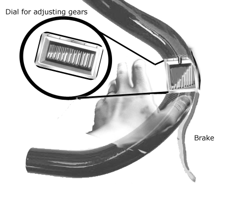
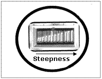 Shifting Mechanism
3) The shifting
mechanism constitutes the greatest change. Rather than a lever, I chose a
knob/dial device that will click into each gear as it rotates. The markings on
the knob correspond to the terrain rather than the difficulty of pedaling.
Therefore, the lower end of the scale will provide the most resistance, as the
rider begins to go up the hill, they can use their thumb to adjust the
resistance according to their terrain. Both handles will have the same control
that functions the same way. With this system, riders can easily look at the
dials to assess what gears they are in and how they might want to adjust them.
Solution by Van Makam
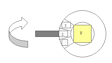
The current design has poor mapping and can easily confuse the rider. The bicyclist must remember which handle refers to which wheel's gears, and also remember which lever makes it harder or easier as the gears increase. There is also an inconsistency in the way the "harder to press left silver lever" implies harder pedaling, but the "harder to press right silver lever" maps to easier pedaling. The current design has a few advantages in that, the silver lever always maps to smaller gear to larger gear, and the black is the reverse mapping. Due to the four different sets: [silver/black] levers, [smaller/larger] gears, [left/right] handles, and [front/back] wheels, the combination must be more consistent and intuitive for the cyclist.
Without changing the physical structure of the gears, one way to improve the design of the gear shifters is to use a rotating lever. If each handle had a lever, labeled "F" and "B" for front and back respectively it could easily be inferred as to which wheel's gear was being changed. To alleviate the issue of increasing the gears to mean harder or easier depending on which wheel you are referring to, one suggestion is to use a numbering or color code system to imply "harder" or "easier." For example, increasing the number or darker color would map to more difficult pedaling. Decreasing the number or to a lighter color would make it easier. The lever would be perpendicular to the handlebars, allowing for a rotating up or down motion. To accommodate the mechanical motion of the bicycle, the lever might have a button on top to allow for reverse motion, and otherwise pushing it upwards.
Below is a diagram depicting the revised design: