Response
to Heuristic Evaluation Findings
Project group 2 performed a heuristic evaluation on the first interactive prototype of CoCoFo, the SIMians Course Comment Forum site. We addressed most of the errors that they found as described below.Rating System Errors
Group 2 found a number of errors dealing with the system that we devised for students to rate courses, professors, and course difficulty. We originally used a 6-point "three-thumbs-down" to "three-thumbs-up" scale for the professors and courses, and a 5-point "very easy" to "very difficult" scale for course difficulty.
HE: [H6 Recognition rather than recall] (Severity 2.5, 2 evaluators found this error)
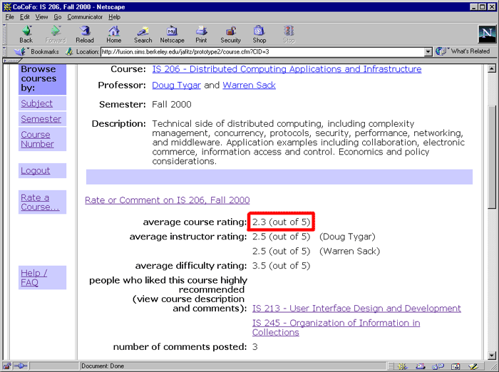
We think that the thumb symbols are a little bit confusing. When new users see a number of thumbs in the ratings, they do not understand what it means, for example, the rating is two thumbs out of how many thumbs as the maximum rating? Users have to follow the rating system link to look at the legends for the rating system and they have to remember the legends in order to understand the ratings or inputting their own ratings.Our Solution: We have eliminated the thumb symbols and are now relying on a 5-point numeric scale for rating courses and professors. In addition, we have included a brief indication of the scale next to each average rating. There is no longer a link to a description of the rating scale.
HE: [H2 Match between system and the real world] (Severity 3, 2 evaluators found this error)
The label for one thumb is good and the label for two thumb is fair. We think that one thumb should mean fair and two thumbs should mean good. The way different people judge something is good, fair, and excellent may be different.Suggested Solution: Use a scale of numbers to represent the ratings to get people's perception more accurately.
Our Solution: This was an unintentional error on our part. The current system does not use thumbs, so we do not have this problem any longer.
HE: [H2 Match between system and the real world] (Severity 2, 2 evaluators found this error)
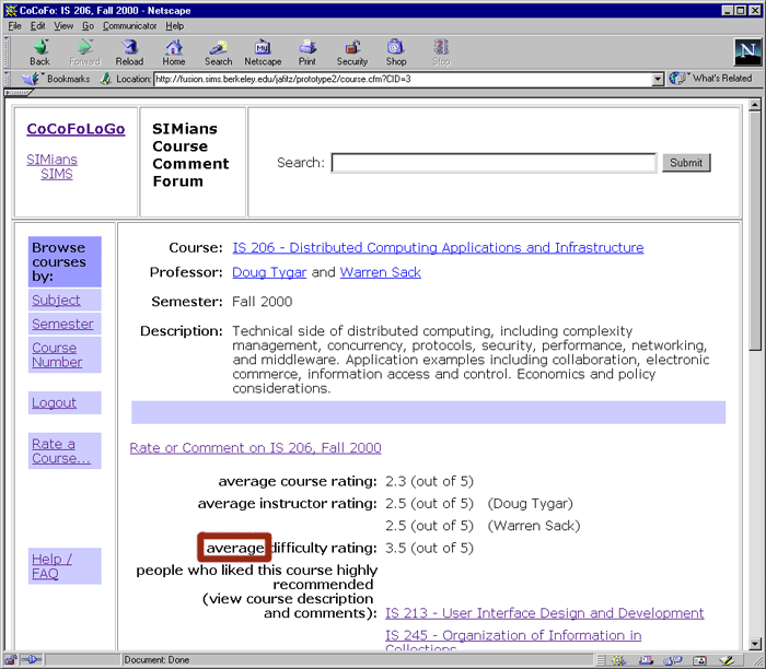
The interface uses the word 'average' for average rating. This might be a little confusing for difficulty rating since 'average' can also refer to a level of difficulty. The conventional word used is 'overall.'Suggested Solution: Change 'average' to 'overall.'
Our Solution: We are now using a numerical rating system, so there is no "average" choice for course difficulty rating. Therefore, we are using the word "average" exclusively to indicate the mean of all submitted ratings.
HE: [H8 Aesthetic and minimalist design] (Severity 1, 2 evaluators found this error)
The explanation of ratings system for Course Ratings and Instructor Ratings are the same.Suggested Solution: Combine the explanation of ratings system for both of them to minimize information that are presented to users.
Our Solution: We have combined the description of the rating system for courses and professors on the "Add a Comment" page. We have tried to make the rating system clear using as few words as possible.
"Add a Comment" page errors
Group 2 also found many errors on the "Add a Comment" page. Most of the errors concerned button labels and the flow of the submission process.
HE: [H2 Match between system and the real world] (Severity 2, 3 evaluators found this error)
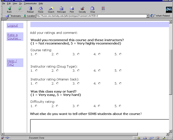
In the add comment screen, it is not clear what 'continue' button does. Users might wonder whether it will submit the rating/comment or gives a preview.Suggested Solution: Replace 'continue' button with 'preview' button and 'submit' button.
HE: [H7 Flexibility and efficiency of use] (Severity 2, 1 evaluator found this error)
For this interface, this 'continue' button seems to refer to previewing the input. Having only this button is not sufficient because users might want to take a shortcut by submitting the input directly without previewing it.Suggested Solution: Same as previous.
HE: [H2 Match between system and the real world] (Severity 3, 2 evaluators found this error)
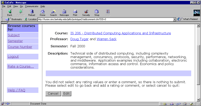
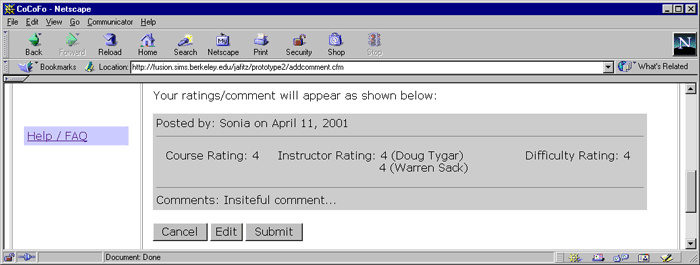
After clicking 'continue' button, the following screen appears. It is not clear, however, whether 'Edit comment' button only refers to the comment part or both the rating and the comment. It is not clear either whether 'Add comment' button means submitting this comment or adding another comment (like what 'Add a comment' link does). The first time I used the interface, I thought the button refers to adding another comment.Suggested Solution: Replace 'Edit comment' with 'Edit' and replace 'Add comment' with 'Submit.'
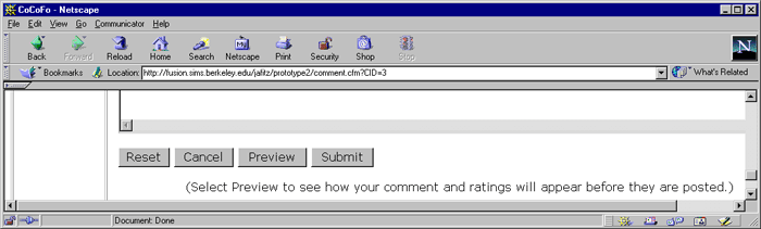
Our Solution: We have changed the flow of the comment submission process, and we have changed the labeling of the buttons. Users can choose to either submit their comments directly or preview their comments before submitting them. In addition, the buttons are labeled with standard "Reset", "Cancel", "Preview", "Edit" and "Submit" labels.
Add a comment page:
Preview comment page:
HE: [H1 Visibility of system status] (Severity 2, 2 evaluators found this error)
There is no feedback to confirm that comments/ratings have been submitted or cancelled.Suggested Solution: Provide a confirmation message after comments/ratings have been submitted or cancelled.
Our Solution: In the current prototype, when a user submits a comment, she is returned to the course page where her comment appears at the top of the list. If she cancels the submission, then she is returned to the course page as she originally found it. At the moment, the new comment may fall below the fold of the page (if the user has a small screen or if the course description is long). For prototype 3, we will try to direct the browser to the point in the page where the new comment has been added.
HE: [H5 Error prevention] (Severity 2, 1 evaluator found this error)
The system currently allows users to input no ratings/comments at all and submit them.Suggested Solution: The system should force users to at least input one rating or a comment.
Our Solution: Users are not allowed to post a completely blank comment. If a user does not enter any comment or rating, then the comment is not posted; the user is asked to edit her comment or cancel the submission.
Labeling Errors
There were a number of labeling problems in our first interactive prototype. Group 2 found the following errors:
HE: [H2 Match between system and the real world] (Severity 2, 1 evaluator found this error)
It's not clear to users how to add ratings only, without comment.Suggested Solution: Change the wording of the 'Add a comment...' links into something like 'Add ratings/comments...
HE: [H2 Match between system and the real world] (Severity 2, 1 evaluator found this error)
The "Add A Comment" link is misleading. It makes users think that it allows users to make comments on the website, not the courses.Suggested Solution: Change the name of the link to "Rate a Course".
Our Solution: We have changed the link to "Rate a Course..."
HE: [H4 Consistency and standards] (Severity 2, 1 evaluator found this error)
The "List of courses" links make users think that by clicking on the links they will go to pages different from those they see when they click on the "Browse courses by" links.Suggested Solution: Show the users that both links lead to the same pages.
Our Solution: We decided to remove the "List of Courses" links from the entry page rather than reword them. We think that the constant links on the left of the page adequately show the user how to find courses.
Flow Errors
Group 2 found a number of errors relating to the flow of the site:
HE: [H3 User control and freedom] (Severity 1, 1 evaluator found this error)
The screen that displays each course has 'view system rating' link. Once users click on this link, they cannot go back to the course description page (which is the next step they are mostly to perform) without clicking the 'back' button. It only provides links to the course listing screens.Suggested Solution: Add a link to the course description page on the 'system rating' screen.
Our Solution: We have eliminated the "View Ratings" page altogether. We have indicated the scale of the rating next to each average rating (see screen shot above). There is also a brief description of the ratings on the "Add a Comment" page (see screen shot above).
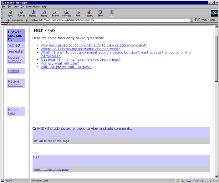
HE: [H10 Help and documentation] (Severity 1, 1 evaluator found this error)
In the Help / FAQ section, there are separate links tailoring different users' tasks. Each link corresponds to an individual page for each help section. However, users might want to read more than one sections at a time, which can be accomplished only by clicking back and forth between 'Help / FAQ' link and each topic's link.Suggested Solution: Have all help content on one page and separate each topic by bookmarks.
Our Solution: We have put all help content on one page with questions at the top and answers with anchor points on the rest of the page.
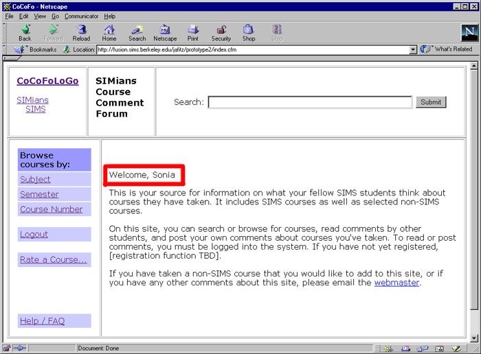
HE: [H1 Visibility of system status] (Severity 2, 1 evaluator found this error)
The system does not tell user whether he has successfully logged in/logged out or not. The user may mistakenly think that he has logged out when he actually did not.Suggested Solution: Add a Welcome Page/Goodbye Page after users have logged in/out.
Our Solution: We have added clues to the interface that make it more apparent whether the user is logged in or not. If the user logs in from the main page, the user is greeted by name on that page. If the user logs in at one of the other prompts, for example when she wishes to read comments on a course, then the comments appear after the login is complete.
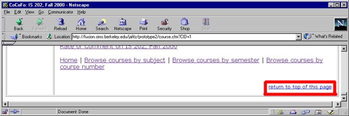
HE: [H7 Flexibility and efficiency of use] (Severity 1, 1 evaluator found this error)
There is no "Back to Top" link at the end of each section in the courses list page. Users have to scroll up to go to the category links at the top of the page.Suggested Solution: Add a "Back to Top" link at the end of each section in the courses list page.
Our Solution: We have added a "Back to Top" link at the bottom of each page.
HE: [H6 Recognition rather than recall] (Severity 2, 1 evaluator found this error)
If users want to look at the ratings they have to log in. However, not every Login Page has a link to the Registration Page. Nor there is a link to the Registration Page on the left panel. Only when you click on the link to a course without logging in will they show the Login Page with a link to the Registration Page. New users have to remember or know this if they want to register.Suggested Solution: Add a link to the New User Registration Page in the left panel of the webpage.
Our Solution: We have disregarded registration for this prototype. We have removed all links to registration pages, and we are assuming for the usability testing that the users are already registered.
HTML Coding Errors
Finally, Group 2 found a couple errors that were basic HTML coding problems.
HE: [H4 Consistency and standards] (Severity 2, 2 evaluators found this error)
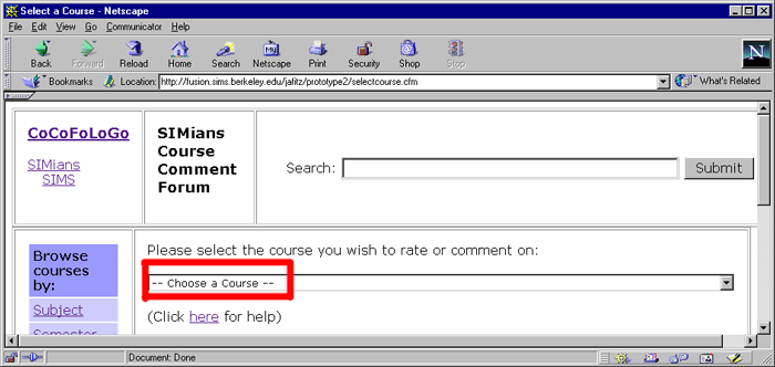
On the Add a comment screen that provides a drop-down list, choosing an item in the list, but the first item (IS202), will automatically direct users to the corresponding course description page. If the first item is chosen, the user needs to click the 'Go' button to see the course description.Suggested Solution: Modify the system so that it either waits for users to click 'Go' button before proceeding to the next screen, or automatically direct users to the corresponding course description page for all items in the list.
Our Solution: We have changed the list so that the default value is not a course. When the user chooses a new value, she is automatically brought to that page.
HE: [H7 Flexibility and efficiency of use] (Severity 1, 1 evaluator found this error)
In the Course Description page, if the browser's width is narrow, users would need to scroll to the right in viewing the Course Description.Suggested Solution: Make the width of the table dynamic, automatically changed according to the browser's width.
Our Solution: We have changed the design of the tables so that the cells expand and contract with the browser's width.
Last Modified: Apr-11-2001
Copyright 2001: Linda Duffy, Jean-Anne Fitzpatrick, Sonia Klemperer-Johnson, James Reffell