Introduction and Description of Prototype
Introduction
We designed and tested a paper prototype of a forum for posting and reading comments about SIMS courses and related courses. The system consists of course listings, course descriptions, and comments about courses posted by students. The system allows users to search or browse for individual courses, read the course description, and login to read comments about the course. Students can then post their own comments. In addition to posting comments, students can rate courses, professors and the difficulty of the coursework with a simple ratings tool. There are additional, more advanced features that we hope to include in the system, including a "shopping cart" for students to list courses they wish to take in the future, and an automatic recommendation feature, similar to what Amazon.com uses, that will recommend similar highly rated courses.
The purpose of the experiment was to elicit feedback about the navigation and content of our initial design from users who will most likely use the completed system in the future. We wanted to find out if users found our preliminary design easy to use and understand. The rationale for the experiment was to test a lo-fi prototype of the system. We used a lo-fi paper prototype for our first test because it allowed us to mock up the system quickly. Because we have not spent hours coding an actual system, we do not feel committed to a final design. In addition, we were able to make minor changes to the design during the test itself in response to user feedback. The remainder of this page describes the paper prototype. The other documents for this assignment describe the methods and the results of the test.
Description of Paper Prototype
The prototype contained a combination of handwritten components and components created using a word processor.
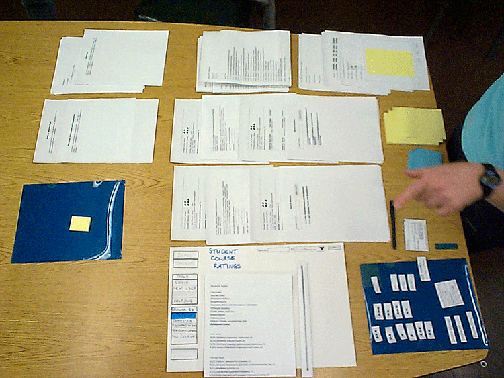
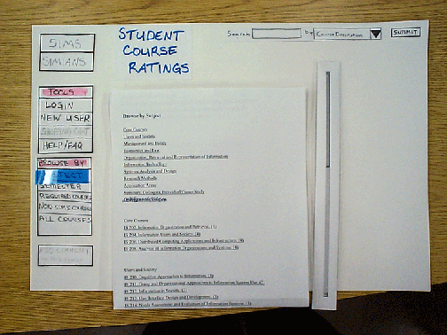
A large piece of white construction paper served as the mock computer screen. On the "screen" were glued the fixed elements of the web site, i.e., the elements that would always be seen by the user as she navigated through the site. The fixed elements were handwritten on white pieces of construction paper or on small, unlined note cards.These elements consisted of:
- A "Tools" toolbar on the left hand side of the screen that contained a button allowing the user to login to the system (this button was covered up with a "logout" button after the user logged in), a button allowing a new user to register, a button allowing a user to add a course to her "shopping cart" (this button was grayed out if the user was not logged into the system), and a button leading to a Help/FAQ page.
- A "Browse By" toolbar providing the user with different ways to view the courses included on the site: by subject, by semester, required courses only, non-SIMs courses, and all courses.
- A button below the two toolbars allowing the user add a comment about a particular course.
- Links to the SIMIANS page and the SIMS homepage on the upper left hand side of the screen.
- The working name of the web site in the center at the top of the screen.
- A search option on the upper left hand corner featuring a text box in which the user could type her search criteria, a pulldown menu consisting of the different attributes of the course descriptions that the user could search on, and a submit button that submitted the search terms to the system.
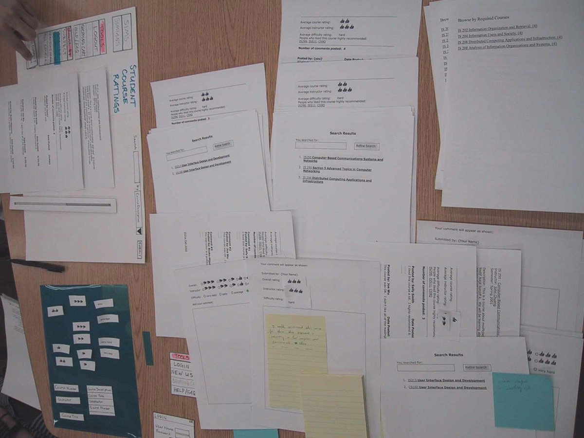
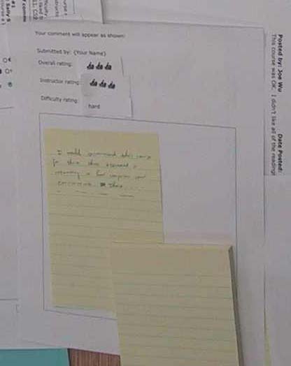
In the blank center of the screen, the "computer" (Jean-Anne) placed and then removed the various web pages that the user saw as she navigated through the site during the test. All of these pages were created in a word processor and printed on 8 ½ X 11 paper. The default page was a list of courses arranged by subject matter. We created pages for every web page we thought the user might try to see when she performed the assigned tasks. These pages included:the default page, a list of courses organized by semester, a list of all courses arranged in alphanumeric order, a list of required SIMS courses, a list of non-SIMS courses, description pages for two courses (IS213 and IS250) that also prompted the user to log on to the system, a series of mock student comments / ratings pages that were placed below the course description after the user logged onto the system (i.e., only authorized users could see the comments), a page allowing the user to post a comment regarding a particular course and to attach ratings to various aspects of the course, a page that previewed how the user’s comment would look once it had been posted, two search results pages (one pertaining to networking classes and one to user interface classes), and a page associated with the shopping cart or portfolio feature.
Some of the mock web pages that contained a great deal of information consisted of multiple sheets of paper glued end to end. By default, we only showed the topmost page in these cases. In case a user wished to see the information on the following sheets, we provided a picture of a scrollbar to indicate that the user could scroll on to view the long mock web page.
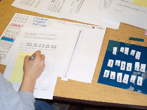
When the user began to add a comment to the site regarding a particular course, the computer placed a sticky note in the mock text box on the page for posting a comment. The user was asked to write on the sticky note. If the user selected the "preview" button on this page, the computer provided her with the comment preview page, on which was placed the sticky note the user had filled out and sticky notes representing the ratings that the user had assigned to the course. This assembled Preview page allowed the user to actually see the information she had provided.
Last Modified: Mar-07-2001
Copyright 2001: Linda Duffy, Jean-Anne Fitzpatrick, Sonia Klemperer-Johnson, James Reffell