Competitive Analysis: The Thorn Tree
The following illustration shows the entry page for The Thorn Tree:
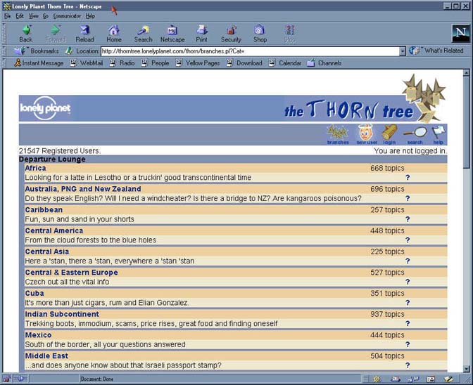
Pros:
- All available forums are listed and briefly described, and the number of topics (i.e., original messages) in each forum is previewed.
- Icons on top present a logical set of frequently used functions (new user, login, search, etc).
Cons:
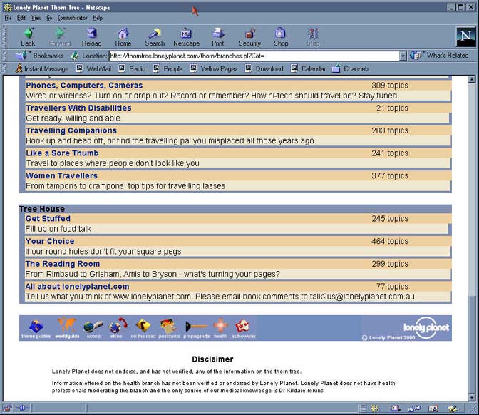
- Forums are grouped into categories which seem arbitrary, perhaps because their names are cute rather than clear (the "Departure Lounge" category consists of forums on geographic regions, but what belongs under "Lobby" vs. "Tree House"?).
- The "Branches" icon is a circular link to this page (again, the cute name does not help to clarify this, espccially since nothing identifies this page as the "Branches" page).
- User must scroll down to realize that forums other than geographic areas are provided.
- The purpose of the question mark link associated with each geographic location is not immediately obvious (it goes to a list showing which countries are considered part of each geographic region).
Selecting a forum displays a page showing the topics in that forum. This page provides the text (usually, the full text) as well as the subject line of the original messages. The information provided also includes the author's "handle", date of original message, and date of most recent reply:

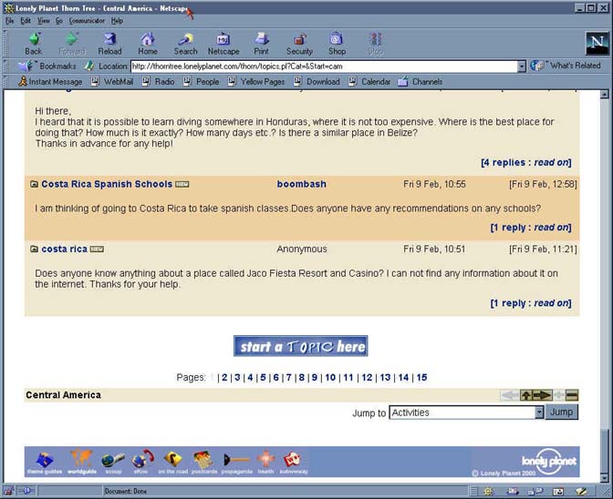
Pros
- The selection of data provided and navigation options seem useful and reasonably complete. For instance, it is clearly shown when no replies have been posted.
- Paging links appear at both the top and the bottom.
- In most cases, the full text of the original message can be read at this level. When a posting exceeds some length, it is truncated, but clearly marked as such.
- The "Jump to" menu at the bottom of the screen provides a mechanism to navigate directly to any forum.
Cons
- The array of buttons with arrows and plus/minus signs are slightly mysterious.
- Given the topic area of the site, it would be useful to always see if the message pertained to a specific country. Because the subjects are defined by the poster, it may be necessary to read the full text to get that information.
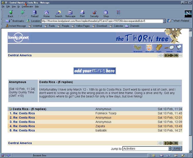
When "read on" is selected, a page is displayed containing the selected message and all replies to it:

Pros
- The layout is clean, and clearly distinguishes the original message from the replies.
- The date/time of each message is shown, along with the "handle" of the author (or "Anonymous" if the author was not logged in).
- The option to add a reply is prominently displayed.
Cons
- A basic limitation is imposed by the absence of threading. If a reply is in reference to a previous reply, this can only be determined by the text of the message(s).
- The format of the date/time includes an overly cute slang name, which is potentially confusing to an non-Australian user.
Selecting the "-" (minus sign) button compresses the replies to a summary listing, as shown below:
Pros
- This is an interesting feature, although it seems it might be useful in the context of a more complex (threaded) display.
- Mouse-over of the buttons provides a brief description of their functions ("summary" for the minus sign)
Cons
- The function of the minus sign and related buttons is not intuitively obvious.
- This group of hard-to-interpret buttons is intimidating to a new user.
- The mouse-over works only for buttons that are not grayed-out. The fact that only partial information is available makes it difficult to feel confident.
An extensive search facility is provided, as illustrated below:
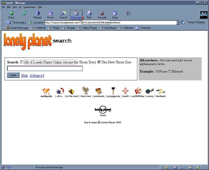

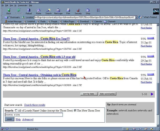
Pros
- Provides a wide range of features, such as toggling display from sort-by-relevance to sort-by-date.
- Displayed results show search terms highlighted.
- New search options are shown at both top and bottom of screen.
Cons
- May be overly elaborate and include some features of limited use (such as "Find Similar").
- Order of icons at bottom of screen is not consistent with other pages; icons normally displayed on top of Thorn Tree pages are not shown (the search function is part of the larger Lonely Planet site, not just for Thorn Tree).
- The only way to return to the previously displayed forum/topic is with the browser back button (again, presumably because the user has left the Thorn Tree site).
- This search facility is clearly not tailored for this specific application / information area; for instance, the displayed "tips" show example searches mainly in computer-related technical subjects.
The following illustration shows the form for posting a reply (the form for a new topic is essentially identical):

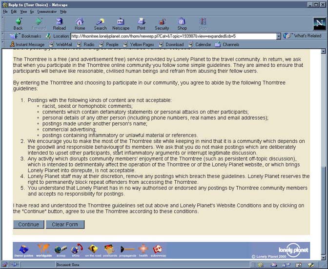
Pros
- Shows the text of the message being replied to.
- Fields are clear and easy to understand; instructions are incorporated into the display.
- After previewing and confirming, a confirmation message is displayed briefly before automatically returning to the topic or forum where the post-message option was selected. The fact that it remembers the starting location is nice.
Cons
- User is forced to scoll to the bottom to access "Continue" and "Clear Form" options. From the bottom of the window, the entered text cannot be seen.
- When at the bottom of the screen preparing to select "Continue", the check box to select previewing cannot be seen.
- The automatic return from the confirmation page to the starting location is disconcerting.
Selecting the "New User" icon (from the entry page or any other Thorn Tree page) displays the following registration page:

Pros
- Instructions on the page seem clear and complete.
- Overall, the registration process was easy, as was logging in.
- After first login, the registered user is directed to the pages where display preferences can be set.
Cons
- Like the post-message pages, this requires the user to scroll down (out of sight of the entry fields) in order to "Submit"
Last Modified: Feb-19-2001
Copyright 2001: Linda Duffy, Jean-Anne Fitzpatrick, Sonia Klemperer-Johnson, James Reffell