Competitive Analysis: Dreamless
Dreamless.org is a discussion website devoted to website design critique. It allows registered users to reply to particular topics and to start their own topics. Messages are only threaded by topic; a user can only reply to a specific posting (rather than the topic in genera) only by quoting the posting or naming the author in his own reply. The postings are loosely moderated; the moderators can take a user's registration away.
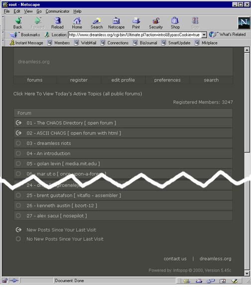
When the user first enters the site, she must click through a description of the inspiration for the site. The main screen for the site looks like this:
Pros:
- The menu bar at the top appears on every screen, bringing a level of consistency to the site.
- There is a key to explain the symbols to the left of each forum.
Cons:
- The entire site is the same gray-on-gray color scheme. Links are the same light gray color as non-links, and different parts of the screen that have different functions are all the same dark gray.
- There is no easy-to-find description of what the different forums are. In fact, if the user clicks on the 4th forum, "An introduction," there is a complete description of how the site works.
- The entire page takes up more than a single computer screen and the user must scroll to get to the bottom. As the symbol key is at the bottom of the screen, users will not understand what the symbols mean unless they scroll down.
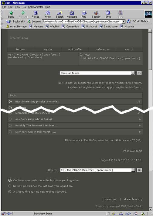
If the user clicks on a forum title, a list of the specific topics within that forum comes up.
Pros:
- Topics are differentiated from Forums in a number of ways. 1) Topics are not numbered as forums are. 2) There is a third symbol that signifies "closed thread" that is not available in the forum list. 3) There is a number to the right of the topic name signifying the number of posts the topic has received.
- There is a short description of the particular forum that the topics belong to at the top of the page, including the type of forum (open or not) and the moderator.
- There is a a description of who may post a new topic or a new reply near the top of the page.
- There is a description of the date format at the bottom of the page.
- There is a navigation tool to jump from page to page. It is in the same form that many other sites use, making it easy to understand.
- There is a link to post a new topic.
Cons:
- The key is again at the bottom of the page, making users scroll down to figure out what the symbols mean.
- The different messages on the page seem to be placed randomly. As the color scheme is monochrome, the different messages do not jump out at the user. In addition, a number of the messages, such as the date format and who may post to the topics, only appears on this page. Although the same information would be useful on the individual topic pages, it is not found there.
When the user clicks on a particular topic, the list of messages appears.
Pros:
- There is a sketch of the file structure at the top of the page, letting the user navigate quickly up the structure.
- There is a link to the next newest and oldest topics, letting the user navigate "horizontally."
- Each post to the topic is clearly delineated from its neighbors.
- Each post has links to read the profile of the poster, to send the poster email, and to edit the post.
- The title of the forum appears in the title bar of the browser.
- The date and time are listed above each post.
Cons:
- It is not clear what words on the page the user can click. Although the file structure is useful, the user must move the mouse over the various words until the arrow becomes the hand to click the link.
- Although the title of the forum is at the top of the list of posts, it does not stand out very clearly because the font is the same size and the color the same as the rest of the page.
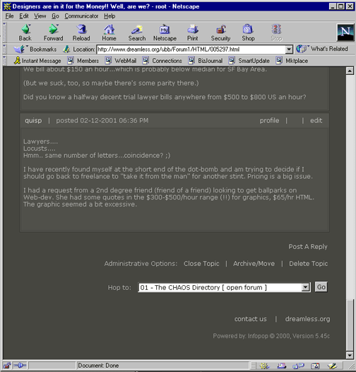
There is more information at the bottom of the page. The user finds links to post a reply, to navigate to other topics and to perform administrative duties.
Pros:
- There is the ability to jump directly to another forum without navigating back to the main page and back down to another topic.
- Administrative duties can be performed from this page. Although there are only a few administrators, as far as I can tell, it allows them to administrate from any computer.
Cons:
- The "Post a Reply" link is inconspicuous. There is only the one link at the bottom of the page.
- The "Hop to" option of navigating is only present at the bottom of the screen.
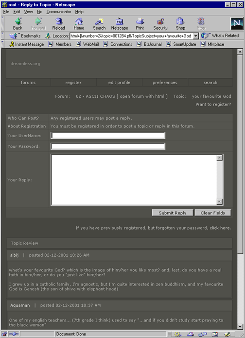
If the user does decide to post a reply to the topic, this screen comes up:
Pros:
- The forum and topic titles are clear at the top of the screen.
- The forms for filling out user name, password and reply are bright and clear. Because the background is so dark, these boxes stand out remarkably well.
- The submit and clear buttons are also very clear and in a logical place.
- The previous postings are below the reply box in case the user wants to review what has already been said.
Cons:
- The link for users to register is at the top of the page, but it is not very visible. It is on the right hand side of the page whereas I would expect it on the left.
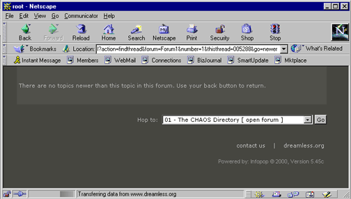
If the user clicks on the "Next newest topic" and there is no newer topic, then one arrives at an "error" screen.
Pros:
- The error message is very clear and tells you exactly what to do to recover.
Cons:
- This seems to be the only page that does not have the standard menu bar. The designers kept the "Hop to" navigation, however, and it does not seem that they wanted to keep the user from navigating elsewhere.
- The message appears in a box on the screen that, until now, has only been used to display the URL of the website. The users eyes do not automatically go to this spot on the page, and they only do because there is no other information on the page.
This website is successful because it uses the simple and easily recognizable form of a discussion forum. It adds in some navigation features that are useful and also recognizable. The biggest problem with the site is the color scheme. Nothing is differentiated by color. In addition, there are some items or navigation tools that seem to be placed randomly on the pages. Although when items appear, they always appear in the same part of the page, there does not seem to be a reason for why items appear where they do.
Last Modified: Feb-19-2001
Copyright 2001: Linda Duffy, Jean-Anne Fitzpatrick, Sonia Klemperer-Johnson, James Reffell
