Competitive Analysis: Craigslist
The following illustration shows the entry page for Craigslist:
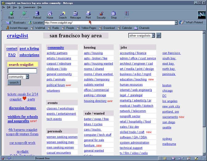
Pros:
- For bulletin board function, provides direct access to all topics, as well as showing their organization into forums.
- Provides direct access to search, FAQ, posting, and other functions.
- The geographic area currently selected is prominently displayed.
Cons:
- Page appears busy and cluttered. User must scroll to see all forums/topics.
- Although access to bulletin boards is clearly "central", the arrangement of other options seems arbitrary (i.e., it does not obviously reflect their importance, permanence, frequency of use, or likely sequence).
- One topic (Community potpourri) is "hidden" inside the forum heading. None of the other forum headings are links.
- Pull down menu and links to select geographic location are redundant. Because neither navigation option is labeled, it is not immediately obvious that these are the same thing.
- Although the search function is shown on the entry page, it is restricted to searching within a selected forum. The user may reasonably expect a "search all" function since search appears at the top level and is labeled "search craigslist".
Interestingly, there is no intermediate display layer at the forum level (between the entry page and the lists of individual topics), even though the entry page's search capability is at the forum level.
Selecting a bulletin board topic takes you directly to a list of message headers, organized by date. Searching (either from the entry page or from the topic-level page) also displays a list of message headers, similar in content but different in layout. The following two illustrations show a list of messages as selected from the entry page and as obtained by a search, respectively.
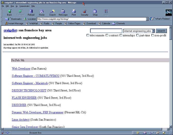

Pros
- Search results page provides a clear mechanism for horizontal access to other bulletin boards as well as return to entry page.
- An interesting range of search filtering options are provided.
- The search function has been thoughtfully designed in terms of the options provided for a given forum. For instance, while each forum allows a combination of user-entered search terms, geographic area, and topic, the jobs forum also provides a set of check-boxes for specific types of jobs (telecommute, contract, etc.).
Cons
- Inconsistencies between the two pages seem arbitrary and accidental (rather than serving the purpose of differentiating the two locations). These inconsistencies include: Background color, available navigation options, position and labeling of link to entry page, available search options (e.g., option to select a different geographic area), and format of message headers (e.g., how location is specified, where date is shown).
- Count of listed messages is not accurate.
- Messages may be listed multiple times, and may appear on the list even after being deleted (the user only learns the message has been deleted by trying to read it).
The text of an individual message may be viewed by selecting an item from the list.
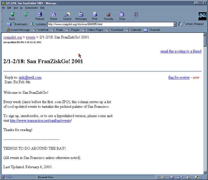
Pros
- Navigation options are consistently provided for returning to entry page and returning to the message list. These "bread-crumbs" are presented in format which reflects the heirarchical organization of the material.
- A full page is devoted to the text of each message. This works well in the bulletin board context, although it might not work in a discussion forum context (and indeed, the discussion forum area of Craigslist handles this somewhat differently, as shown below).
Cons
- Sometimes an option is provided to move to the next item in the list, but not always (it is not clear when or why).
- Format of link to entry page is not consistent with other displays.
- The purpose of the "flag for review" option is not clear, and is not explained in the FAQ.
The discussion forum section of Craigslist, shown below, is separate from the bulletin boards, and is accessed from a single link on the entry page.
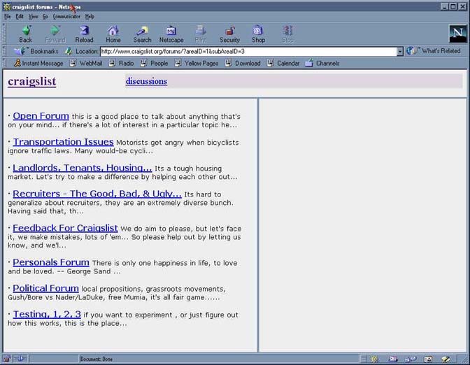
Pros
- All discussion forums can be accessed from this single page.
- For each forum, both a clear title and an extract from the forum's introductory text are displayed.
Cons
- In a few cases, the extracted introductory text is somewhat cryptic (e.g., is 'Transportation Issues' really all about motorcyles?).
- It is not initially clear why the blank, unlabeled frame on the right is displayed.
- The heading/link labeled "discussions" is a circular link to this page.
- The link to the Craigslist entry page is inconsistent (in labelling and/or location) with those used in the bulletin board area.
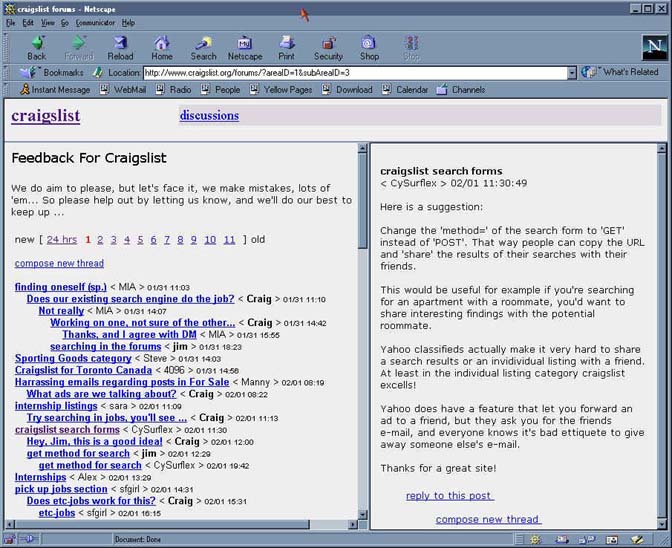
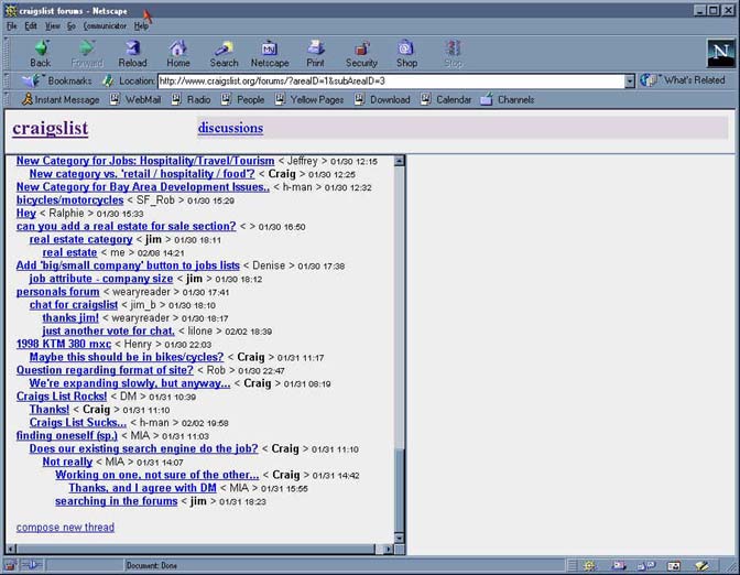
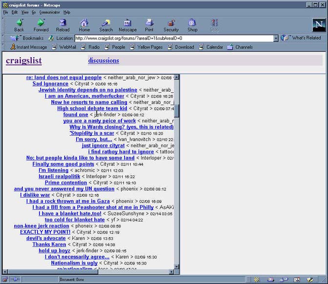
When a specific discussion forum is selected, a display containing the introductory text for that forum and a list of threaded message headers is displayed:
Indentation is used to indicate threads of replies beneath an original message. This can get quite deep and complex, as shown below:
Pros
- Indentation provides additional information about the context of a particular reply.
Cons
- It can be difficult (or impossible) to locate a specific message to check for replies. There is no search capability within the discussion forums.
- After scrolling down, no navigation options are provided (e.g., to go to the next page) without scrolling to the top again.
- No option is provided to "compress" areas or depth within the threaded discussion. For instance, when searching for replies to a specific original message, it would be very helpful to view only original messages, not the full (and sometime elaborate) threads underneath each original message.
Selecting a specific message displays that message in the right-hand frame:
Pros
- Options to reply or start a new thread are provided.
- Message text can be viewed simultaneously with indented list showing thread context.
Cons
- For a long message, it would be necessary to scroll down to see the reply option.
- The indented list display does not highlight which message is currently being viewed.
- There is no option to view the "next" message.
The form for posting a message (in this case, a new thread) is shown below, along with the result of selecting the preview option:
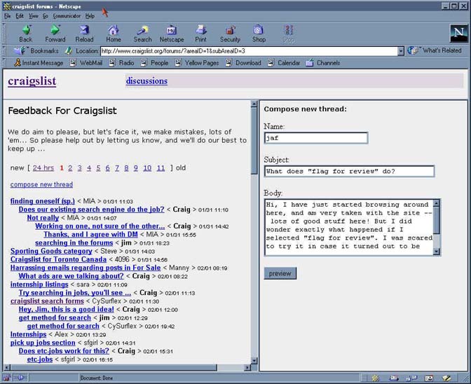
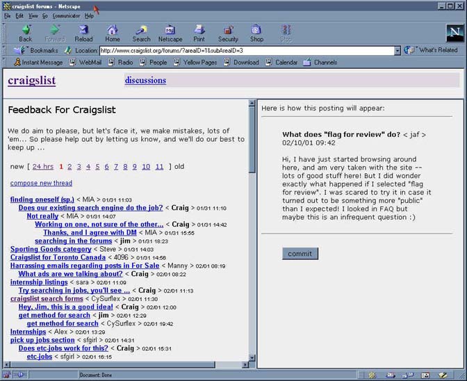
Pros
- The form is simple, clear, and easy to use.
Cons
- Composition and Preview windows do not provide a "cancel" option.
Last Modified: Feb-19-2001
Copyright 2001: Linda Duffy, Jean-Anne Fitzpatrick, Sonia Klemperer-Johnson, James Reffell