Competitive Analysis: Best of Berkeley
The Best of Berkeley site contains all types of event information that U.C. Berkeley students would find useful. A bulletin board is included in this site. This site seems to have the same backend as the Dreamless.org site. However, it has been implemented slightly differently. A set of eight forums has been laid out by the system administrators. Registered users can start new topics within the forums and reply to topics already begun.
This is the main page of the bulletin board.
Pros:
- The colors of the site are very bright and help distinguish different parts of the page. The columns of the chart are delineated well using gray and white, and the different forums categories of forums are set off in orange.
- The links on the page are easily distinguishable as links.
- All of the important information is on this page. The user can see what each forum is called, what it is really about, how many topics are in each forum, how many posts have been made, when the last post was made, and who the moderator is.
Cons:
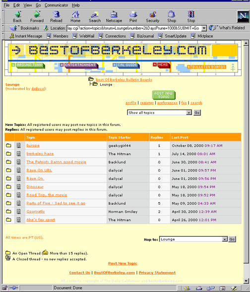
When a user clicks on a forum, she is brought to the following page:
Pros:
- Again, this page contains all of the useful information a user might want to see. The user can see which are the topics that are being posted to regularly and which topics have had recent posts.
- The key to the symbols is visible.
- There are a couple different ways to navigate: vertically via the file structure and horizontally via the "hop to" button.
Cons:
- The different buttons, links and menu bars seem arranged haphazardly around the screen. One of the ways to navigate is at the top while another is at the bottom of the screen. The name of the forum is stuck at the top of the page with no acknowledgement that it is the name of the forum.
- There is one symbol that is not referenced in the key: the symbol to the right of the file folder before each topic name.
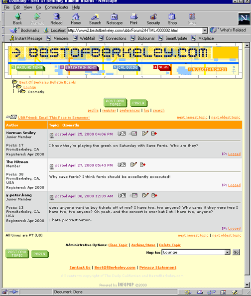
Finally, when the user clicks on a specific topic, a screen with the postings appears.
Pros:
- The postings are easily distinguised fron each other using color.
- The date and time that the posting was made is very visible.
- The "post" and "reply" buttons are both above and below the postings.
Cons:
- The file structure used to navigate is now in a different location on the screen. Rather than in the middle at the top, it is on the left-hand side.
- The registration information about each person who has posted is not necessary. A link to the information would make the page cleaner looking.
- There are a lot of little icons right next to the date that each posting was made. They are not readily recognizable, although they do give a text description with mouse over.
When a user decides to make a post of their own, they come upon this screen:
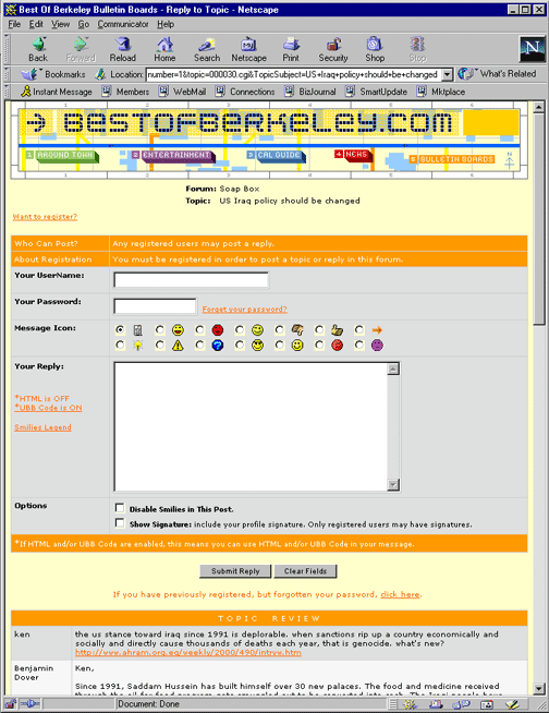
Pros:
- There is a very visible link at the top for those users who have not yet registered.
- The previous postings are listed at the bottom of the page in case the user needs to be reminded of what she wanted to say.
- The "submit" and "clear" buttons are clear.
- The forum and topic titles are clear at the top of the page.
- The color scheme makes the different boxes and rows stand out.
Cons:
- There are a lot of extra features that make the page cute but cluttered looking. For example, the smiley face option gives the user more options, but because not everyone will understand the faces to mean the same thing, it will not be obvious to everyone what the user meant by using them.
This site is generally well designed. The problems occur because there are many extra options on each screen that produce clutter. In addition, some of the useful options are placed randomly on the screen or in different places on each screen. The color scheme is bright, and it helps to delineate different functions on each screen.

Last Modified: February 7, 2001
Copyright 2001: Linda Duffy, Jean-Anne Fitzpatrick, Sonia Klemperer-Johnson, James Reffell