Competitive Analysis: Ultimate Bulletin Board
The opening screen:

Forums are arranged into categories. Each forum listing consists of a name, a short description, the number of topics and posts within that forum, some information regarding the last message posted, the name of the forum moderator, and an icon indicating whether there are new messages since a previous visit.
Pros:
- The forum listings convey a large amount of information about each forum in a relatively compact space.
- The organization into categories is helpful.
- The small but distinct message regarding login status serves its purpose well.
- The primary textual interface scales well in terms of font size for those who need it.
- The primary option (to click on a specific forum) is indicated through a slightly larger text size.
Cons:
- The light bulb icon may not be the best way of indicating new messages-most other information at this level is conveyed to the user through a combination of text and layout cues. This possible shortcoming is only somewhat ameliorated through an icon legend at the lower end of the screen.
- The meaning of the icons associated with each topic is not clear (this is a consistent problem through the board-a mouse-over of the icons reveals no further details, but only tells you to look in the FAQ for icon meanings. The user picks the icons at the time of posting.)
The registration screen:
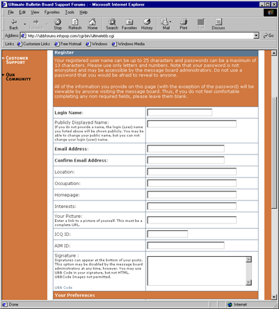
Pros:
- The form is worded reasonably clearly and in a reasonably organized fashion.
Cons:
- It takes three clicks to get to the actual registration screen from the front page (there are intervening pages for age verification and license agreement).
- It is not clear which aspects of registration are required and which are optional.
- It is not clear what the purpose of all of the fields is.
- Actual posting requires yet another step (ok by administrators).
- There is no clearly marked exit back to the forum listing.
- You can't pick a password-it is e-mailed to you. The fact that this is the case is hidden inside a reiteration of your registration information. The e-mail isn't exactly snappy, either, causing considerable delay before posting.
The topic list screen:

The topic listing screen is similar in layout to the forum listing screen. Each topic listing consists of the topic name, the user name of the person who started the topic, the date and time of the latest reply, the number of replies, and an icon representing the status of the topic (options include new/no new messages, open/closed topic, and more/less than 15 replies). There is also an icon representing the 'mood' of the first message.
Pros:
- Recency and number of posts indicators are good.
- The topic status icons represent a number of variables compactly.
Cons:
- The topic status icons still require a legend.
- The 'mood' icons are unclear, easily confused with the (more important) topic status icons, and have no associated legend.
The messages screen:

The messages screen contains both the original message and any and all replies, with the latest message listed last. The messages are listed linearly, rather than in a threaded fashion, but some messages contain 'quotes' from previous ones for context. Each message contains, in addition to the body of the text, information regarding the poster and a number of icons representing different action.
Pros:
- The linear layout makes it easy to read quickly.
- The layout of each message allows for a large amount of information about each message to be conveyed clearly without detracting from the clarity of the message body.
Cons:
- Lack of threading makes tracking complicated reply/response patterns difficult.
- The function icons are not completely clear. They are labeled through mouse-overs rather than a legend, breaking the previous pattern.
The post screen:

Assuming the user is logged in, the posting screen consists of a central text box and a number of additional options. These include automatic signatures, the addition of 'mood' icons (now apparently called graemlins), and buttons to enter 'UBB code'.
Pros:
- The ability to enter HTML text is handy.
Cons:
- The message body text box is too small.
- Having both HTML and a proprietary code available for the text is confusing overkill.
- The HTML code and UBB code entry is not WYSWIG..
- The distinction between the 'mood' icons (attached to the message) and the 'graemlins' (contained within the body of the message)
- We will not speak of the spelling of 'graemlins'.
- There is no preview function.
Last Modified: Feb-20-2001
Copyright 2001: Linda Duffy, Jean-Anne Fitzpatrick, Sonia Klemperer-Johnson, James Reffell