Egon Pasztor
SIMS 247 -- Information Visualization
Assignment 5: Project Report
Visualizing Human Relationships across Time
An
Instance of Hierarchical Clustered Graph Drawing
| Abstract |
This report presents a problem in information-visualization, namely, the visual representation of family trees for ``modern'' families where remarriage, adoption, and stepchildren are the norm rather than the exception. After confirming that no good method of diagramming such families appears to exist, I invented a new one by sketching some timeline-based drawings that were visually appealing for simple examples of modern families. The challenge was then to scale this up from hand-drawn diagrams representing simple families to automatically generated layouts for complex ones. We study the resulting graph-drawing problem, show it equivalent to the NP-complete ``crossing minization'' problem in the drawing of hierarchical graphs, and explore solutions based on integer linear programming, and heuristics.
| Introduction |
This work began as a challenge to come up with better representations of family tree structures, optimized for the kinds of fragmented families common today. The standard family tree diagrams used by genealogical researchers are clear and easy to understand in the case where each individual partners with a single mate to produce descendents, giving every individual a unique place in a hierarchy, below his ancestors and above his descendents. This works less well for situations involving remarriage and divorce, stepchildren and step-parents, multiple marriages, and adoption.
Standard Family Trees
The standard family tree diagrams do have a set of conventions to handle situations like this, in what amounts to a complex visual grammar.
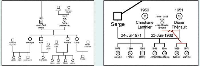
Figure 1:
On the left is a traditional family, for which the diagram is clean and
comprehensible. On the right is a family where multiple individuals have
had multiple marriages. (From GenoPro Software sample family tree,
[5])
In this example we have a family where both mother and father have had children in previous marriages. As the diagrams emphasize patriarchal lineage, the father's wives are listed from left to right in order, while the mother's previous marriage is in a smaller font off to the side. The mother's child-of-the-former marriage is drawn connected to this previous pairing. The "two dashed lines" indicate the wife divorced the previous husband; the same is assumed for the father without a visual marking.
The convention is to order the children from oldest on the left to youngest on the right, within a given marriage, then order the wives from first on the left to last on the right. So in this example the first three children, and the one on the right from the wife's first marriage, were born first. The children in the middle were born last. However, this ordering is not obvious to one unfamiliar with the visual rules.
These diagrams appear difficult to extend further -- for example if the husband's first wife went on to have a second marriage of her own, it's unclear where that information would be placed. Also, important information about the timing of relationships appears to be missing from these diagrams. For example, did the children from the father's first marriange stay with the father? Which family is older, the mother's first marriage or the father's?
Prior Work
If the traditional family tree diagrams work poorly for modern families, perhaps an alternative structure already exists? I searched the web for solutions to the problem of displaying family trees where multiple marriages are the norm rather than the exception, and found only solutions such as below:
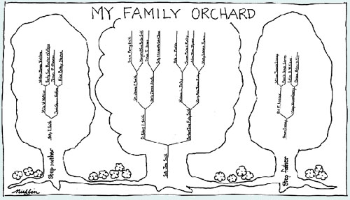
Figure 2: This
structure, found on many web sites, fails for all but the simplest
situations. [1]
Another visualization strategy from "Progeny Software", takes a timeline based approach, where each individual is represented as a bar whose horizontal start and end points identify the birth and death dates. Interestingly, this style of diagram is not particularly biased towards traditional families, as a given individual could be shown connected with multiple partners just as easily as one. This makes a timeline approach particularly interesting.
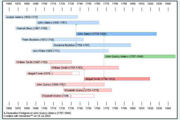
Figure 3: "Progeny
Software" takes a timeline approach, which permits multiple events in an
individual's life to be simultaneously displayed. [8]
However, this diagram makes family units particularly difficult to make out.
A New Design
The traditional family tree diagrams have the advantage that there's a one to one correspondence between a family unit and a specific graphical structure, which makes them easy to pick out. We would like to keep this property in a new design.
However, if each individual is represented with only a single point, then problem is inevitable if that single individual is associated with multiple partners or multiple sets of parents during his lifetime.
A visual representation of time removes this problem: When a person participates in multiple families during his life, he generally belongs to only one family at a time. This can be made more explicit by identifying "participating in a family" with "physical proximity".
This motivates a timeline-based approach, where each individual is represented as a line moving horizontally, either from birth to death, or for whatever subset of his life he is represented on the diagram. However, in contrast to the "Progeny Software" diagram in Figure 3, we demand that individuals who are part of a family are drawn adjacent, and visually close.
Each individual is therefore represented as a line which meanders vertically across its horizontal span, first as a part of one family, then another. In a traditional family tree, each individual is part of two families during his lifetime -- that of his parents (when he is child), and his own family, (after finding a partner and having children). Hence, when reproducing a traditional family tree, the lifelines are drawn as shown:
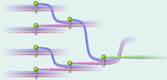
Figure 4: A
timeline-based approach looks remarkably similar to a traditional family
tree (turned on its side) when the family dynamics are regular.
Close proximity in the vertical direction indicates that the individuals concerned were involved in a relationship; however, outside of close vertical groupings, absolute vertical position has no meaning. (Note, interestingly, that a {\it relationship} denoted by two lifelines entering proximity for a time does not need to be one in which children are produced. Hence, this type of diagram is particularly flexible, and could be customized to provide more or less detail about individual's contacts during their lives.
Finally, the mapping between time and the horizontal direction is relaxed, to account for the fact that relationships of similar importance can take widely different amounts of time. For example, an individual's first relationship might result in a child but last only a single year. He then has a second relationship that results in more children and lasts his whole life. If these two relationships were drawn such that their horizontal sizes were proportional to the time involved, then the second might be dozens of times longer than the first, making one or the other difficult to visually recognize. Generally diagrams should be drawn so as to avoid long stretches of parallel horizontal lines, on the one hand, and also to avoid overly many changes occurring in too short a horizontal span.
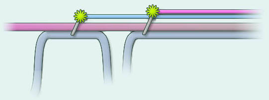
Figure 5: Horizontal
time is not drawn to scale; the two relationships need not have taken
comparable amounts of time.
In this type of diagram we can draw the two relationships at nearly equal size, the only constraint being the preservation of absolute order. So long as this constraint is satisfied, we are free to place the graphic representing the relationship anywhere on the page.
This results in a great deal of freedom for laying out even simple graphs. As graphs get more complex, and we try to represent the mutually interacting lives of more and more people on a single page, it becomes a considerable challenge to organize such a layout so that it remains visually comprehensible. At once we'd like to minimize the size of the graph, minimize the number of lifelines that cross, and group related events close together. This motivated looking at the graph-drawing literature.
Bells and Whistles
In addition to drawing lifelines together or apart, it is possible to style the graphics in such a way as to represent additional information about the individuals concerned. For example, the images above use different hues to indicate gender.
In addition, we can use color and size can be used to indicate age, using bright, highly-saturated thin lines to represent the vibrancy of youth, blending smoothing into a grey thick stroke representing the aged. Note that providing age information in this way is visually evocative, and largely compensates for the horizontal ambiguity in time. We can see that a given relationship takes a long time if the participants age considerably during it. (Note also that since color information is coupled with line thickness, the information is accessible to the color blind.)
Finally, it goes without saying that names and other descriptive text should be attached to the lines in the same way that text peppers a traditional family tree. Further, unrelated contextual (or historical) information could be pinned to specific points in a person's lifeline, or imprinted in light tones over the background.
However, the layout of the individual lifelines constitutes the most significant challenge in automating the creation of these diagrams, and the rest of this paper shall focus on that.
| The Layout Problem |
First, we present the layout problem formally, describing the internal representation of the relationship data which is provided to the algorithm.
Internal Representation
Let {x1, x2 ... xN} be the set of n individuals for whom lifelines are to be drawn in a diagram. The matrix of interactions between their lives is presented as an ordered list of relationships, S = (s1, s2, ... sM). A relationship is simply a subset of X, along with an optional marker for each individual identifying his role in the relationship.
The relationships do not have to be in strict temporal order, merely the correct order for each individual. That is, if xI participates in two relationships sJ and sK, and sJ occurred before sK, then (J < K).
The lifeline of each individual is defined by the relationships in which he is involved, so for each individual there is a monotonically increasing set of indices identifying the members of S in which he is a participant. For example, consider the following set of sample relationships:
|
s1 -- |
{x1, x2} |
-- Individuals x1 and x2 live together |
|
s2 -- |
{x1, x2, x3 (birth) } |
-- x3 is born into this family. |
|
s3 -- |
{x1, x4, x3 (child), x5 (birth) } |
-- x5 is born, but parent x2 has been replaced. |
|
s4 -- |
{x2, x6} |
-- Individual x2 has married someone else. |
Each relationship must be drawn at a certain spot on the page by drawing its participants' lifelines together into a vertical cluster. However, the vertical ordering of each relationship is not specified, and must be determined by considering the graphical positions of relationships to the left and right.
The "birth" and "child" markers provide additional information about how to construct a graphic for the relationship. We also support "aged", "death", "fade-in" and "fade-out". The "birth" and "fade-in" markers indicate the beginning of a life-line in the diagram, and the "death" and "fade-out" markers indicate the end. (The "fade-in" and "fade-out" markers are required because these diagrams are necessarily incomplete, with many individuals recorded for only a subset of their lives.)
Each relationship translates directly into a rectangular region of screen real-estate with lifelines crossing horizontally. Thus, drawing the diagram in its entirely consists of:
|
(a): |
-- Selecting an (x,y) position for each relationship graphic |
|
(b): |
-- Ordering the relationship members for each graphic |
This is illustrated in the figure below. Notice first that the program automatically generates "fade-out" and "fade-in" tiles for each person whose life does not explicitly begin or end in the relationship list provided. The work of the layout algorithm consists of positioning these tiles such that the connecting curves have a maximum number of short straight segments and a minimum number of crossings and vertical movements.
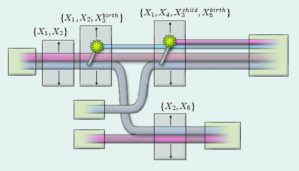
Figure 6: Each
relationship corresponds to a rectangular tile. Lifelines connect the
tiles using lines or sigmoid curves.
With the tile boundaries removed, the graph appears complete and whole, ready for a later stage, (so far unimplemented) to place labels and other textual markings onto the diagram.

Figure 7: The final
graph with the tile boundaries removed.
We now review the stages of the algorithm which perform layout and ordering. The first stage has been already mentioned above -- the automatic insertion of "fade-in" and "fade-out" tiles. (This is a simple linear pass through the relationship list. If an individual is first seen without a "birth" marking, a new relationship is prepended with that individual marked "fade-in". The same then occurs from the end for "fade-out" tiles.)
At this point the algorithm can be certain that each individual has a distinct starting and ending relationship in the list. The algorithm continues from there.
1. Temporal Compression
The first step is to horizontally compress the relationship list into the minimum number of time slices possible given the partial order constraint. All the relationships in one time slice will be drawn more or less with the same horizontal coordinate, that is, as if they occurred simultaneously. Therefore the goal is to identify those relationships which could occur simultaneously.
After the automatic insertion of "fade-in" and "fade-out" tiles, the relationship list for our example above has gone from 4 elements to 9. Note that I'm using the word "relationship" and "tile" interchangeably, even though two individuals "fading-in" to the diagram does not correspond to an actual human relationship. (The relationships marked with asterisks are inserted automatically.)
|
* #1: -- |
{ x1 (fade-in), x2 (fade-in) } |
|
* #2: -- |
{ x4 (fade-in) } |
|
* #3: -- |
{ x6 (fade-in) } |
|
#4: -- |
{x1, x2} |
|
#5: -- |
{x1, x2, x3 (birth) } |
|
#6: -- |
{x1, x4, x3 (child), x5 (birth) } |
|
#7: -- |
{x2, x6} |
|
* #8: -- |
{ x1 (fade-out), x4 (fade-out), x3 (fade-out), x5 (fade-out) } |
|
* #9: -- |
{ x2 (fade-out), x6 (fade-out) } |
These 9 relationships do not need 9 distinct time slices. We compress by assigning each relationship a time slice (initially 1..9), then moving each relationship downward until an ordering constraint is violated. The process is then repeated in the other direction.
In this case, the table compresses to 5 time slices -- that is, relationships { 1, 4, 5, 6, 8 } in the table above all involve x1; hence none of these five may be simultaneous. Relationships { 7, 9 } may occur simultaneously with { 6, 8 } since no participants are in common, however, since { 5 } and { 7 } share individual x2, we know that { 7 } must occur after { 5 }. The full table, reproduced below, can be seen clearly also in figure 6 by noticing that the tiles are arranged in five columns.
|
|
Time --> | ||||
|
1 |
2 |
3 |
4 |
5 | |
|
| |||||
|
Relationships: |
#1 |
#4 |
#5 |
#6 |
#8 |
|
|
|
#2 |
#7 |
#9 | |
|
|
|
#3 |
|
| |
2. Selecting Vertical Permutation
The relationship present in each timeslice, (or rather the individuals within them) now become the nodes of a hierarchical graph, for which a "crossing minimization" pass has to be done. The goal here is to set up the vertical order of the relationships within each timeslice, as well as the vertical order of the individuals within each relationship -- such that the total number of crossings is minimized.
This turns out to be a classic problem in computer algorithms called crossing minimization, which is NP-complete even in the case that there are only two levels [3] (timeslices). This problem can be converted to an integer linear program working on an instance of the linear ordering problem [6] which is able to find an optimum permutation that minimizes the ordering in most small cases (under 30 nodes), but a heuristic-based method actually yields better solutions globally when the two-level optimization is repeated to globally optimize an N-level problem.
Hence the crossing minimization step operates using a heuristic which is not guaranteed to actually minimize the number of crossings. (Further, it appears likely that to make a graph easy to understand, one should not try to minimize the absolute number of crossings, instead one should minimize the number of lines whose removal would result in a graph with no crossings. [7])
This stage operates though a series of passes across the timeslices, taking timeslices in pairs. For a given pair, the elements of one are permuted using a heuristic (known as barycentric weighting; [9]) designed to minimize the number of crossings across the pair.
First the algorithm selects (randomly) an ordering for the tiles and individuals within timeslice 1, and then permutes timeslice 2 using the heuristic. This permutation for timeslice 2 is then held fixed and timeslice 3 permuted against it, and so forth, until the end is reached and the algorithm comes back in reverse. This continues until the total number of crossings in the graph stops decreasing.
3. Fixing Vertical Position
With the vertical permutations fixed, the third task is to fix the absolute vertical position of each tile. (Since the ordering is fixed at this stage, note that giving a vertical position to each tile is sufficient to give a vertical position to each individual lifeline, as the lifelines are fixed within each tile.) The target for this stage is to maximize the number of horizontal vertical segments.
That is, the preceding stage has fixed the total number of lifeline crossings, by fixing the ordering of the tiles and the ordering of the individuals within them. But it still remains to select actual y-coordinates in such a way as to make the most lines straight. Each tile has a vertical margin requirement (proportional to the size of the family), so placing one tile at a vertical position to match a tile from the preceding timeslice may lock out other tiles from coming close.
This is done also using a heuristic whose properties are less well understood. The algorithm begins with the thickest timeslice -- the timeslice with the most relationships contained in it -- and spreads them out. Then, spreading outward from this starting timeslice in either direction, the algorithm attempts to make the thickest connections straight. More work is necessary before this step is optimized.
4. Selecting Horizontal Positions
Finally, each timeslice is given a horizontal position based on the kinds of relationships in the preceding timeslice. That is, "fade-in" relationships, and singleton or paired individuals together require the least amount of horizontal space, while larger families and births or deaths are given more horizontal space. Individual relationships' x coordinates are jittered about within a vertical band corresponding to each timeslice.
| Future Work |
A user interface is clearly necessary to permit a user to iteratively build up larger and larger graphs. At the moment, the layout code is implemented in Matlab, sending commands to a thread which has an OpenGL window open, and renders the sigmoid-curved lifelines are texture-mapped strokes. I wrote the OpenGL thread, and designed its curves and sprites, and then proceeded to write Matlab code to actually perform the layout given an input matrix of relationships.
Hence, at the moment, the interface is still very techie and not user friendly.
In addition, the placing of labels and annotative text onto the graph may turn out to be an interesting problem in itself, similar to the problem of placing labels onto maps in such as way as to prevent the text from overlapping interesting features. This should be added to the user interface.
Finally, graphical embellishments added onto nearby lifelines could be used to indicate the strength or character of the relationship between the individuals involved, in a manner similar to sketches by Joanie DiMicco [2], to provide further information while at the same time producing a truly attractive piece of artwork.
As always, there is still much to do.
--Egon
| References |
[1]: Alabama Department of Archives and History; "Draw your
Family Orchard: Activities
for Children"; web
page; http://www.archives.state.al.us/activity/actvty26.html;
May 2004.
[2]: DiMicco, Joanie; "Assignment 4: Social Networks"; class
project for MAS961: Social
Visualization, MIT
Media Lab, May 2003, from web page:
http://web.media.mit.edu/~joanie/socialvis/assign4.html.
[3]: Forster, Michael; "Applying Crossing Reduction
Strategies to Layered Compound
Graphs",
Graph
Drawing 2002, Pages 276-284
[4]: Forster, Michael and Christian Bachmaier "Clustered
Level Planarity", Lecture Notes in
Computer Science,
2004, ISBN 3-540-20779-1
[5]: GenoPro Software, Sample Family Tree from Help File;
Downloaded April 2004 from web page;
http://www.genopro.com/
[6]: Grotschel, M., M. Junger, and G. Reinelt: "A cutting
plane algorithm for the linear
ordering
problem". Operations Research 32 (1984) 1195--1220
[7]: Mutzel, Petra: "An Alternative Method to Crossing
Minimization on Hierarchical Graphs";
Proceedings for Graph
Drawing 1996.
[8]: Progeny Software; "Genelines Charts: Timeline Charting
Tool"; web page;
http://www.progenysoftware.com/genelines_charts.html;
May 2004.
[9]: Seemann, Jochen; "Extending the Sugiyama Algorithm for
Drawing UML Class Diagrams:
Toward Automatic
Layout of Object-Oriented Software Diagrams"; Lecture Notes in
Computer Science,
1997, ISBN 3-540-63938-1
| End |