
| PROJECT
GOALS |
Recently
the blogosphere has experienced explosive growth, both in the number of
bloggers and the number of new blogs created per day.
As of October 2005, Technorati tracked over
18.9 million weblogs, doubling roughly every five months with no signs
of
slowing down. There are an estimated 70,000 blogs created daily; a new
blog is
created approximately every second [1]. Millions
of conversations are happening on the Internet through blogs but it is
difficult to determine the relative influence of bloggers and to
understand how
topic ideas spread.
For
our project Blog Viewer, we wanted to study the evolution of the
blogspace over
time and the dynamics of information propagation. Blog
Viewer is a time-based visualization
that maps the spread of ‘news’ or memes through blogspace. Blog Viewer
tracks
the path of topic dissemination through the blog network and can therefore
demonstrate the speed at which memes spread as well as identify the
most
influential blogs that initiate epidemics. Starting with a topic node
we will
track how the idea spreads from one blog to another to create a
conversation
network.
| RELATED
WORK |
The explosive growth of blogs has captured the attention of many researchers. Intelliseek’s Blogpulse has been working on the Conversation Tracker tool to create a snapshot of weblog conversations. The purpose of the tool according to CTO Sundar Kadayam is to “Track the viral diffusion associated with individual posts.” The conversation tracker collects blog posts with the full text intact. Blogpulse’s citation analysis technology then recursively tracks the citations of posts to any level of depth to create a threaded tree structure. This threaded view of conversations based on posts and links can be used to discover trends that show the popularity of specific topics over time and how deeply conversations develop [2].
Other research that has been relevant to our work includes studies of information diffusion among blogs. Adar and Adamic, from HP’s Information Dynamics Lab, proposed a method to find information propagated between blog entries by analyzing the routes of individual URLs. Link inference techniques were applied to find graph links that are not explicit. In determining who is getting information from whom there are via or direct links, which are rare (less than 2%), multiple explicit links, and no explicit links. HP researchers discovered that when an idea infected at least 10 blogs, 70% did not provide links back to a previous blog that mentioned the idea. Therefore, link inference was based on similarities in text, links and infection rates.
The HP visualization, the Blog Epidemic Analyzer, is a java program
that
shows an infection tree with each node representing a blog. Links
between the
nodes show how infection may have spread for a specific URL. The iRank algorithm was applied which
drew a
weighted edge for all pairs of blogs that cite the same URL. A higher
weight
was given for mentions that were closer together. iRank was different
from
traditional ranking strategies in that it acted on the implicit link
structure
and dynamic information to find blogs that were the best at introducing
ideas
into the mainstream [3].
“Information Diffusion through Blogspace,” by Gruhl, Guha, and Tomkins from IBM Research and Liben-Nowell from MIT, also discusses information propagation of weblogs. The paper characterizes information diffusion along two dimensions, Topics and Individuals. The characterization of topic structure include chatter, continuous discussion whose subtopic flow is determined by the author’s decisions, and spikes, which are short-term, high-intensity discussion of real-world events relevant to the topic.
The second dimension, Individuals, was characterized based on typical posting behavior within the lifecycle of a topic. A probabilistic model of information propagation among individuals was introduced in the paper and an algorithm was created to induce a transmission graph that captures information traffic in the blogspace. Users that have a great impact on a community are titled “connectors” and are the ones that provide a boost to every topic they post about. The number of follow-on infections generated by each person is referred to as a fanout. The paper was helpful in showing how communities of interacting bloggers have temporal characteristics. Topics become subjects of intense debate for a period and then fade away [4].
| DESIGN DESCRIPTION |
It is difficult to conceptualize how expansive the blogspace has become and how quickly topics spread over time. We hope that our visualization gives users a way to quickly absorb this information and evaluate how different blogs connect to each other based on common memes. Blog Viewer should help identify who the major influencers are in blogspace and see spreading patterns in the blog network. Blog Viewer is useful because it is not a static view of the blogspace. Rather the visualization makes it possible to track the flow of information. How far and how quickly ideas spread and the popularity and centrality of blog participants can be recognized. Bloggers themselves can use to tool to understand what kind of reach they have in certain online communities.
Blog Viewer uses methods similar to the Blog Epidemic Analyzer developed by HP Labs in terms of inferring infection routes. Text similarity comparison and string commonality counts were used by Blog Viewer to determine the possibility of influence.
DATA
The data used for BLOG VIS is from Intelliseek’s BlogPulse Conversation Tracker (http://www.blogpulse.com/conversation). Blogpulse claims to search postings from the top 10K most cited bloggers, returning postings that match a specified topic. A full-text crawl is then performed on the results of a dynamic Blogpulse query.
For every posting returned by the BlogPulse Conversation Tracker, Blog Viewer visits the post URL and scrapes the included posting text. Once all the posting text is captured, each posting is then compared against the others to determine a rating of similarity between the two.
Several methods were considered for determining the degree of similarity between two posts. Standard term frequency and page ranking comparisons were first tried but resulted in a very small range of similarity values; most had considerably less than a .1 similarity. A greater range of diversity was discovered using a system that compared the longest string of tokens or words that the two postings shared. It was assumed that postings that used the same phrase or quote were likely to be referencing each other, or at the very least, the same source. What was surprising was to learn that many postings actually shared strings as long as 60 or 80 words. This indicated that perhaps sections of one post has been lifted and copied to another.
USE OF VISUAL PROPERTIES
In
the
visualization the central focus is the topic term which is placed in
the center
of the concentric circles to demonstrate visual hierarchy. The next
ring out
are blogs represented as nodes. The further out the nodes are, the
lighter they
are shaded. Applying the Gestalt principle of similarity, nodes that
are the
same hue and brightness are related based on time of post. Direct links
between
blogs are shown by bold lines and implicit links are shown by lighter
lines.
Blogs that are not connected are free floating.
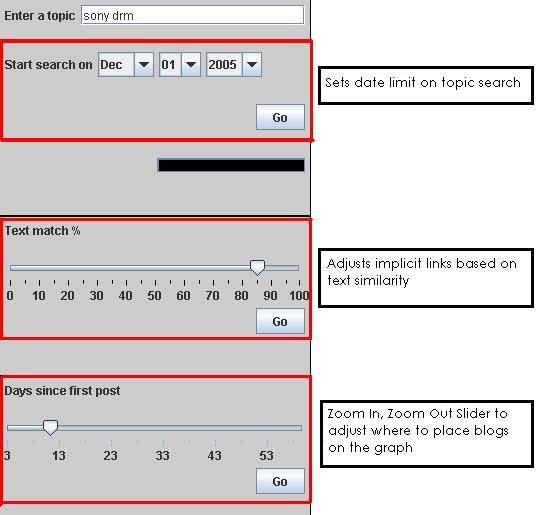
Dynamic
queries
are present so users can select values for “% Text similarity” and
“Day’s since
first post”. We wanted our visualization
to be able to provide real-time feedback with rapid, incremental, and
reversible controls.
Brushing
and
linking functionalities are also included. The user can mouse over any
given
node and the Post Name, Blog Name, Posted Date and URL are displayed on
the
lower right hand corner. Clicking on a specific node rearranges node
orientation. Potential clustering physics will be added in future
iterations of
Blog Viewer.
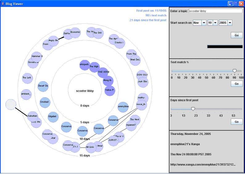
The amount of nodes returned is set to 45 because the higher the depth setting the longer the processing time. Starting with a current date the visualization pulls back postings back as far back as the ‘depth’ setting or the ‘first date’ setting. For chatter topics like “Scooter” and “
If
blogs have a
direct physical link, the link line is bold. The “Text match %” slider
is used
to determine implicit links. The text
similarity slider allows the user to adjust the required length of
matching
string between two posts before for a thin, implicit link line is drawn.
| USABILITY STUDY |
A
usability study was performed to recognize any possible design
modifications and usability problems that need to be solved. Participants were asked to compare
Blogpulse’s Conversation Tracker tool with Blog Viewer and to identify
which
visualization tool is better and in which situations.
Figure 2: Blog Pulse Conversation Tracker
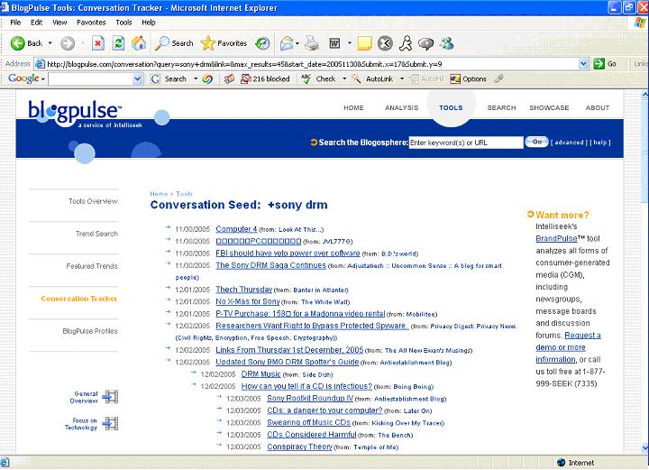
Figure 3: Blog Viewer

Three participants (2 Male, 1 Female) with an average age of 24 volunteered to perform our usability test. All participants were familiar with the Internet and use it daily. Two of the three participants stated that they had their own blogs and all three had posted on a blog before.
Participants were asked to perform two tasks. For the first task we did not show the participants how to use the UIs for each tool. In task one, participants had to choose a topic (current news, movie, game, etc) on their own and enter the term in both the Conversation Tracker and Blog Viewer. Task one was more for participants to get familiar with each of the tools and was more or less a training run. To understand what users were thinking and not just doing we urged participants to “think aloud”. We were able to get a sense of what kinds of issues they had and what components they did not understand. After task one, participants were allowed to ask questions about things they did not understand when using each tool. Collecting and answering the participants’ questions during this first stage allowed us to identify the issues and at the same time allowed the participants to gain insight into the usefulness of each application for the next task.
For our usability test we chose to use a “within subjects” design rather than a “between subjects” design. We wanted all participants to perform all treatments rather than having only one group of participants for each variable treatment. A “within subjects” design allows the participants to see the different conditions so comparisons can be made more effectively.
RESULTS
The usability testing provided great insight for future design implementations. We were able to better understand the usefulness of the two tools as well as recognize what adjustments are required and which interactive components have problems.
Participants when using Conversation Tracker did not understand the Link and Max Breadth box. The Link box was left blank and Max Breath was left at the default value.
FIGURE 4: BlogPulse Conversation
Tracker Search Interface

The
results
returned were in a flat tree list and participants figured out rather
quickly
that the indentations meant direct links. All participants mentioned
how Post
Names and Blog Names were useless in determining the actual content. Clicking on the links brought participants to
the specific blog. One participant did a keyword find on the search
term at the
actual blog site and found that most of the blogs had little or no
relevance to
the term searched for.
FIGURE 5: Blog Viewer Search
Interface and Controls
BLOG VIEWER VS CONVERSATION TRACKER
The qualitative feedback we received was extremely helpful in identifying usability problems and provided great potential solutions for future designs. Task two was very helpful in determining the benefits of each blog visualization tool. All participants agreed that Blog Viewer was helpful in seeing the whole picture. It was good and finding blogs with similar content and finding the most connected bloggers. Participants found it hard on Conversation Tracker to see which blogs were similar to one another because Post Names provided little information. In order to determine content similarity they would have to go to each blog individually.
Finding blogs that were physically linked to each other was easy on Blog Viewer after they understood that bold lines meant direct lines and fine lines were implicit links based on text similarity. Finding physically linked blogs on Conversation was also easy to tell based on indentation of the tree list. Blog Viewer however has the advantage of seeing which blogs had multiple links whereas with Conversation Tracker’s flat tree list that was almost impossible to tell.
| FUTURE ADDITIONS |
In the next iteration of Blog Viewer we hope to solve many of the usability issues identified. One critical issues identified is the difficulty in seeing linked nodes. To solve this issue we would like to apply color highlighting when you mouse-over or select a node. Other potential solutions include adding some clustering physics to group similar blogs together.
Another
major
problem was participants were unable to recognize what the bold links
meant
versus the fine links. All the participants suggested a legend that
explained
bold lines meant physical links and fine lines meant implicit links
based on a text
match. Another potential solution is to
make implicit links dotted lines.
Other design improvements that can be made include:
| • | Renaming the “Days since first post” slider so users know the slider really provides a zoom in, zoom out functionality. |
| • | One “Go” button for the entire form. One participant clicked on the bottom “Go” button after entering a new search topic and was confused when the results returned were about the previous topic. |
| • | The possibility of removing the date control under the search topic box. Since the program is set to a default breadth of 45 it maynot be necessary to have a start search date. The Blog Viewer will instead search until it finds the most recent 45 entries. |
| • | Saving search history as thumbnails so users can view and compare past searches. |
| TOOLS |
To accomplish our goals we used libraries from the Prefuse toolkit to manage and render the data. Prefuse has rich support for tree structured data and it allowed us to experiment with various rendering styles and node layouts. A custom node renderer and layout engine were written to provide more control over the ‘network growth’ animation and to allow for nodes to be placed in concentric circles. Data fetching and parsing was done using standard java IO and HTML libraries and user controls were developed using Swing components.
To run the current Blog Viewer application, you will need to have Java 1.4 or later installed on your machine.
>
java –cp BlogTracker.jar blogtracker.BlogViewer
| REFERENCES |
1. Dave Sifry. State of Blogosphere October 2005, Part 1: Blogosphere Growth. Technorati News. October 17, 2005. http://www.technorati.com/weblog/2005/10/53.html
2. Sundar Kadayam. Overview of Technology: BlogPulse Conversation Tracker. Quicktime video file (2min 20sec) http://intelliseek.com/media/blogpulse/aBP-TechConversationTracker.mov
3. E. Adar, L Adamic. Tracking Information Epidemics in Blogspace- Conference of Web Intelligence, 2005. http://doi.ieeecomputersociety.org/10.1109/WI.2005.151
4. D Gruhl, R Guha, D Liben-Nowell, A Tomkins. Information Diffusion Through Blogspace- Proceedings of the 13th International World Wide Web conference, 2004. http://wwwconf.ecs.soton.ac.uk/archive/00000597/01/p491-gruhl.pdf
| LINKS |
• Blog Viewer PowerPoint
presentation
• Blog Viewer jar file
• Blog Viewer paper as a Word doc
or PDF