Assignment 4: Low-fi prototype & Usability Testing
Introduction | Prototype | Method | Test Measures | Results | Discussion |
Work Breakdown | Appendices
Introduction
SkillShop is a temporary hiring marketplace that creates an
individualized marketplace for temporary laborers and hiring managers
to meet for on-demand work engagements. It creates a network where jobseekers can find jobs and employers can find temporary staff, helping the efficient allocation of resources in this market.
SkillShop has been categorized into five parts:
- Search
- Social Network
- Messaging
- Scheduling
- Reputation
These five main areas are tied together by the interface and accessible though separate jobseeker and employer dashboards.
The purpose of the low-fi prototype test was to gather initial user feedback on the design and functionality of the Skillshop interface. We developed a model of how the interactions between the users and the system should take place. As designers, we had a vision of what Skillshop should look like and what it would be capable of doing. We also had an idea of the layout of the different pages, the functionality that was going to be offered and the language that was going to be used. However, we needed the perspective of actual users (potential jobseekers and restaurant/catering mangers) to validate or refute parts of our grand vision. This form of low-fi prototype testing will not only help us highlight the areas of our design that could be improved, but also gives us an idea of how to go about the process of refining our interface so that it is more usable and effective.
We began the process of developing our prototype by identifying the central tasks for each of our two primary personas, and determining what we felt was most crucial to test at this stage. We knew from the outset that our personas had different sets of needs, and to respond to this we developed two separate dashboards, with different features available depending on the user’s role. We developed interaction diagrams, mapping out usage patterns that would make sense to each persona and meet their requirements in the most straightforward way possible.
We then divided up the interface into major component parts, and designated a group member to address each one. We individually drafted intial designs for our areas of responsibility and then met to present our sketches. In this way we were able to introduce the widest possible variety of concepts for discussion, and pull from them the ones that most suited our goals.
Having decided on an overall aesthetic and functional pattern, each of the group members then modified their original sketches to fit into the new standard. Finally, we translated all of the designs into Illustrator mockups, taking advantage of the program’s ability to design in layers to reuse portions of the design over and over again. This resulted in greater uniformity of appearance across the entire interface and also a more readily understandable mockup for usability testing participants. We created widgets to represent drop-down menus, and a variety of response screens (such as search results, and then details for each of the search results) to allow users to explore the system’s functionality in-depth.
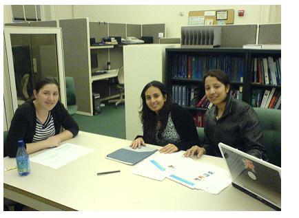
Participants
Three participants were used for low-fi prototyping:
Participant 1: Catering/Restaurant Manager- Our first participant is the catering manager at the International House at the University of California, Berkeley as well as a restaurant manager in San Francisco. His feedback was valuable because he provided insight on the differences in the hiring processes between the catering industry and the restaurant industry. Participant 1 is in his mid thirties and is an intermediate computer user. He uses the computer daily both at home and at work to check his email. He frequently uses MS Office Applications to do budgeting, scheduling, and to create menus and also reaches menus online.
Participant 2: Jobseeker- Our second participant was a graduate student in Civil Engineering. He has worked part-time jobs in the past and has experience searching for jobs online. He frequently attends networking events to search for jobs and relies heavily on references. Participant 2 is in his early twenties and is an expert computer user. He uses the computer everyday for academic purposes.
Participant 3: Jobseeker- Finally, our third participant was a Masters student in the School of Information. Participant 3 is in his late twenties and is interested in finding temporary work. He is also an expert computer user and uses the computer daily for academic purposes as well as recreational uses like gaming, and blogging.
Procedure
Each low-fi testing session began with team introductions and a brief overview of SkillShop’s goals. We defined what role each member of the team would have during the test session; facilitator, “computer”, and note taker. We had all participants sign the
Part 1: Pre-test Interview- We asked the participants a series of questions about their computer usage and familiarity. In the case of employers we asked them about their current hiring process and in the case of jobseekers we asked about their job searching methods.
Pre-test Interview for Employers
- How often do you use a computer at work or at home?
- What computer applications do you use most frequently?
- Do you use any online sites to do recruiting?
- How would you describe your duties at work as they relate to hiring or staffing employees?
- How often do you search for workers?
- What current methods do you use to find employees?
Pre-test Interview for Jobseekers
- How often do you use a computer at work or at home?
- What computer applications do you use most frequently?
- Do you use any online sites for job searching?
- How often do you search for jobs?
- What current methods do you use to find jobs?
Part 2: Scenarios & Tasks- We presented the participants with two brief scenarios and the associated tasks.
Scenario 1- Employer Account Signup
As a catering manager you heard about SkillShop, a temporary hiring marketplace for the food service industry, and you want to check it out and explore some of the system’s features and functionality.
Task: Sign up for a free user account
Scenario 2- Employer Job Posting
Now that you have an account with SkillShop you’ve just checked your staffing schedule for next week and notice one of your servers cancelled for a large event next Thu evening March 8th.
Task: Login into SkillShop with your login ID and password, “Post a new job” and fill out the appropriate information for the event.
Scenario 3 -Jobseeker Account Signup
As a jobseeker you heard about SkillShop, a temporary hiring marketplace for the food service industry, and you want to check it out and explore some of the system’s features and functionality.
Task: Sign up for a free user account.
Scenario 4- Jobseeker Job Search
You are in need of some extra pocket money so you want to find a job in San Francisco for Thu March 22 nd. You are busy in the morning but can work the evening shifts starting after 3PM. You have past experience working as a bartender, server, and host but prefer to find a bartending job because it pays the best but you don’t have that much experience.
Task: Login into SkillShop with your login ID and password, search for a job that fits your availability and apply for it.
The user was asked to complete the two tasks one at a time using the paper prototype (Note: All users were able to complete the tasks within the time allocated for the testing session). The tasks were created to test the major functional areas of our system, specifically user sign up, job search, and job posting.
During the testing, observations were recorded regarding the users actions, including the ease/difficulty in which the user completed the task and understanding/confusions about certain aspects of the interface. After the participants finished the tasks we concluded the testing session with a post-test discussion.
Part 3: Post-test Interview/Discussion- We asked the participants about their general impressions of the interface.
Post-test Interview Questions
- Overall, what are your feelings about the interface?
- Would you use this system?
- Is there anything you wish the system did that it doesn’t do?
- How could we make it better?
To conclude the testing session we thanked each participant and answered any questions they had.
While performing our tests, there were four key areas that we were focusing on and hoping to gain useful feedback from users. These areas are outlined below.
- Language – We wanted to make sure that the vocabulary we were using in the interface was clear. It is important to verify users understood the meaning of domain specific terms such as “temporary worker”. We were also looking to see if any of the terms we used throughout the interface (especially in the registration process and the setting up of preferences) were ambiguous or confusing and were hindering users’ success at getting the system to performing the required tasks.
- Navigation – We wanted to ensure navigation through the interface is easy and intuitive to users. We tried to make note of how users felt about the layout of the interface and to make certain that pages were not too cluttered.
- Information – We wanted to discover if there was any information that users needed that we may have neglected to include in the interface. This could include general help on how to perform certain tasks and explanations for the different actions, tabs, buttons and widgets. We made sure to note if there were any missing data fields that users could require may require to perform tasks more effectively.
- Functionality – As designers, we tried to predict the different tasks that users may want to perform and attempted to include proposed functionality based on our previous needs assessment processes. However, we realized that there may have been some tasks that users needed that we have missed while attempting to define user needs. Thus we used the low-fi testing process as a way to identify any missing parts of interface functionality that would be useful to users so that these could be implemented in future iterations of the design.
Scenario/Task 1: Employer Account Signup
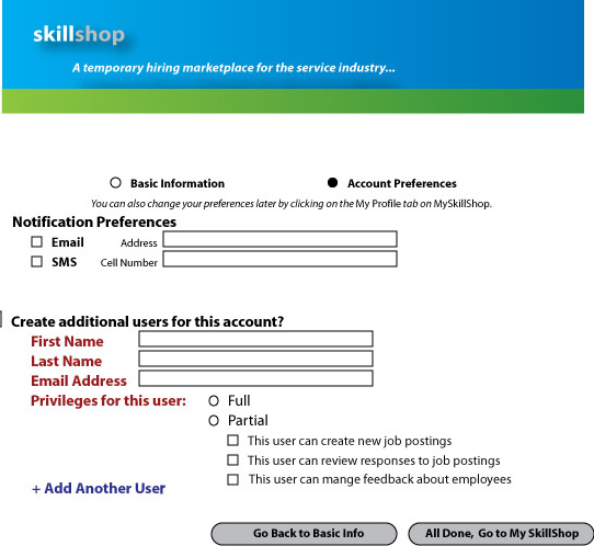
- Language- There was confusion surrounding the links and labels. some section headers and content groupings were not easy to understand (i.e. "Add Another User"). On the basic sign up page the user did not check “Add another User”. This section is not necessary because the user stated he is the only one that does the hiring.
- Navigation- In this task the user filled out only the required fields, Name, Email, Password, Security Question and Answer and skipped everything else.
- Information- The user expressed confusion about the "Notification Preferences" section on the basic sign up page. He suggested help icons next to field names to indicate what certain fields mean.
- Functionality- The user expressed that the functionality was adequate and did not think anything was missing in this section.
Scenario/Task 2: Employer Job Posting
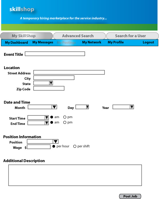
- Language- There was some confusion surrounding the labels on the Job Posting page. Labels should be less ambiguous so the user does not have to guess the meaning. For example, "Location" can vary depending on the event.
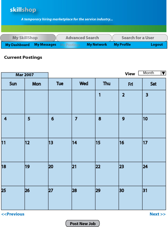
- Navigation- The user expressed the need to have some way to cancel or exit during the signup process. Also the "Post New Job" button on the bottom of the Employer Dashboard Page is hard to see and should be more visible.
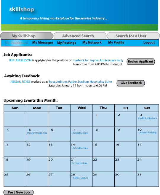
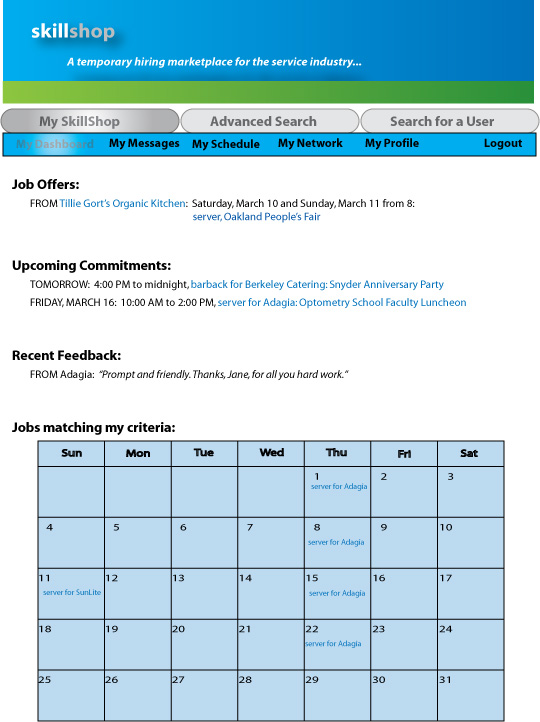
- Information- The user wanted a clear confirmation that his job was posted after he hit the submit button. He suggested a confirmation message that says “Job Posted” when the user is taken back to the dashboard. He also expressed the need to have important notifications very noticeable on the dashboard. He suggested new job postings on the calendar view to be highlighted.
- Functionality- The user mentioned several fields that were missing that should be added to the Job Postings page. He mentioned for the wage option we should have the ability to specify if tips are included. The user also suggested adding an option for attire and a definition of what attire means. He also requested reminder features and would like to have saved locations like in Weather.com. There may be different locations for the event/job. Lastly he wanted the option of posting his contact phone number so jobseekers can reach him directly. In terms of the dashboard he wanted to be able to see immediately what his status was for that day or week. For example if he had a cancellation for a particular event on Saturday he wants to be able to glance at his dashboard and quickly see that there is an open shift.
Scenario/Task 3: Jobseeker Account Signup
- Language- During this task the users expressed confusion regarding the word "Type" in the accounts preferences page. They suggested it should be "Job Type" to make it clearer. Both our users did not know what the job type “bar back” was. "Notification Preferences” caused some confusion. Also according to one the users, "Go to Dashboard" button on the signup confirmation page is not intuitive.
- Navigation- Users expressed the need to have some way to exit or cancel during the signup process. They suggested a pop-up to confirm that the user wants to cancel the signup process.
- Information- During this task the users were confused about the search option on the homepage and requested more information about it. The users also wanted to know the format of the resume to be uploaded (PDF, Word). There was also some confusion on the privacy settings page and the users did not know where to go for help. The ability to control who can view their profile was not clear. Also users were confused about the purpose of the calendar on the account preferences page.
- Functionality- Users wanted to a way to mention the minimum expected salary during the signup process. They also suggested that the Security question should have some options including “other”. There should always be a default option as well as the ability to customize.
-
Other Comments:
Users just filled required fields in the Basic Information page. They had a hard time finding the link to signup for account, since its way below on the page, after all the text.
Scenario/Task 4: Jobseeker Job Search
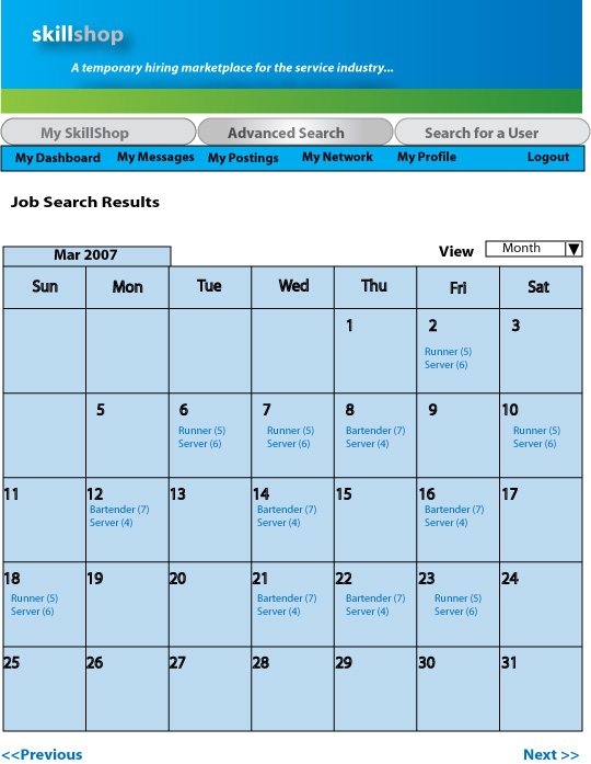
- Language - The users did not know where on the dashboard to go to find a job. They did not realize that "Advanced Search" was the tab to go to for job searches. The users also didn’t understand what “Type” implies.
- Navigation- The user expressed a need of having a “Not interested" button in the restaurant details page as part of search results.
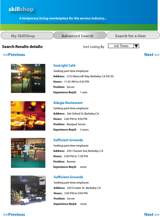
- Information- The user was confused about what save search criteria means and would like to have more information about what that option meant. The user also wanted moretext about the restaurant so that people can compare different restaurant. The calendar on the dashboard should display the month name
- Functionality- The user wanted to view the upcoming commitments in a calendar format. Our users also wanted to search for jobs on the basis of hourly rates. Users also suggested having a rating system for Employers. While looking for a job, he would want to see how many stars and Employer got to get an idea if it’s a good workplace. According to our users the advanced search page has a lot more potential. For example, search by availability /time preference on advanced search. The users also want the advance search result to show expected dress-code and time. They thought a restaurant logo might be helpful as compared to the restaurant photographs that we currently have in the search results page. Mentioned having the job type in Job offers more prominent.
Low-Fi prototyping helped us validate the basic principles we followed during our initial design and revealed many usability issues which will help us make our interface better in upcoming iterations.
Scenario/Task 1-Employer Account Signup- Task 1 revealed some important facts about common user behavior when filling out forms. We realized the participants only filled out the required fields highlighted in red. As a result we will need to make more fields required in future iterations to capture more information about the user. There was much confusion surrounding field names and labels. The users were unsure what "Notification Preference" meant. There needs to be some kind of help offered to users while they register so they are not lost. If users do not understand field names they will either guess or even worse abandon the registration process. A possible solution is to have a help icon or inline help text describing what the field names mean. In terms of the "Create additional user" section, although the manager we interviewed mentioned that this is not necessary for him because he is the only person involved in hiring, we decided to keep this as an optional field because different restaurants or establishments have different hiring processes. The main takeaways from this task is to make sure field names are intuitive and easy to understand and to provide some kind of help for users during the registration process.
Scenario/Task 2- Employer Job Posting- Task 2 confirmed the need for our team to go through a process of vocabulary development. The user thought our links and labels were unclear and ambiguous. We have to eliminate ambiguity and make field names more specific. The "Event Title" field on the job posting page seemed to confuse the user. Again we can solve this problem by providing a help icon next to field names. The user expressed the need of having more information on the dashboard in order to help him identify staffing needs/status without much effort. In the calendar view, we will provide some more visual cues to address this requirement. Hiring managers are busy people that have to juggle many tasks at once. It is therefore necessary to create a dashboard that allows employers to quickly identify where the gaps and open shifts are. Some other minor issues we identified that are easy fixes are missing fields such as the date field for the posting the job page, adding a tips field, adding a dress code field and also giving the manager the option of including his/her contact number in the job posting so potential candidates can contact him directly. The user also indicated that saving event locations would be helpful and we have decided to save the locations entered by user and give them way to select from previously saved locations. After the job is posted the user is taken back to the dashboard and the job post appears on the calendar. But there was no explicit confirmation message and it made the user unsure about what happened after he had posted the job. We need to provide a confirmation message for the user once he/she submits a job posting. Overall, the main takeaways for this task was to improve feedback and increase visibility of system status for the users.
Scenario/Task 3- Jobseeker Account Signup- This task highlighted many problems related to language, navigation and functionality. The first issue the user encountered was locating the signup option. Generally "Log in" and "Sign up" options are always co-located in websites. We will take this account in the next iteration and place these options next to each other on the homepage. The "Type" field used in the signup form confused the users and we have decided to change the field name to "Job Type" to be clearer and less ambiguous. We must make sure we use common industry language while specifying job types. The user pointed out that there should be default security questions provided as well as an option to create own security questions. This definitely makes sense and we plan on providing an option of either selecting a security question from a drop-down list or allowing users to create their own. Another change we will make to the jobseeker signup page is the ability for the jobseeker to upload their resume in any format (pdf, doc, text). On the "Privacy Settings" page we should give the user a default option as well as an ability to customize their own settings. In the account signup process we will have to provide exit options to make sure user can leave the process at any point.
Scenario/Task 4- Jobseeker Job Search- Task 4 brought forward general issues about layout and navigation. Content groupings on the jobseeker dashboard are not intuitive. For example, having the "Feedback" on the dashboard seemed out of context and users suggested "Feedback" should fall under the "My Messages" section. In terms of navigation there was confusion surrounding the multi-level tabs on the dashboard. The tabs at the top of the screen seemed hidden to the user. The user did not realize the "Advanced Search" option on the top-level tab was where they had to perform the job searches. We will have to rethink the labels and placement of search.
Task 4 helped us identify missing paramaters such as specifying time in the job search form. It is absolutely necessary to include time so that user can specify start and end time while searching for a job. The ability to search based on wage is another functionality users recommended. The option to save search criteria is apparent but users were unclear on how to retreive the saved searches.
To summarize, the testing process was very helpful in identifying issues with our interface. We will definitely incorporate the feedback from the participants in future iterations of SkillShop.
Things the evaluation could not tell us:
- Almost all people who participated in the testing process were intermediate to expert computer users. The evaluation could not really tell how easy and usable the system would be for a novice computer user. For future testing we hope to recruit participants with varying levels of computer skills.
- We were unable to test multiple designs to find out which one users liked best.
- We were unable to test computer-specific issues or stumbling blocks such as system response time and how these issues would affect user experience.
|
Saud Al Shamsi |
Debbie Cheng |
Alana Pechon |
Bindiya Jadhwani |
Meghalim Sarma |
| Interaction Diagrams | 20% |
50% |
30% |
0% |
0% |
| Prototype Construction | 20% |
20% |
20% |
20% |
20% |
| Testing | 22% |
12% |
22% |
22% |
22% |
| Writeup | 20% |
20% |
20% |
20% |
20% |
| Website | 0% |
100% |
0% |
0% |
0% |
| Assignment 4 Review | 20% |
20% |
20% |
20% |
20% |
Interaction Diagrams
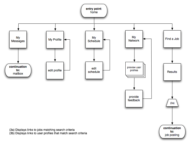
Jobseeker Dashboard- Interaction Diagram
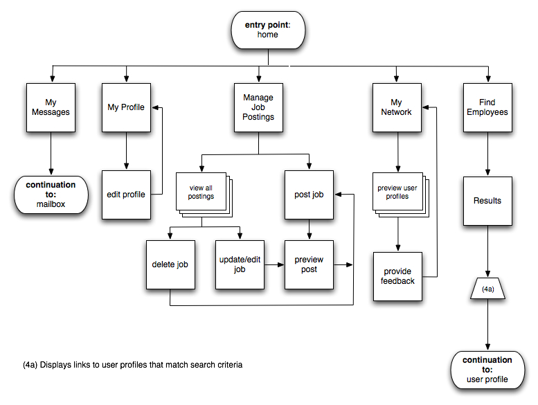
Employer Dashboard- Interaction Diagram
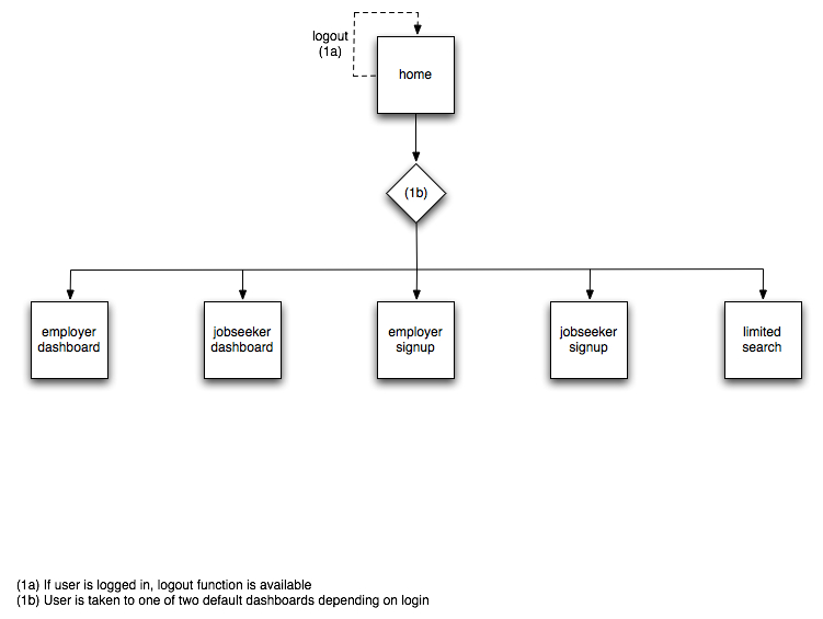
Login- Interaction Diagram
Illustrator Mockups
Employer Basic Signup
Employer Signup Preferences
Employer Dashboard
Employer Current Posting
Employer Create Posting
Jobseeker Basic Signup
Jobseeker Dashboard
Jobseeker Advanced Search
Jobseeker Search Results
Jobseeker Search Results-Server
Jobseeker Search Results-Bartender
Jobseeker Search Details
Test Scripts & Consent Form
Jobseeker Testing Script
Employer Testing Script
Informed Consent